Final Course Reflection
When I signed up for this course, I had enough classes already to graduate once I completed them at the end of the semester. It wasn't one I needed, but I remember feeling extremely unprepared to graduate. It could have been completely irrational, but after some asking around I signed up for the class anyway. I think part of me also wanted to learn some more design skills just for fun. Looking back from the other side, I'm definitely glad I did.
I went into day one not really knowing what to expect. We were first thrown into the toy project (which honestly set the tone a little bit for my personal workflow, I did not need to spend as much time as I did on that) then right on to inquiries. I will not lie, I saw a 1-2 week turn around and could've passed out. I was already working through my internship and other classes so I quickly became nervous for how I was going to pull this off. Thankfully, it became apparent to me that the inquiry didn't have to be a full final project level of content. Quality over quantity was kind of the main focus. Now, did I still stay up way too late trying to finish everything? Absolutely. I'm the CEO of losing the forest through the trees. I could have a degree in it. Seeing this pattern of how I worked though ended up being a good learning moment for me. Obviously I'm juggling multiple rigorous classes while I'm trying to work on this, and that probably (hopefully) won't be the case in a future career, so time management does become a lot harder than it generally would be. However, every day of my life I get sidetracked by a detail and work on refining that instead of, you know, the task that needs to get done asap. Design work is and has not been any exception. Thankfully, that gives me the opportunity to learn how I can avoid getting lost. Maybe I can actually put some energy toward that after this last week is over. My brain is a junk drawer for now.
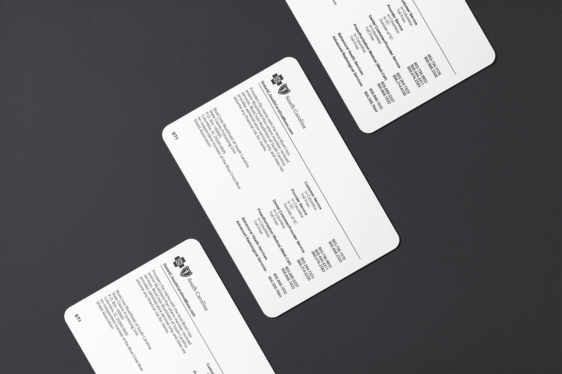
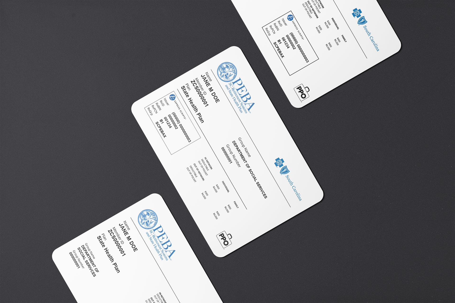
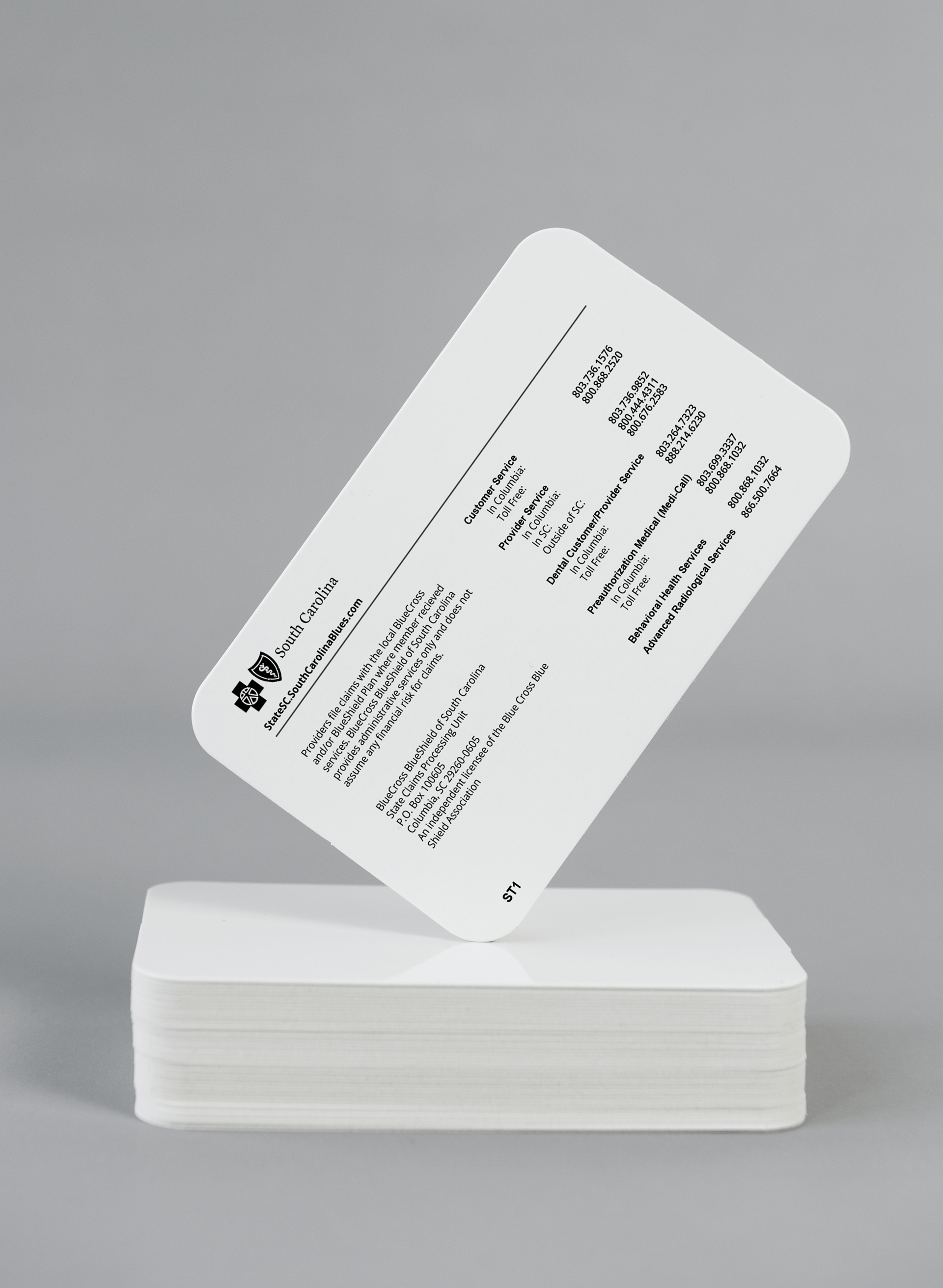
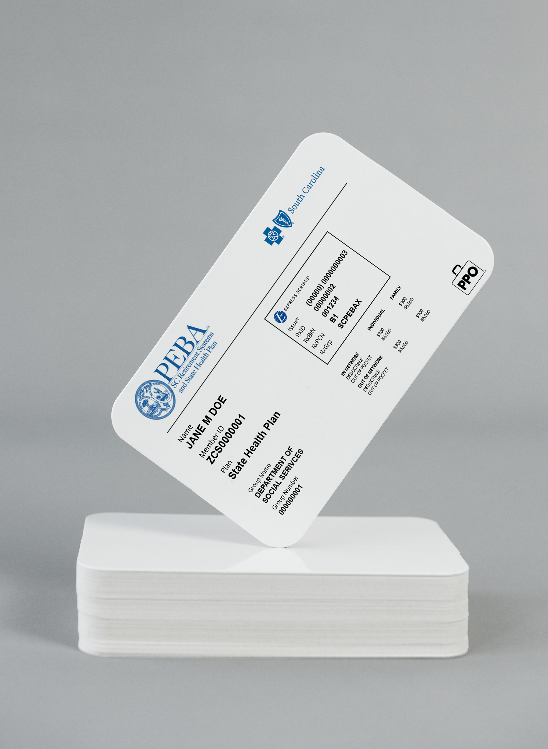
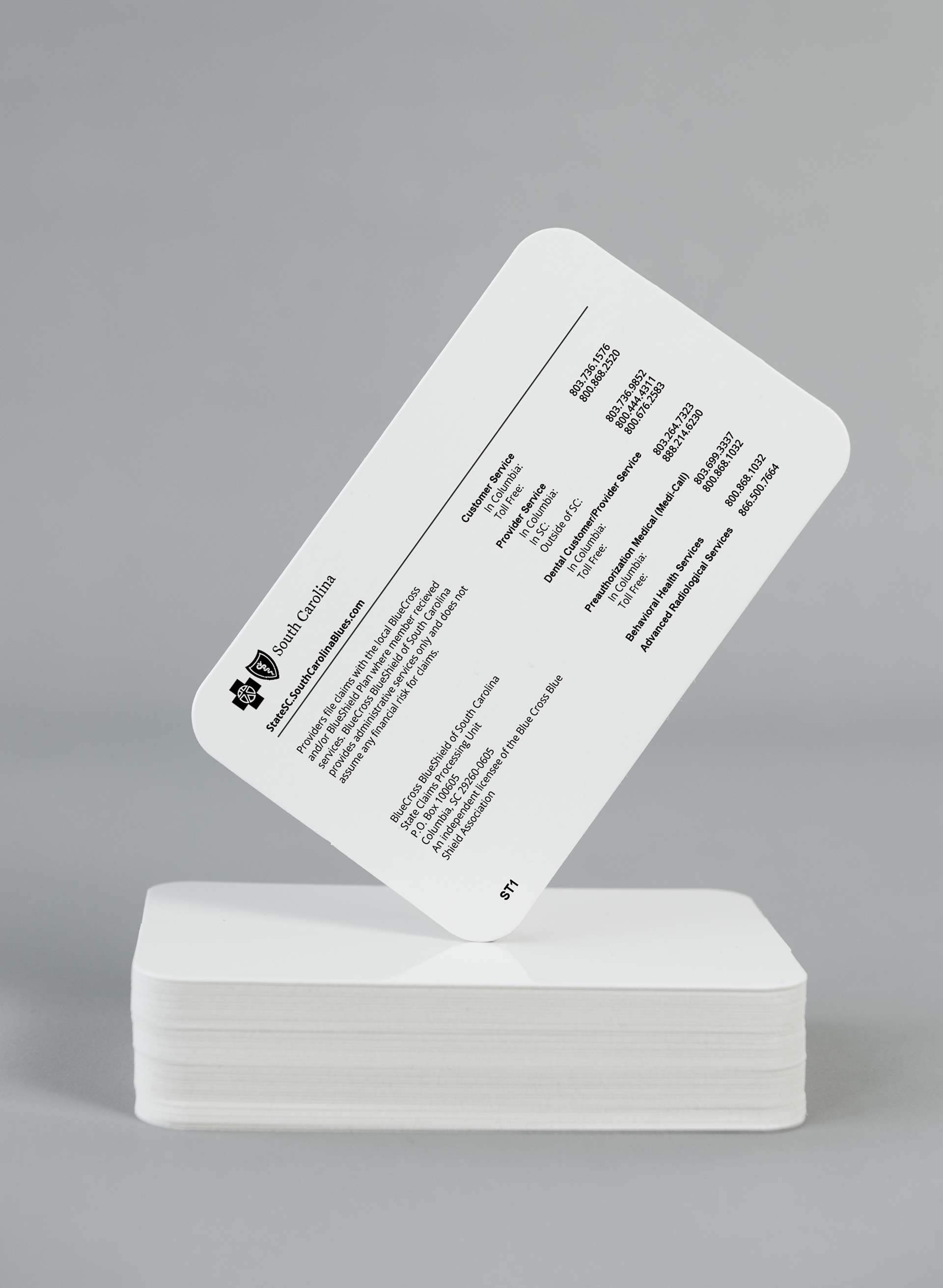
Tangent aside, I really enjoyed getting to chose my own projects. Though that seemed intimidating at first, I clearly had a laundry list of problems I wanted to fix that I could choose from. Exhibit A is that stupid, awful, useless Blue Cross insurance card. It was so satisfying to fix after the ordeal I went through trying to find my Rx insurance numbers. I even put that project in my senior portfolio and I had several people tell me how much they hated that card layout at Portfolio Day. It's such a validating experience to solve a problem that others have too. The other cool thing about this project approach is I can usually do my thing of completely scrapping an idea I've been working on and start over a little more easily. Professor Valdes described this way I worked a little better in critique this semester, and to my credit, I usually get something better in by the due date. That was cool. I'm glad my sporadic creative process has some supporters. It taught me something else about myself- if I don't like it, it's almost painful to work on. Sometimes it takes a few days of working to realize, but a better idea usually follows.
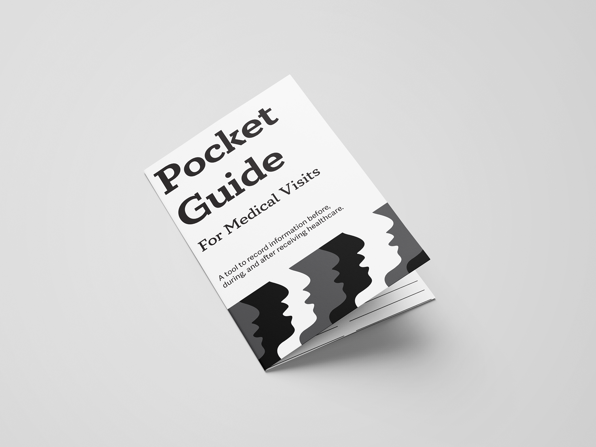
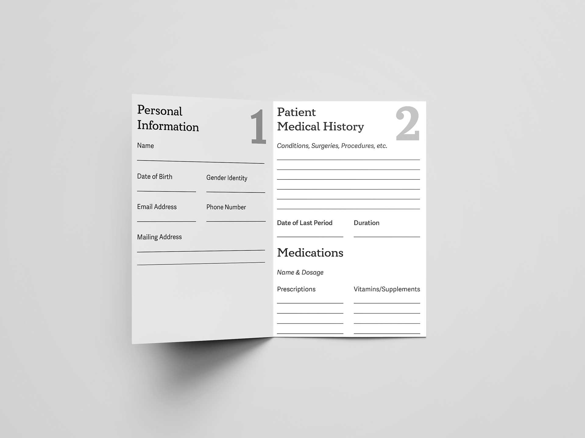
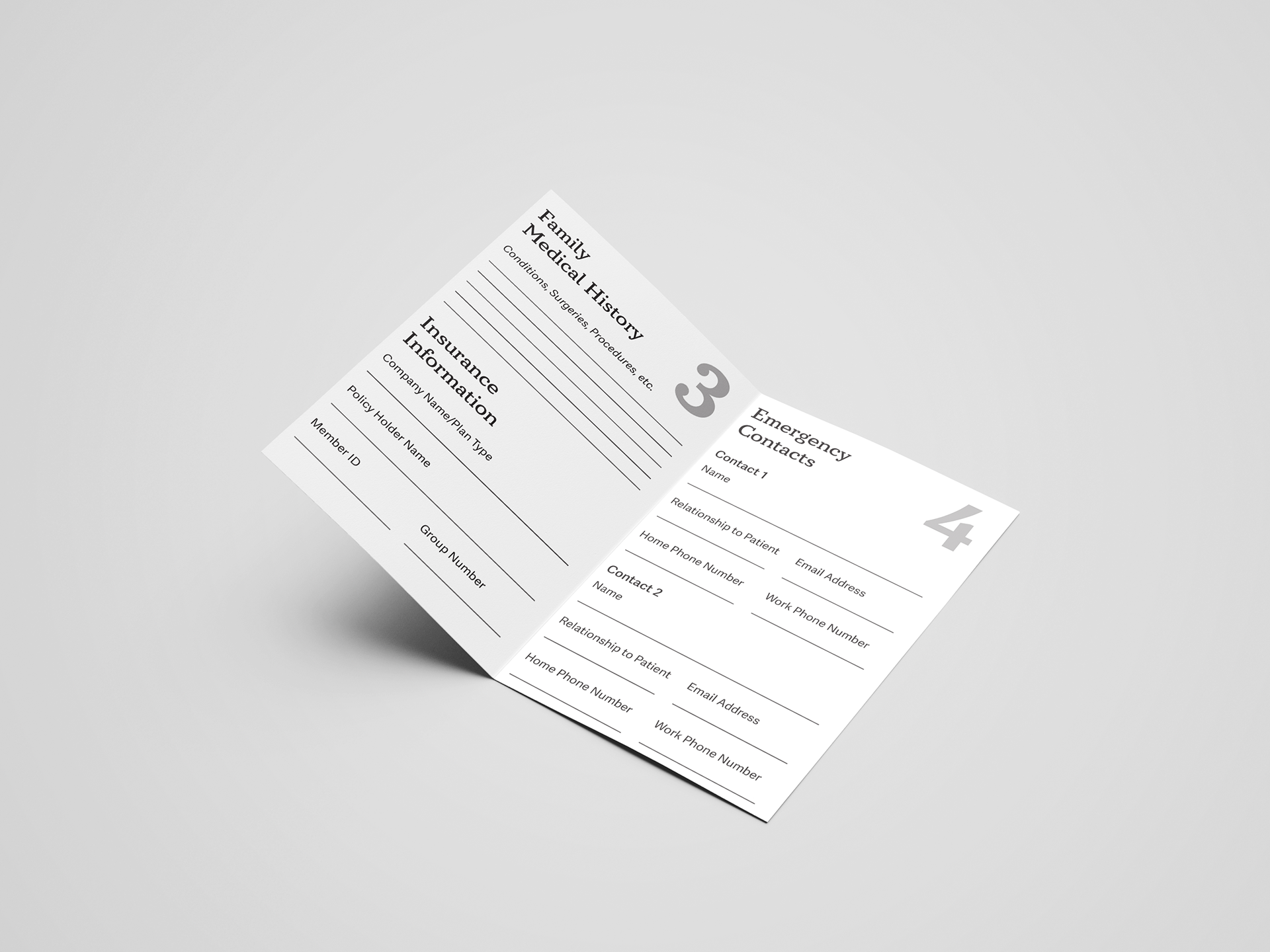
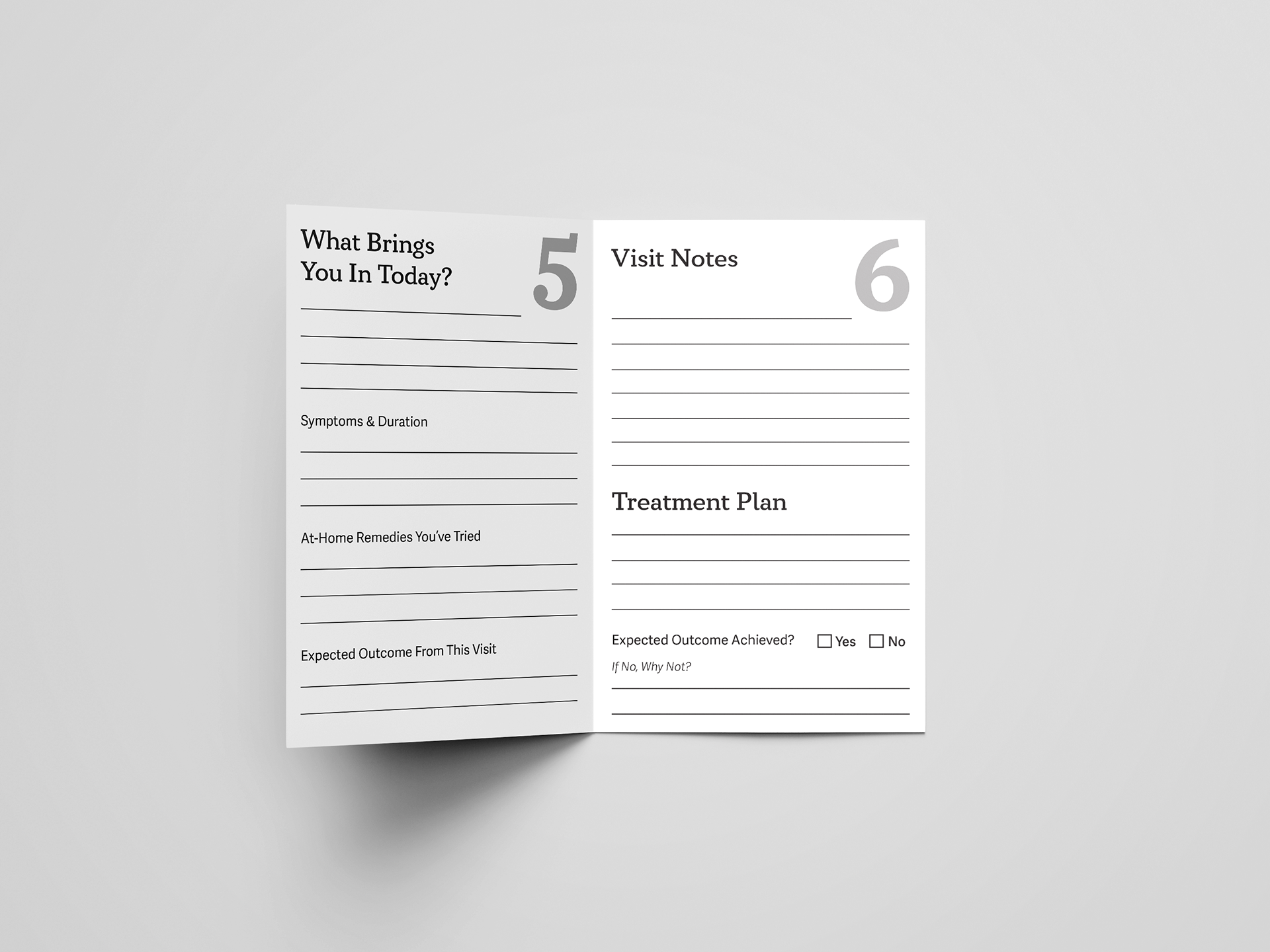
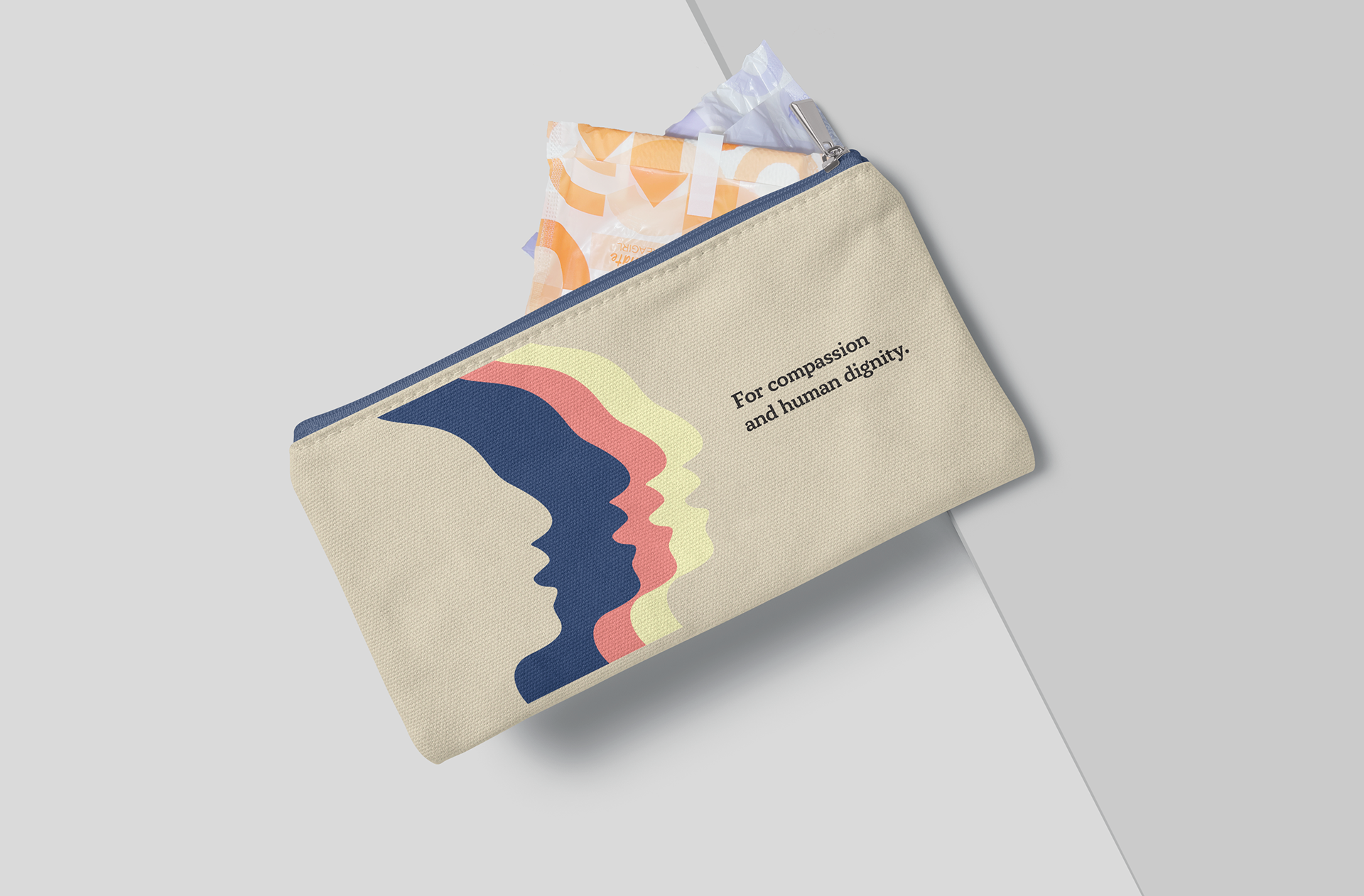
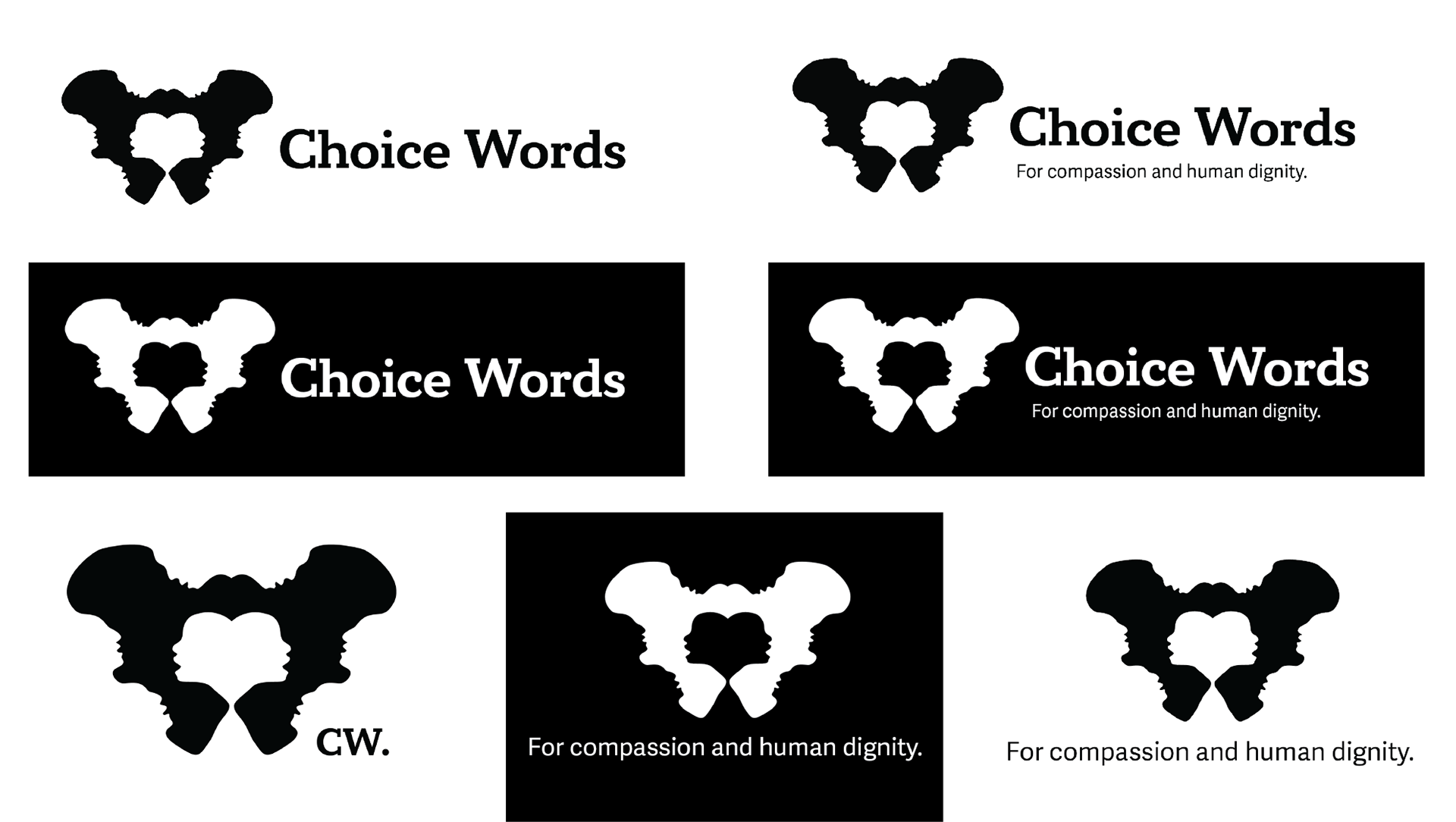
This class, especially with the long-term final project, was obviously amazing for my senior portfolio. I was running around like a headless chicken all semester but I got some really good compliments at Portfolio Day. I'm not entirely sure how else I would've gathered enough work otherwise. The best part is I really do like everything I put in that portfolio. I feel like it's a great reflection of my skills and how they've developed over the last three years. The final project especially is where I kind of just made whatever I could think of and had time for. The subject matter is one I quickly became passionate about, kind of like my ADHD magazine from Syntax & Semantics, and I was able to make some cool stuff from that. Branding is still not my favorite, I learned I'm not super excited about making websites, but the advertisements and useful collateral pieces are where I felt the best. The period products bag and guides for medical appointments hit being both helpful and nice to look at. I think I really confirmed my love for information and publication design. It's like organizing my house to the optimal arrangement...just with words on a computer screen and not furniture. I still want to try different things as much as I can, but I'm glad this is something I like (partially because it's printed on my business cards).
I'm not entirely sure how I got to the end of both this semester and my college years, but here I am. I can't think about it too hard. At the end of the day, even though I don't think I've gotten less sleep on a regular basis in my entire life, I'm so glad I registered for this extra class. I feel a lot more prepared to go design for a living. Not completely, but I don't think anyone really is. I got to know myself, how I work, what I like to work on, and what pitfalls I tend to run into. I'm going to take as much as I can with me out into the career world. Of course I'm absolutely terrified, but if I can get a project together in a week like I did this semester, I feel like I can figure out just about anything. I'm going to miss this design program so much and I'm thrilled I got to be a part of it. Even if I got here a year late.
P.S. Happy birthday Professor Khalili! Thank you for being my first USC professor and one of the best I've learned from. Keep doing great things.



Strategic Creativity: Chapter 7 & 8
One the most important things to me when it comes to my design work is DEI concepts. It's also my favorite subject matter to view in others work. I find a lot of value in listening to how someone's life experience varies through the lens of marginalized identities. As the book states many times over, understanding how the world is for others is key to responsible design work.
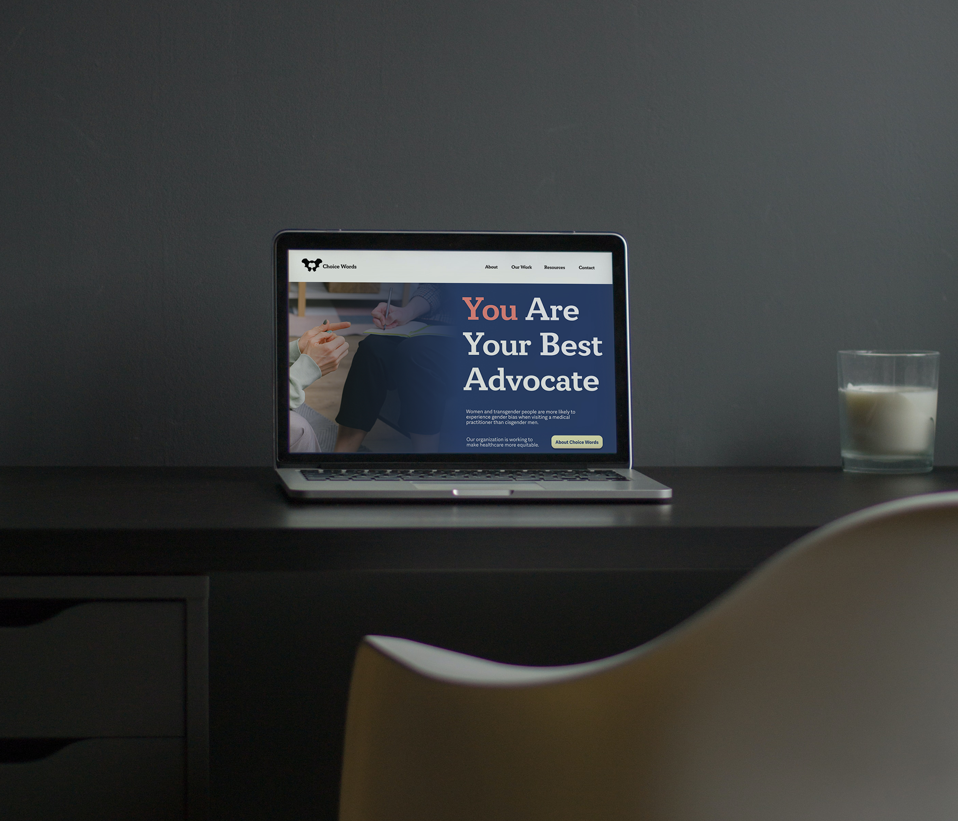
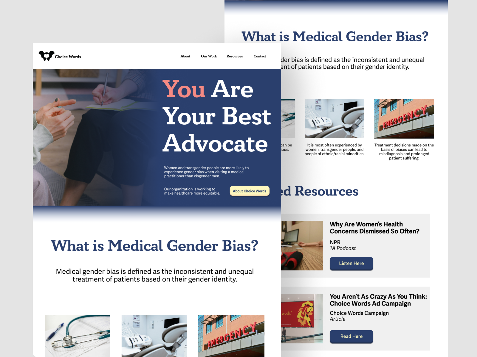
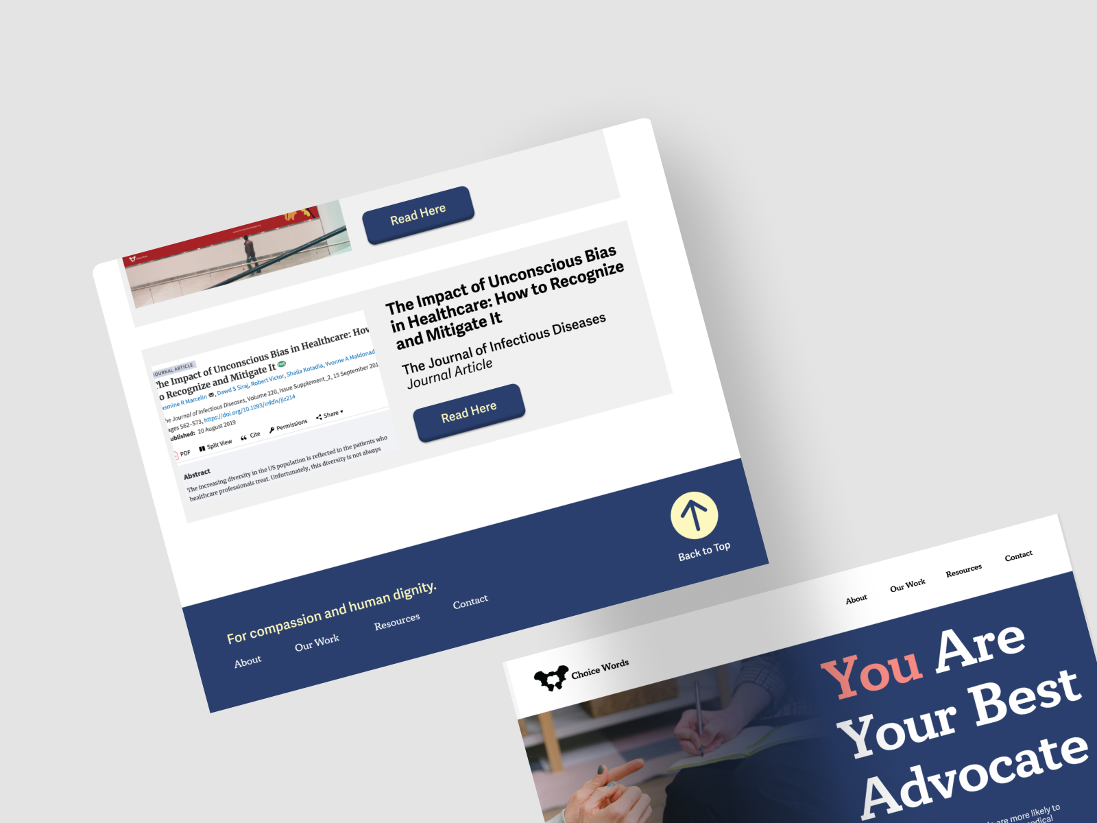
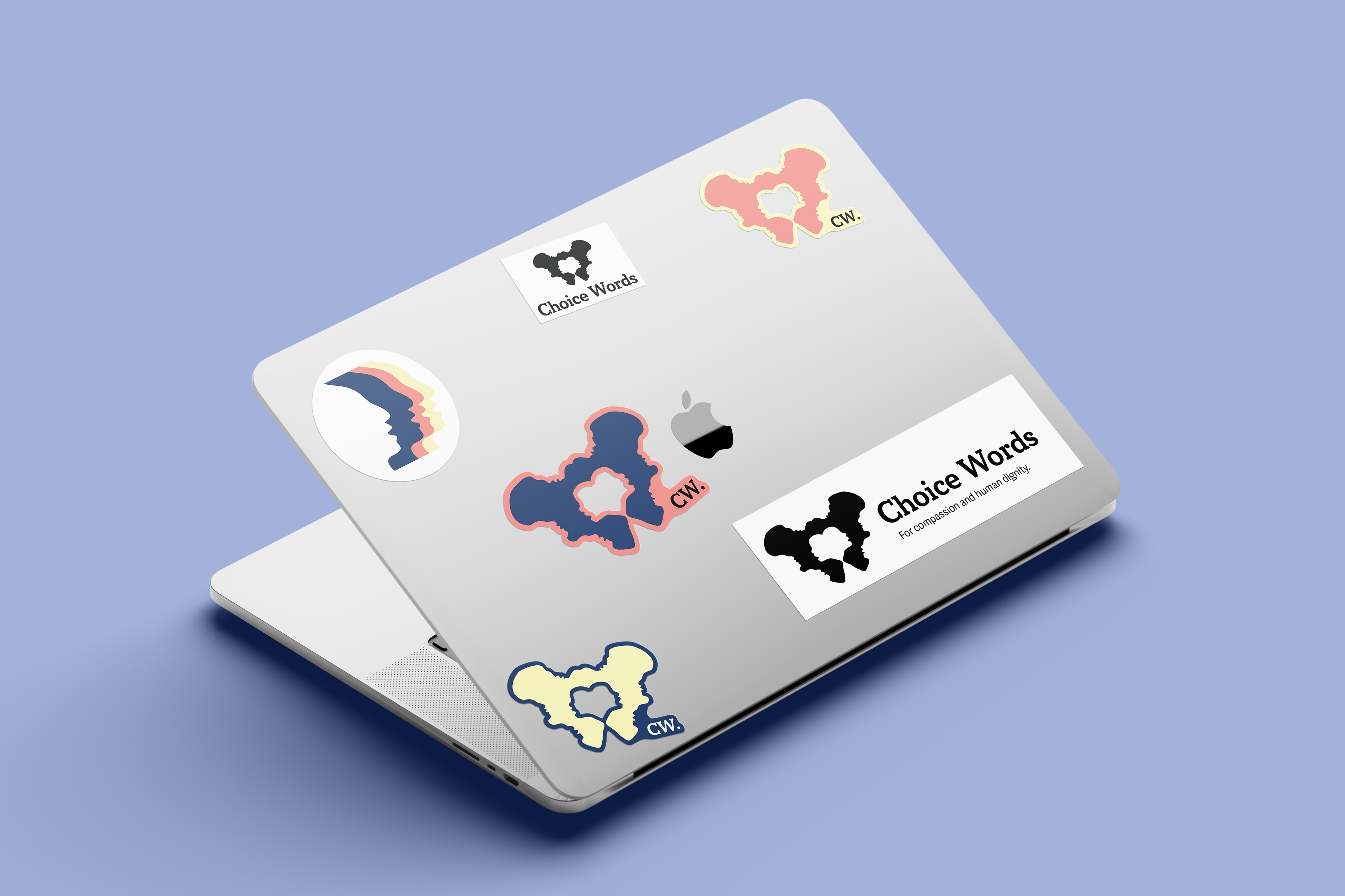
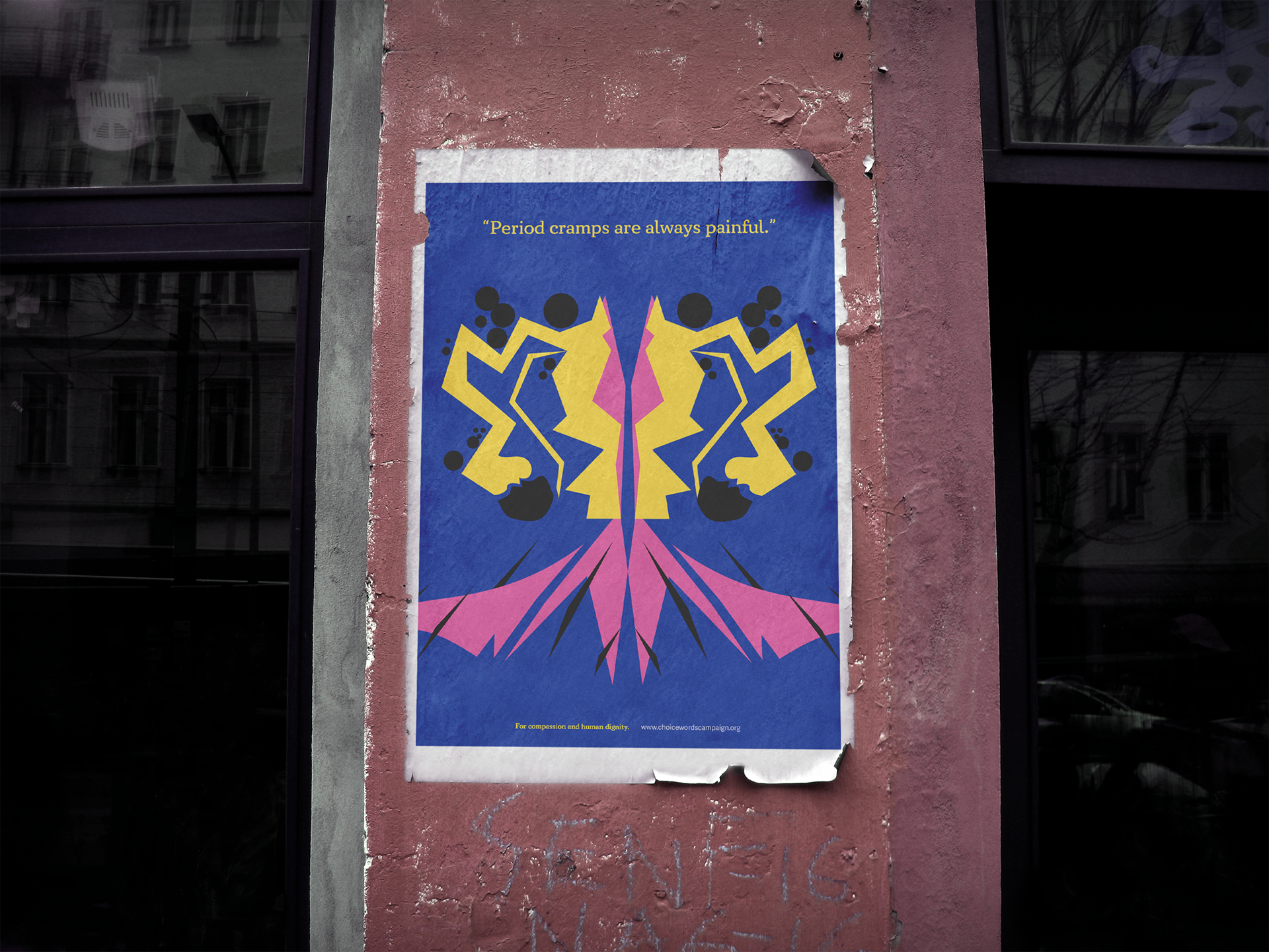
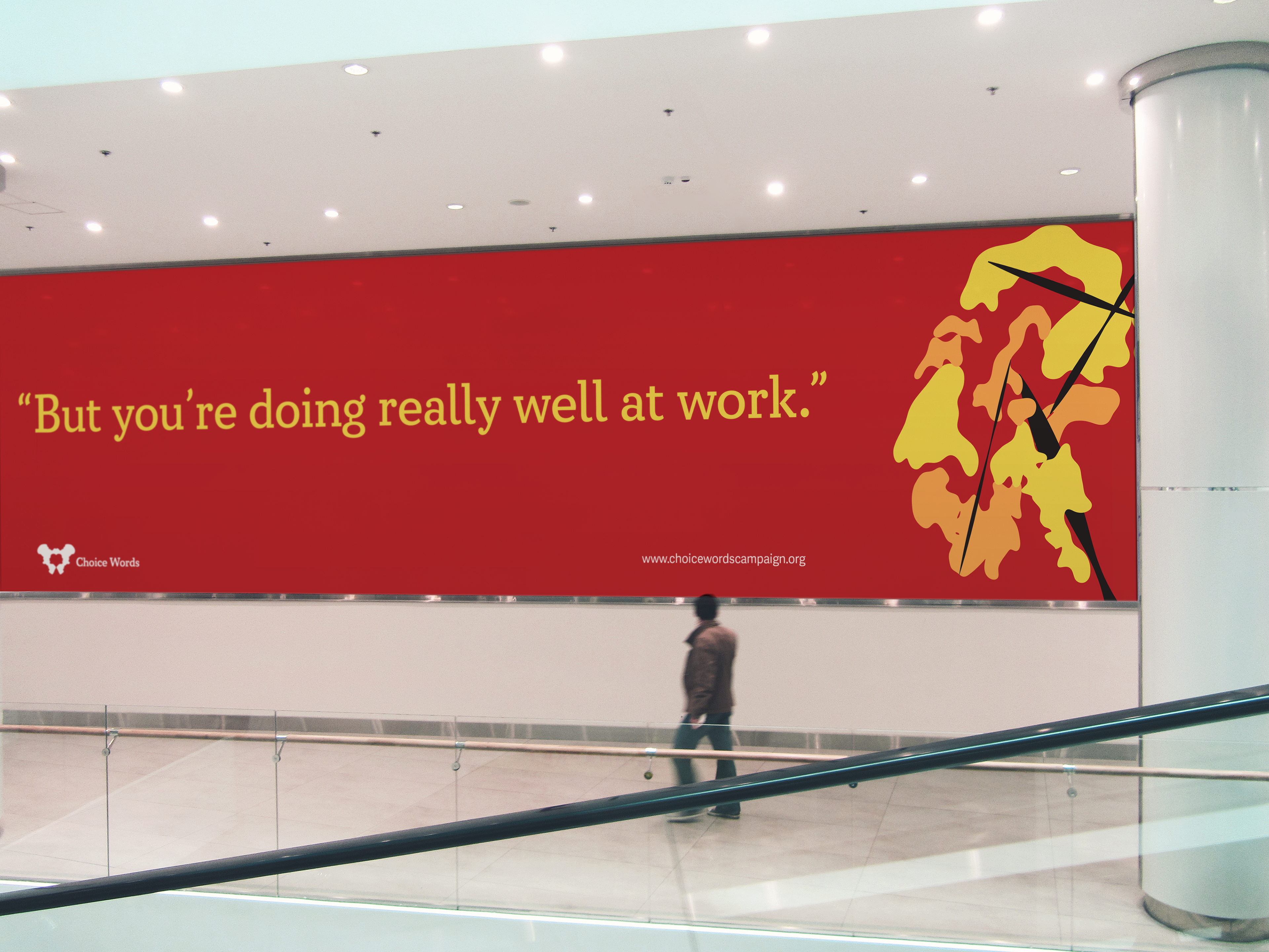
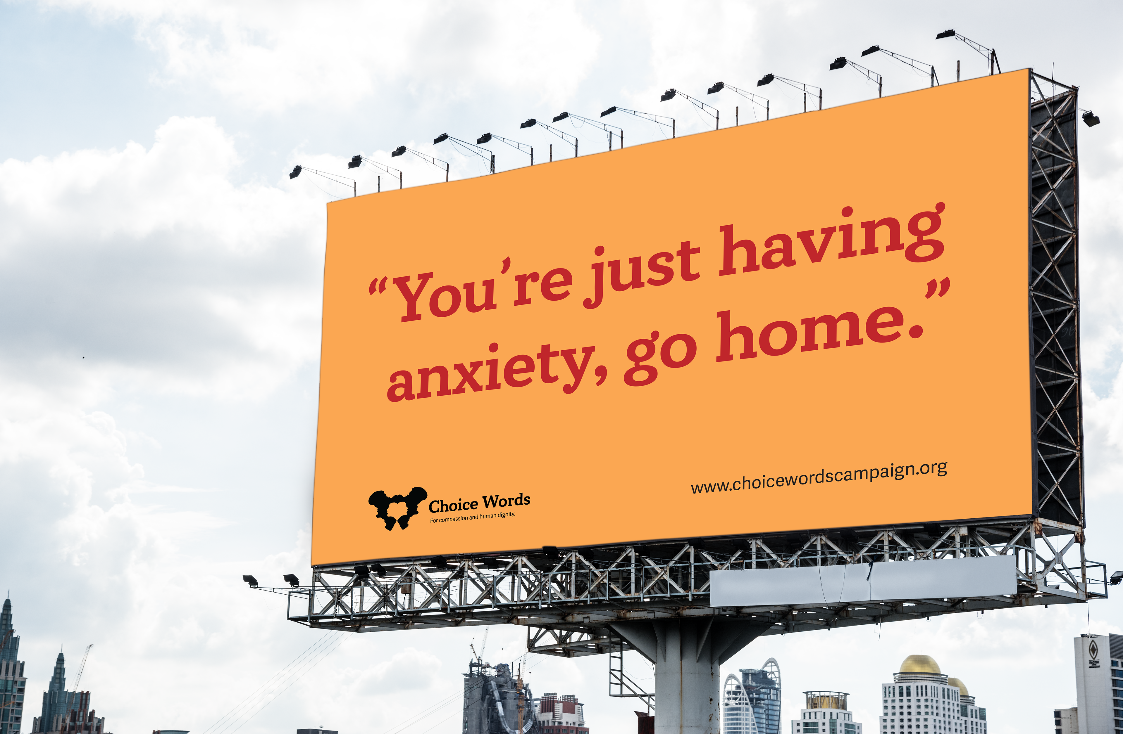
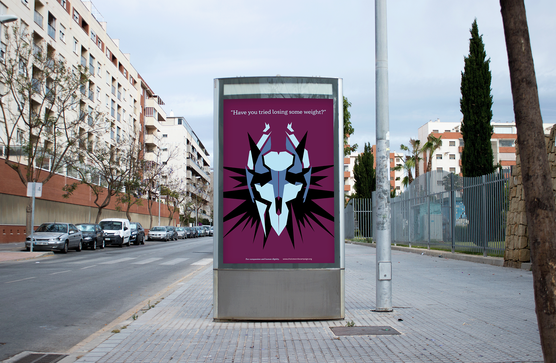
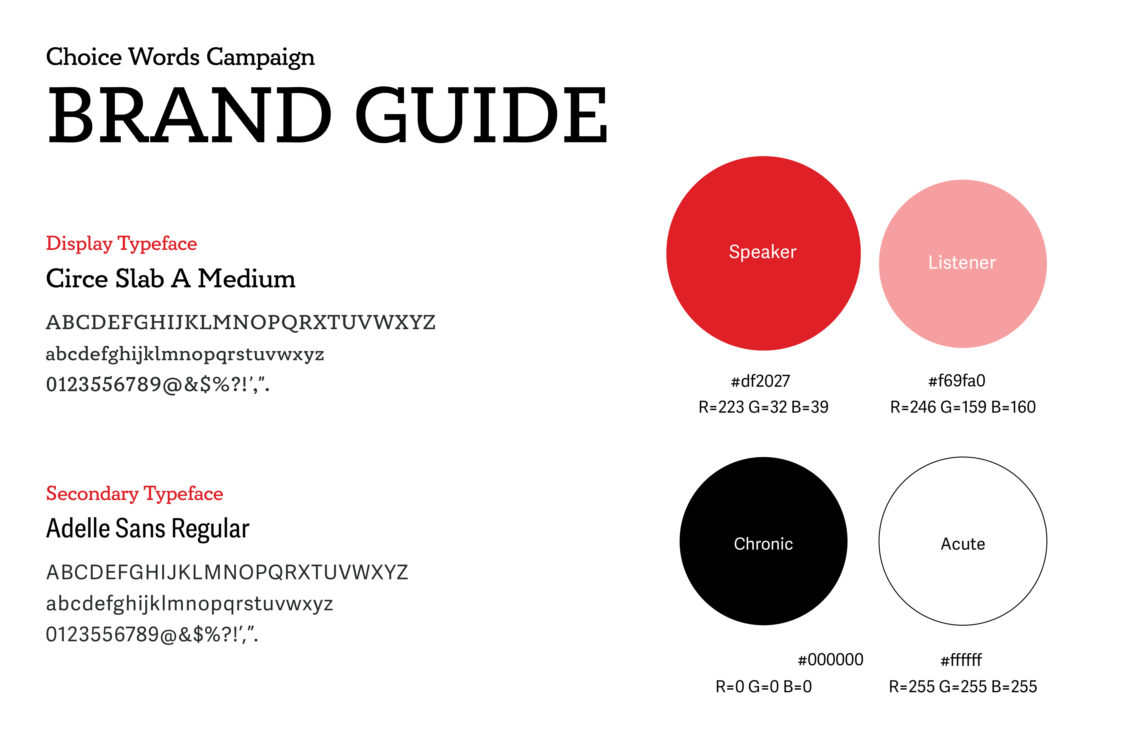
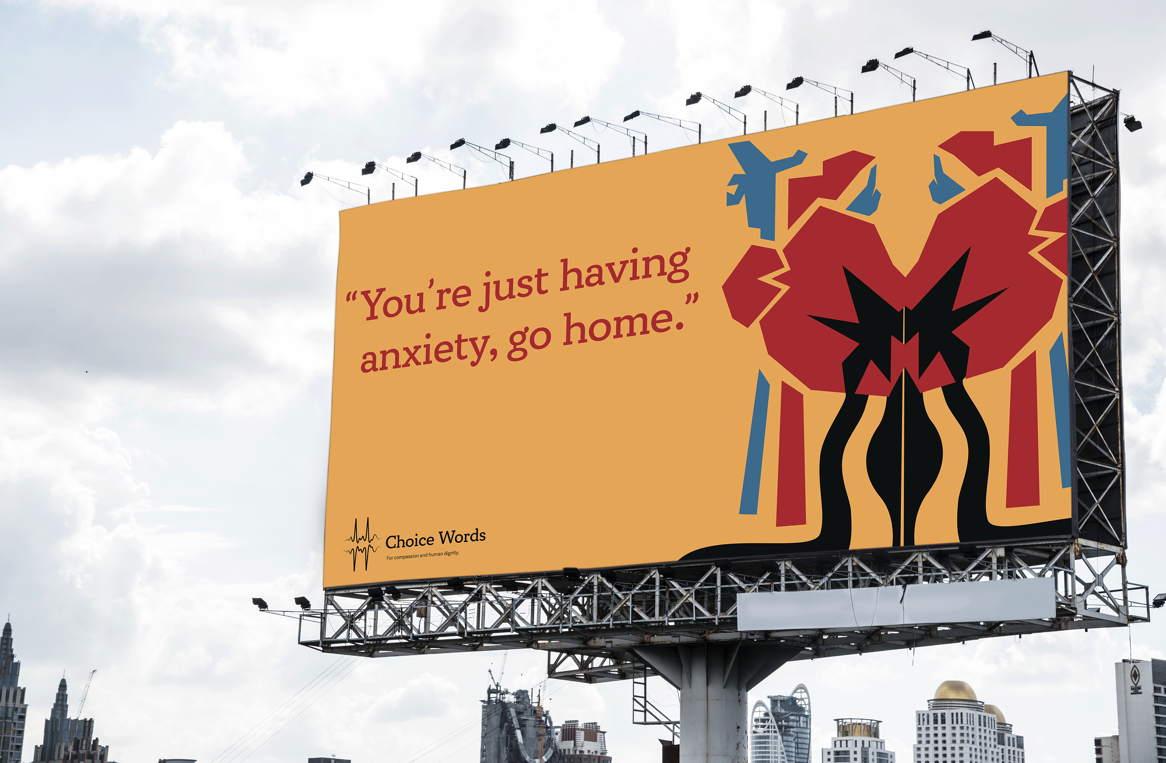
Especially with the prevalence of information on social media, I'm always finding a social justice related topic I feel passionate about. This directly translates to the design work I find myself the most excited to work on. A prime example is my ADHD magazine from last semester and the Choice Words campaign that I'm currently wrapping up. It's something I feel I can contribute to the cause while educating myself and others. Even with non-social justice related projects, I try to incorporate something that prioritizes accessibility, or at the very least learn the ways in which accessible design works the best. I feel a sometimes intense need for my design to "save the world", as I've heard is common with young designers. This provides both fulfillment, but also quite a bit of pressure. I've come to accept that my work won't always solve every single problem I want it to. As long as I'm making the best effort I can, it will "solve problems" more substantially the more practice I have.
I'm also a strong believer in a supportive work environment. In my portfolio Capstone course this semester, I've had the most experience collaborating with a design team that I've ever had the opportunity for. It's intimidating at times, but I truly work with a group of designers that are understanding and always willing to help. This prospect gets me excited for working professionally with a design team in the future. Sometimes those I work with, even in simple studio critiques, suggest ideas that I never would have thought of. Peer review makes any designer's work stronger, no matter how uncomfortable it feels at the time. It's another part of my education I'm dead set on taking with me post-grad.

Strategic Creativity: Chapter 6
This chapter seems to have read my mind a bit. The second paragraph talks about how people can typically spot inauthentic brands, then later talks about how most people don't like being blatantly sold to. Basically, addressing the qualms I've had with branding and marketing the past month. Reading this felt reassuring in a way. I was beginning to think my feelings were more isolated than they were, that maybe the negative impression I have of this marketing industry was unwarranted or overly critical, despite how strongly I felt exhausted by advertisements. Thankfully, it seems like the general public tends to feel a similar way in response to bad companies or campaigns. It seems the difference here is creating a brand that actually follows through on promises or morals that it claims to embody. This feels like it should have been obvious to me, but I think I know why it wasn't. With all the brands I see on a day-to-day basis, it seems like there are very few that do that. I think the best example of such are brands claiming to be sustainable. A lot of them simply have greenwashed marketing and presence while generating as much waste as any other brand (not to mention not paying their employees a living wage). Seeing these brands practices be revealed so many times over has definitely caused a break of trust, in which I consume advertisements with doubt and the assumption of ill intentions. Though I'm not sure yet if this mindset is helpful, harmful, or somewhere between, my best option for now feels to make my own work with genuine intentions.
Some more portions of this chapter felt very helpful for my final project. Relating a brand identity to aspects of human behavior and a role in the consumer's life. Both portions felt like a sort of personality test for brands- and I love a personality test. I can't help but think that the less engaging parts of creating a brand identity could be made more fun by personifying my campaign. It would be more like creating a character or cast of characters than hypothetical brand goals. Though I'm very passionate about the subject matter, I do feel more separated from what I'm creating the longer I work on it. This could be a way to reel me back in.
Another concept I want to try out is copy-driven construction, primarily for the billboard advertisements. This idea was brought up in critique a few weeks ago, in which I obscure or completely remove illustration in favor of type for the large-scale billboard setting. Just placing the image on the surface with some type does the job, but not as well as it could. I intend to create a few examples of copy-only advertising for my campaign. Here I really want to see if the brand can be recognized while also getting the message across. My love for experimental typography makes this sound fun, as considering the creative rut I've sunk into, I'm jumping at anything that breathes energy back into my work right now. It'll pass as it has all the semesters before once my two hundred projects are wrapped up, but an idea that gets me through the home stretch is always welcome.



Strategic Creativity: Chapter 5
One of the things I have been struggling with the most in working on this final project is brand identity images. I have all these ideas, but also have to boil them down in a way where all the elements feel part of a whole. Of course I've done this before in other projects, but now doing it so expansively is proving to be a marathon. I think this chapter gives helpful reminders of the fundamentals of art used in brand designs and typography.
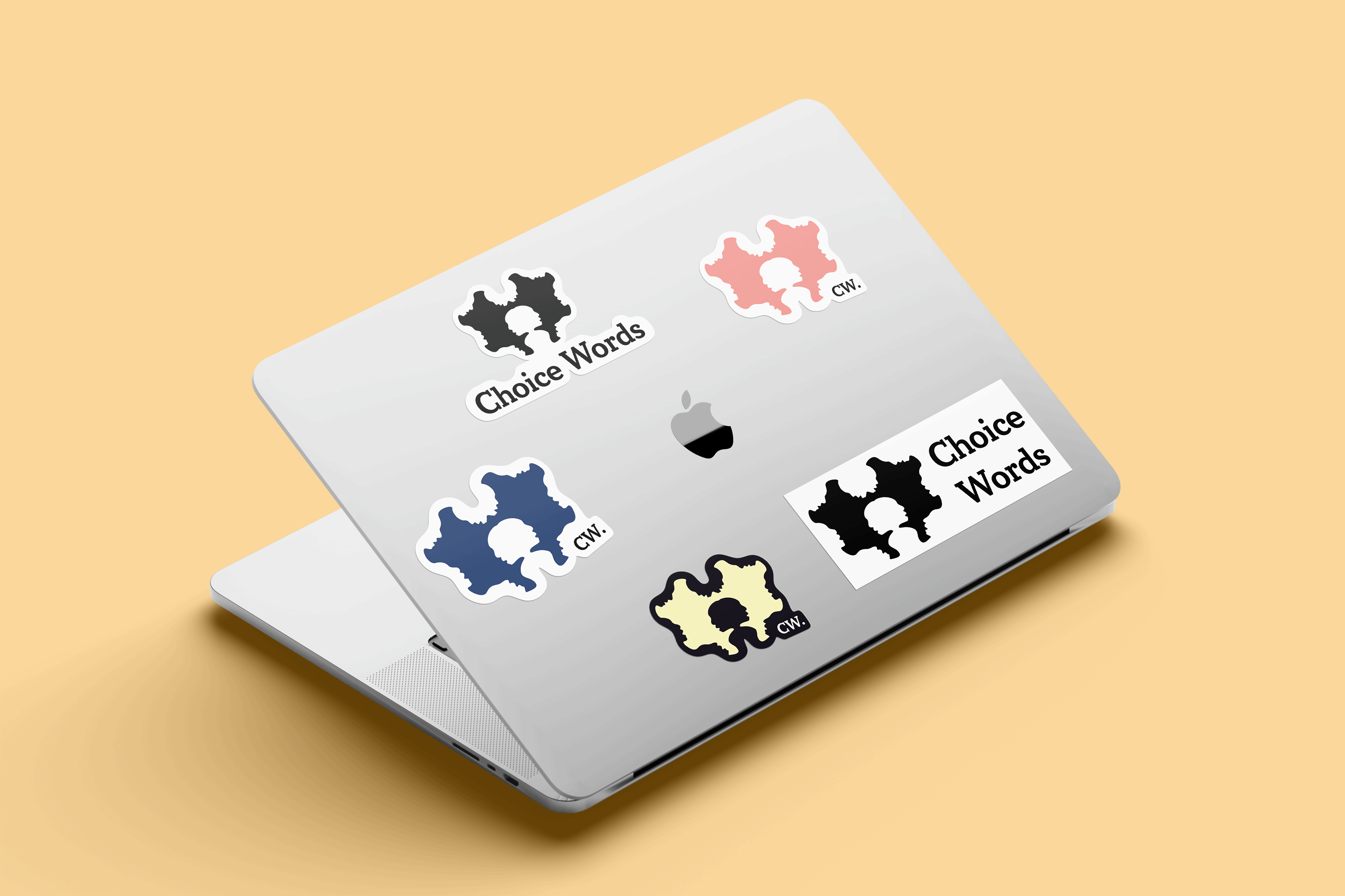
One thing I hadn't totally considered was how my typeface interacts with my illustrations. I've been so focused on those, I almost forgot that the type is just as important. Landa mentions counterforms when talking about what type looks like. I think that observing what shapes exist in my display typeface in order to translate aspects into my design would be something interesting to try. My attempts at a logo from last week look okay enough, but don't really get the message across for the campaign. A lot of my inspiration has come from the Rorschach ink blots used in psychology. I think this provides a lot of opportunity, as the abstract shapes can contain a lot of figure-ground qualities found in the Gestalt Principles.
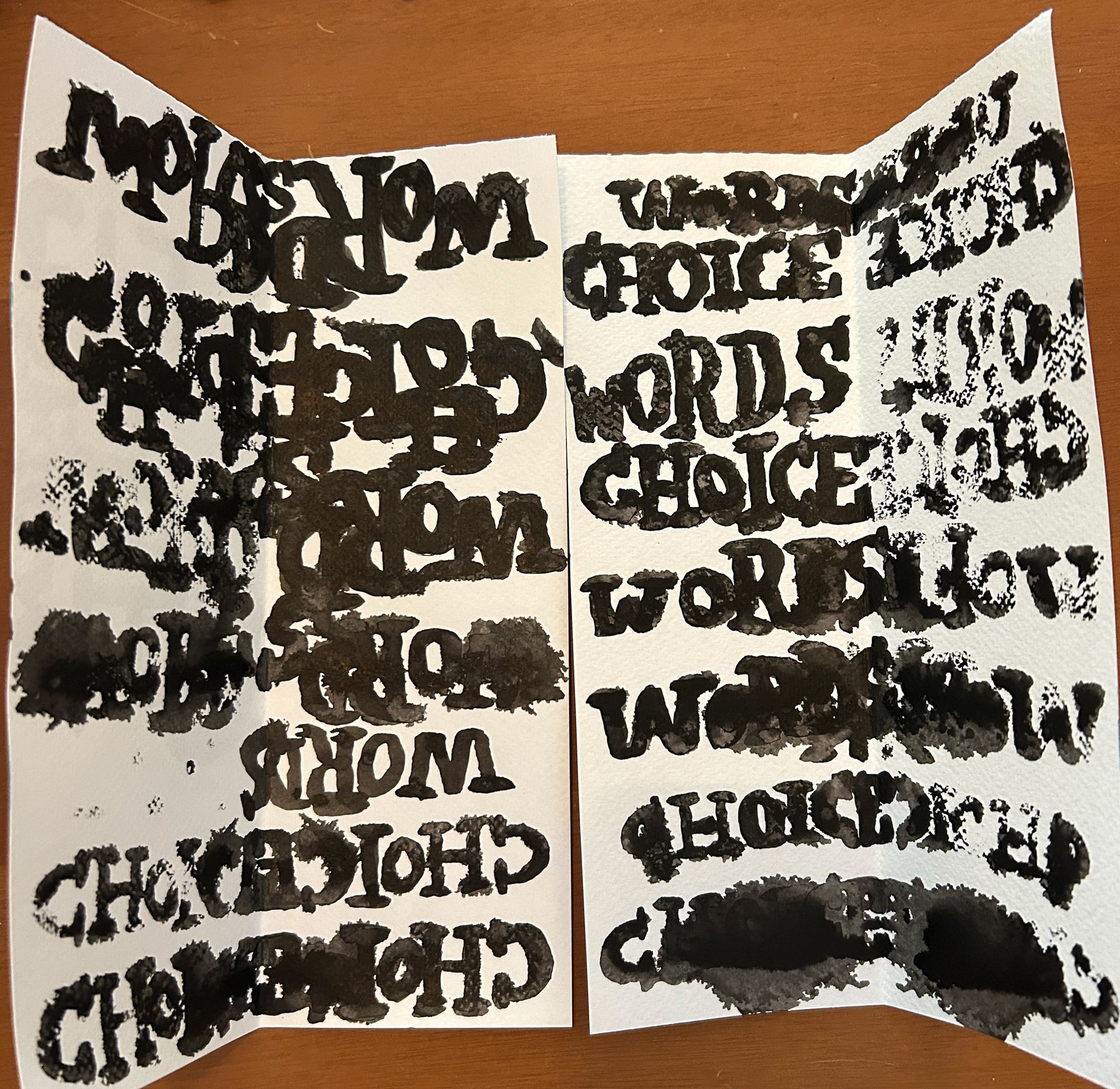
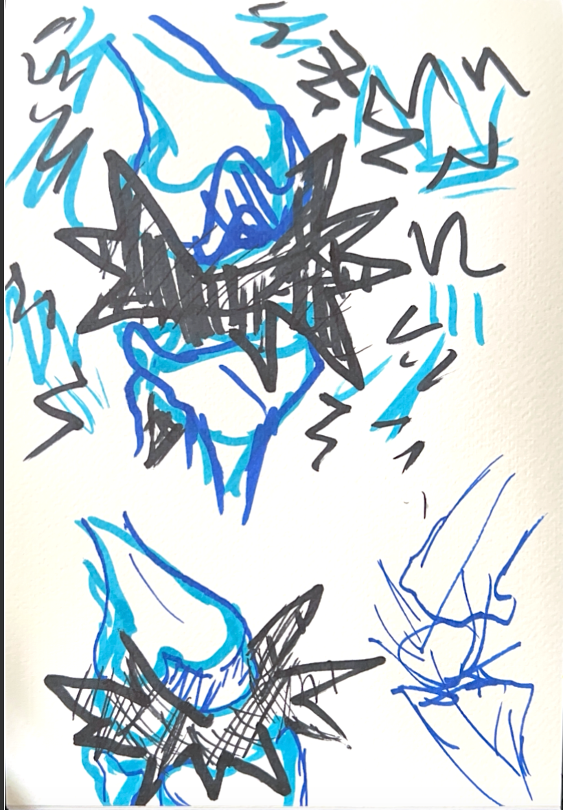
Thus far, I've been experimenting with creating brand identity images in much more abstract ways. For example, I've taken to creating my own ink blots. The first few were abstract shapes, but I then decided to try doing so with the campaign name in the typeface I selected. I've created multiple different versions, granted some with ink completely blotting out letterforms, that I feel will be of great use as I solve this "identity crisis". I find that drawing them out physically tends to help me grasp what elements look like a lot better. Repeatedly drawing the typeface eventually allowed me to do so from memory without looking at the reference text. Even if I don't end up using these later, it's a good exercise in attacking a problem from a different angle. Speaking back to the counterforms idea, I feel this style of illustration could also be executed by observing the spaces between letters and repeating them in some way. I want to analyze both type and image logo options fully to see what best gets my message across.
Another part of my issue is, likely, focusing so deeply on this logo concept. Alex Isley mentions how what something should look like should come last. It's speaking especially to my old habit of jumping right into sketches and designs without fully fleshing out what my concept is. I think what this problem is telling me is I need to work out what exactly I'm trying to accomplish in specific detail. This is the part I dislike, of course. It's boring to me- but it's extremely necessary. I tend to lose the forest through the trees in most things I do and I wouldn't doubt it's happening here. I'm going to reevaluate what my messages and concepts mean again even if it's just to refresh my memory. I'm determined to find a way out of this creative rut, not only because the deadline is approaching, but because I'm working for a long time and not accomplishing much. It's disheartening and dissatisfying, not to mention inefficient for the mountain of work I have to do otherwise. A lot of these processes are unlearning old bad habits and learning to not fall back into patterns that don't work. I'm glad to be able to realize this in myself and even more glad I'm open to ways I can change it.



Strategic Creativity: Chapters 3 & 4
I think one of my main distastes for corporate marketing comes from disingenuous, out-of-touch methods that don't value consumer needs, values, and feedback. Chapter 3 made this personal thought process a bit clearer to me. Nothing makes me more frustrated than company practices or choices that illicit a "This sucks. We hate literally everything about this." from a majority of customers that go unchanged. I imagine this is usually because a company faces little to no financial repercussions, so they have no reason to make a change. It seems to be always about wanting as much money as possible, never about the people giving it to them. Working at a certain green coffee company may have influenced me here, but now it's something I can't unsee. I'm thankful for that, as it allows me to be more conscious of my choices.
Among the frustration though, there are instances where companies will hear true audience feedback and make active efforts to resolve any problems. This is something I find hope in. I'm much more likely to spend my money on a product from a company that feels connected to a customer base. From a more lighthearted marketing standpoint mentioned in the chapter, I also find myself more interested in companies with a good social media presence. This is more quality over quantity. Spamming my feed with meaningless posts is annoying. Getting a few posts that utilize popular culture references in a way that is actually funny- much more engaging. Once brands realized that using memes generates audience engagement and makes them feel "relatable", many jumped on the bandwagon until the market was oversaturated. Paired with extremely fast trend cycles, this makes for a lot of outdated, cringe-worthy Instagram posts. Part of this is the lengthy approval processes for advertising, so it's all the more successful when a brand is able to stay on-trend, relevant, and above all funny. I feel this is my generation's trademark form of marketing. It's corporations using social media platforms to assume the identity of a person posting from their home instead of curated campaigns made by a faceless entity. I mean, we have verified brand accounts posting one sentence comments on random TikTok videos. They're not even usually in the form of "Buy our thing #brand". They comment like a real individual. As much as I hate to admit it, some of them are really funny. The fabricated feeling lifts for at least a while, which is really genius marketing.
Those approaches rely a lot on the styles of copywriting in Chapter 4. Short conversational phrases and "show don't tell" methods are usually the most interesting to me, and it's nice to see that they're effective if done right. I haven't done a ton of copywriting, but the processes presented appear to be a very helpful guide in which to get started. I know I'm good at writing a lot of content with long-winded explanations, comparisons to other things, and tangents in a (hopefully) comedic or relatable tone of voice. Harnessing that to have the same impact in fewer words is something I can't imagine wouldn't be helpful to my work now and in the future.







Strategic Creativity: Chapters 1 & 2
These days, discussions of brands or company branding usually induce an internal exasperated reaction within me. I believe this is primarily attributed to the intense saturation of branded material and advertising the general population is subjected to every day. Everywhere I look, from a YouTube video with 7 ad breaks to outdoor signs, it has become completely unavoidable. It's definitely exhausting to have disembodied companies trying to persuade you to buy something every chance they get. Even Pinterest has multiple advertisements disguised as posts- which makes users feel almost "tricked" when tapping on an image that looks aesthetically pleasing. Though brands and ads have existed for decades now, they felt more avoidable without social media. Not to sound a thousand years old of course.
All this to say, my personal experiences in this regard have sort of put me off from any branding or advertising work. Ironically, my final project for Process and Systems is essentially creating an entire social justice brand. You would think my selection wouldn't be this concept I'm not fond of. I'm realizing more, however, that advertising and branding are becoming increasingly unavoidable today. As an artist, a personal "brand" is essential to the work used to promote yourself. A new company always needs a logo for something, which I have been prompted to create for the first time recently. It's kind of a "if you can't beat em, join em." situation. In tandem, I'm realizing this work doesn't have to be miserable even if it's not my favorite. The first two chapters of Strategic Creativity brought up a lot that turns branding or advertising into a sort of psychological puzzle- which I'm fascinated by.
First of all, props to Nick Cosgrove for bringing up that creative people usually do best under constraints. I don't think I've seen something outright verbalize that. While complete creative freedom is nice in smaller doses, that's almost always where I personally lose the forest through the trees. His sentiments on getting non-creative individuals to grasp your ideas was another good one. Even in my laid-back, less corporate internship, the concepts I present to those supervising are not always clear unless I give them a rundown of my intentions. I even find myself educating people double my age on type hierarchy. When looking at a piece of material, the untrained eye won't necessarily get why something does or doesn't work just because they don't know. After you give them context, that's when they start to notice.
The C.H.O.I.C.E acronym feels very applicable to the work I'm doing for my final project. Primarily considering the Context and Humanistic letters, here I'm mostly thinking about how my campaign would fit into someone's life and routines. I want my advertisements and materials to be productive uses of space and practical instead of a novelty. Compassion is also at the forefront of my messaging. I want viewers to relate and feel validated by the work, which puts human need as a top priority. I'm learning that the way I present this campaign has a multitude of angles that need to be considered, not just one pertaining to visual appeal.
I went into this project apprehensive, but I'm slowly but surely challenging myself to set aside the impressions I've built in order to make this project one that holds both my own and audience attention. I often forget that design isn't exclusively formulaic. If I can't stand the way I'm working on something, I'm usually able to alter my process in some way. When I do so, it usually makes the experience a whole lot less frustrating. I'm really working out my problem solving muscles here. Writings like this help me to consider multiple factors I would have otherwise missed, while reminding me that the process and satisfaction of finding a good solution is what makes my work the most fulfilling.
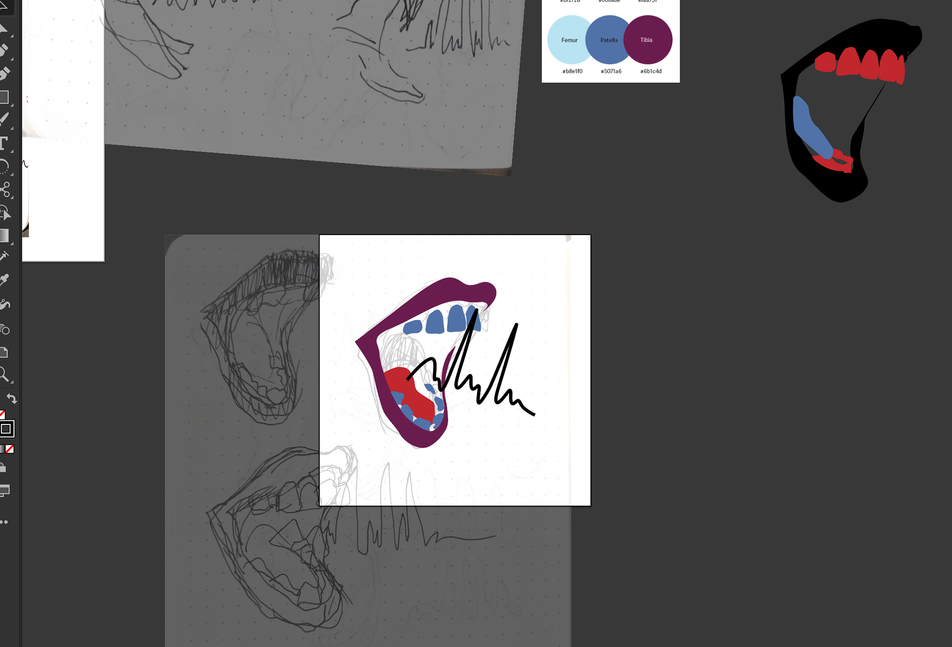
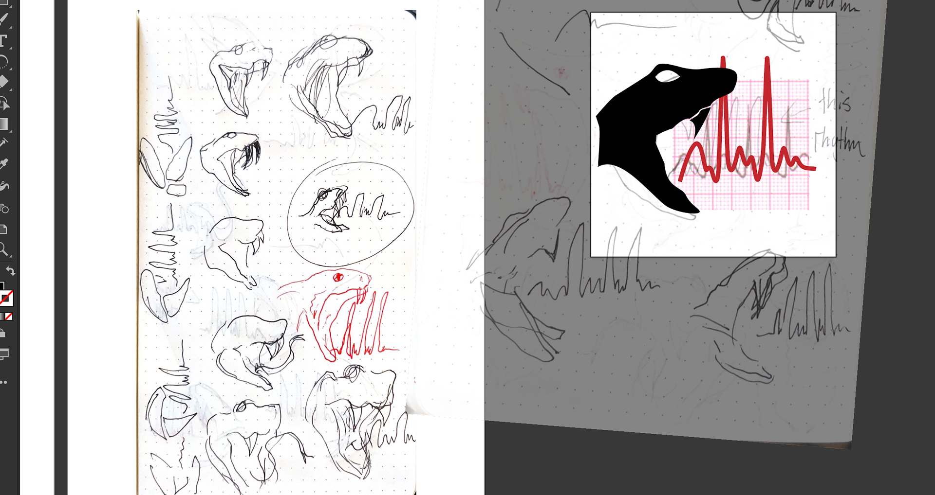
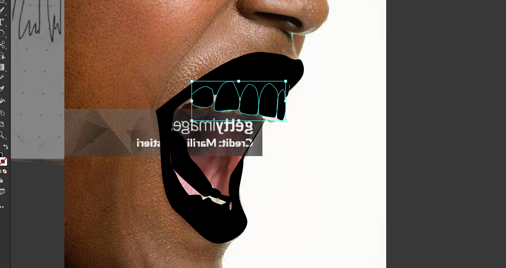

Data Visualization / Workshop
Data Visualization
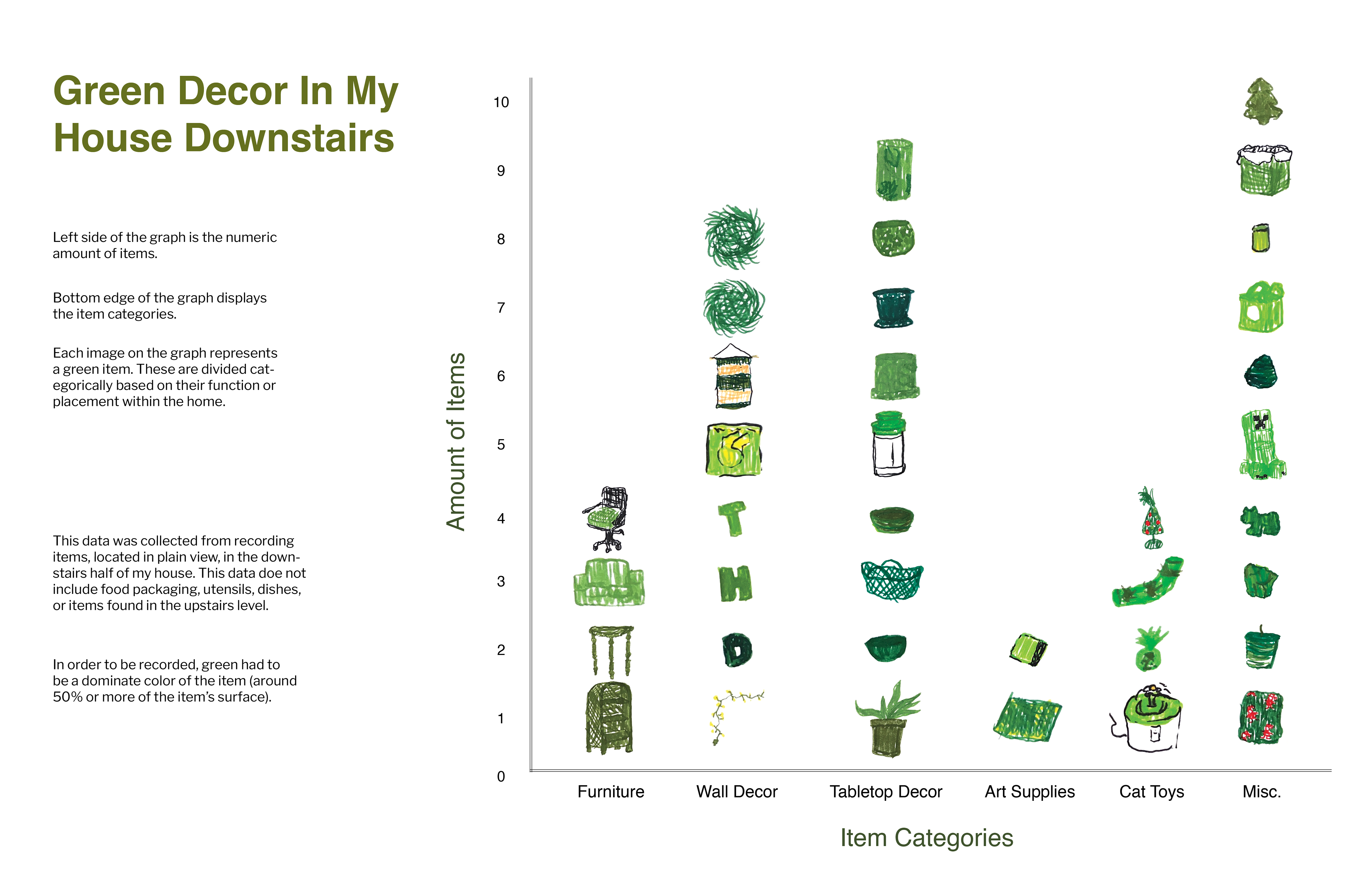
This sprint concept was a part of design I totally forgot existed. When I look at graphs or charts of data, I'm usually remembering how painful STAT110 was. But visual data feels a lot more immersive. It really helps me to visualize what exactly the information is conveying. When selecting what data I could collect, I started drawing a blank from the seemingly endless options I had. Thankfully, during class I wrote down quick ideas that I definitely would've forgotten otherwise. One was counting all the green items in my house, which felt like both an inventory and a look into just how much green stuff I find myself gravitating toward.
I quickly realized I should only do what was in the downstairs half of my house. The upstairs has my clothes- enough said. I took pictures instead of writing them down so I could have an easily accessible reference for later. I chose to place each piece of data in a category and also depict them with a small drawing rather than a line or dot. This was the time consuming part, but still pretty fun. After scanning and editing the drawings, though, I ran into the problem of arranging the data points. Since it was a sprint, I went with a standard bar graph layout and instead stacked image in categories and aligned with numbers on the left side. Instructions went on the left, laying out what exactly qualifies as a green item.
If I were to try again, I'd really want to find a more interesting way to display my data points. The graph functions and the illustrations are charming, but the layout bores me just a bit. I could definitely try something different that feels interesting or unexpected with some research and experiments. I want to see how other designers take this on and how far someone can stray from the sterile and mathematical visuals of statistics. Though I may choose different subject matter next time. Drawing a house's worth of green things already sounds like a mountain to climb.
Brad Vetter & Adrienne Miller Workshop
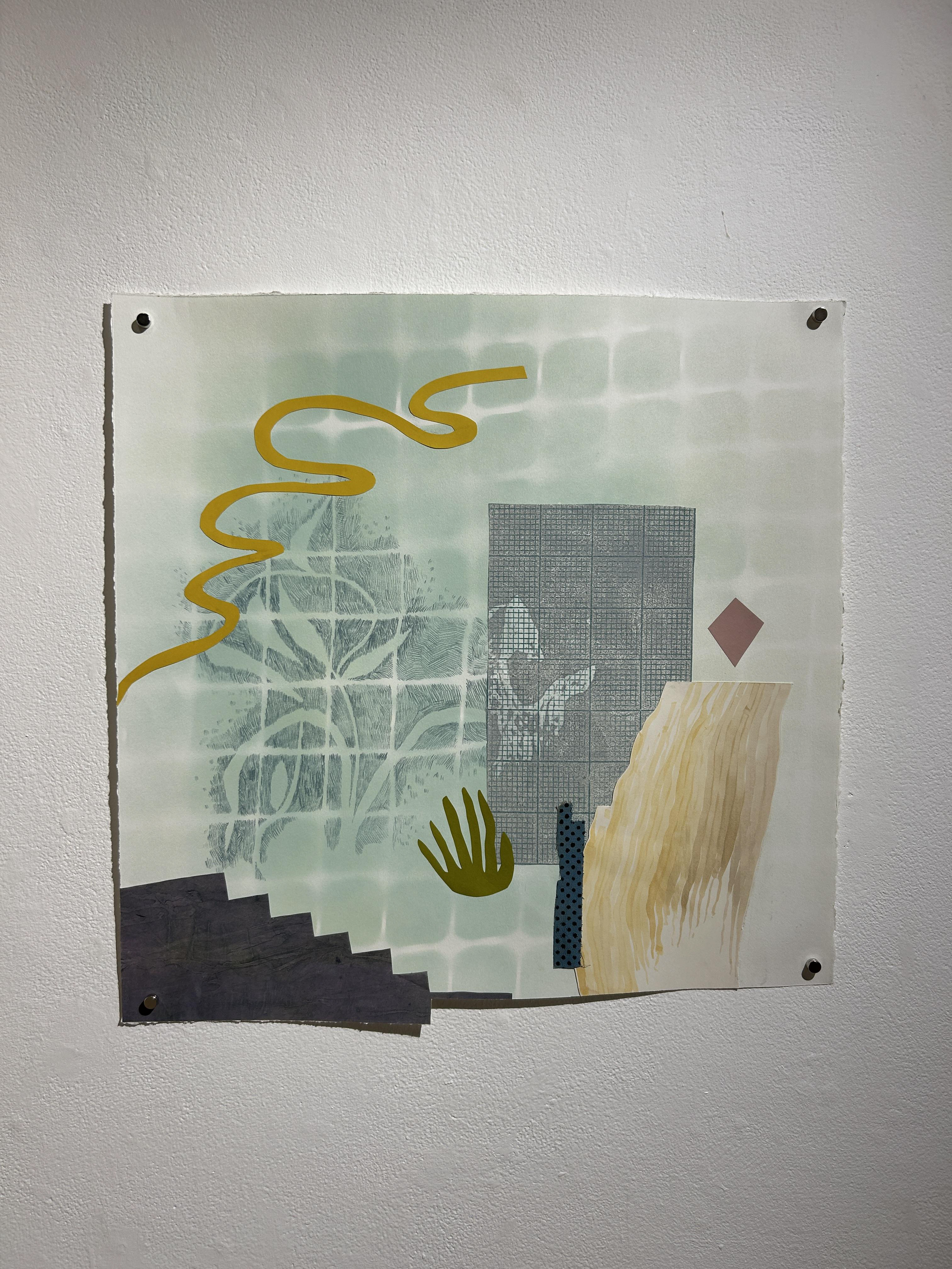
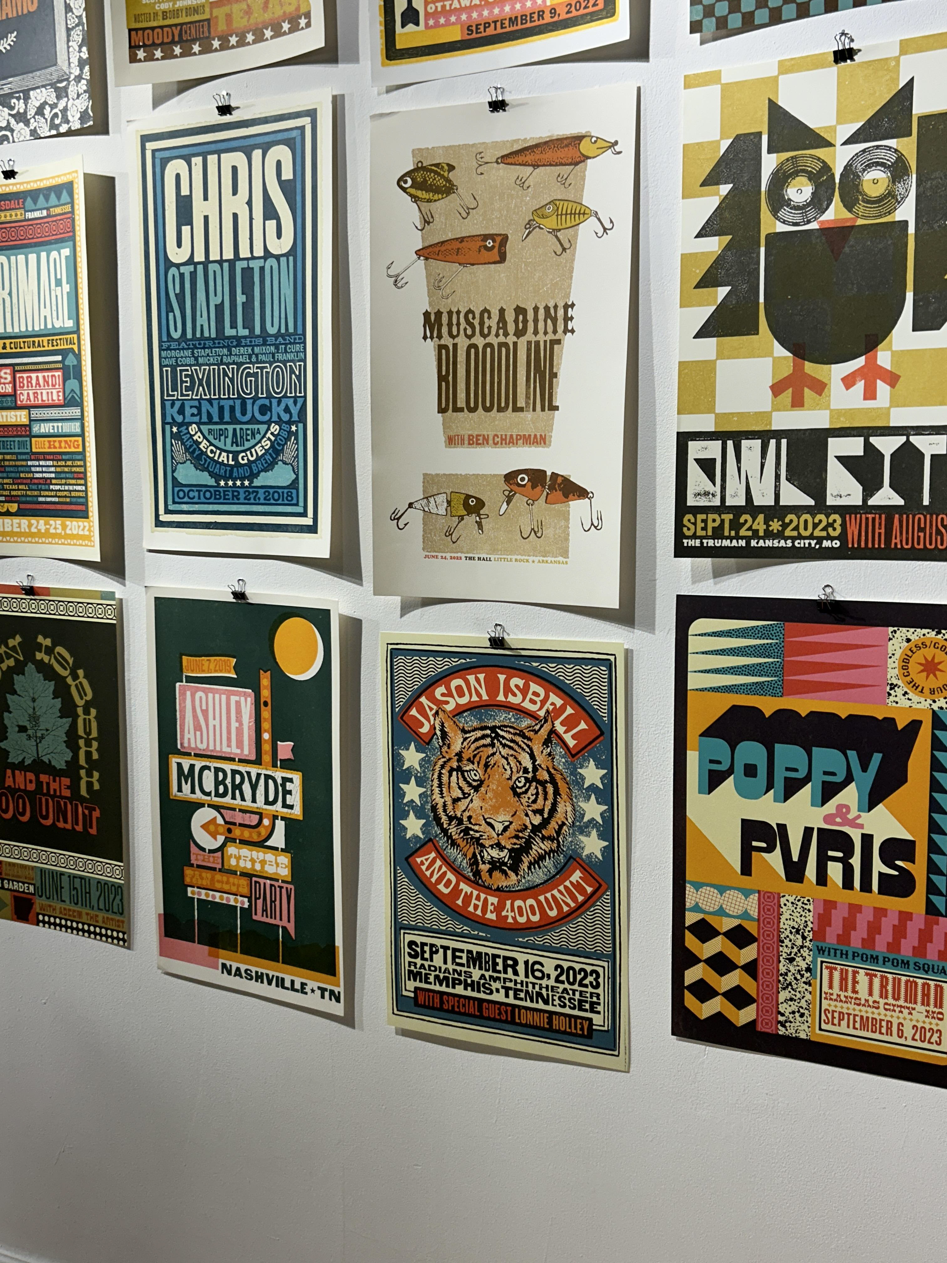
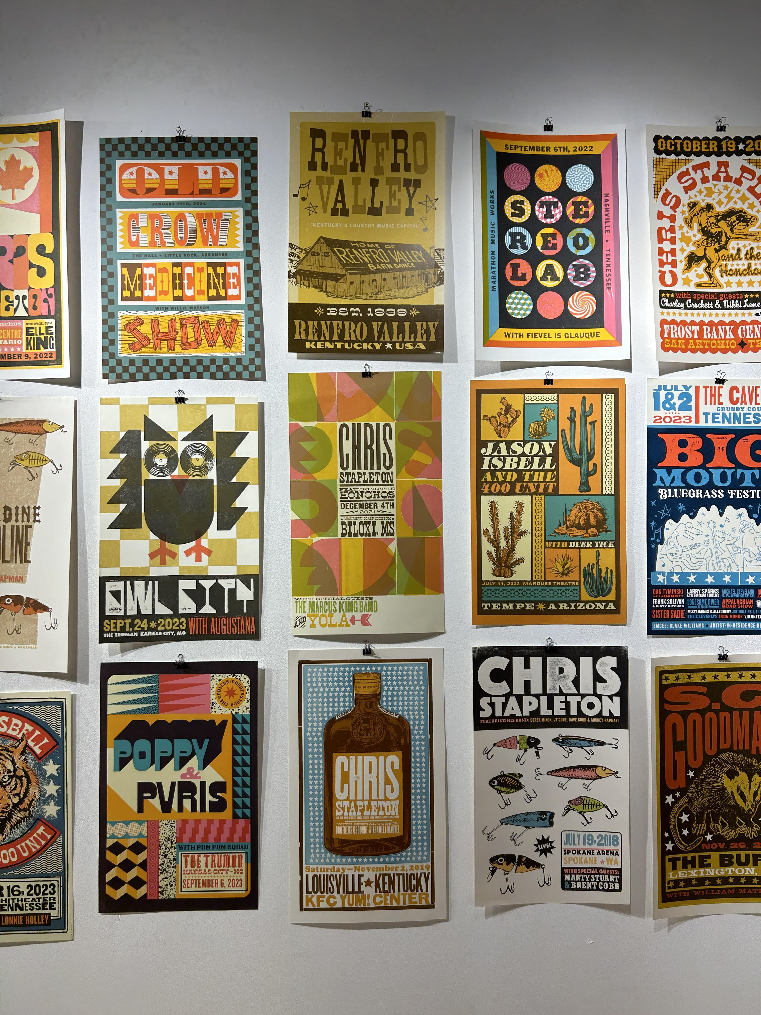
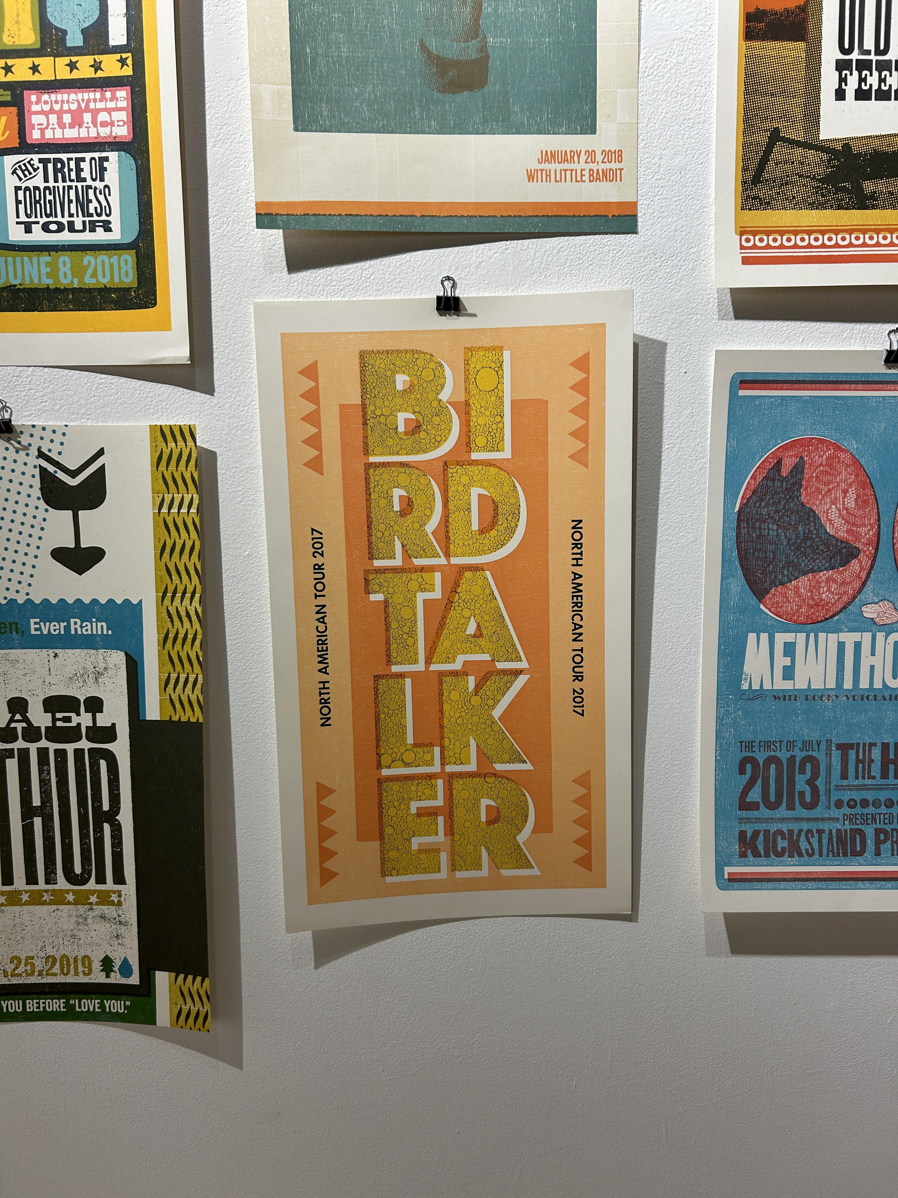
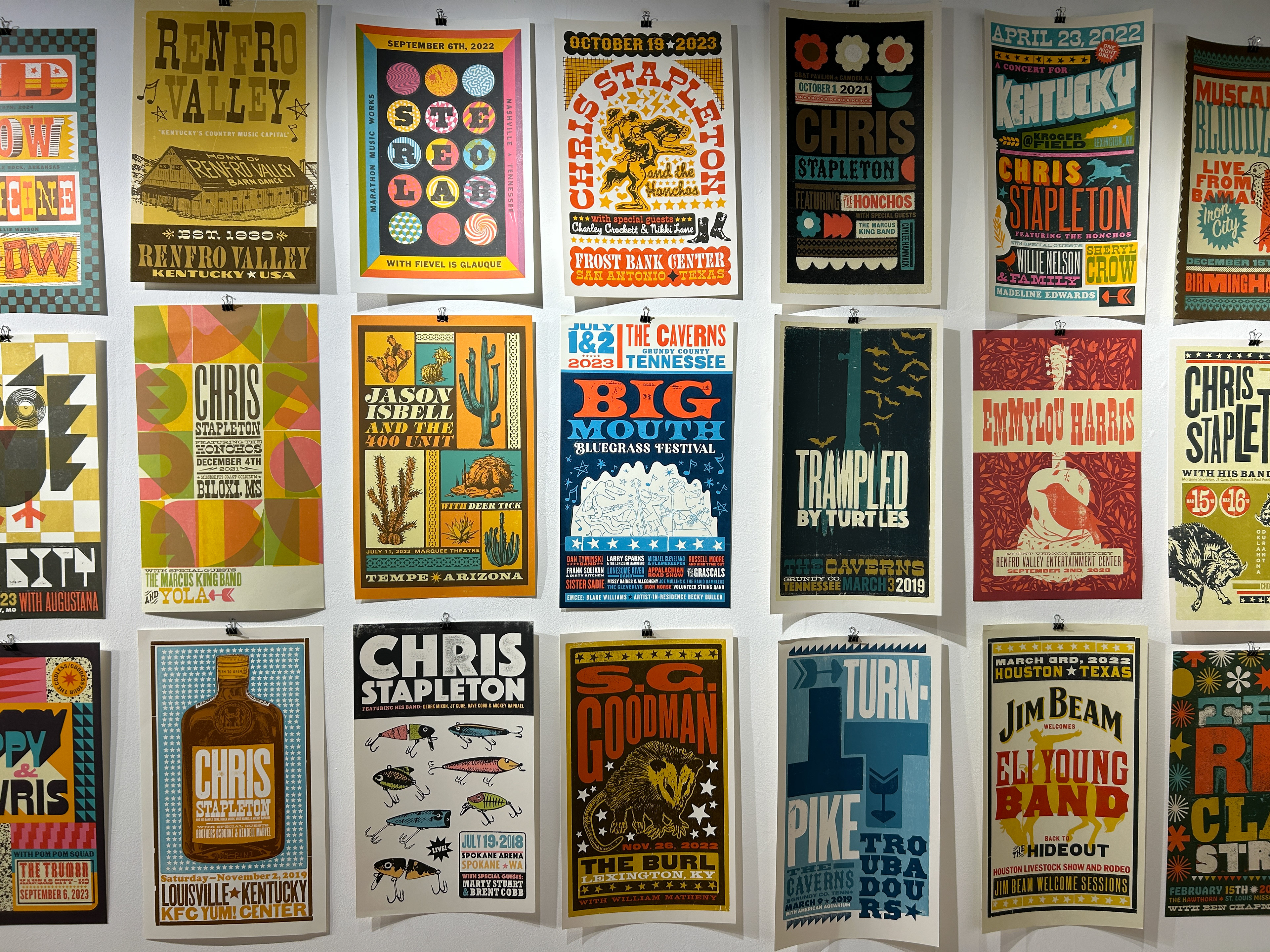
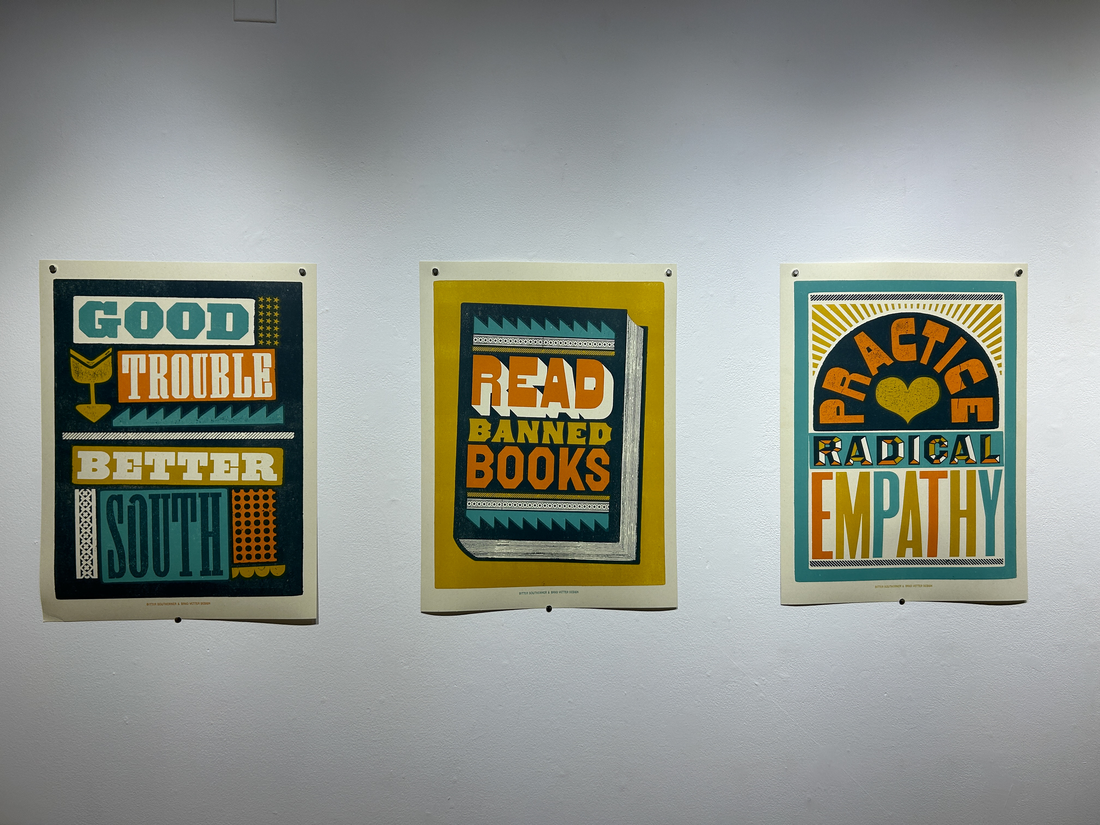
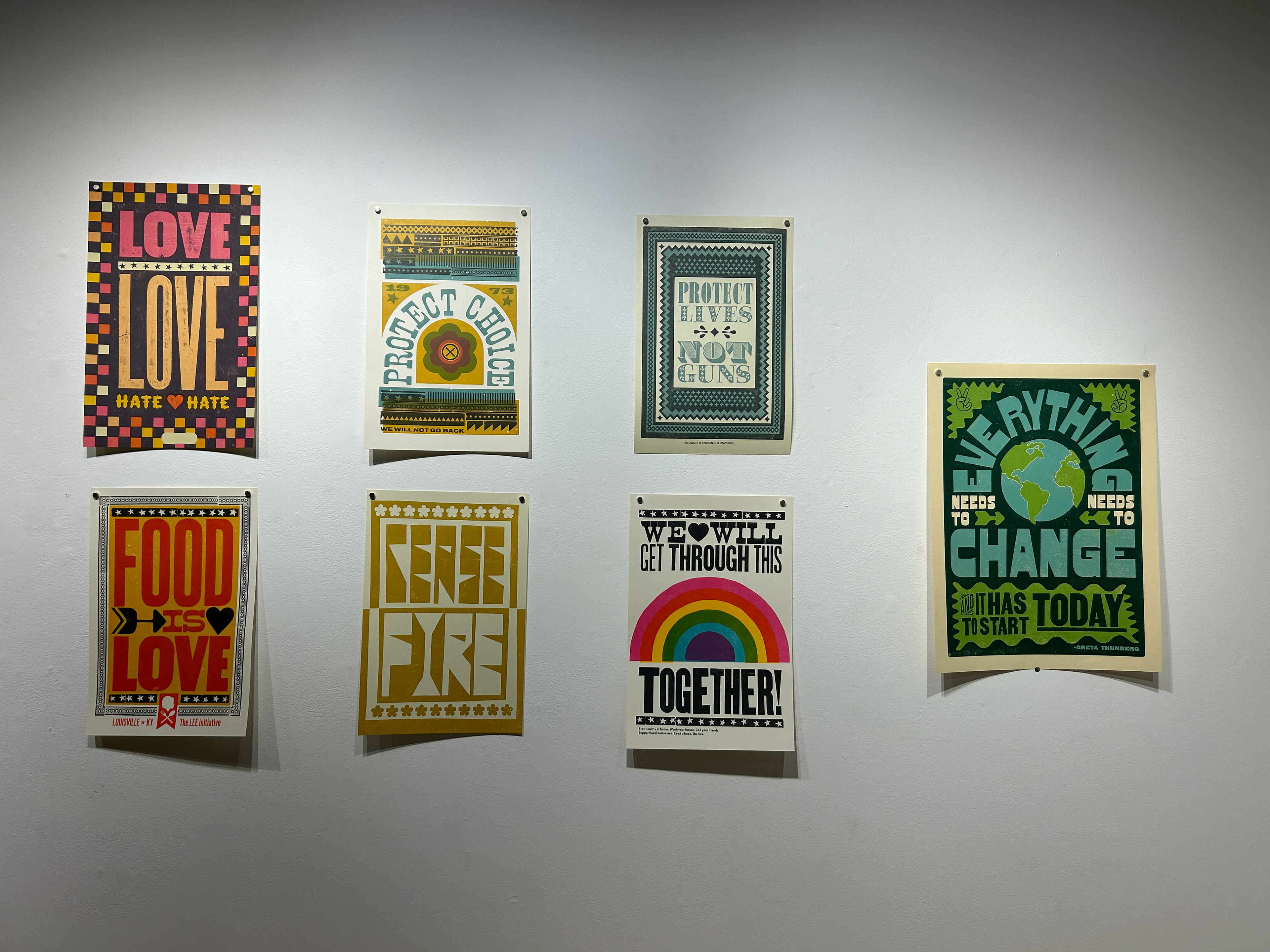
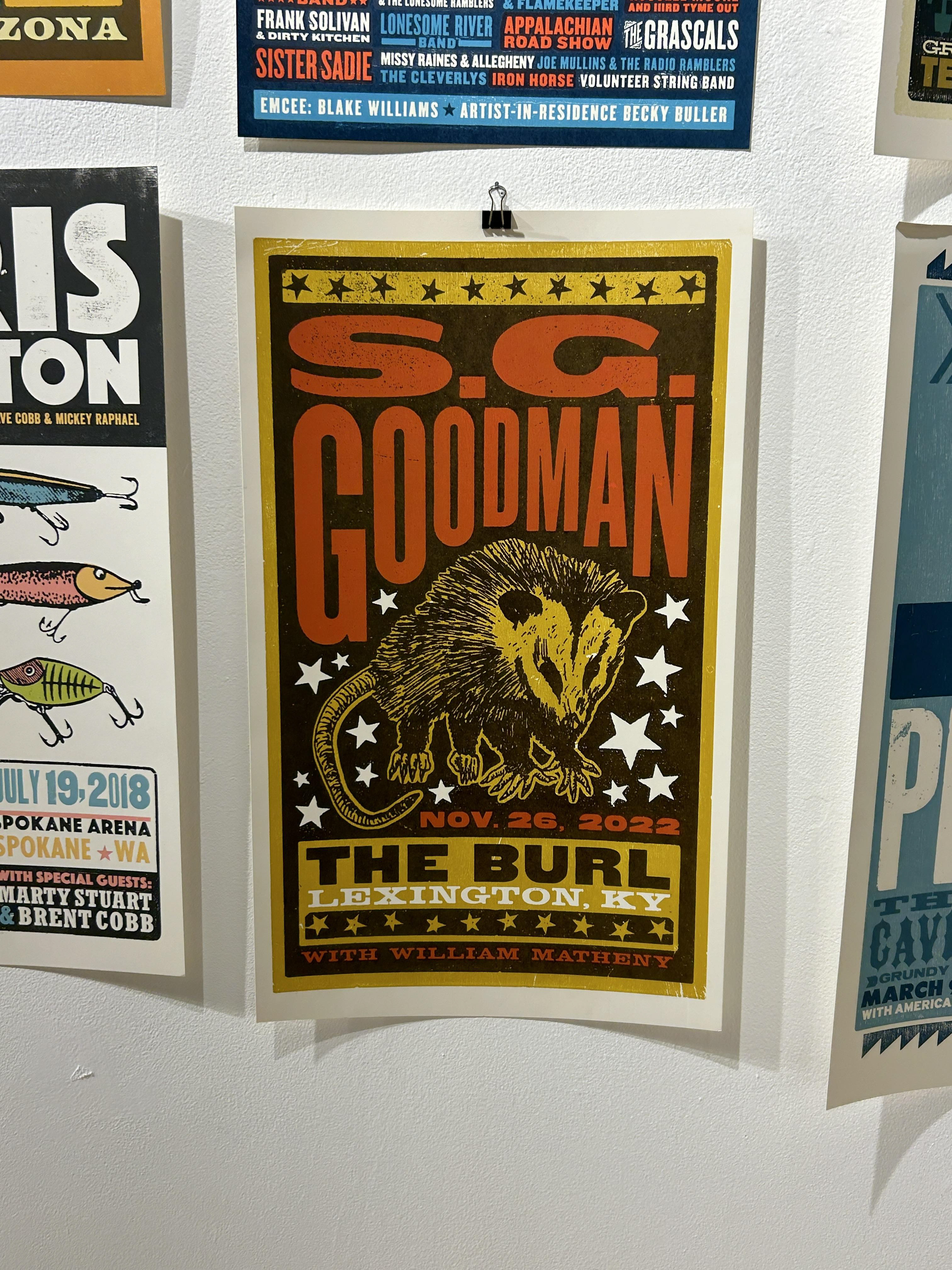
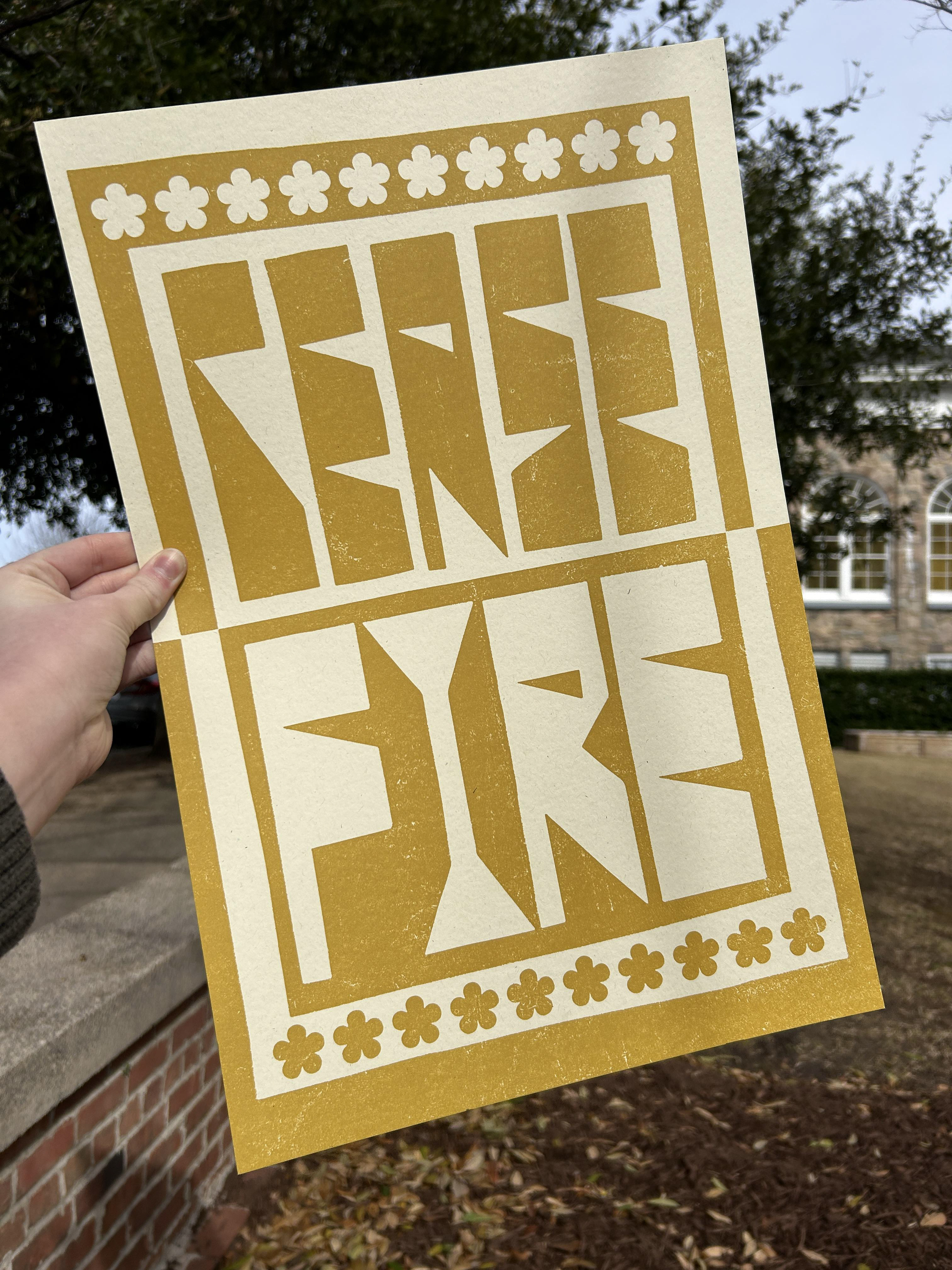
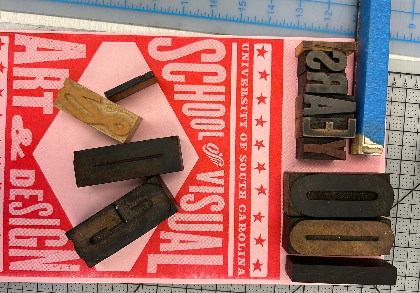
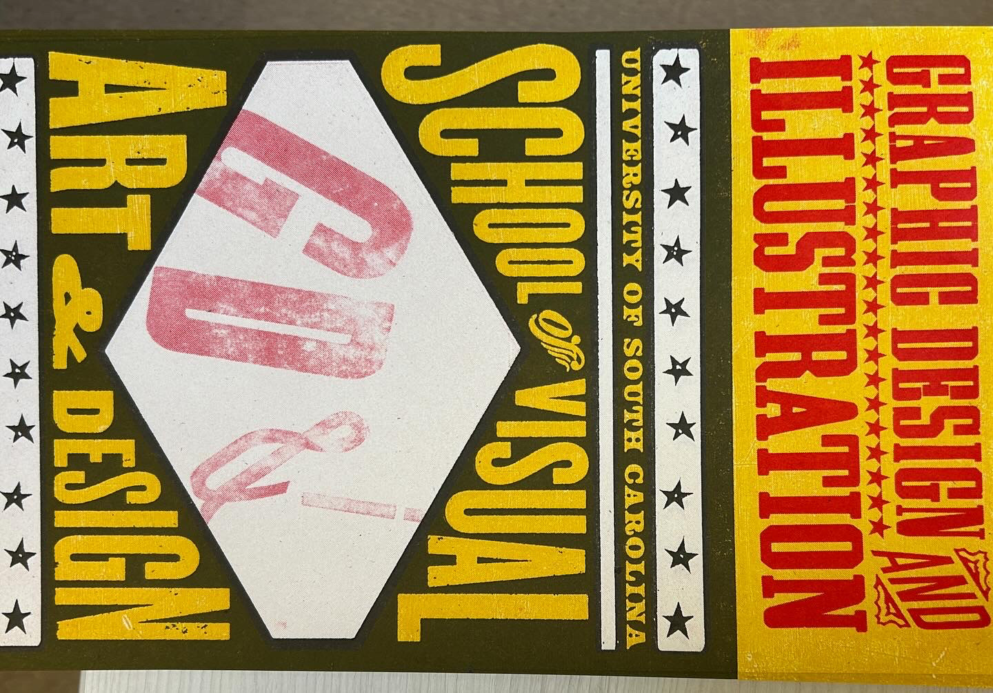
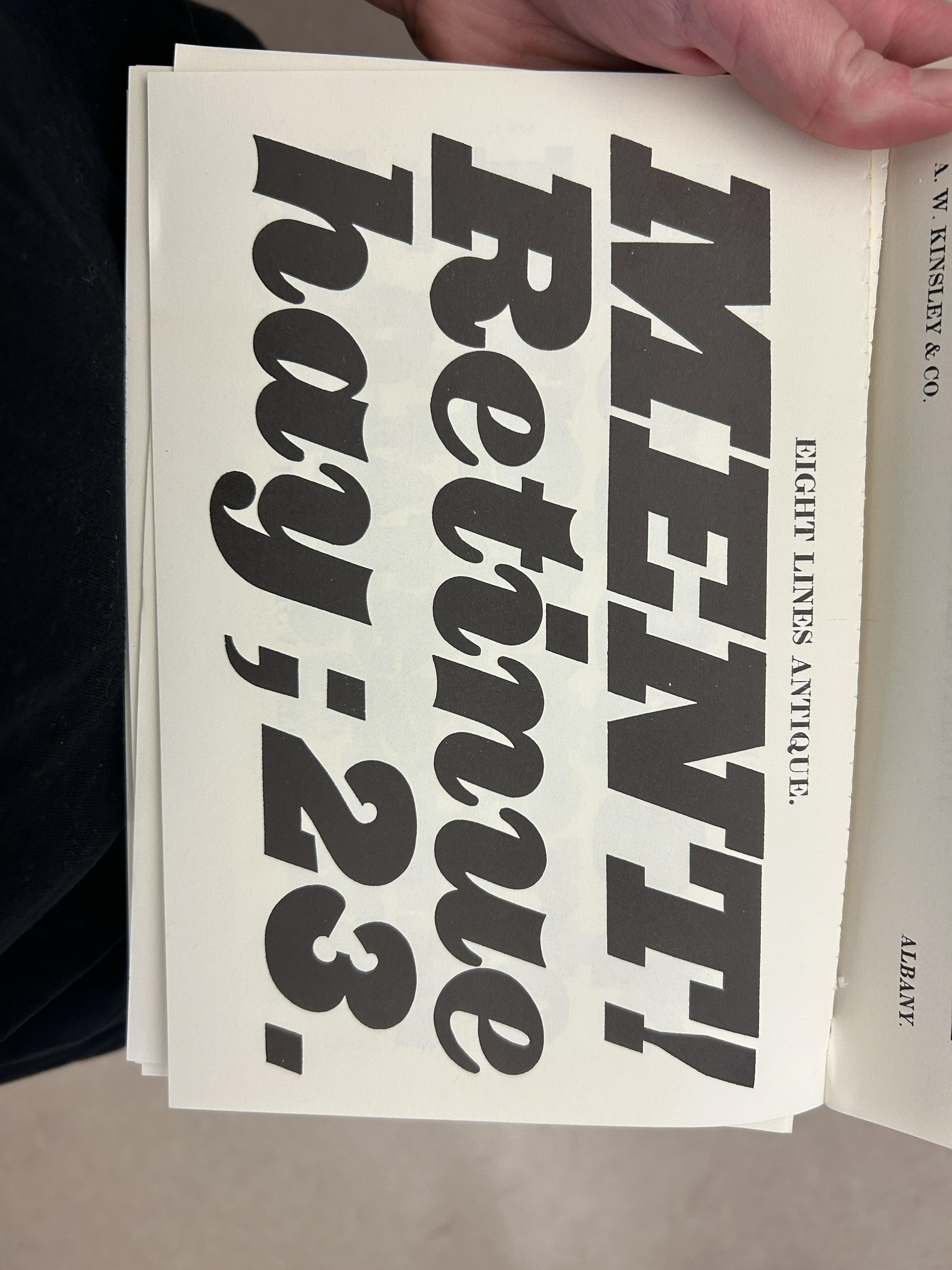
I went into this week not expecting how invested I would become in Brad and Adrienne's work. The past few months, I've been getting into block printing as mostly a hobby, It has definitely made it's way into my coursework, but it also exists outside of it as something to do for myself. That kind of art activity is becoming rare as I get older. Most of what I do is for class or for others, with little time for or interest in hobbies in my split seconds of downtime, but printing isn't like that. Long story short I'm really into print work right now, so Adrienne and Brad visited at a great time. You can tell how passionate they both are about what they do by just hearing them talk for a few minutes. Brad's lecture and demo with the letterpress gave me a lot of ideas for how I can experiment with my design work. I like to.play around with type in a digital medium, mainly with how the angles and negative space of letters can fit with one another. I realized when trying it with the lead type, though, how much more fun and engaging it is. I strongly agreed with his mention of feeling disconnected with work when it's done digitally. Putting the letters together in this way and printing them felt more real- because the work actually existed in front of me. I also really felt his mindset on imperfections in work. This for me goes back to when I first started working with brush and ink. The materials left little room for edits, so I was usually stuck with what I ended up with. Often times the work with accidental brushstrokes or misaligned elements are the results I love the most. I've said it before, but accepting blemishes as a necessary component takes so much pressure off. I've always approached my art like it has to be flawless- otherwise it's bad. Doing work this way unravels that old way of thinking for me. Now, I feel that my messier art is my favorite in terms of process and product. Brad Vetter does amazing work with a similar philosophy, so it's empowering to know good art really doesn't mean technically perfect art.
Adrienne talked about her work at the closing event and I was really fascinated with how she had been doing those pieces off and on. She explained that working full time requires you to actively carve out time to make work for yourself. That's a reality I've learned through my degree progress. I tend to struggle to work on something when it's not for a deadline or project, but when I do find something I want to do, it's then a matter somewhat of time, but mostly mental and creative energy. I'd love to get to a point where working on something for me didn't feel quite as much like I'm wasting time- and I definitely can. She also explained that there will be times where you don't want to make anything, which is okay too. That was extremely validating. I'm learning that I don't have to be making things all the time if I need a break. This applies to other areas of my life, like not saying yes to absolutely everything. My energy is a resource I protect as much as I can, and I've learned that overworking myself just leads to work that sucks or debilitating burnout. I will still tend to my responsibilities, I will also let myself rest whenever I need to without judgement.
At the end of their visit, I found myself making sure I spoke to them, saying thank you and any goodbyes. This was way out of my typical comfort zone. The phrases "small talk" and "networking" make me a little nauseous. I was nervous of course, but I felt that I couldn't not say something. The conversations didn't feel like either of those phrases either. Brad and Adrienne feel like genuine individuals doing good things with their work. I'm glad to have gotten to learn from them this week.
Inquiry 4/Media Review 4
Inquiry #4: Merch Rework
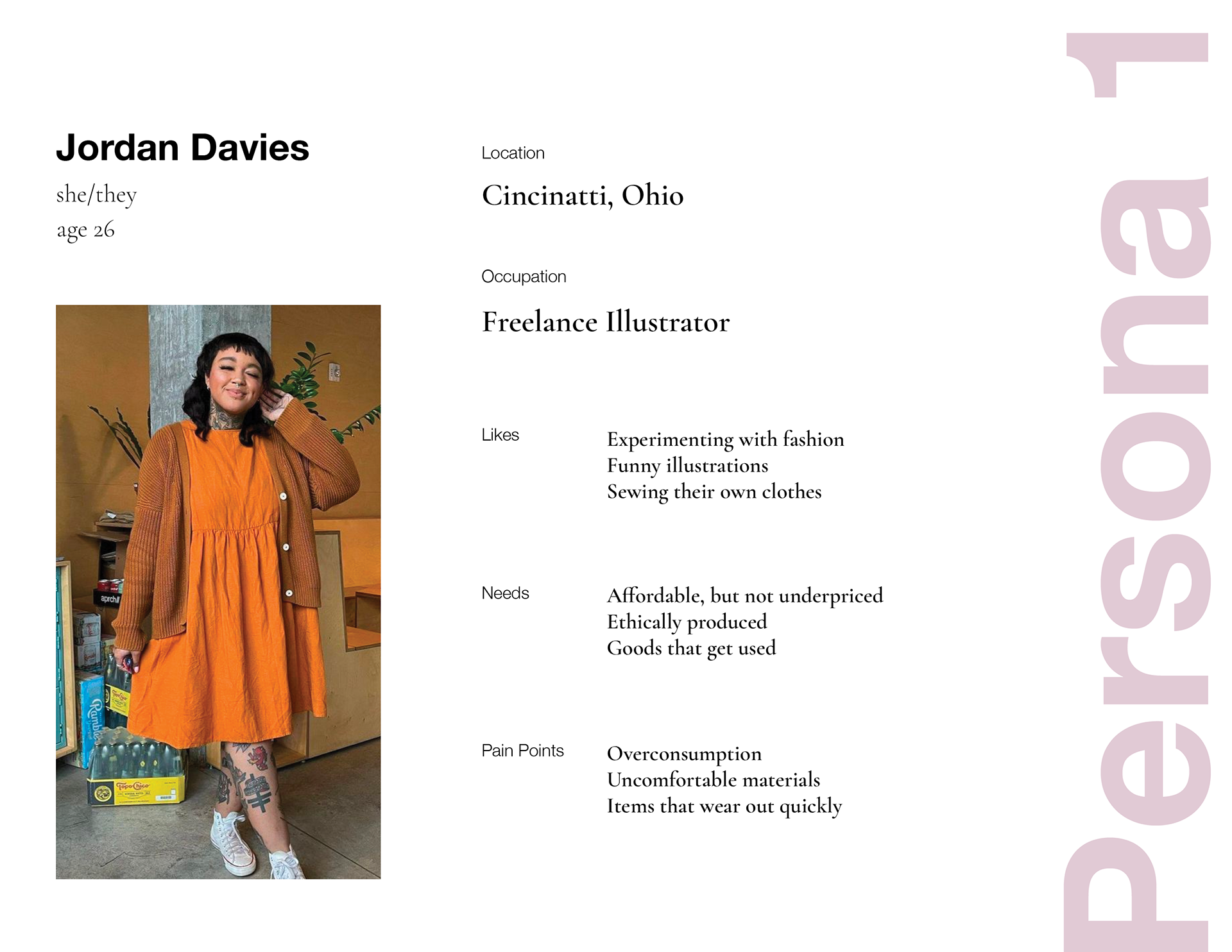
My chosen subject matter for this last inquiry gave me the space to display how much my skills have advanced since the original project's completion. Though it was a year ago, I remember being deeply dissatisfied with my final merch pieces at the time. I knew that I had the capacity to do much better, and I would have to demonstrate that if I wanted the work to be portfolio-worthy.
The illustrations my merch was based from were brush and ink drawings, which I had done quickly without concern for extreme detail. I am still firm in believing that this method worked in my favor. When I am staring at a project for an extended period of time, I start to lose the general idea and dive into fixing things that don't really require the attention. Making designs quickly and in succession doesn't give me a spare moment to fixate, and usually the pieces are much more successful. By the time I wanted to add them to merch, however, I had no idea how they would even translate onto a physical object. In my new approach, I wanted to pay more attention to how the design exists on a piece of merchandise. I did so by immersing myself in moodboard examples and research. The searching I did allowed me to look at how other designers or artists put work on apparel, thus giving me extra inspiration.
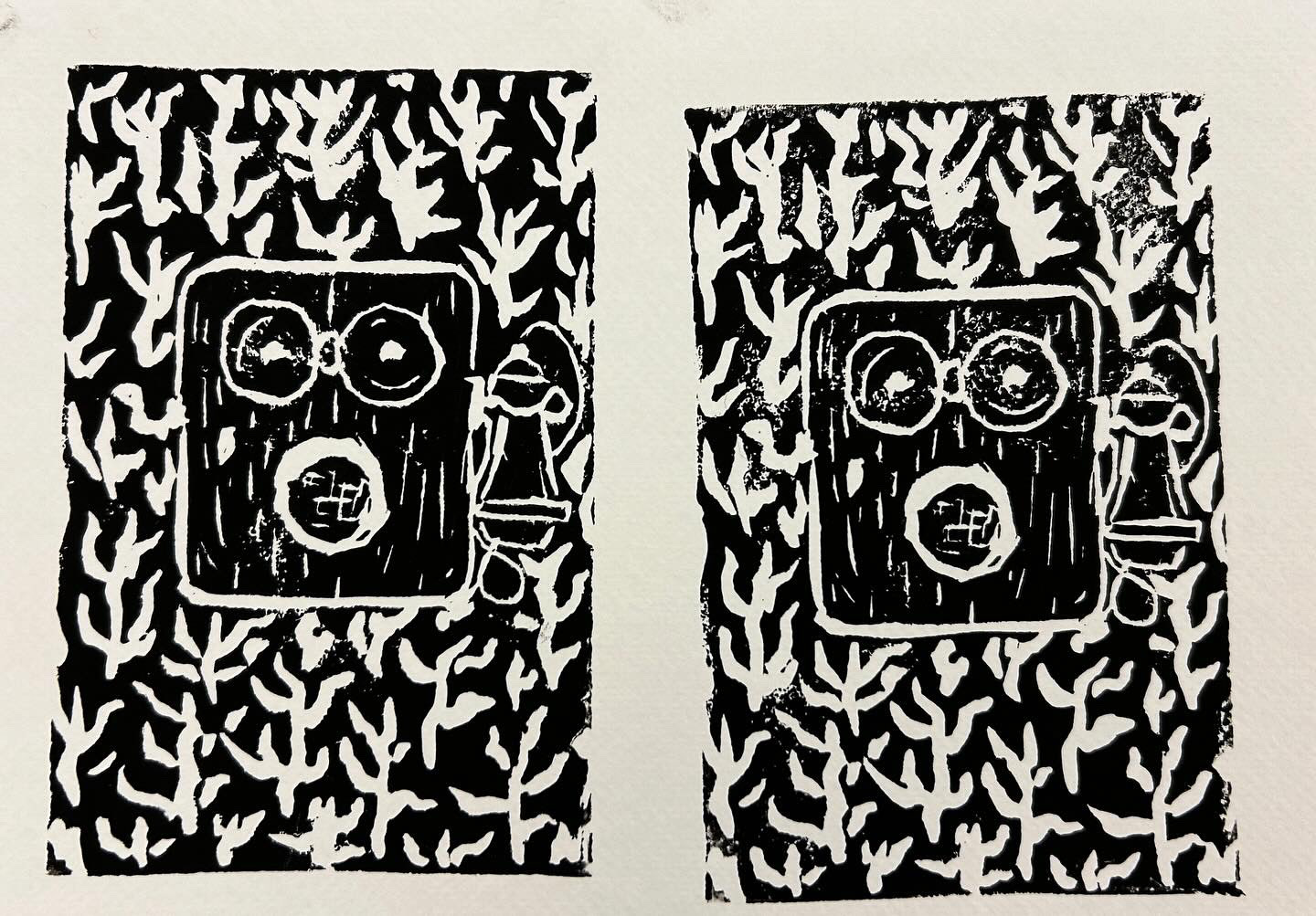
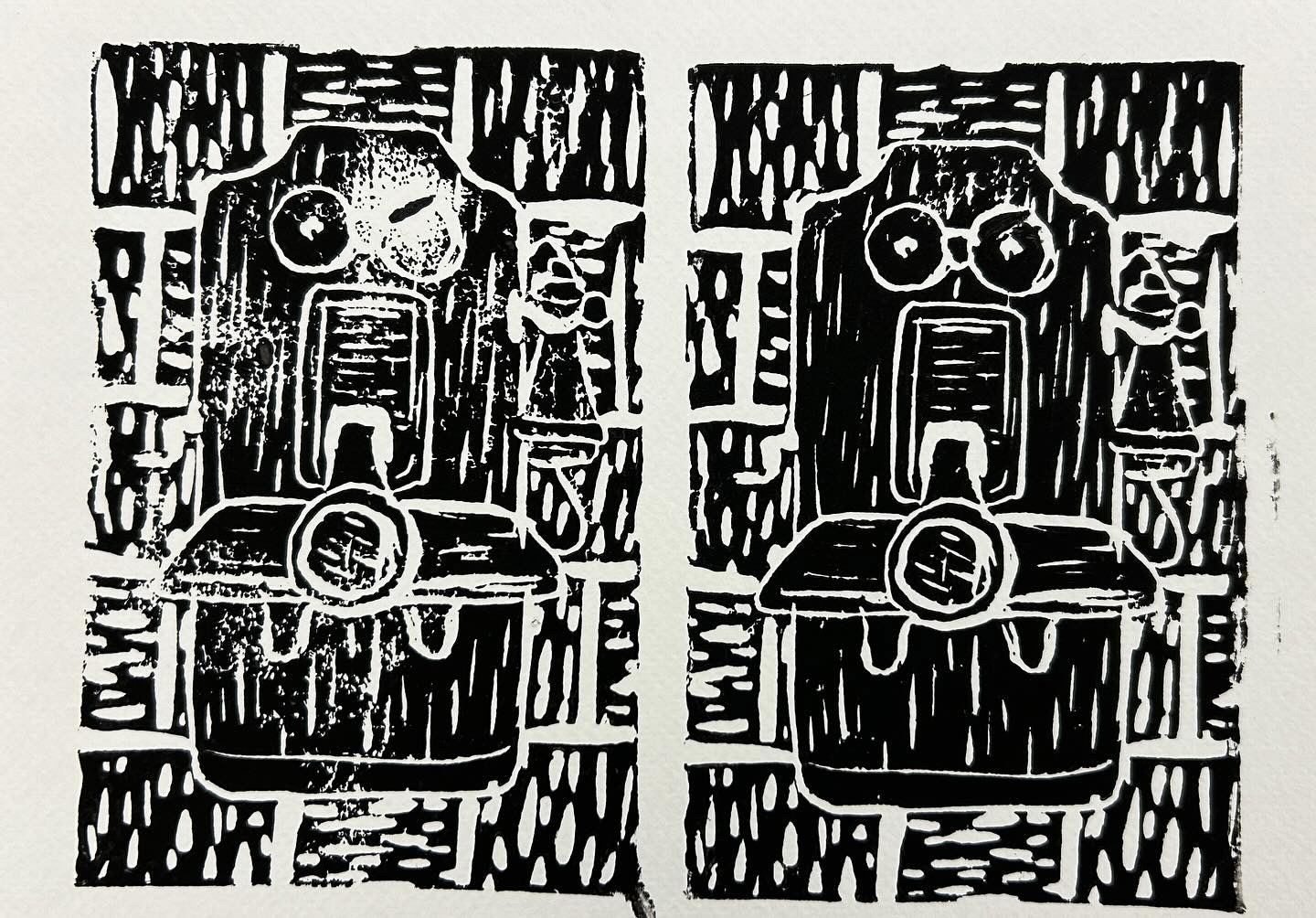
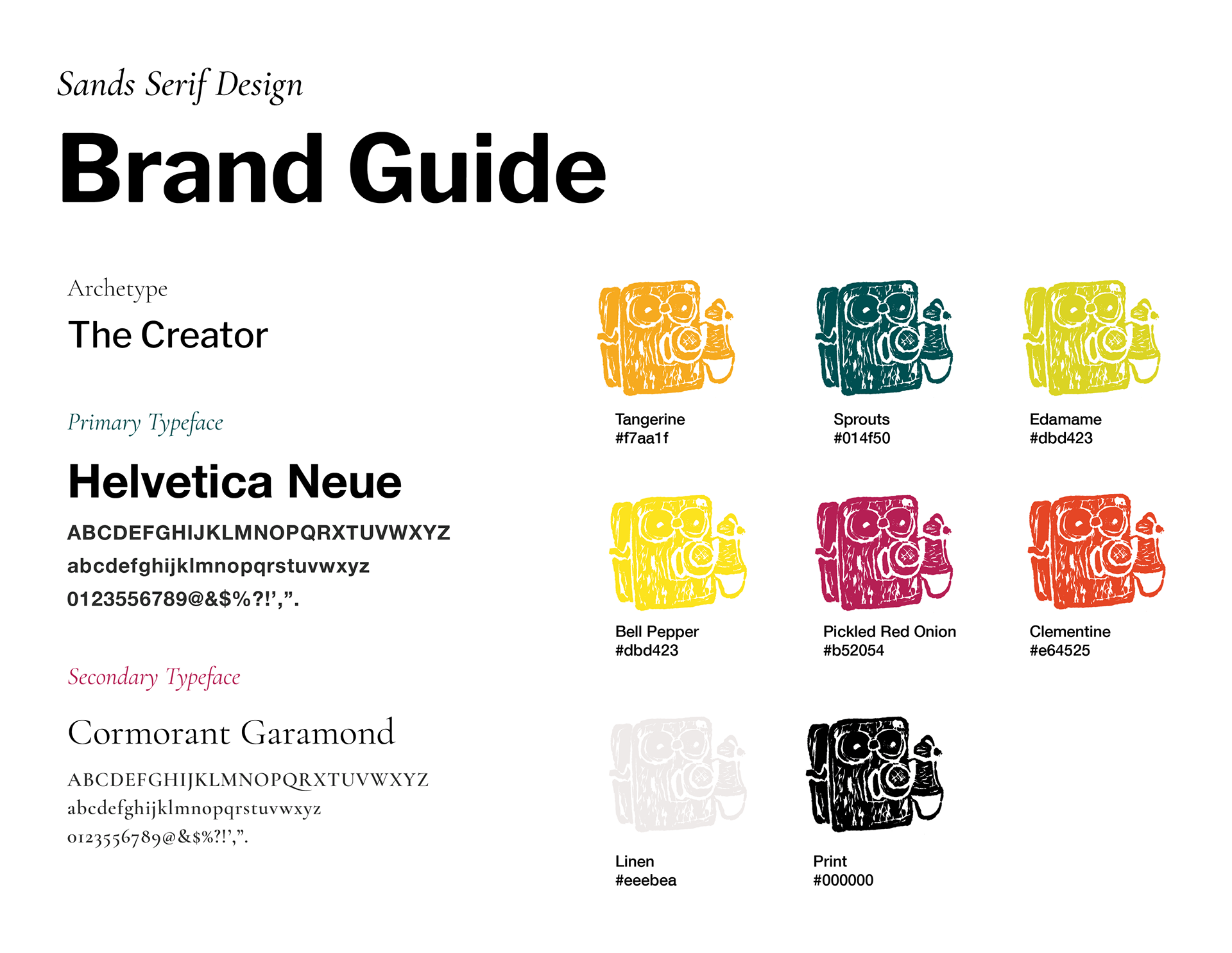
I also enjoy that the illustrations served as a callback to my initial materials and medium. That ARTS266 project is what got me into ink illustration. It was a medium I hadn't really tried before, but found a lot of freedom within. You can't really erase ink, so any marks I made were essentially permanent (and trying to cover mistakes usually makes them worse). I took this a step up with my newest favorite medium- block printing. It ties in my love for ink with my love for contrast and negative space. It's challenging to discern what carving will yield the design I'm envisioning, which makes the process feel so much more rewarding when I get it right. I've never even taken a printmaking class. I'm truly doing it through trial and error, not worrying if my process is "right". That's probably the best part. This medium has also made another idea click for me- that illustration isn't always pencils and paper or Adobe Illustrator. For some reason, I always felt that illustration = drawing, which is why I tended to struggle in my illustration classes. I found digital programs overwhelming or too clean so I was always nervous about those classes. In a conversation with Professor Valdes yesterday, though, I really understood that working with physical materials is just fine. I like the imperfect and messy yet style, so it's totally fine to work with the materials that get the outcome. It helped a lot to hear that validated. I always say my best work happens on accident- and the unpredictable nature of block printing reflects that perfectly.
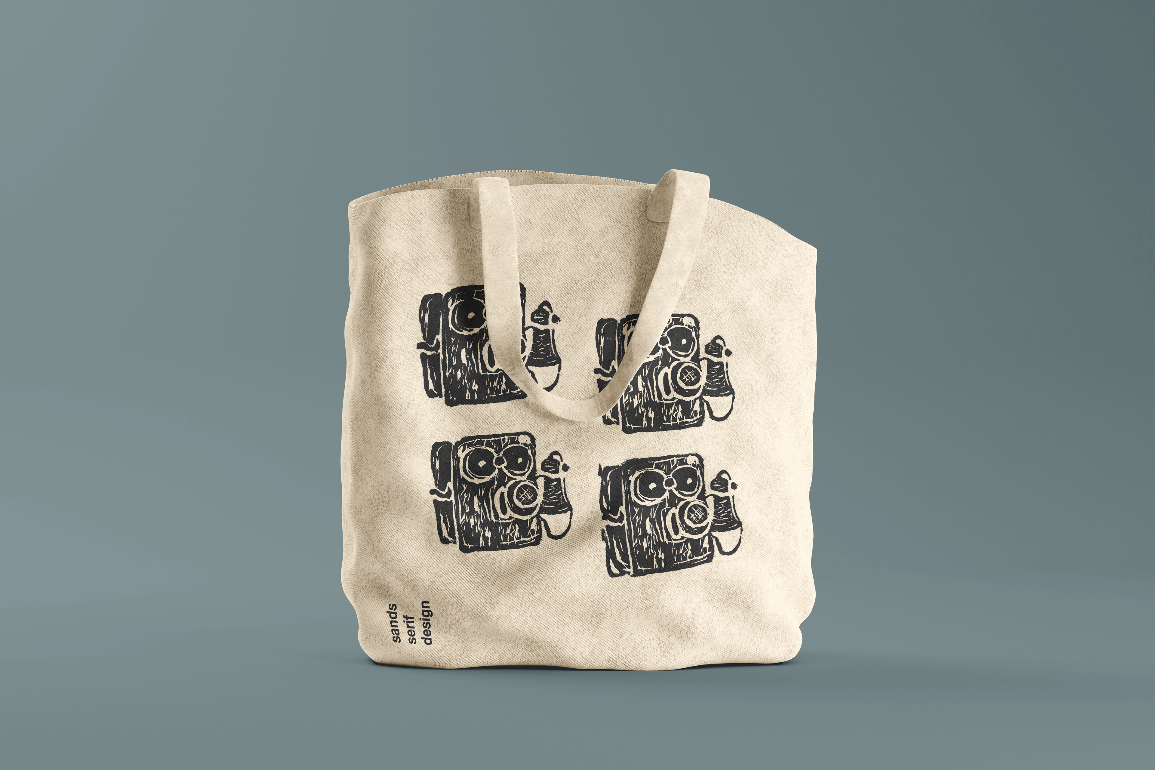
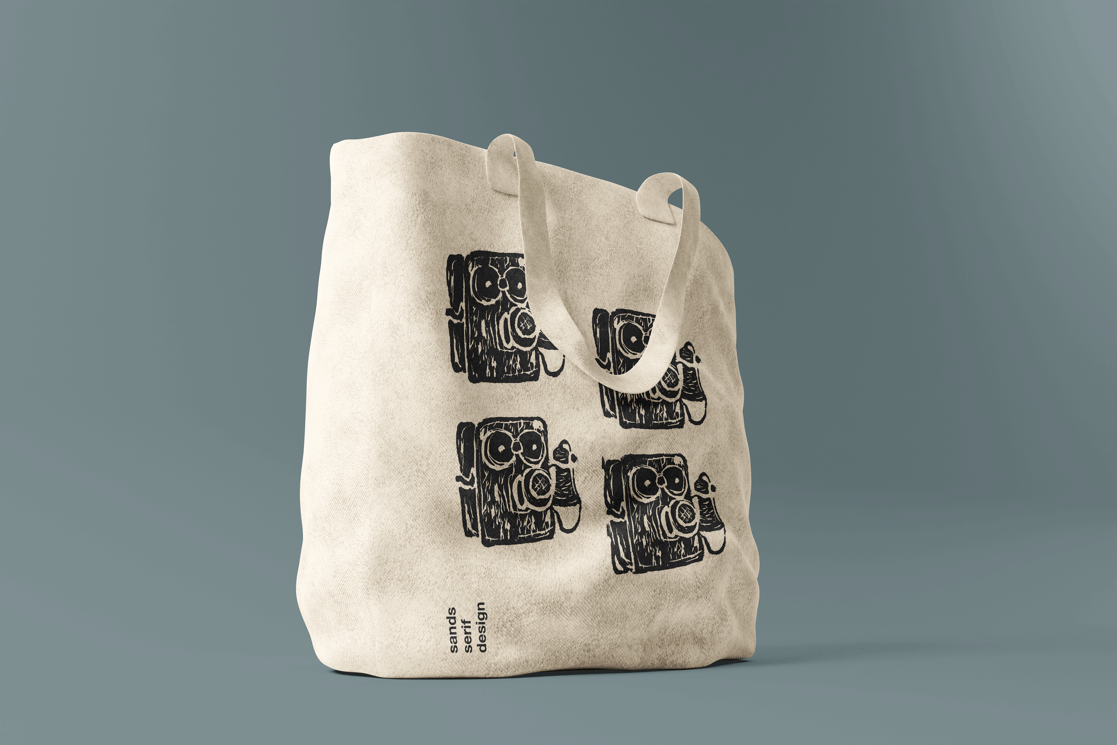
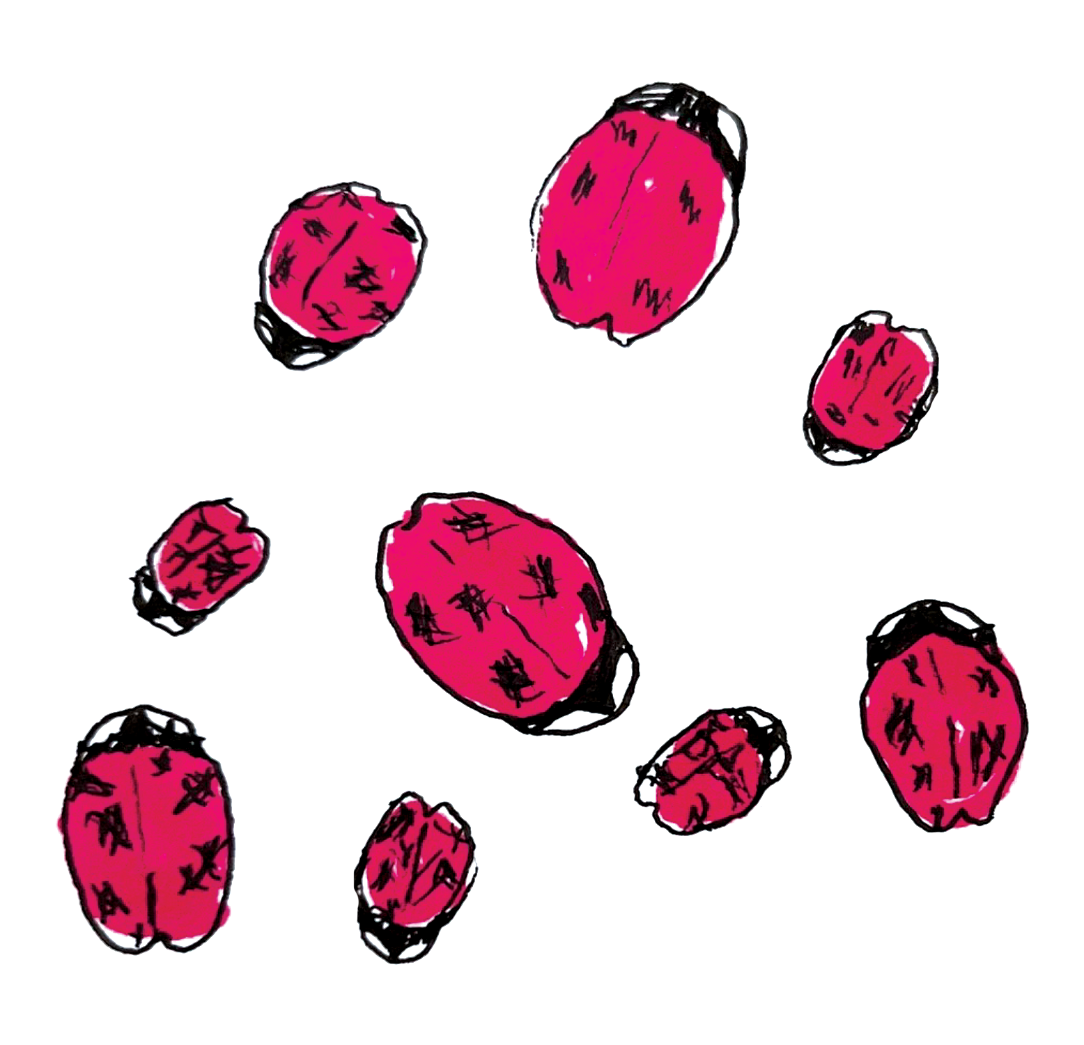
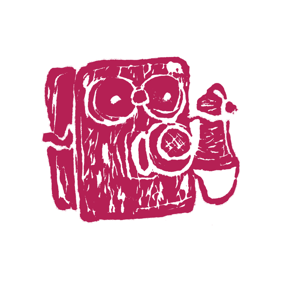
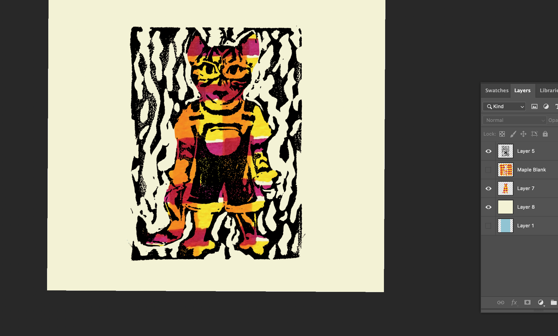
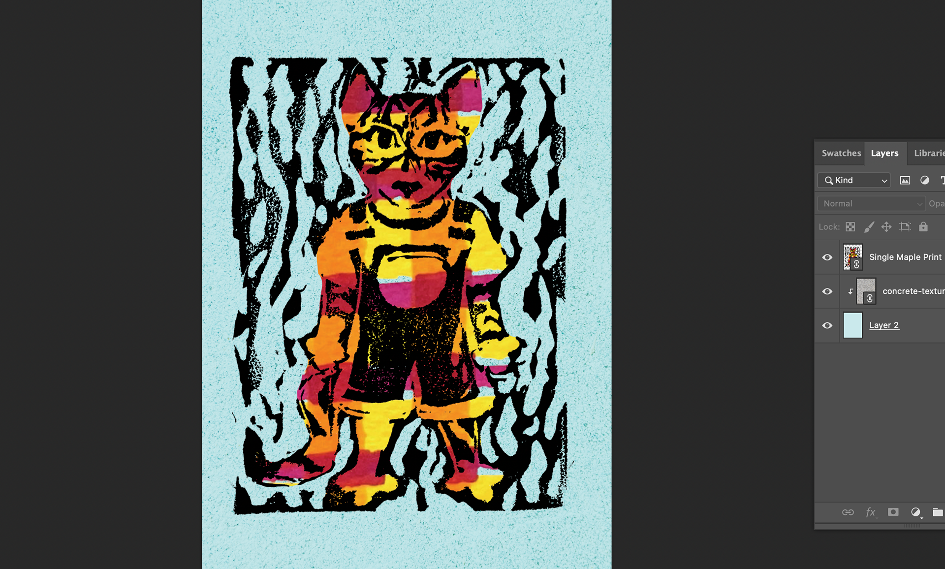
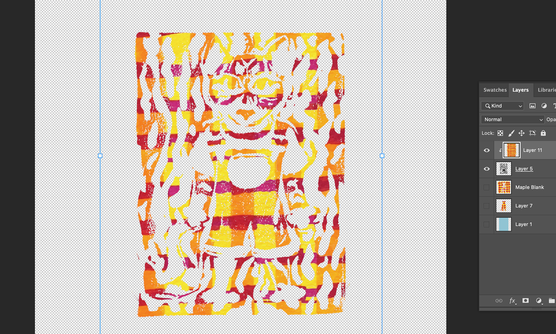
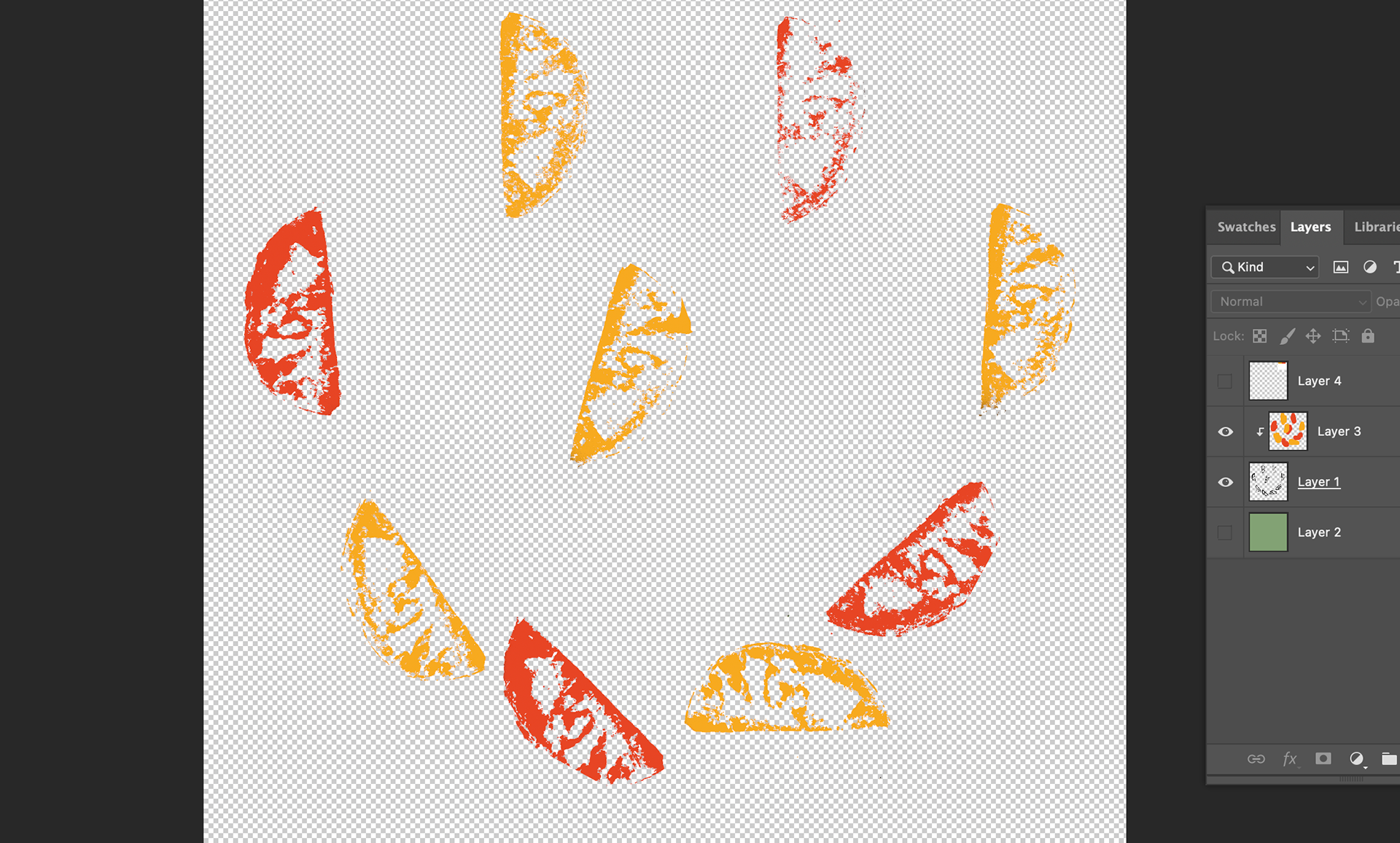
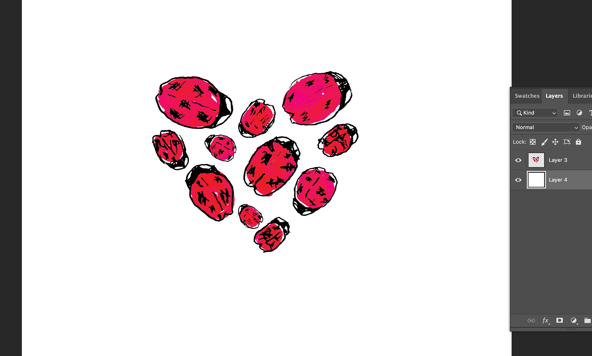
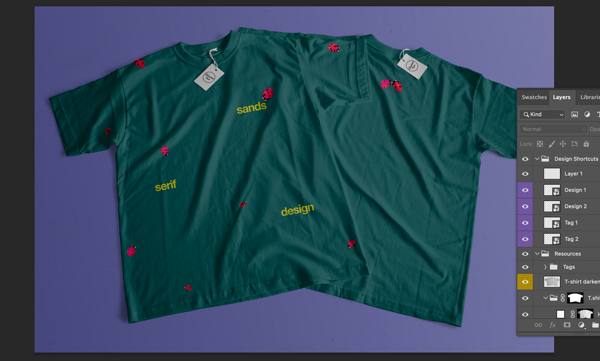
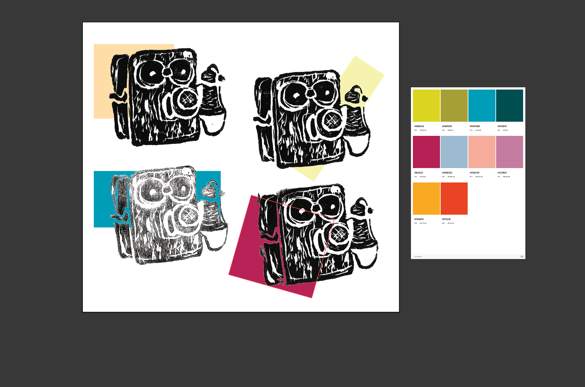
For the merch, I chose two block prints I had made along with alcohol marker drawings- which are another tool I love to use. I got the prints scanned in, but struggled a bit like last time in knowing what to do with them. I didn't want to just throw the designs on a shirt, and the black ink didn't completely match the large amounts of color in my moodboard, so I looked for ways people had added color to their prints. Some would use different colored inks for the main illustration and background. This gave me the idea to use my alcohol marker pattern on the outside of my cat print. I edited this in Photoshop, adding texture and layer modes, and found a version that I really fell in love with. Speaking to the accidental nature of my work, I also tried carving and printing with a sweet potato. The initial pressing didn't stand out that much, but after cutting the potato in half and using the bottom edge to print, I accidentally created a texture that looked like orange slices. This wasn't intentional by any means. I made a candid discovery that I loved enough to put in the final work.
I'm much, much happier with these designs. The cat journal specifically is one I would love to have as real merch, along with the antique wall phone tote bag. Preparing for Senior Portfolio Day has opened an opportunity to have some of these designs on postcards for sale at the event, so that's definitely how I'll be proceeding. My Advanced Illustration class is also doing a postcard project, in which I've chose to keep going with my block printing medium. I'm excited to keep working and see how where else I can take this new skill.
Media #4: Graphic Design Process Excerpt
I found looking through Michael Bierut's process for the New World Symphony logo mark fascinating. This serves as a great reminder that you can throw out as many drafts as needed to achieve a result that you're satisfied with- something i forget from time to time. His dedication to reflecting the orchestra's history, materials, and space is a thoughtful approach to design work that I hope to achieve in as much work as I can. The designer went through different styles to see what stuck, noting what he or others felt wasn't working. Each draft is visually pretty minimalist, but through his sketches and testimony, you see quickly how each mark was made with intention and reason. The completed logo accumulates all of these ideas very well. I enjoy how it requires you to look closer at each line, revealing the NWS lettering in an abstract way. The merchandise mockup for an umbrella is particularly visually pleasing, especially combined with the smaller type in the corner. It's modern, but not "corporate". I don't design logo marks often, but this is a good frame of reference for how to approach the process the next time I do.



Inquiry 3/Media Review 3
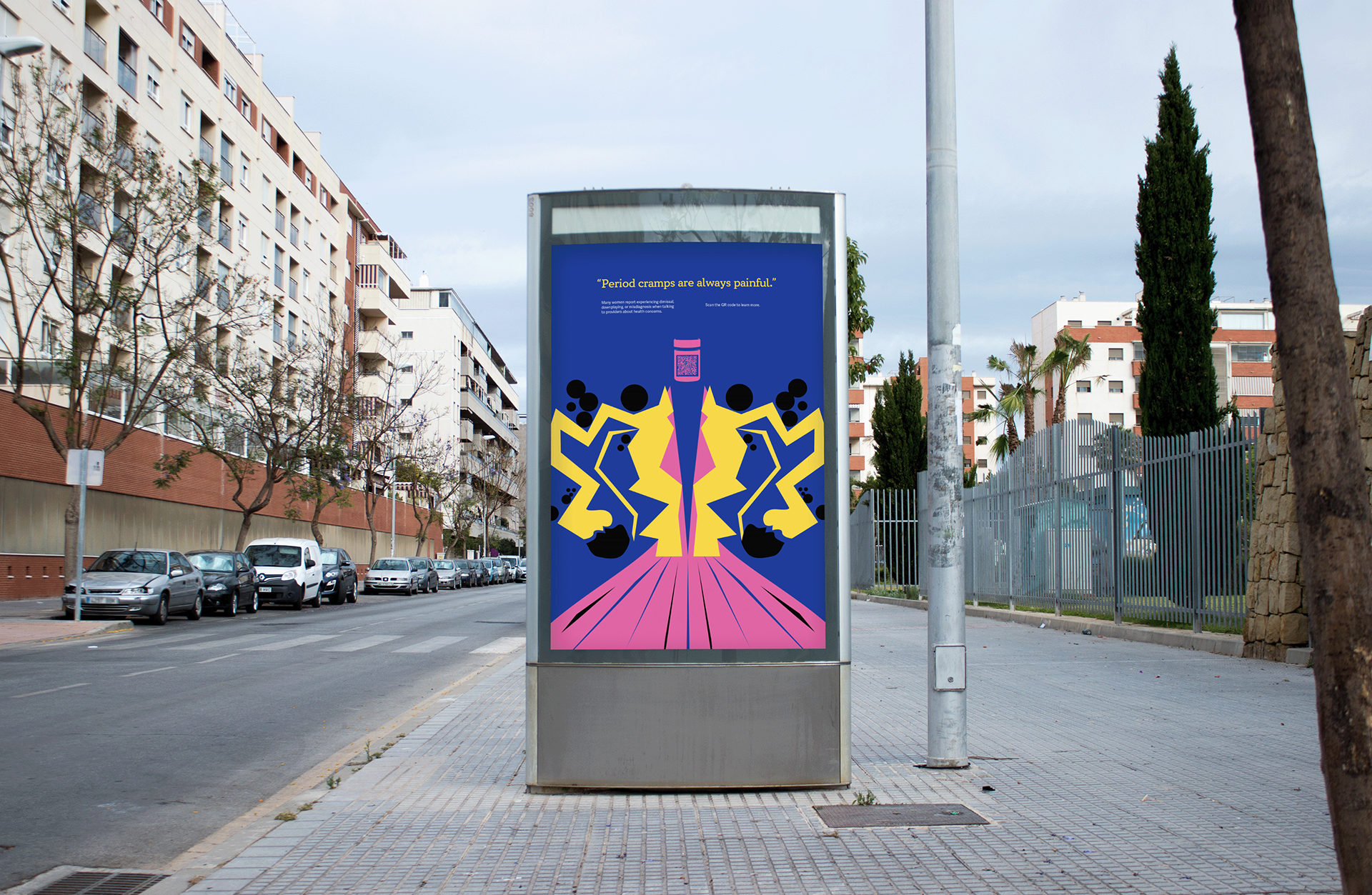
Inquiry #3: Gender Bias in Healthcare Posters
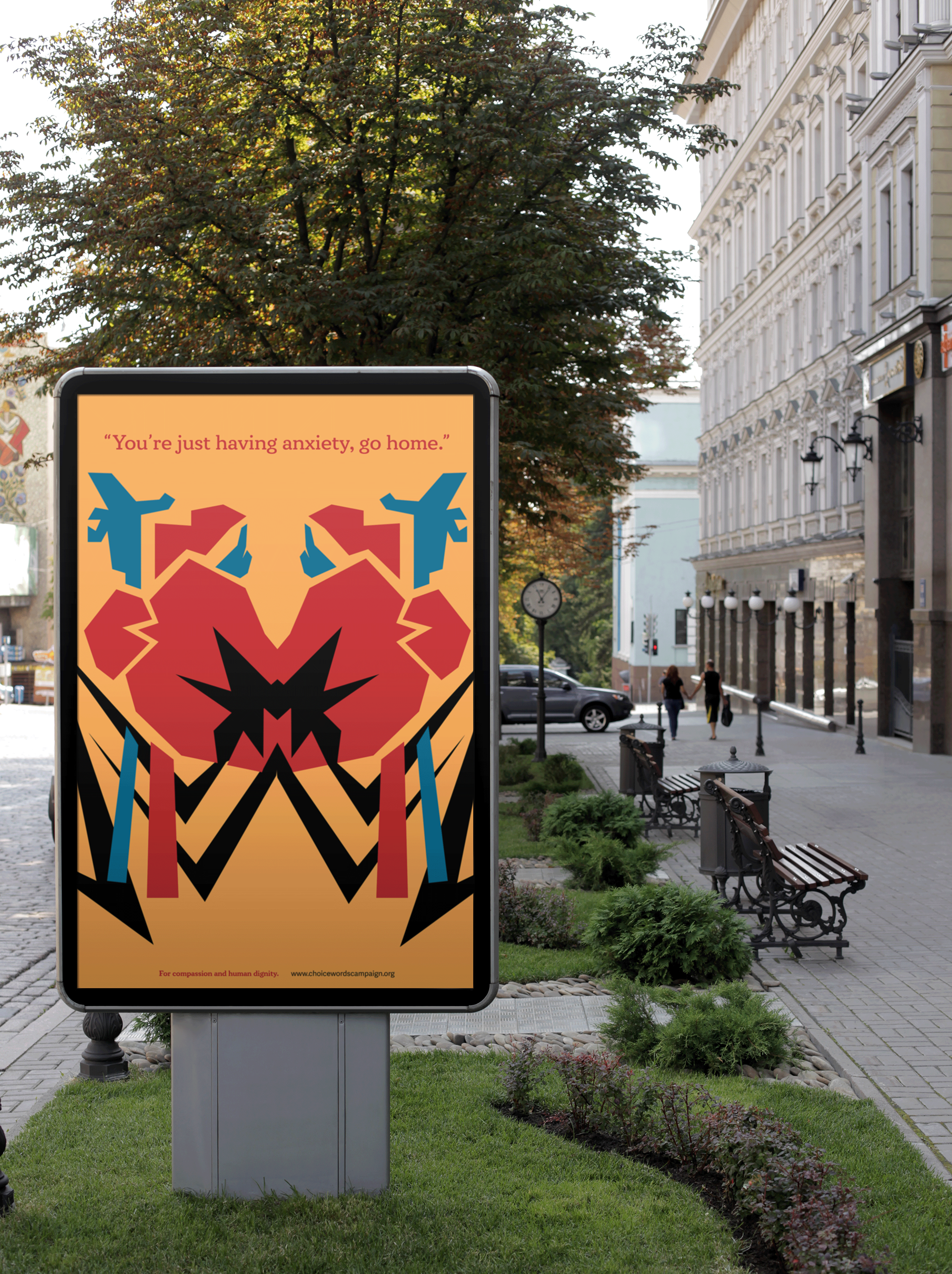
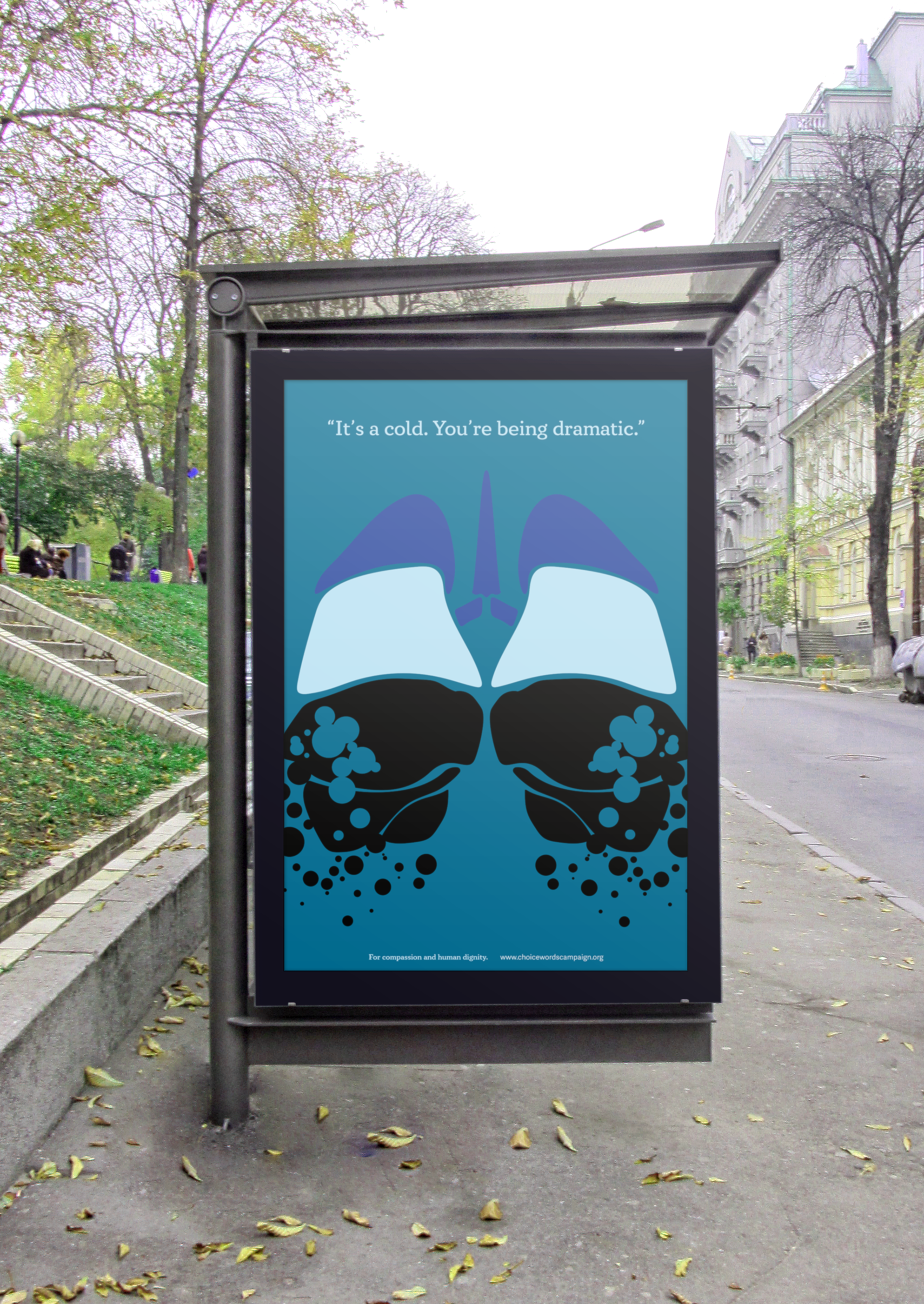
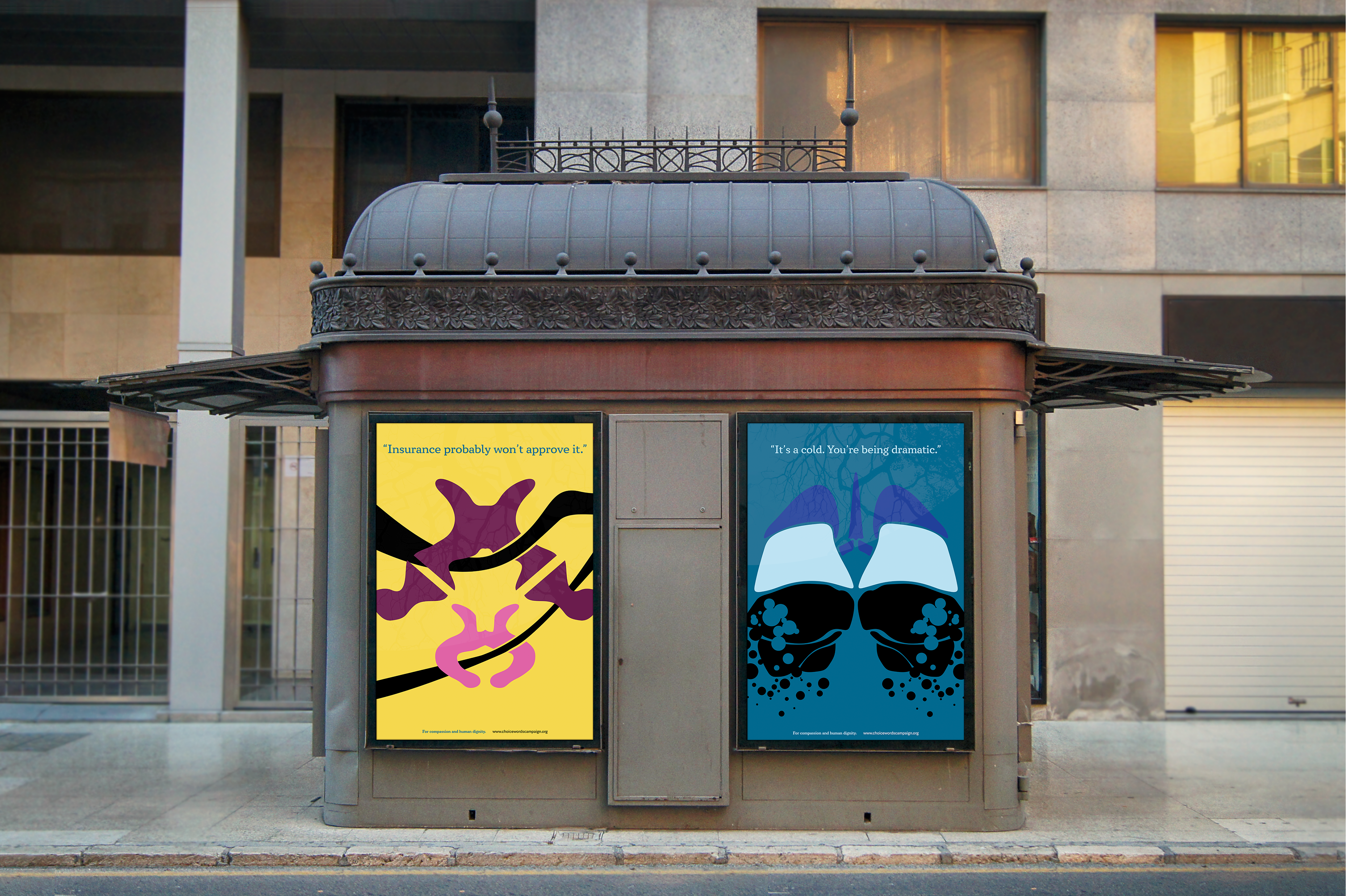
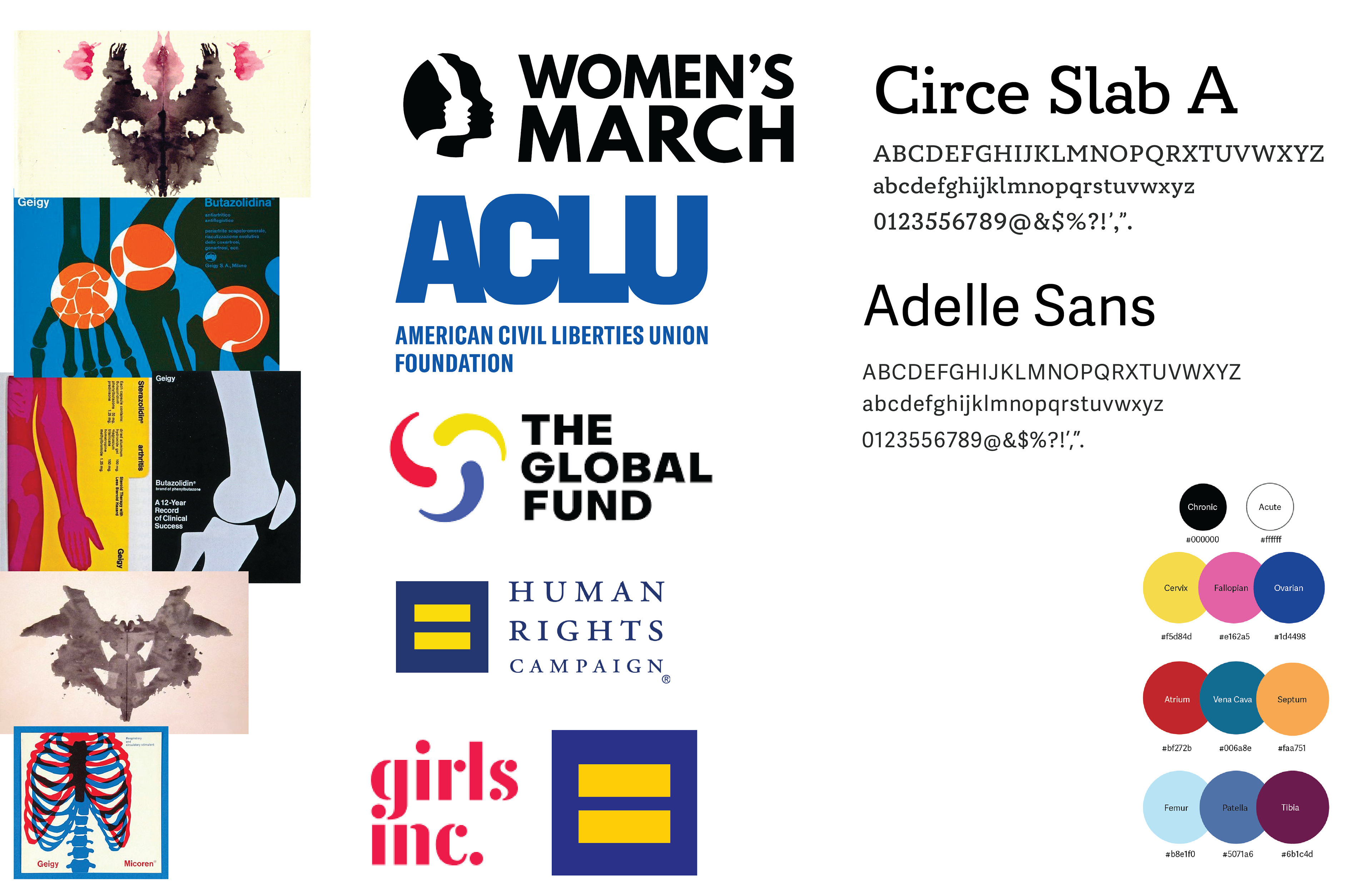
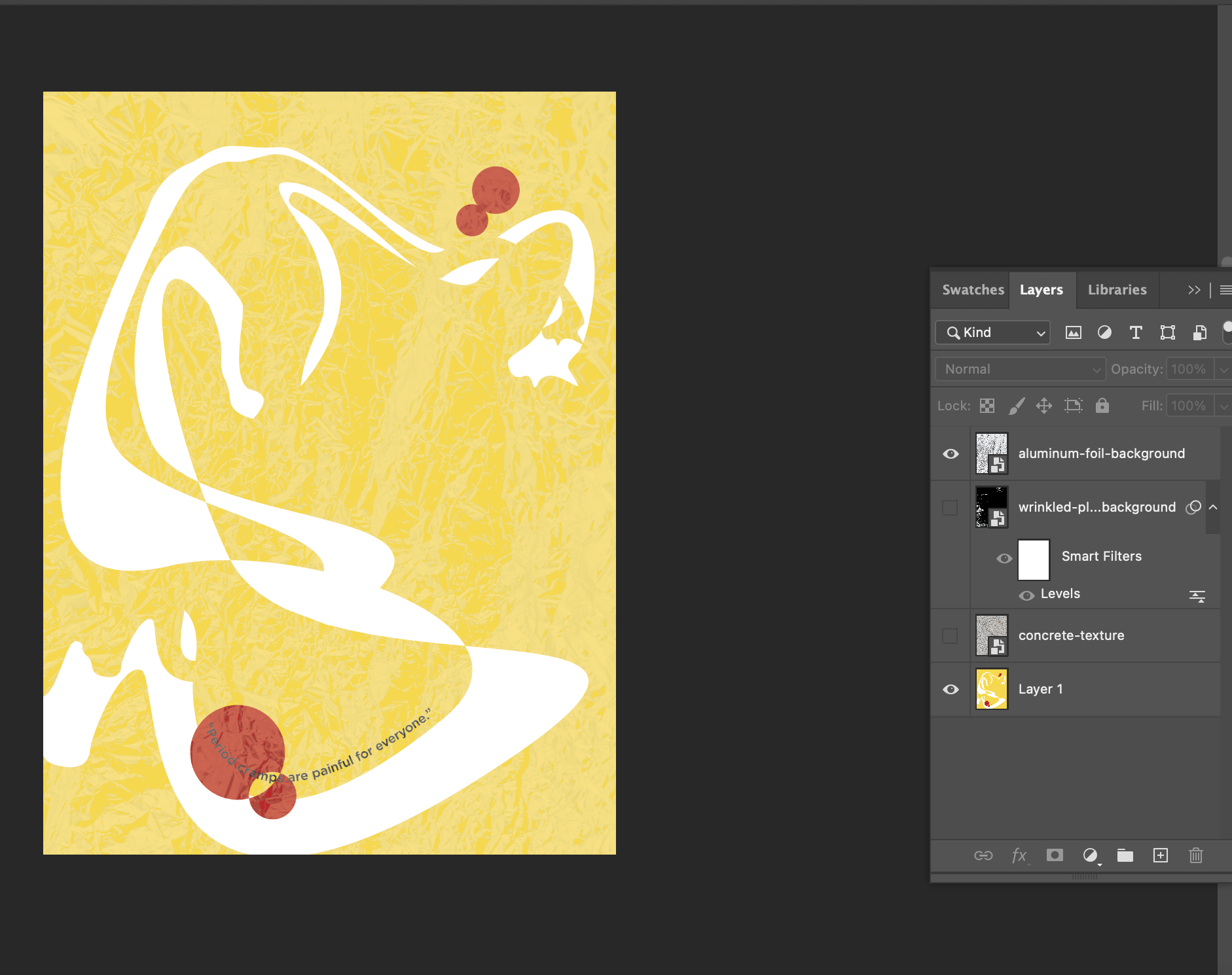
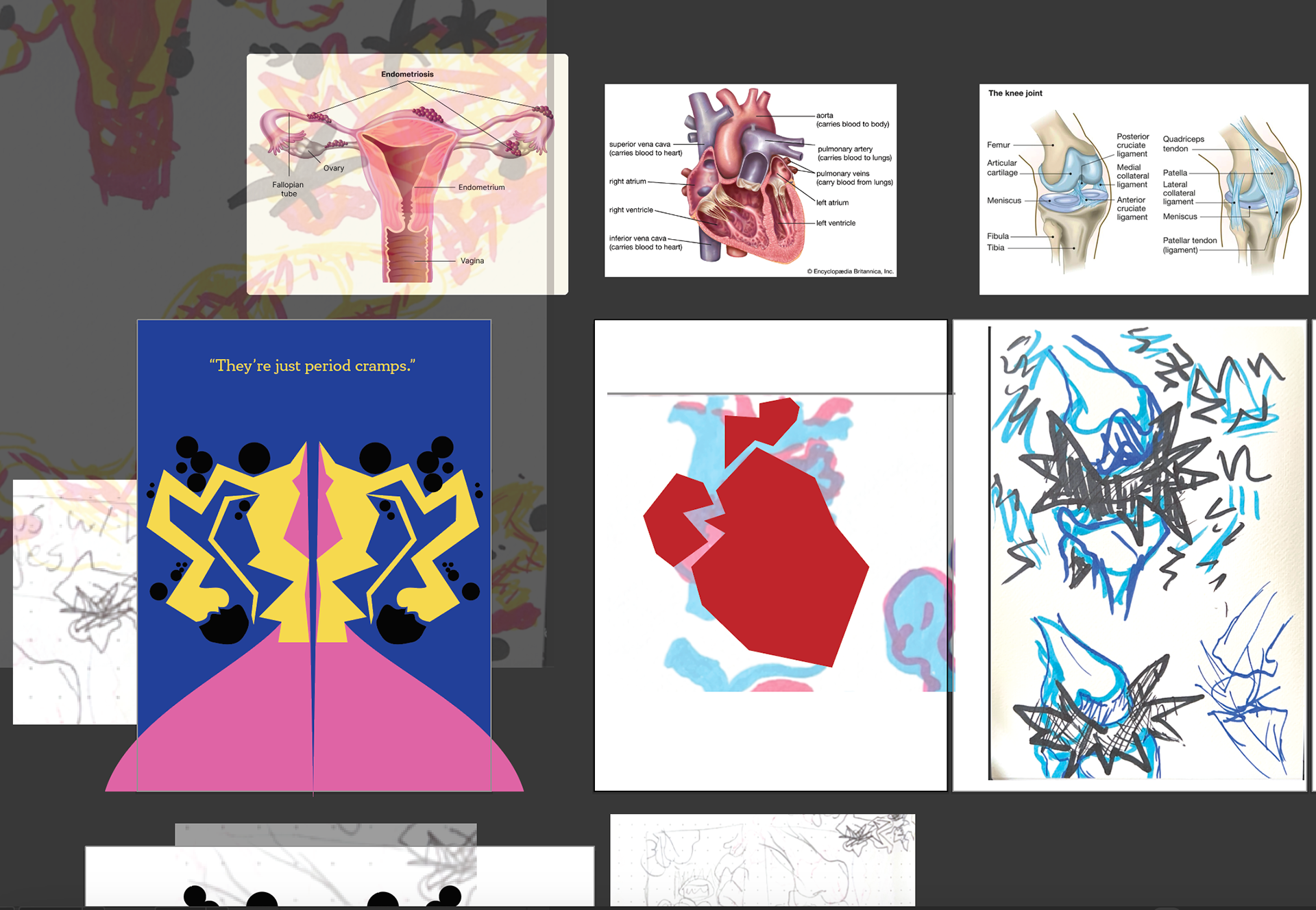
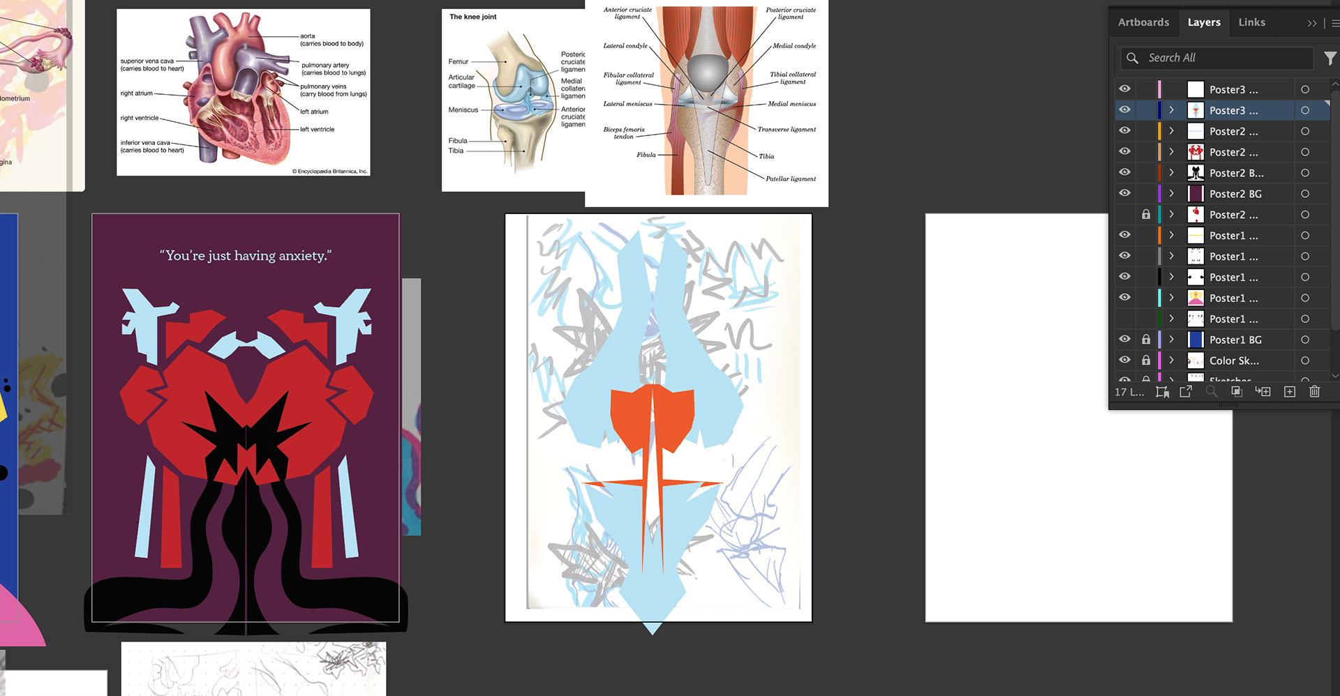
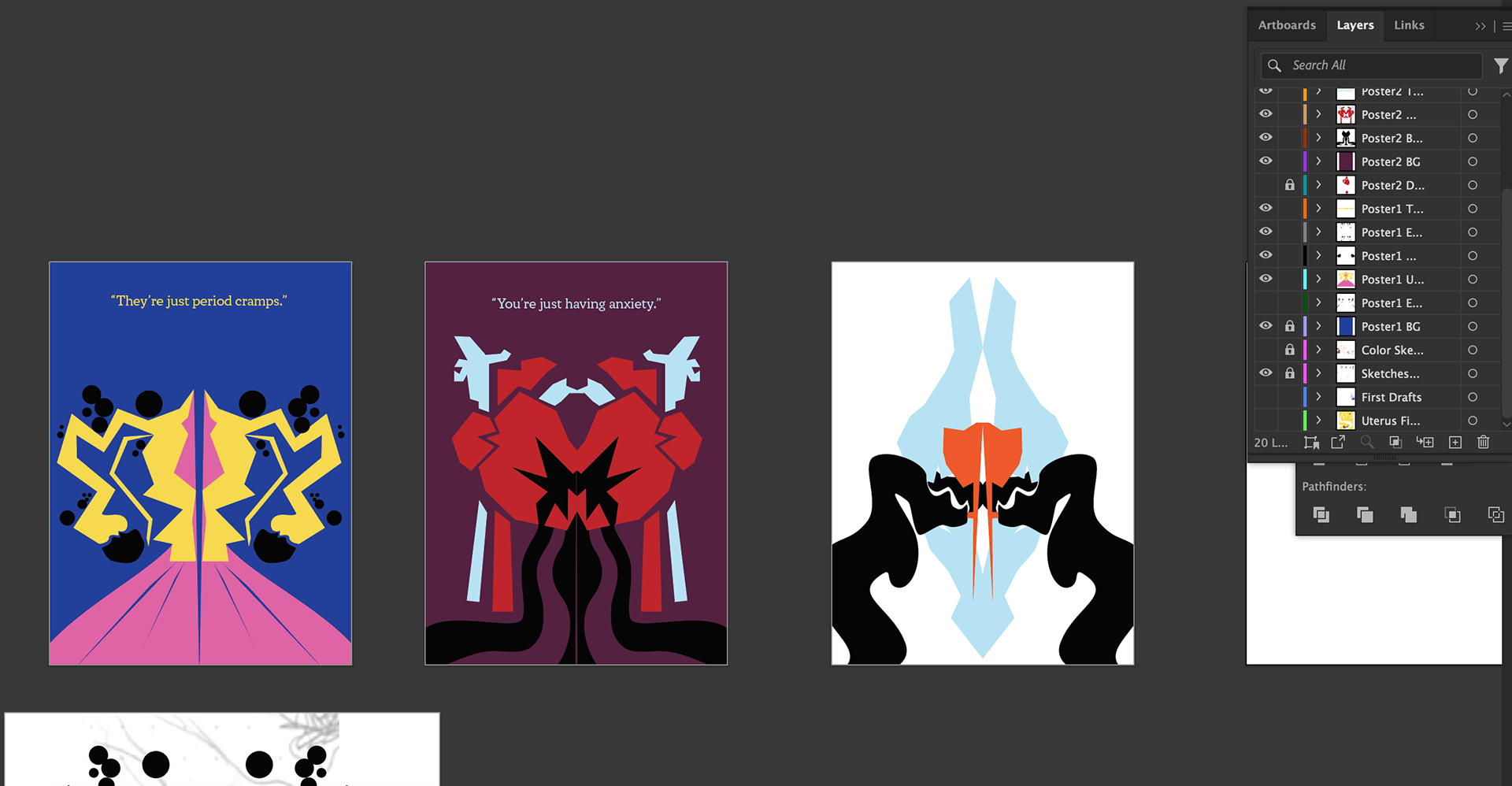
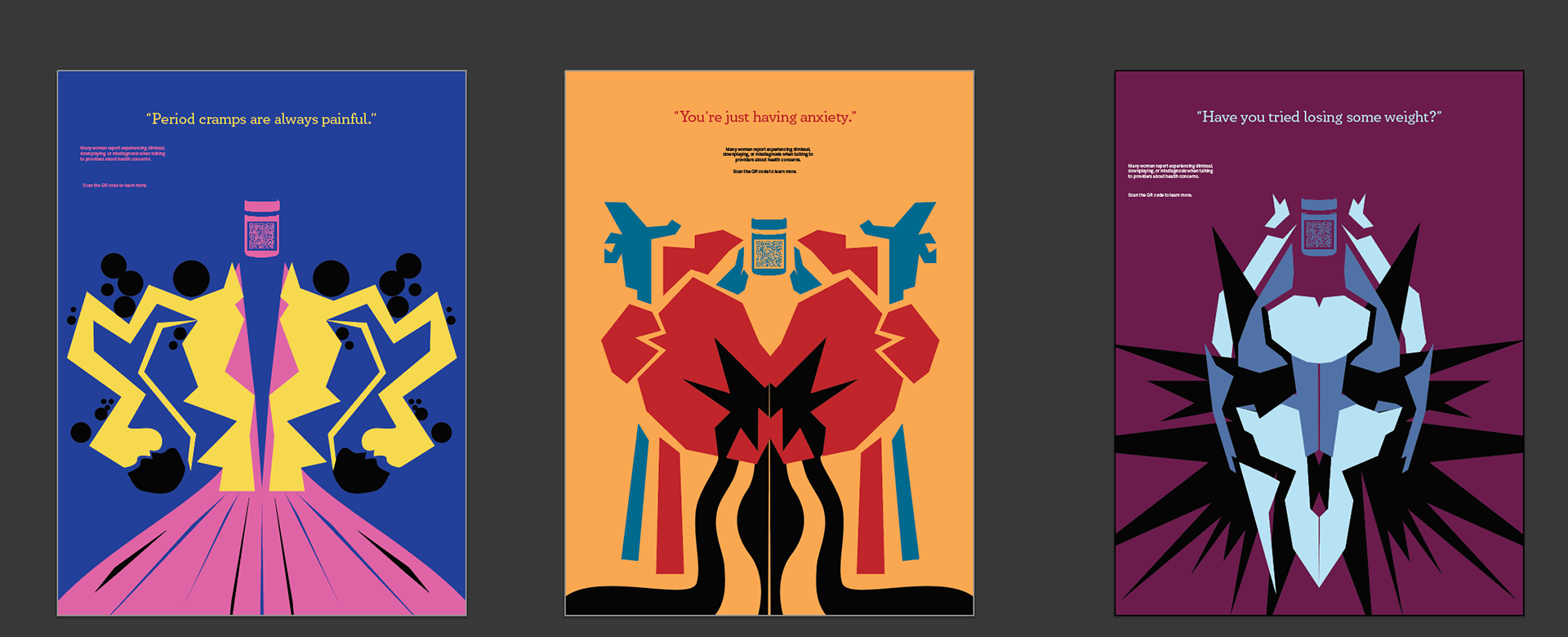
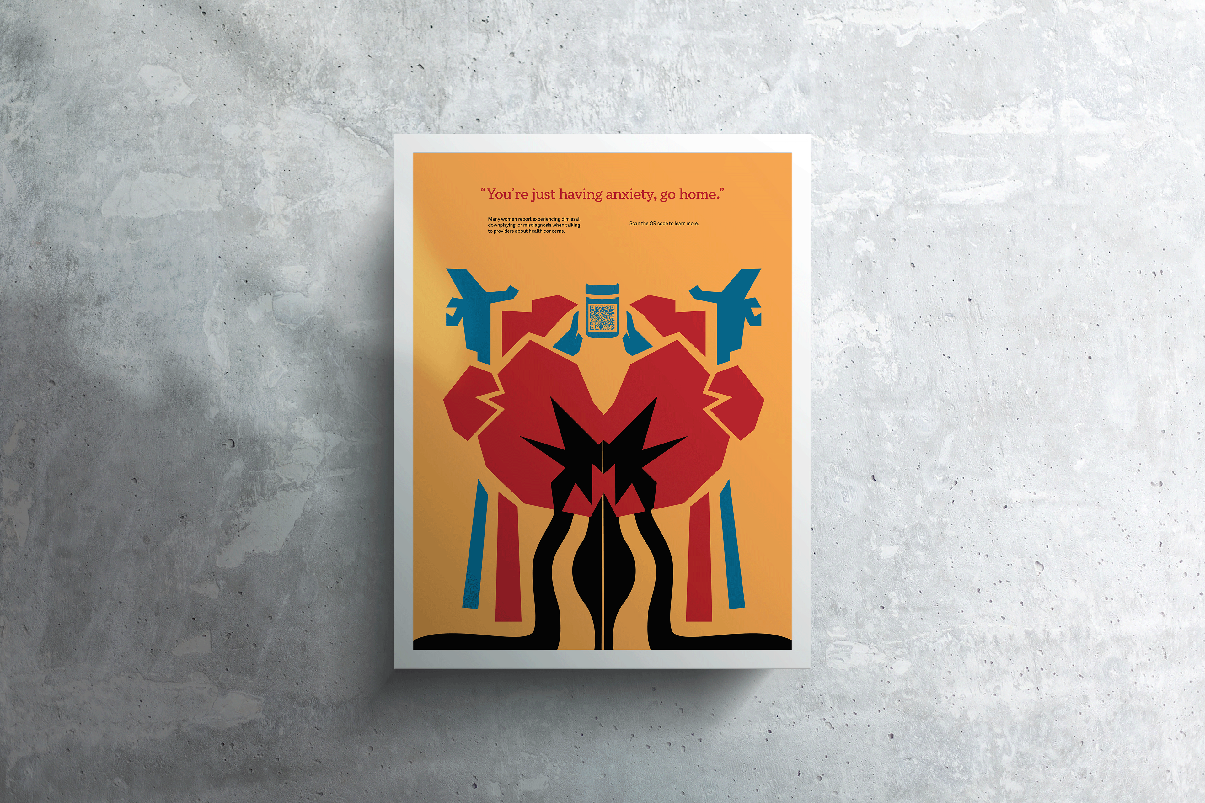
Inquiry 3 felt like the most fulfilling one for me yet. I chose to create a poster series based upon the medical gaslighting and ignoring of women's health concerns. I came across images of these design works that incorporated bright color and geometric shape with medical diagrams that felt like a unique inspiration for the posters. Through my research, I also remembered the ink-blotting style of the Rorschach test, which I felt could imply the labelling women's health conditions as predominately psychological.
This concept came to me first out of frustrations with birth control. I had been finishing up the first month of a brand new prescription given to me by my OBGYN, and was really struggling. My mood swings were out of nowhere and intense, I had no energy to do anything, I felt sick waking up every morning, and the hormone fluctuations made my ADHD medication feel like sugar pills. Basically, I was frustrated and angry that women and AFAB people are expected to shoulder the effects of these medications, while male birth control doesn't hit the market because it has "too many side effects". I was just so, so angry. And the hormones didn't help.
My original idea was throw this energy into a project that dealt with how debilitating birth control can be. I talked with female friends and their experiences were similar to mine, if not worse. One bled for months on end when getting the Nexplanon implant. Another had severe abdominal pain after getting her IUD, resulting in two ultrasounds with no problem located and doctors not believing her pain was that bad. And yes, the pain stopped when she got her IUD out. While these horror stories are way more common than they should be, I didn't want to risk scaring anyone away from the option. Birth control can be life saving for some, and I didn't want to negate that experience whatsoever. Researching these negative experiences, however, led me to a common theme. Women in these scenarios were often not listened to by their doctors. More Googling ensued, and I found my topic.
I realized just how much I and the women around me had experienced these excuses when seeing a provider. A high school Alex had been told repeatedly to just take Aleve and stretch when reporting knee pain that didn't go away ever (I did that and more, guess who's got more joints that hurt now...). Later she was cycled through about ten different antidepressants and told by her psychiatrist "Well, none of these have worked. Let's try from the beginning and put you on Zoloft again.", and after angrily switching providers, had the new doctor say her decade-long chronic exhaustion wasn't normal. My friends have been told they're being "difficult" when saying how a birth control is negatively affecting them. My mother with bad migraines always seems to come back from checkups saying the doctor saying he "wants her weight to come down". It broke my heart honestly. Reading online provided me many more anecdotes. Endometriosis patients not being diagnosed for years because no one believed them. Women of color's pain being believed even less, as screaming because of level 10 pain is called "dramatic" instead of actually treating the cause for such intense suffering. It made me livid. The NPR podcast describing the National Institute of Health not requiring women or people of racial minorities to be included in their funded studies until 1990 really sent me over. So we're behind on research for how these conditions can present differently or affect women, and instead of doing the work to understand....we're ignoring it. Got it!
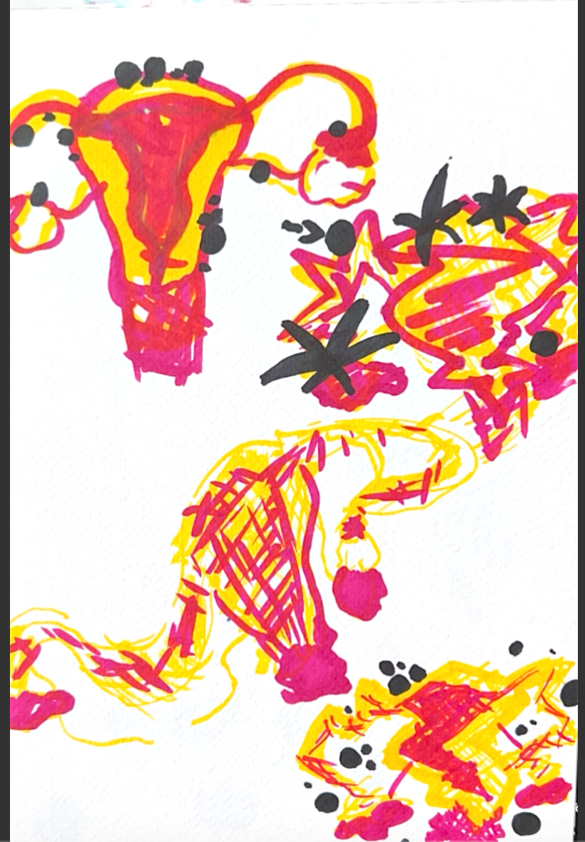
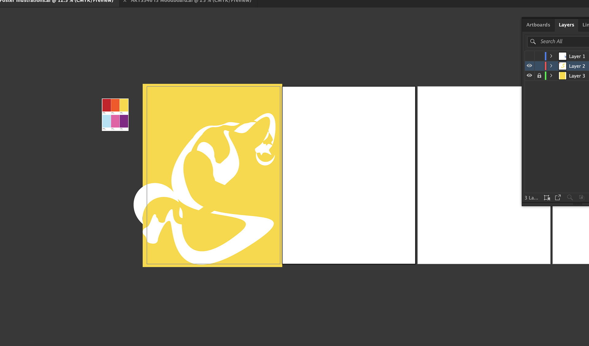
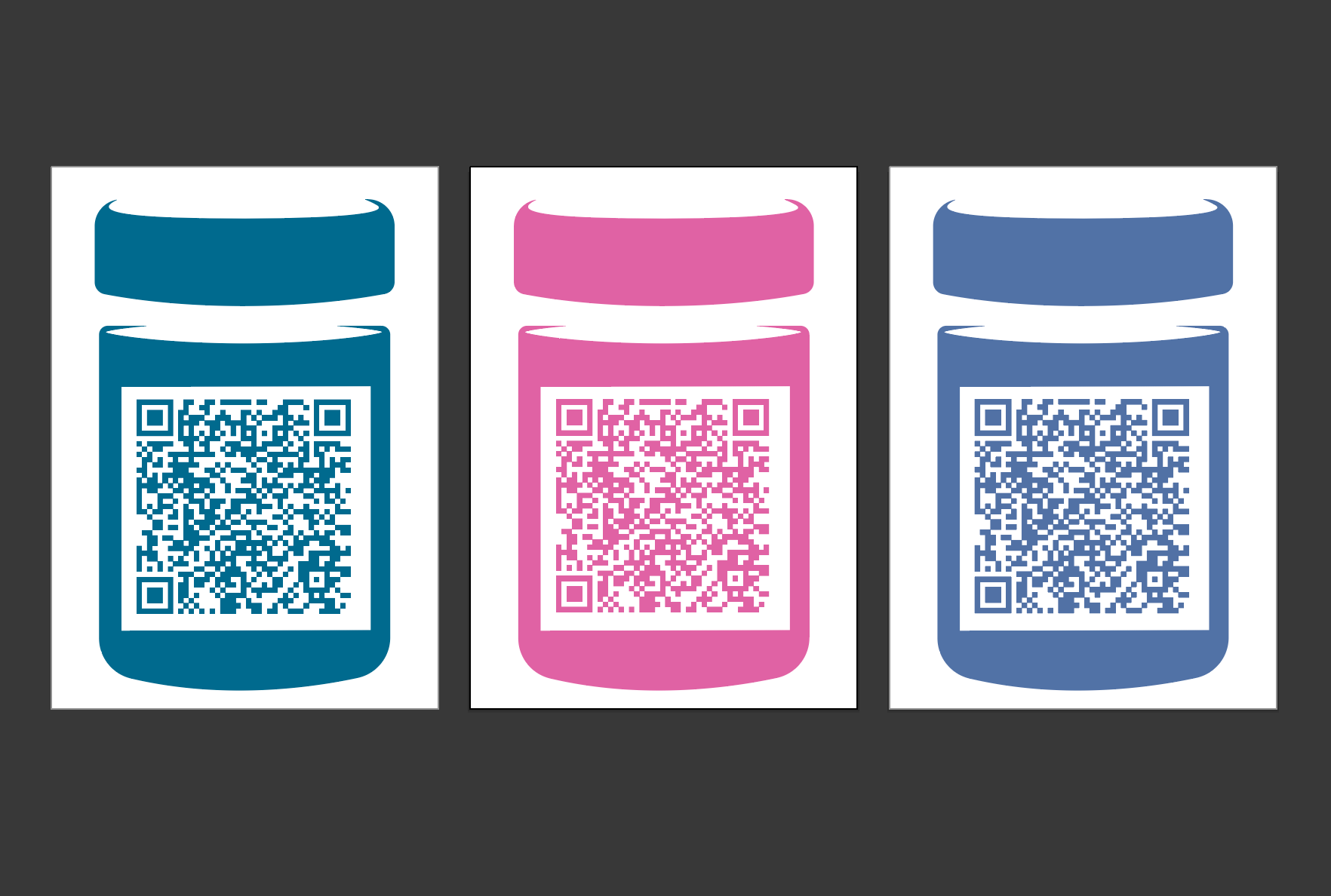
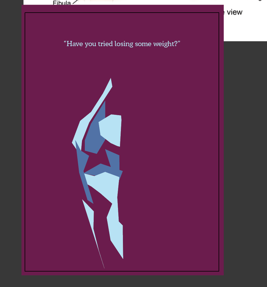
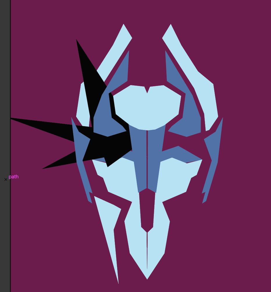
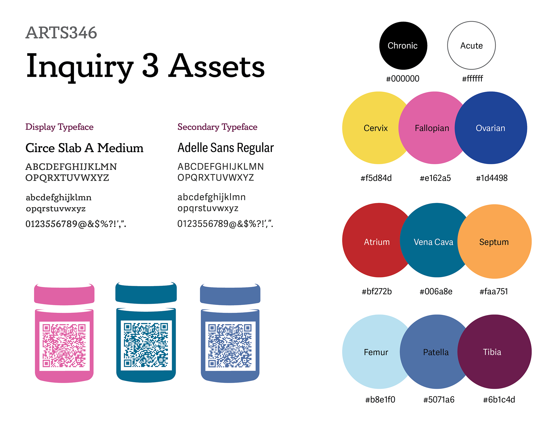
I could go on, but this unethical treatment of patients made me want to create work that let people know what goes on. Though I had six or seven conditions I wanted to represent, I realized three were more realistic for the timeframe. I took the inspiration from my moodboard and sketched originally with pencil. This was a good start, but left me in a creative block after a bit. Since I wanted to work with bold colors, I shifted to illustrating more freely with alcohol markers. I made a good choice here, as it put me more in the mindset of what I wanted to make. The designs were mostly freehanded from here. I placed the sketches in Illustrator and loosely made shapes over them while also working from medical diagrams. I made sure each design split the body part into basic shapes and made sense when reflected symmetrically. Color choices came partially from awareness ribbons, such as the yellow for endometriosis. I knew I wanted the type above to display the dismissive quotation with a brief explanation below. This mirrored the Ad Council project from ARTS347. I selected two typefaces created by women to intertwine the message with the imagery even further. One aspect I'm not completely satisfied with is the prescription bottle QR code. I felt the need to include access to a resource within the poster, though I'm not completely sure if it was necessary. I tried to place the icon where it looked like something was missing as well. This is something I can play with further when I expand on the project.
I feel pleased, but not totally satisfied with my final product here. I still feel like I have more to do when I look at it. This is the biggest indicator of this needing to be my final project, though, and I have many ideas for how to proceed. I'm holding out hope that I can finish the work to the extent I want in the time allotted. While I'm nervous I'll get too carried away, I'm making an effort to practically deliver a final set of a work that has a realistic quantity of elements.
Media #3: Creative Pep Talk
The first point really hit home when pertaining to my work. It's become evident to me that the projects I find myself the most enveloped in and passionate about are the ones where I'm tackling a topic that I'm angry about. Perfect examples are Inquiries 1 & 3. The first redesigned an aspect of the health insurance system I detested, after having a frustrating experience with it. The third tackled an issue, also with American healthcare, in which people's conditions are brushed off or ignored by providers based upon explicit or implicit bias toward their identity. Compared to the second inquiry I did, these had much more passion involved. For me, being passionate about a project makes me work on it. It seems to be one of few internal motivators I have most of the time. Being angry (on the surface) about the problem I'm solving definitely helps to get the work done when it would be hard to otherwise, but it can also take a mental toll. I think balancing the making of work about difficult injustices or inequities with more lighthearted concepts is important to my sanity. I'm no psychologist, but that constant stream of upsetting information cannot be good for your brain. While it's harder to find projects I'm just as interested in, I want to do it anyway. There's a million problems in the world that I want to solve, but I can't do that feeling defeated.
Speaking to his point of standing out, I feel this resonates with the way I approach art. I may feel attracted to certain styles, but I have learned to appreciate any way someone expresses their ideas in an art form. The general public will roll their eyes at "modern art" (the kind that's a solid color or shape on a giant canvas). The phrase "I could've made that" makes me want to rip my hair out. I heard a response to this once that said "Well, go make it then.", and it's stuck with me since. Most people don't understand the skill and time that it takes to make even the most "simple" pieces (which is also why artists aren't paid enough!). Could you have gotten that red paint to appear uniform with few brushstrokes, or made the lines crisp and seamless? Didn't think so. I feel similarly about the "weird" art of my generation. Gen Z humor consists of jokes nested within other referential humor that has layers for the viewer to understand, and is deeply rooted in irony. That explanation has been said to death but it's probably the most accurate. Younger artists reflect this with work that's silly with sporadic mark making. It can take itself seriously, but it doesn't always have to. All this to say I love seeing people do something different with a concept or style. In my eyes, the more out-of-left-field an idea is, the more impactful it becomes. This is why I've been trying my best to loosen up with my work at times this year. I've spent a long time trying to learn the fundamentals of design and execute them seamlessly. In doing so, though, I've noticed you can keep these skills central in a design while making something that first appears to break them. Once you start doing it, it's too much fun to stop. My skillset has grown the most when not adhering to rigidity. I've made peace with "failure" for the most part, and don't hesitate to adjust or completely scrap a work if it's not working.






Inquiry 2/Media Review 2
Inquiry #2: Godzilla Podcast Branding
Developing this second inquiry had a much less linear trajectory than the first. Inspired 99% Invisible podcast episode, I initially was all about making a CD practical and sustainable longbox. I got through the research phase when I realized I wasn't feeling it. With the upcoming week's heavy workload, I also determined my brain was too burned out for cardboard engineering. So, what now?
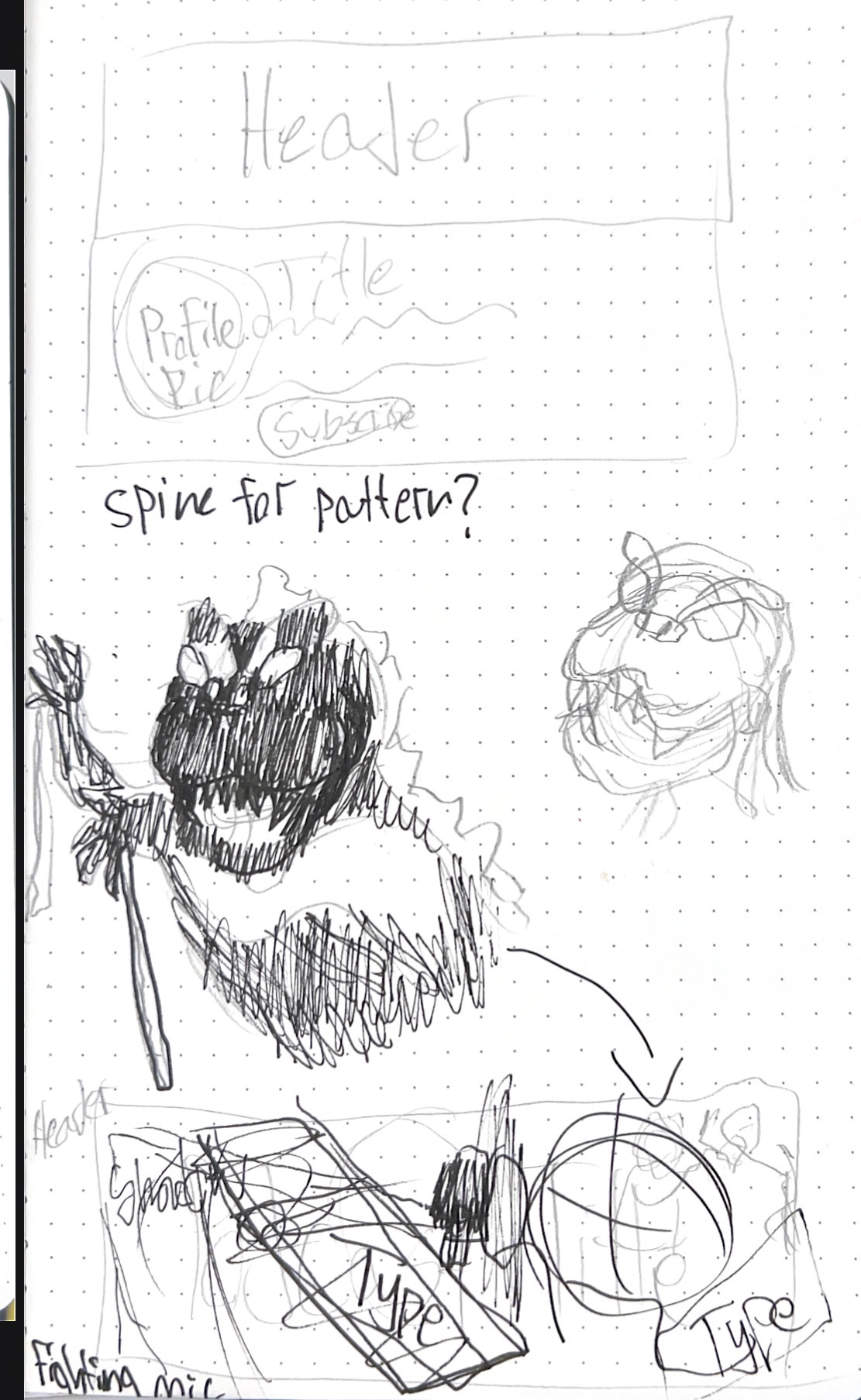
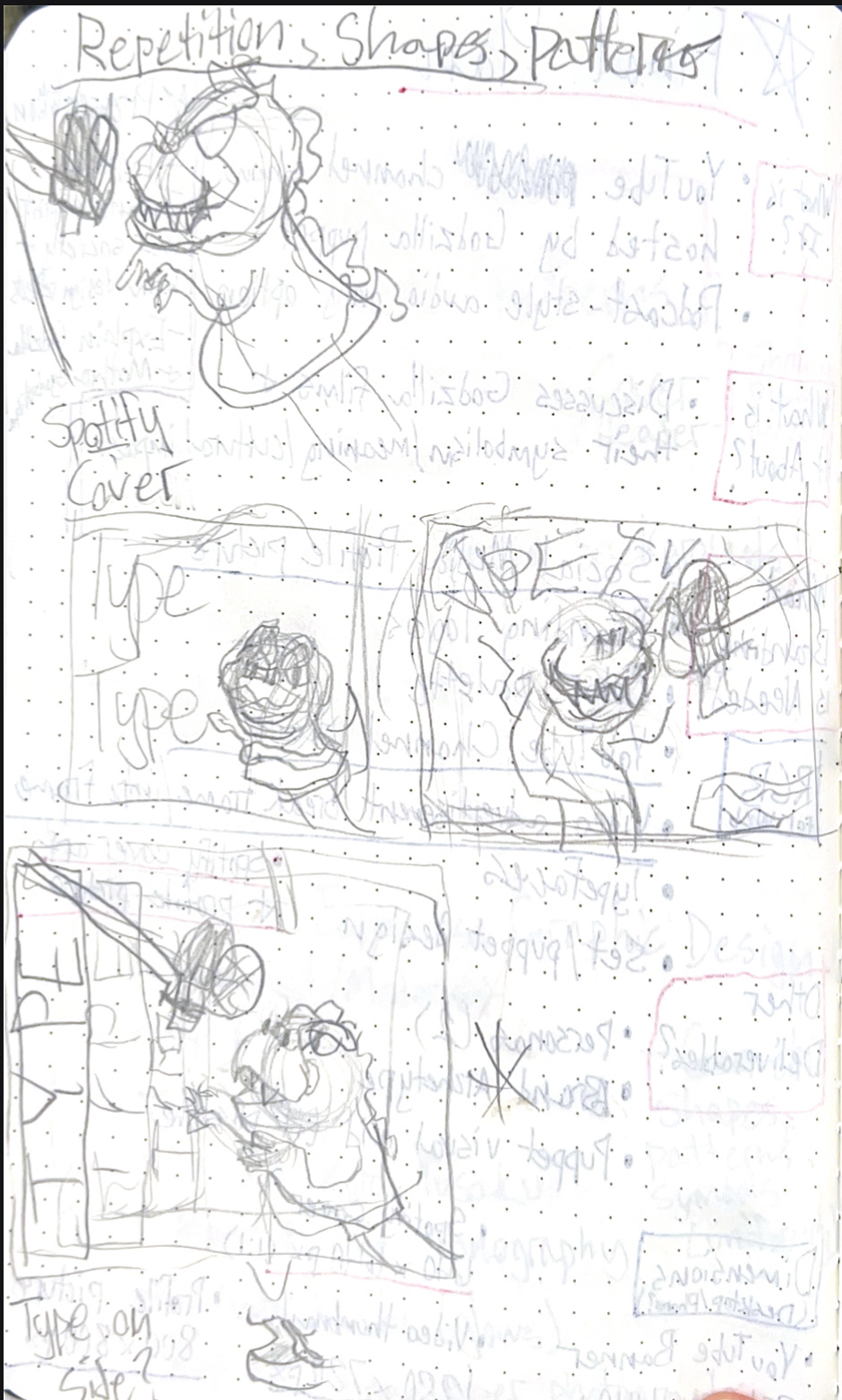
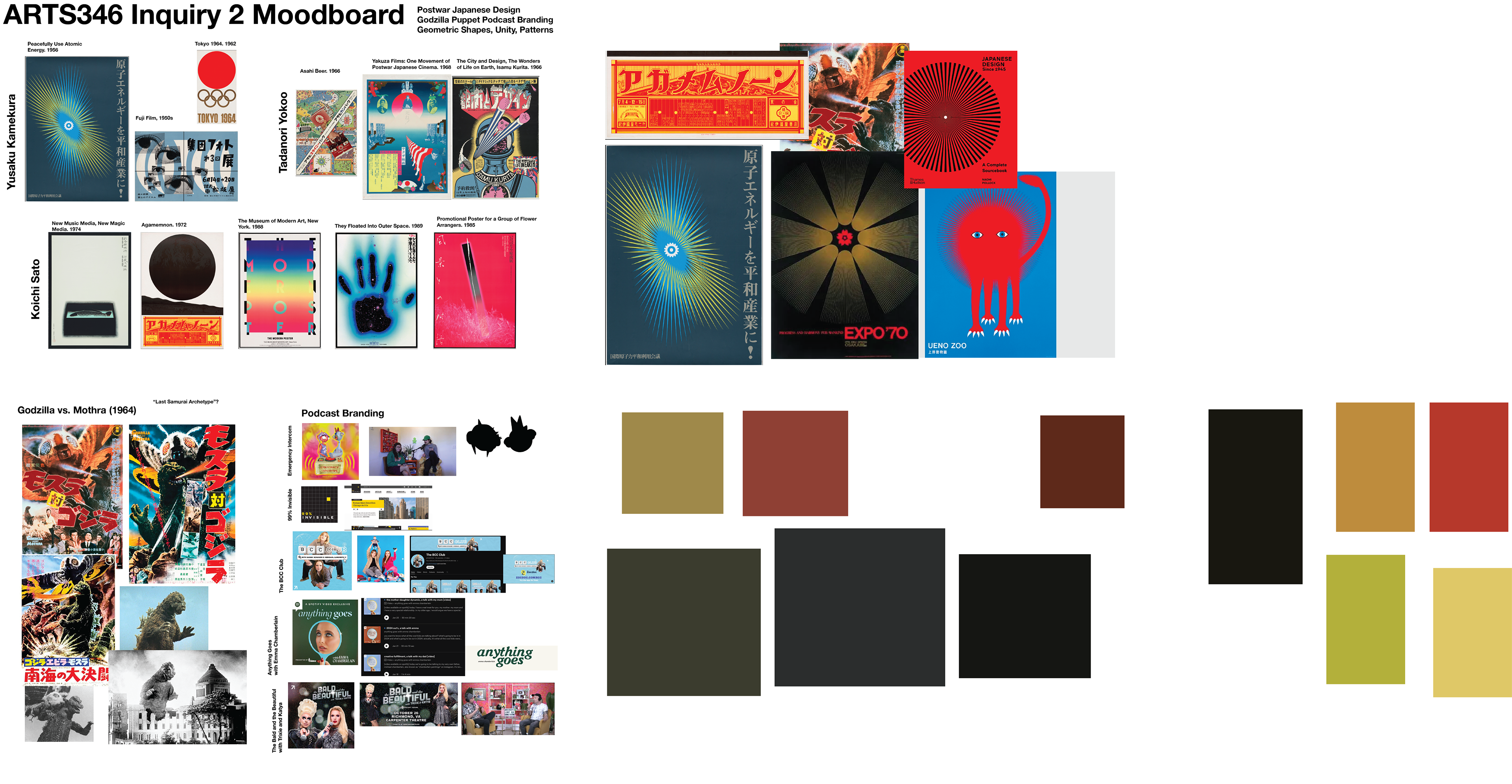
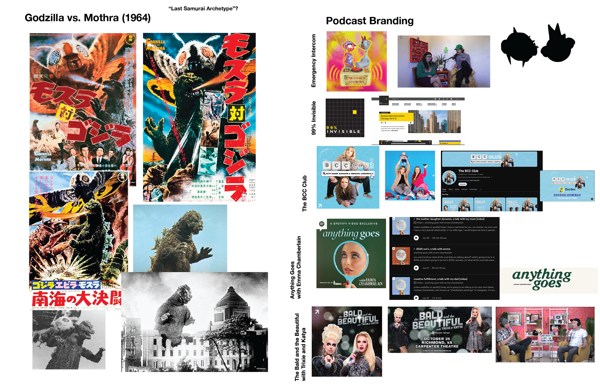
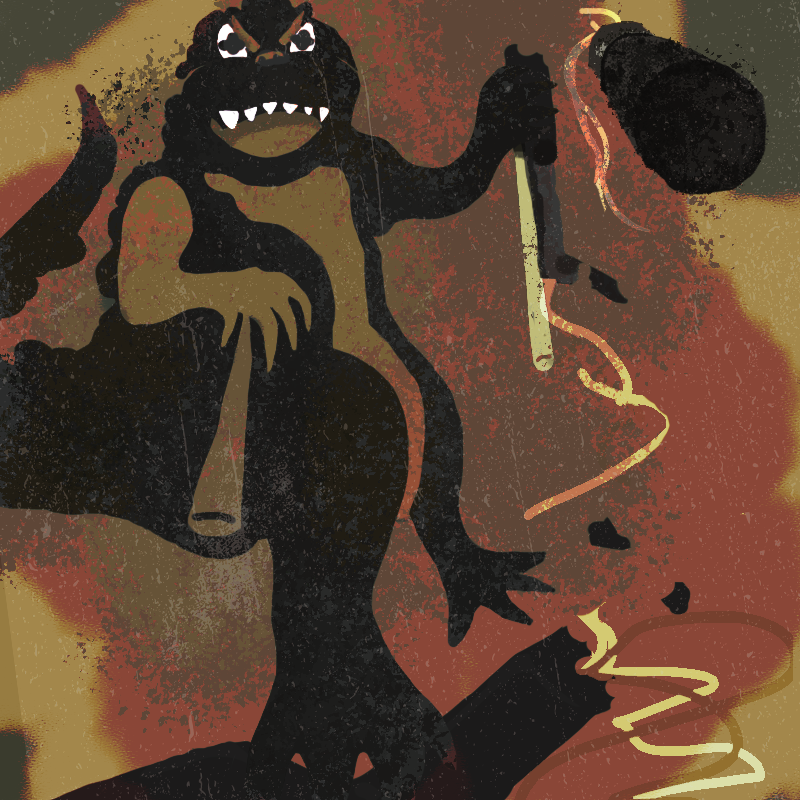
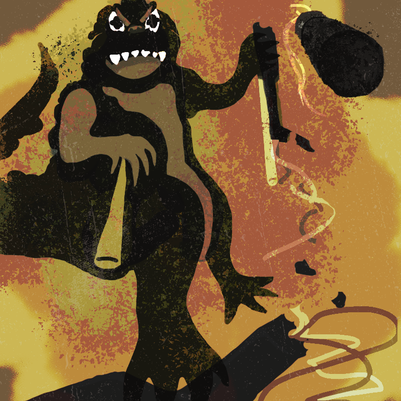
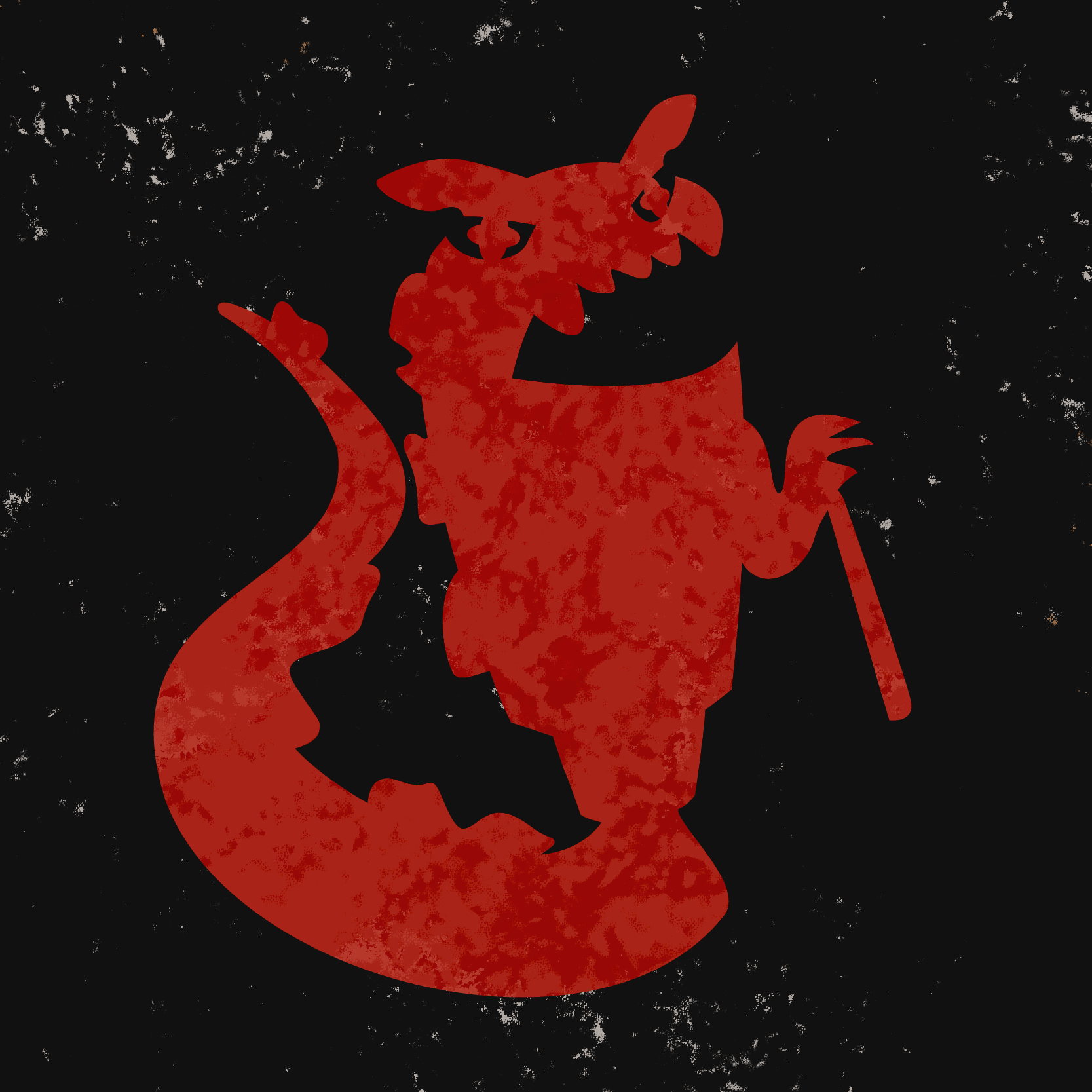
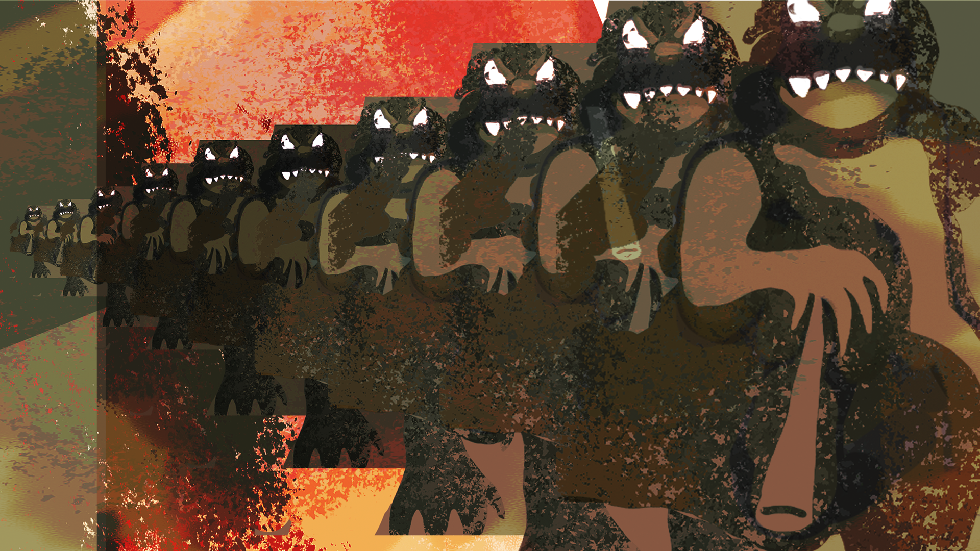
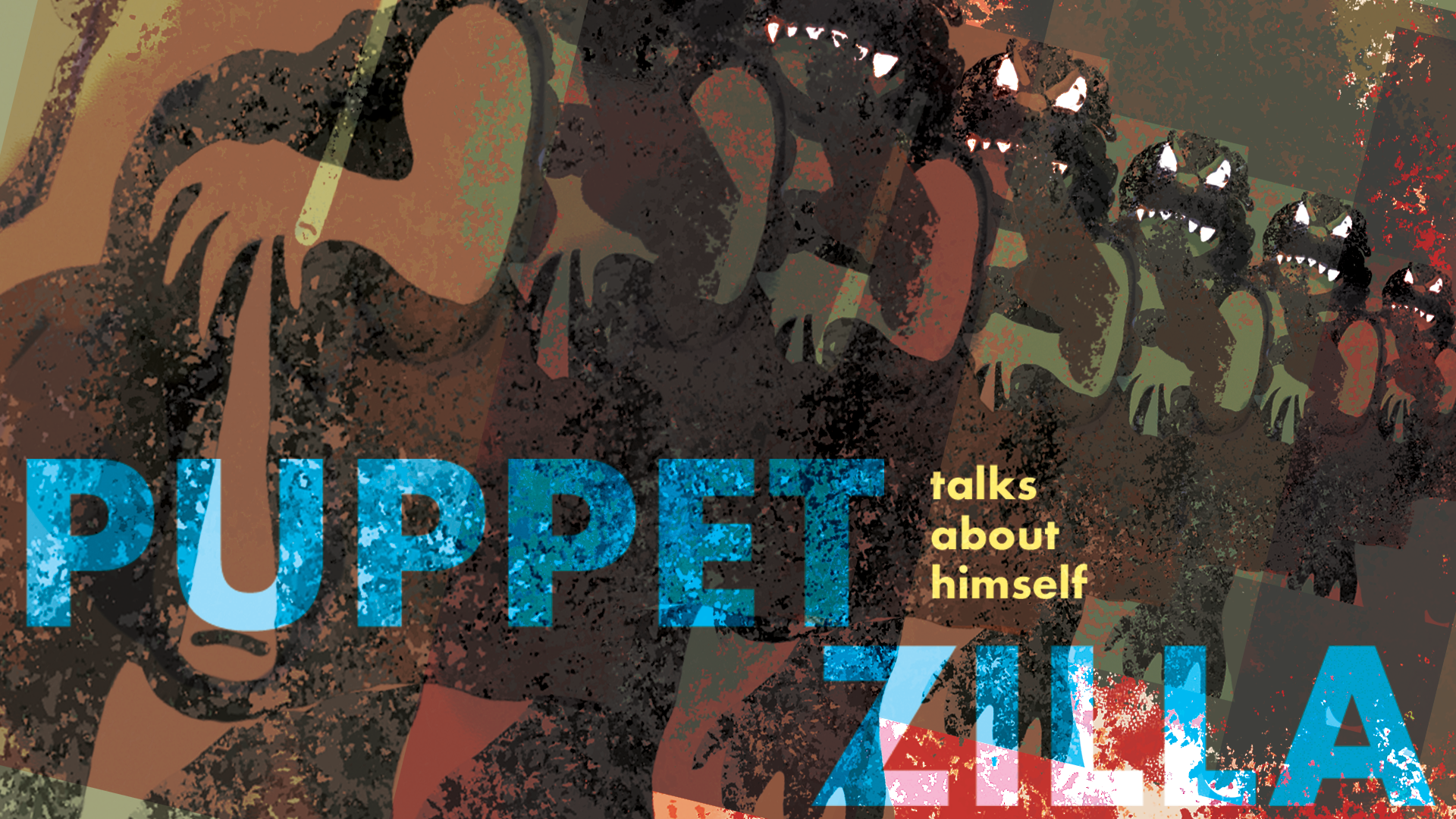
I realized that I had another project in rotation that held a design opportunity. My Advanced Illustration class has an ongoing project in which we are to rebrand Godzilla into an original and unexpected character concept. I had chosen to turn Godzilla into a Jim Henson-style puppet character who hosts a YouTube podcast discussing Godzilla films. Now what does a podcast need to develop an online presence and following? Branding of course. This became my new inquiry.
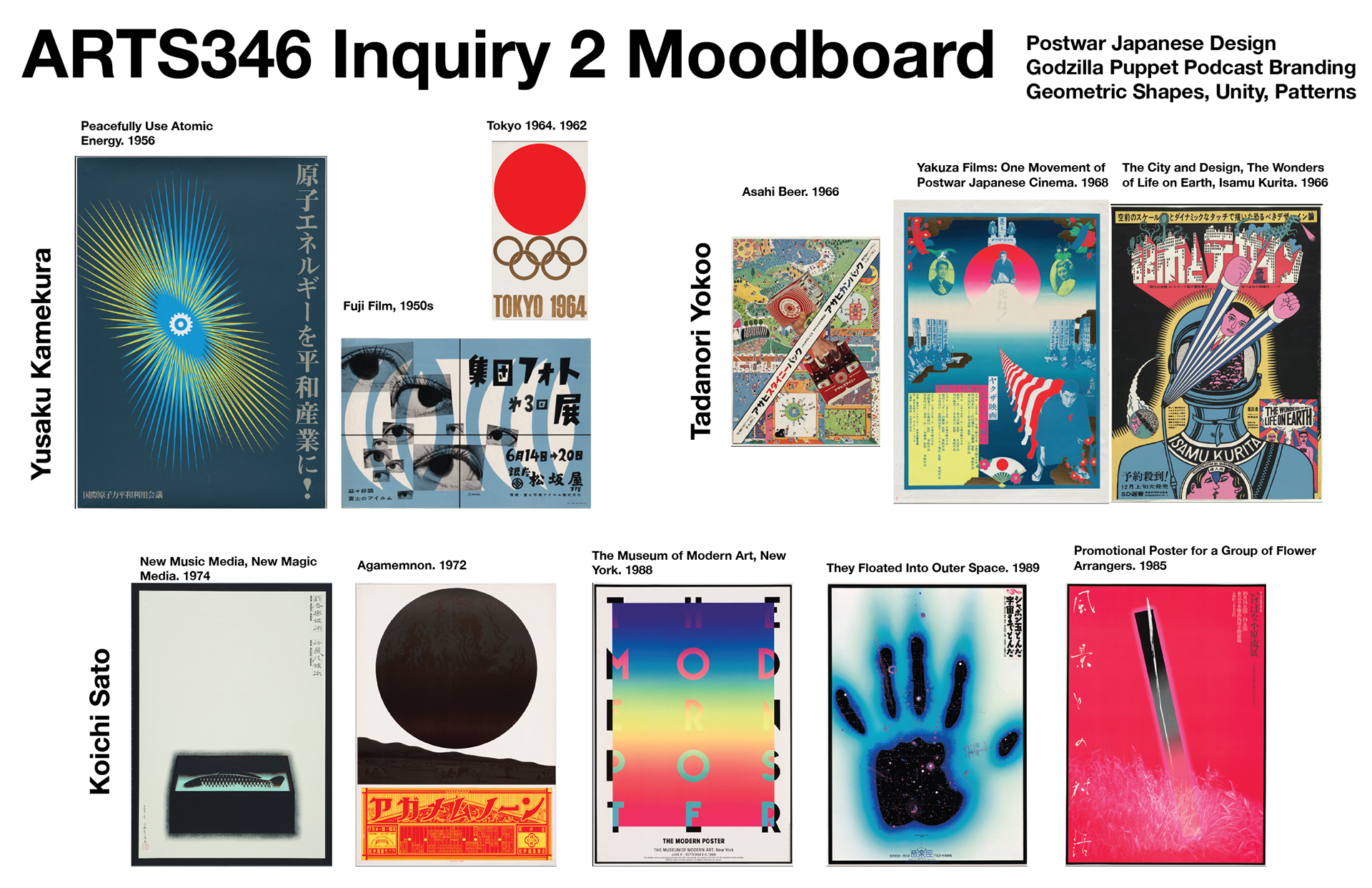
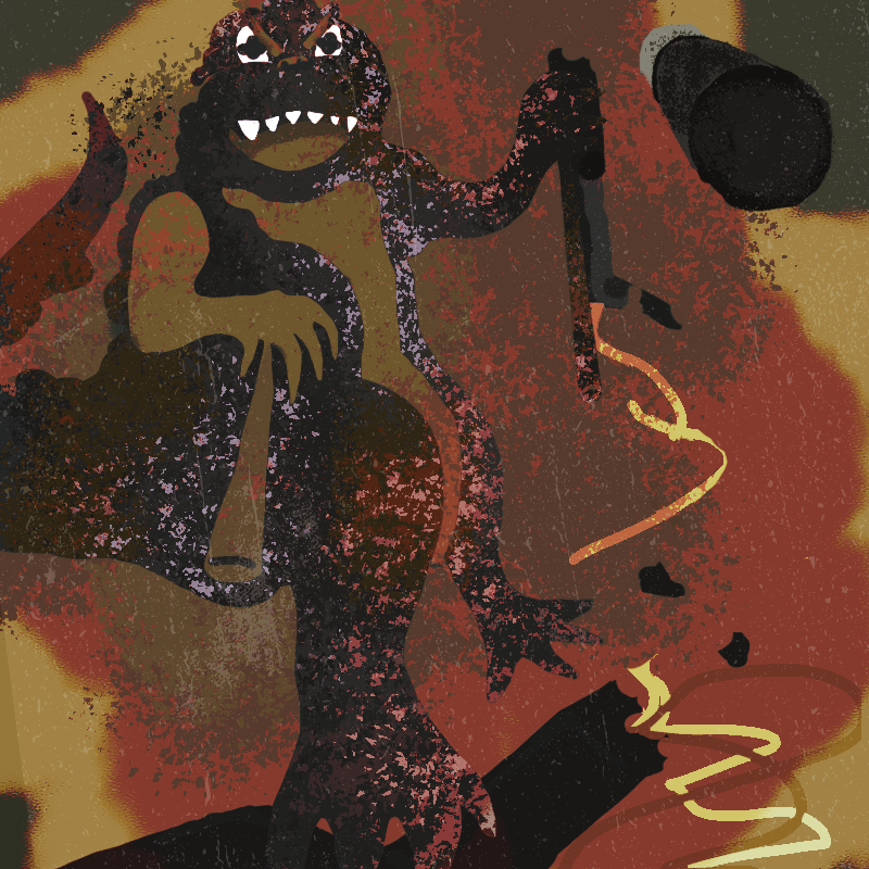
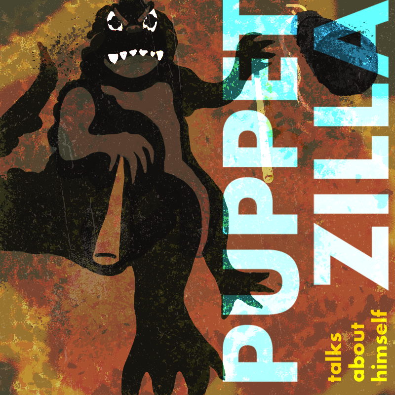
Now I've done branding for myself and hypothetical dentist-lead pinball teams (don't ask), but never for an entertainment entity. Looking to the podcasts I listen to was a key bit of research. Most of them also have YouTube video versions as well. Keeping with the Godzilla theme, I also took to my previous Illustration research. Godzilla's symbolism and cultural context lead me in the direct of Japanese postwar design, from which I took inspiration for vibrant, yet slightly muted tones and unifying patterns. My Godzilla puppet's design is based upon the 1964 film. Aside from any still frames I gathered, the movie posters also heavily contributed to my approach. I wanted to emulate the high contrast, dramatic shadows, grain, and pops of color overlayed by type in my designs. Being completely honest here, this was very difficult for me. I tend to have trouble wrapping my mind around how a visual style is executed and this was no exception. It took a lot of experimentation and different versions to get where i wanted to be.
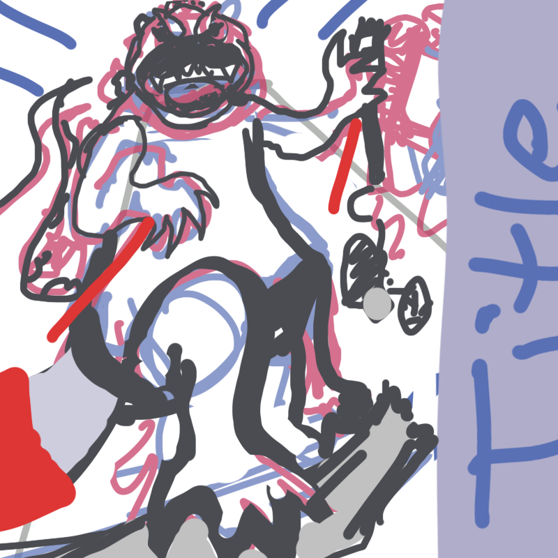
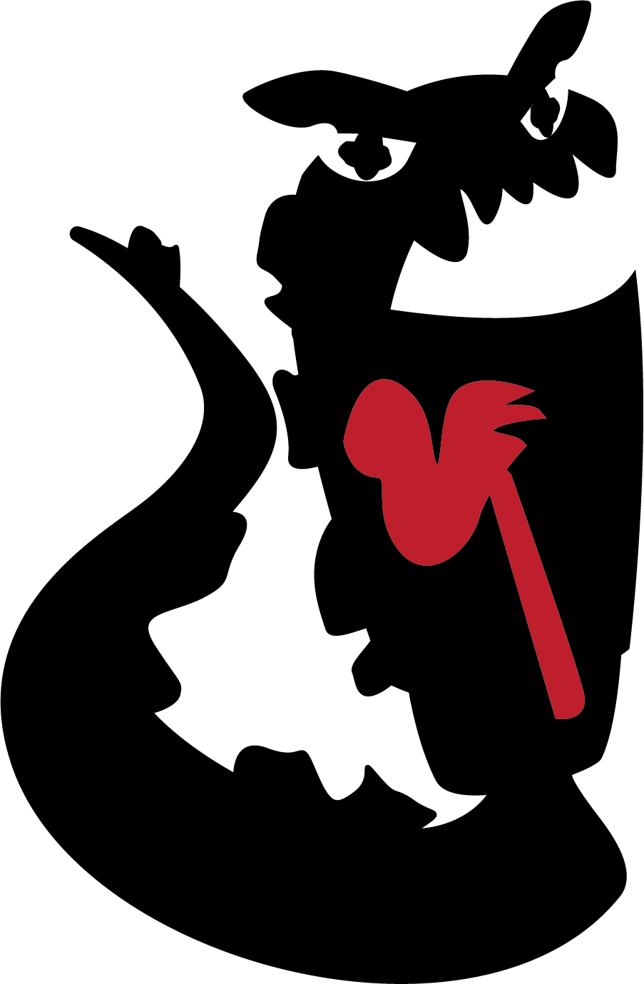
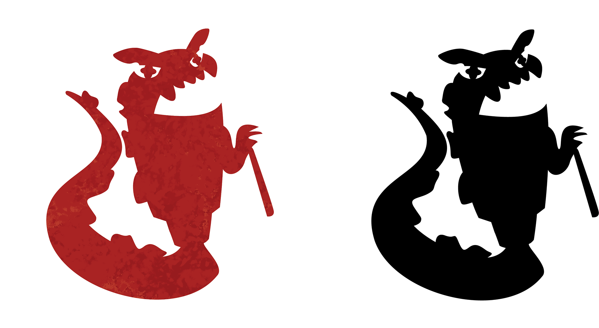
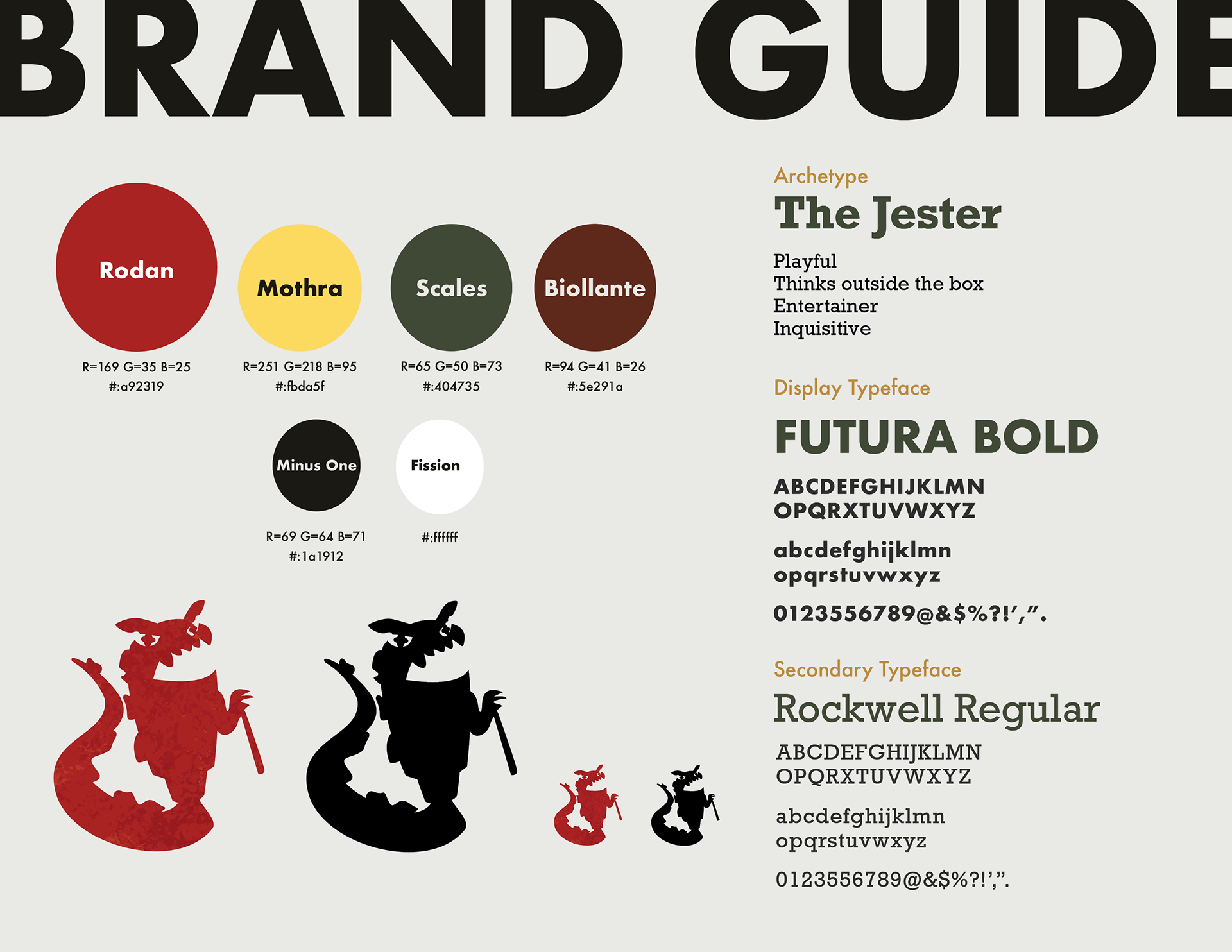
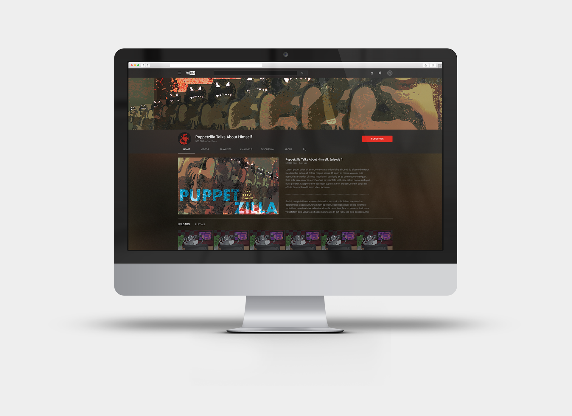
At the same time, I kept in mind what deliverables I wanted to produce. These were a YouTube profile picture, channel header, intro/advertising break frame, along with a streaming "album" cover, logo, and brand guide. Working in such a different format allowed me the experience of designing for unconventional dimensions. My goal was to display the comedic Puppetzilla in the dramatic, darker style of the film posters in order to parallel the content with the messenger. Though I had visualized multiple concepts, I did struggle quite a bit with translating them into sketches. Using some drawing fundamental class skills, I finally got the perspective close to what I was envisioning for the streaming cover. This presented a new challenge, though- actually emulating the styles I researched. I couldn't seem to wrap my head around how the poster style was achieved technically. This lead to lots of back and forth between layer modes and mark making. By the time I had a cover I liked, I felt a bit like I was running on fumes. Though I thought this would affect my ability to make a logo mark, I formulated an adequate design relatively quickly. Looking back, I think I'm surprisingly most dissatisfied with the branding board. I was fighting hard to make a color palette that worked with the subject matter especially. Either way, I'm glad I worked with what I could do and still finished out the project.
Though stressful and exhausting, this experience revealed something about my design interests to me. I think I just hate branding. Creating brand elements from scratch seems to be the most draining aspect of design for me. I felt uninspired and found myself not wanting to work on the project, which is unusual. Maybe it was just the subject matter, as it definitely left me uninspired, but it was just something I definitely noticed. Despite this, I'm glad I was able to to get out of my comfort zone and learn all of that from the project. It'll help me to navigate my work moving forward.
Media #2: Design Matters: Ping Zhu
Listening to Ping Zhu's journey through a career in Illustration was a very validating experience. Her discussion of how she talked about her work during critique especially resonated with me. I look at my own work in a similar way now sometimes, always thinking more about what I didn't do or did poorly rather than what I did and did well. Many of the projects I've worked on involve a pattern of getting too focused on details rather than the collective whole. This leaves me scrambling by the deadline, choosing between sleep and including a certain element. It's an exhausting way to both work and see your work, which is why hearing how she changed this view felt encouraging to my own workflow changes.
I really loved the quote, "Not everything can be used to say everything.". This is something I learn all the time while designing. Class critiques are often full of comments relating to this idea. I've had many where a classmate will say "This name sounds like it means this." and the realization is mutual throughout the room. This is why input from others is so important to the work you do. Others may see instantly what you never would have With experience, I've learned to think about content differently. Many characters or images are symbols for something else and it really matters how you use them. It can misconstrue a message instantly. Intimidating? Of course. But this is something I love about design. It offers so many ways to get a message, thought, or feeling to the viewer without necessarily needing to be explicit. Ping Zhu's explanations of her materials and process was also very pleasant to listen to. I've never used gouache paints before, but I definitely would love to try it out. She describes how delicate and permanent the material is, mentioning how it can't be erased if one messes up. I tend to love those kinds of materials. A lot of my best work happens by accident instead of when I'm actively trying to do something a certain way. Ink has been a big component to that. One of my favorite things is making random marks and textures with it. Black ink isn't easily corrected, which allows me to embrace mistakes and incorporate them. It's a piece of art and design that I hold dear, and I'm glad Ping Zhu shares a similar appreciation for those materials.








Inquiry 1/Media Review 1
Inquiry #1: BCBS South Carolina Insurance Card
When I heard we could switch our focus for an inquiry study from the introductory five-dollar toy assignment, I knew pretty quickly what I was going to focus my attention on. Last semester, I ran into the issue of not being able to locate the necessary prescription insurance information on my health insurance card while on the phone with Publix's pharmacy. I was in the process of changing medications, one that is very necessary to my daily functioning, and changing pharmacies due to the ADHD medication shortage. I was tapering off my old Zoloft prescription when Publix called asking for my information, and of course, they caught me on a day where the side effects had left me couch ridden. I had run out of my ADHD medication days prior and was waiting to find a pharmacy that had it in stock. So basically, finding the RxBIN number in a completely different company login was too much for my brain that day. Even the day after, it was not possible without confused Googling.
Since that hot mess, I've been thinking about how badly I wanted to design this card to be more functional. Finally, an opportunity came in the form of the first inquiry. My main goal here was to place all the necessary medical and Rx insurance information onto one card, to avoid frustrations from anyone also trying to locate a RxPCN or RxGRP number. Upon researching other cards (and looking at my old physical card), I learned that having all the information onto the 3 inch card. In order to properly display the information, I felt inclined to research the legal requirements for insurance cards in the United States. Long story short, very long and complicated process. To my surprise, these guidelines were very hard to find- at least in a version more recent than 2011. These may be instructions reserved for the actual designers of the materials, but I don't know for sure. With my 17 tabs of information, I was ready to start the actual design.
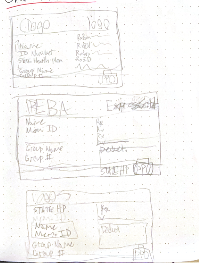
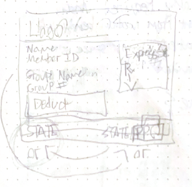
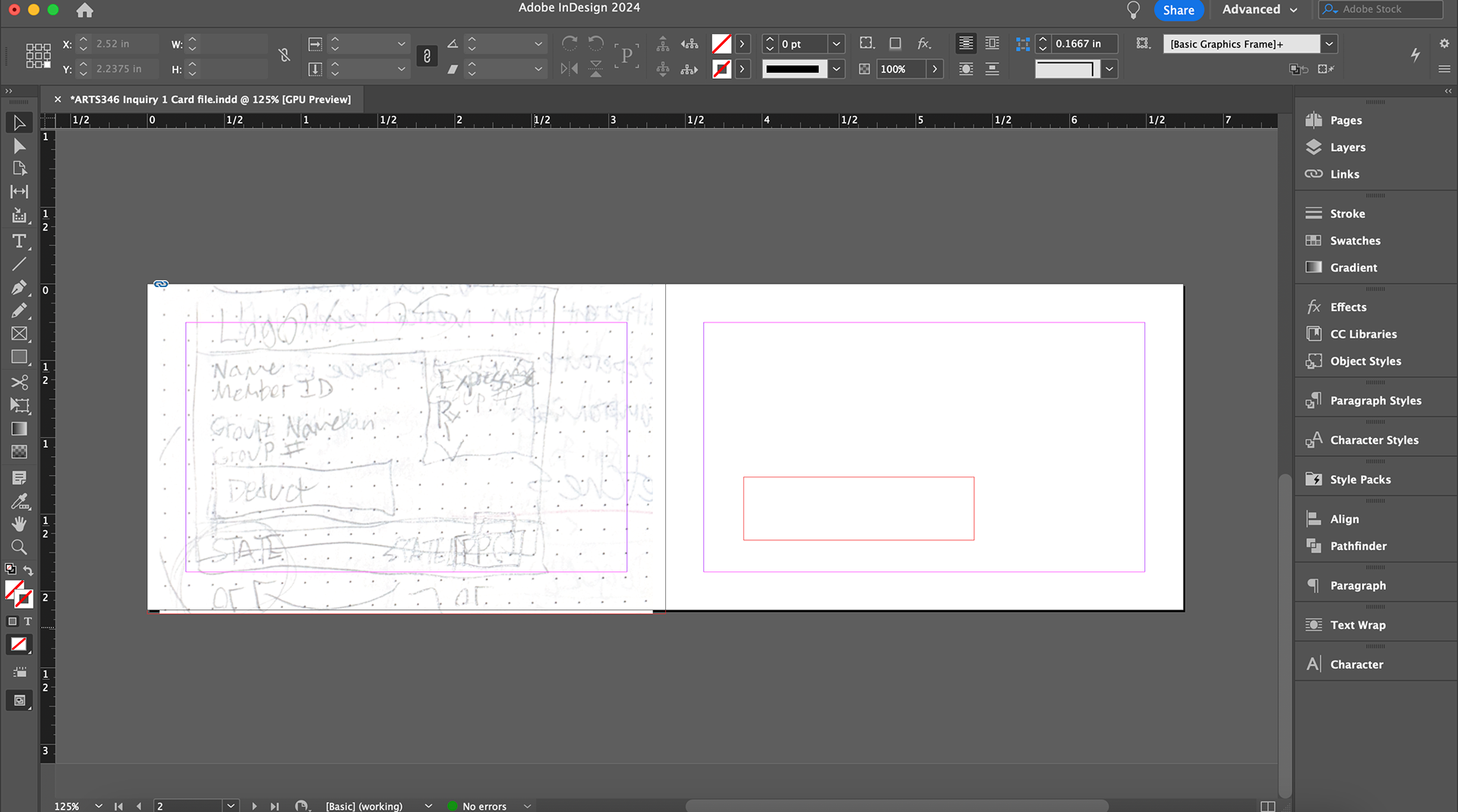
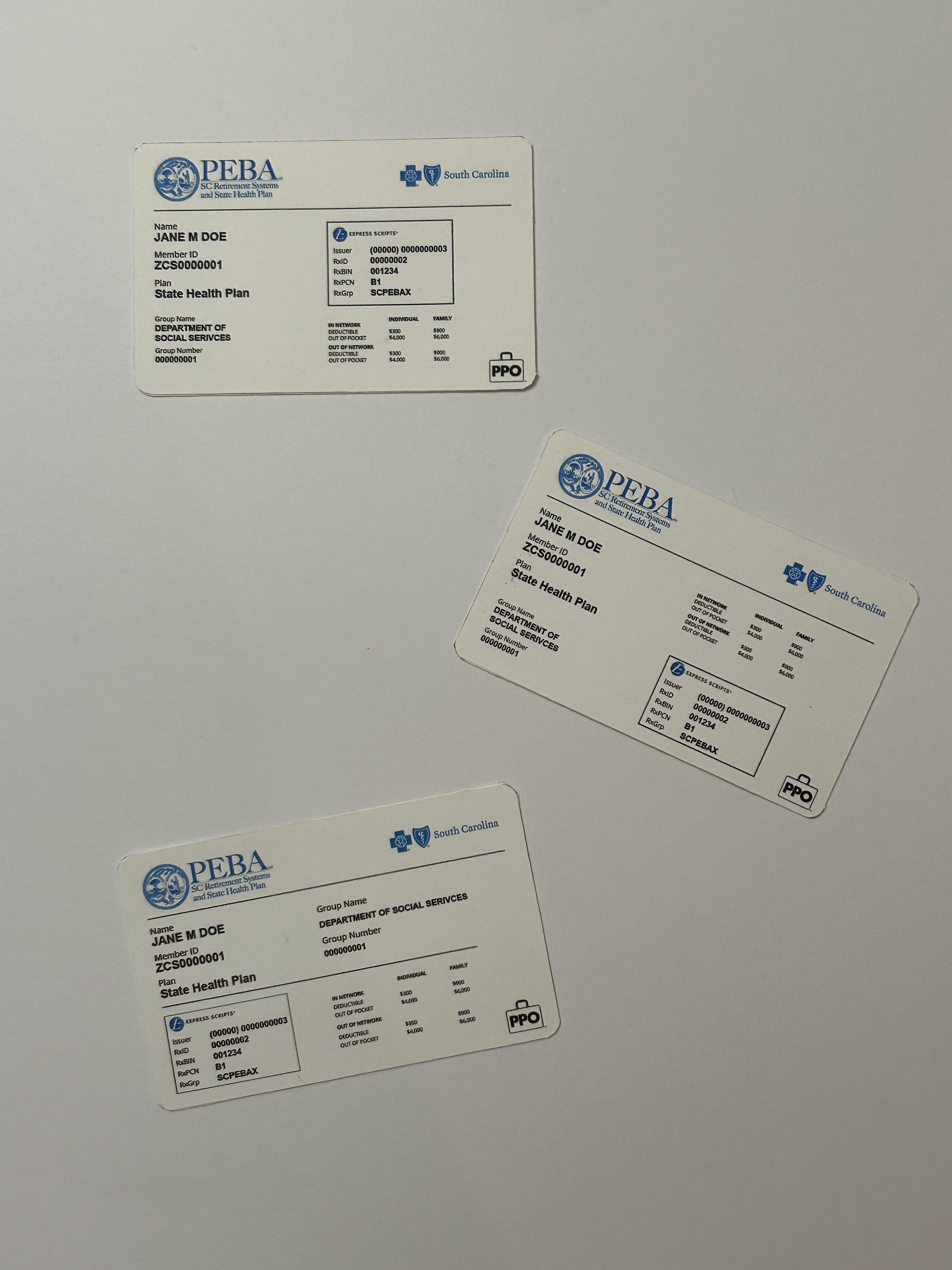
The elements required on the card are the policy holder name, member ID number, policy type, deductibles, company contact information, disclaimers, machine readable logo or mag strip, and PPO suitcase icon specifically for BCBS SC state plans. I was left with the group name/number and prescription insurance information. So overall, not a ton to cram onto the card. I kept with the WEDI guidelines of typeface choice and information layout, adding the missing information with substantial space in between, and kept all company logos. I made the choice of bolding the customer-specific information in order to avoid confusion from bad labeling. I also opted to box in the Rx insurance numbers, as I saw United Healthcare has done on their cards. I've been long breaking the habit of boxing things in while designing, but I felt it was more necessary here. It sort of feels like a card within the card, and adding the Express Scripts logo also cues to the viewer what external service their insurance is coming from (which I had previously been unaware of. I created three different layout versions, mostly because I couldn't decide which I liked best, but also for critique/feedback on which arrangement benefits the user the most.
It felt very satisfying to print these cards to scale. Holding them in my hand allowed me to look more clearly at what was working or not working. The most prominent change I can think of is definitely an increase in type size, as the currently size does get difficult to read for the deductible lists. I learned here that I had way more space than I thought to design the card. I will be sure to print test drafts earlier and more often going forward so I can adjust as I go.
Before this point, I had no idea how much I loved designing government documents. I could absolutely see myself trying this out again, The next time I run into a legal or healthcare system that I can't stand using, I know now that I have the skills to make a solid attempt at fixing it.
Media #1: 99 Percent Invisible Podcast
I previously hadn't heard very much about the CD longbox, but this podcast episode sparked quite a bit of interest in the container. So many artists hated this format to sell their music due to the excessive amount of waste, which I totally understand. However, I think Jeff Gold and Jeff Ayeroff's transformation of this space is a fascinating study in design.
These two took a design problem and created their own solution that eventually got a bill signed into law. They enlisted the market of R.E.M fans, who were also young voters, to do so. This is a genius solution for both the Motor Voter Act's lack of momentum to be passed and dissatisfaction with packaging CDs in longboxes. As these packages were meant to be thrown away afterward, there wasn't much concern for the card being ripped off and mailed to a senator, making it a perfect vessel for this campaign.
From a design standpoint, I personally really enjoy the novelty of the longbox. Controversial? Maybe. But visually I find the boxes extremely interesting. This has given me a new concept that I'll be considering for our next inquiry. I'd love to design a more functional longbox that serves a purpose, rather than just a vessel to be thrown away. Other than this challenge, the dimensions are something I haven't really seen before either. Challenging myself to design new album cover for an existing band could be a further exploration into this concept as well. I will absolutely be researching this further.
