Final Blog Post: Project 4 Reflection 12/01/2023
The Dutch Folio + AR project brought forth a lot of challenges for me and my design process. While frustrating and exhausting, I feel satisfied and fulfilled with what I've accomplished now that I'm at the end of the project. Troubleshooting and crafting this work by hand was a really productive way for me to learn. When you're holding the design in your hands, you see the successes and mistakes a lot more clearly.
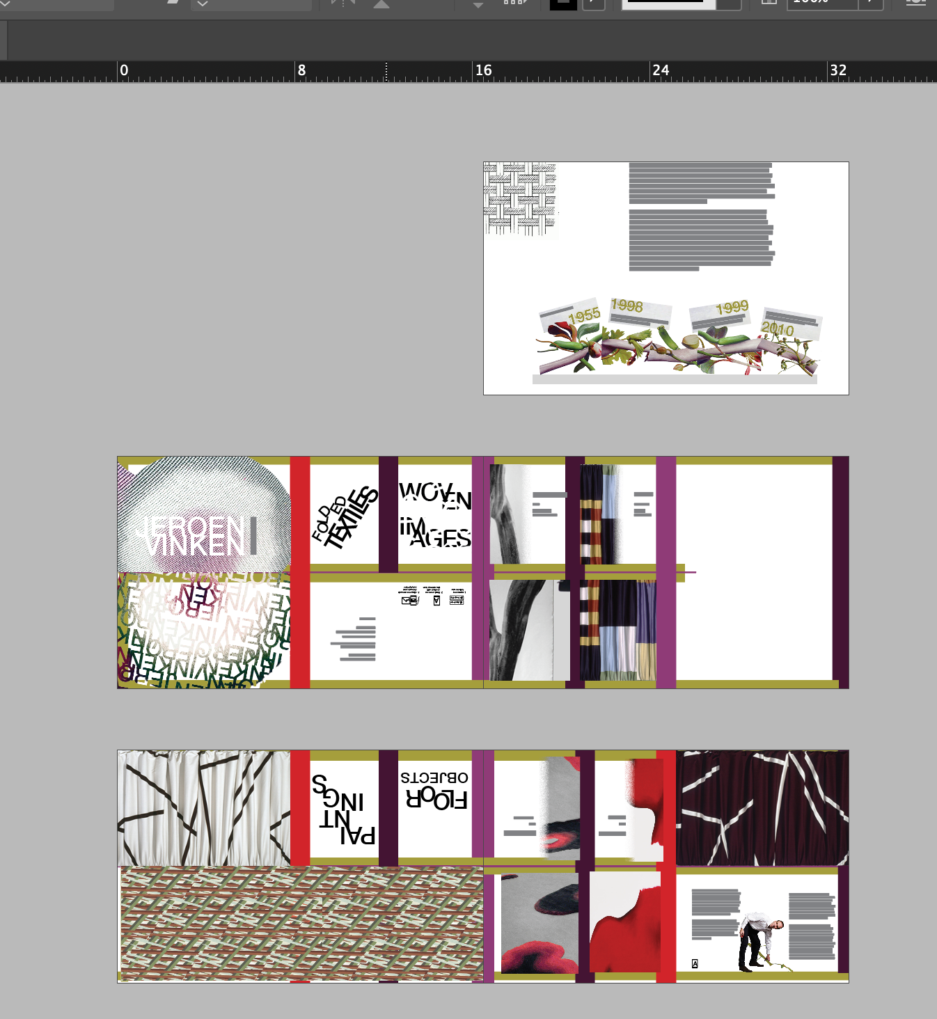
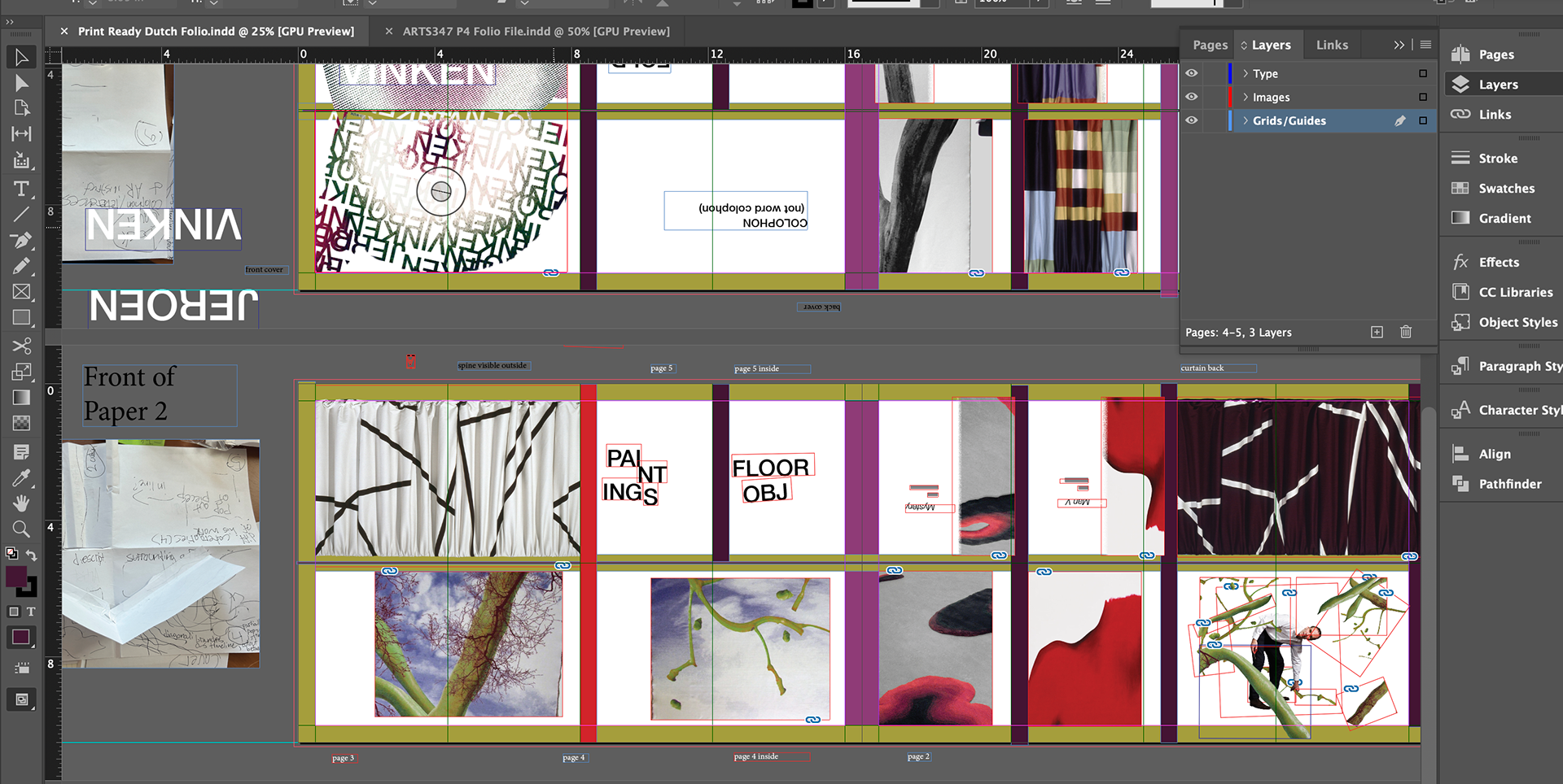
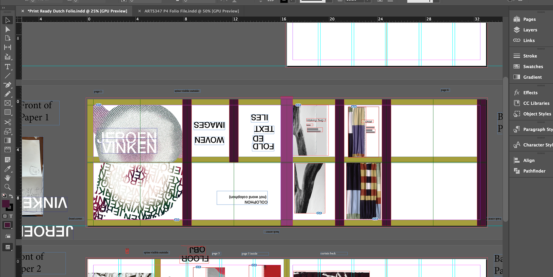
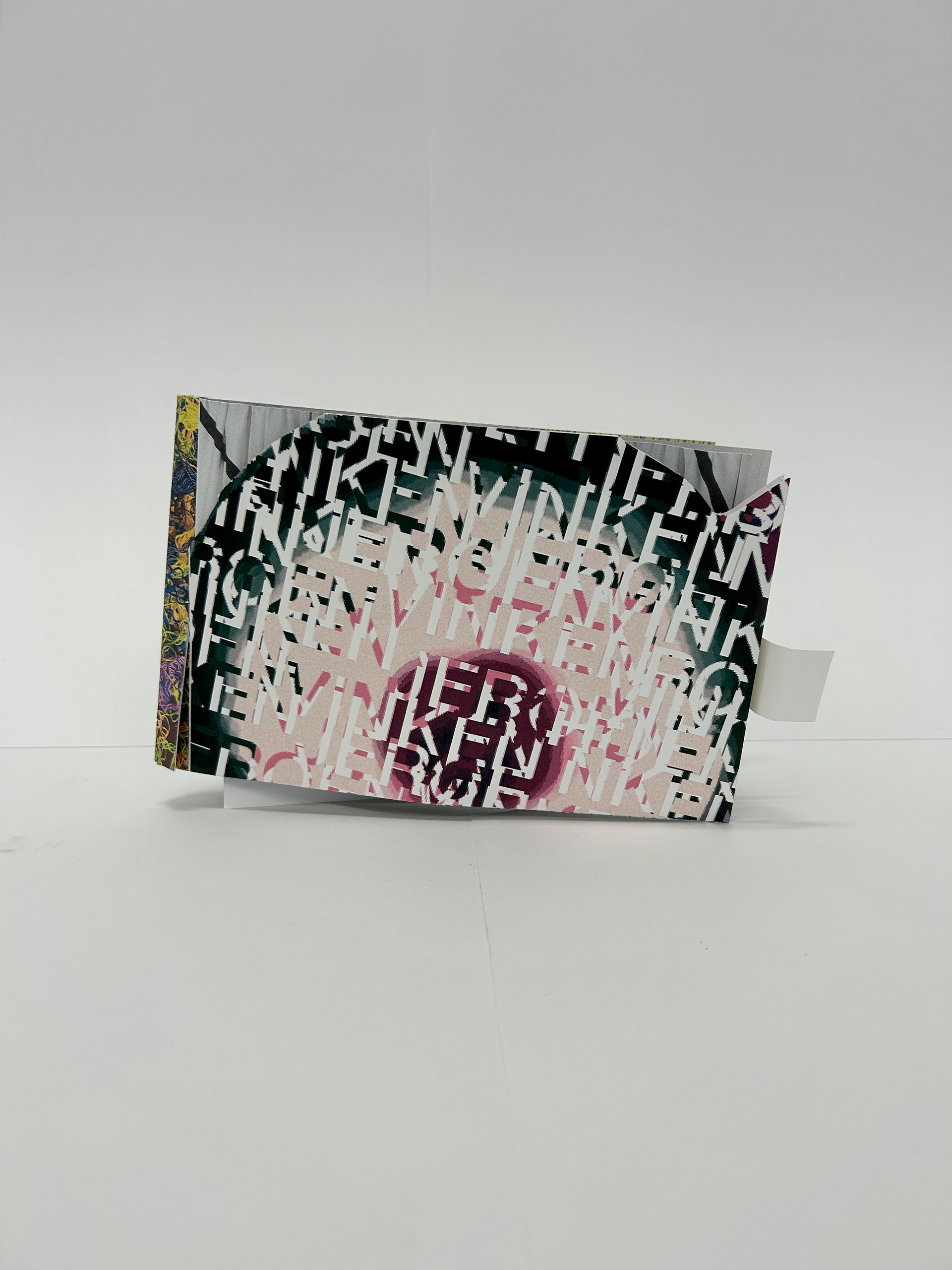
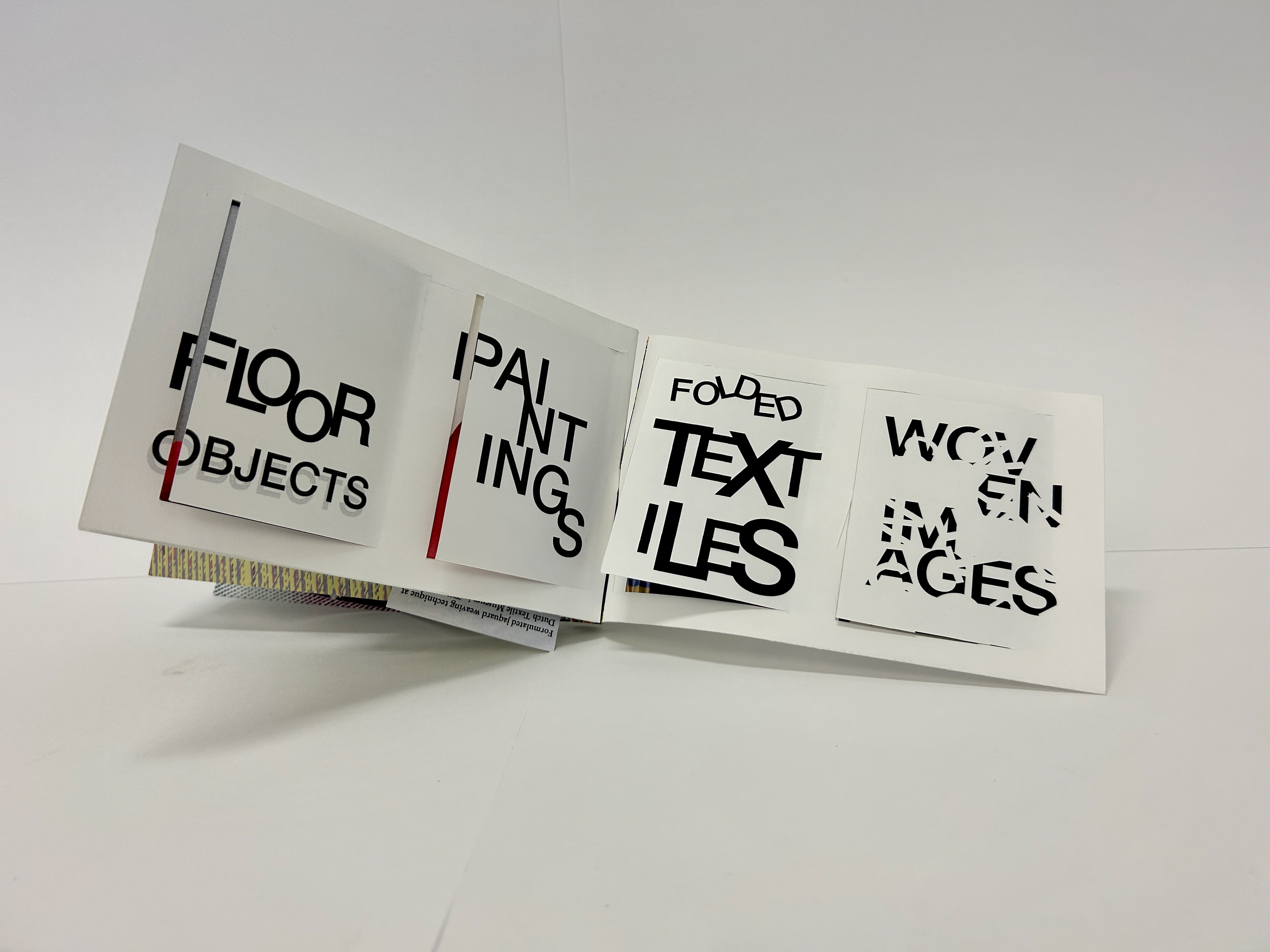
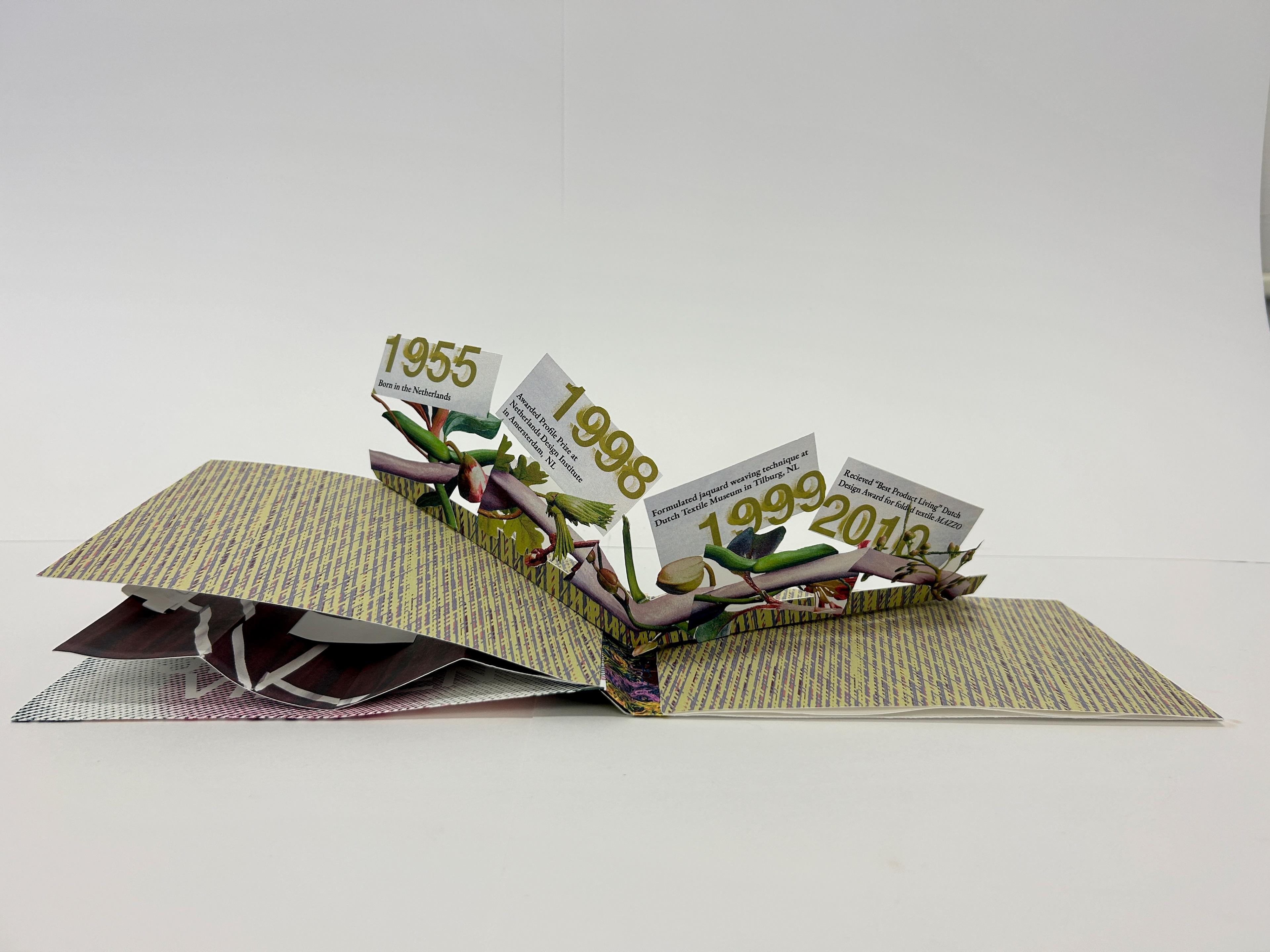
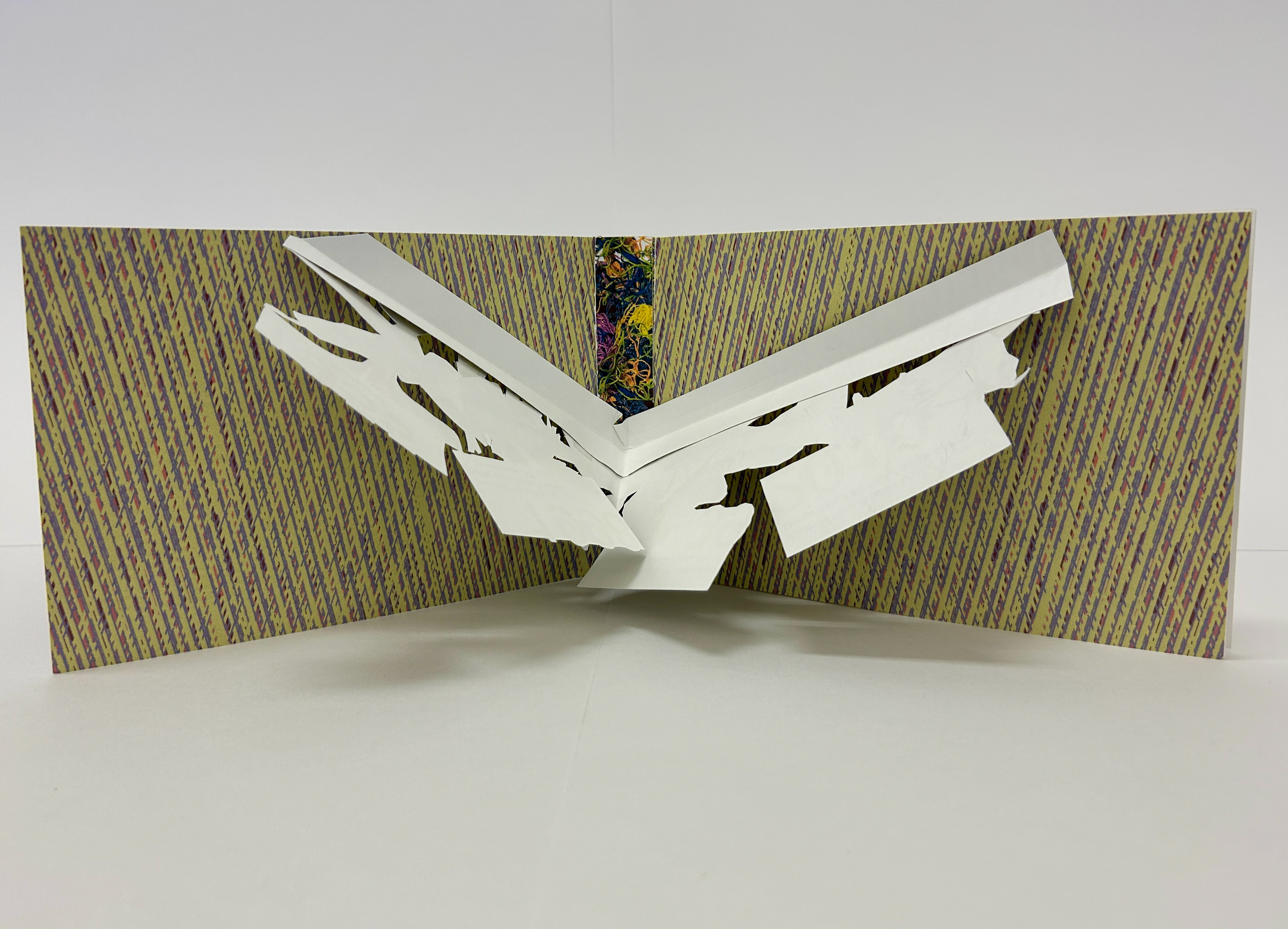
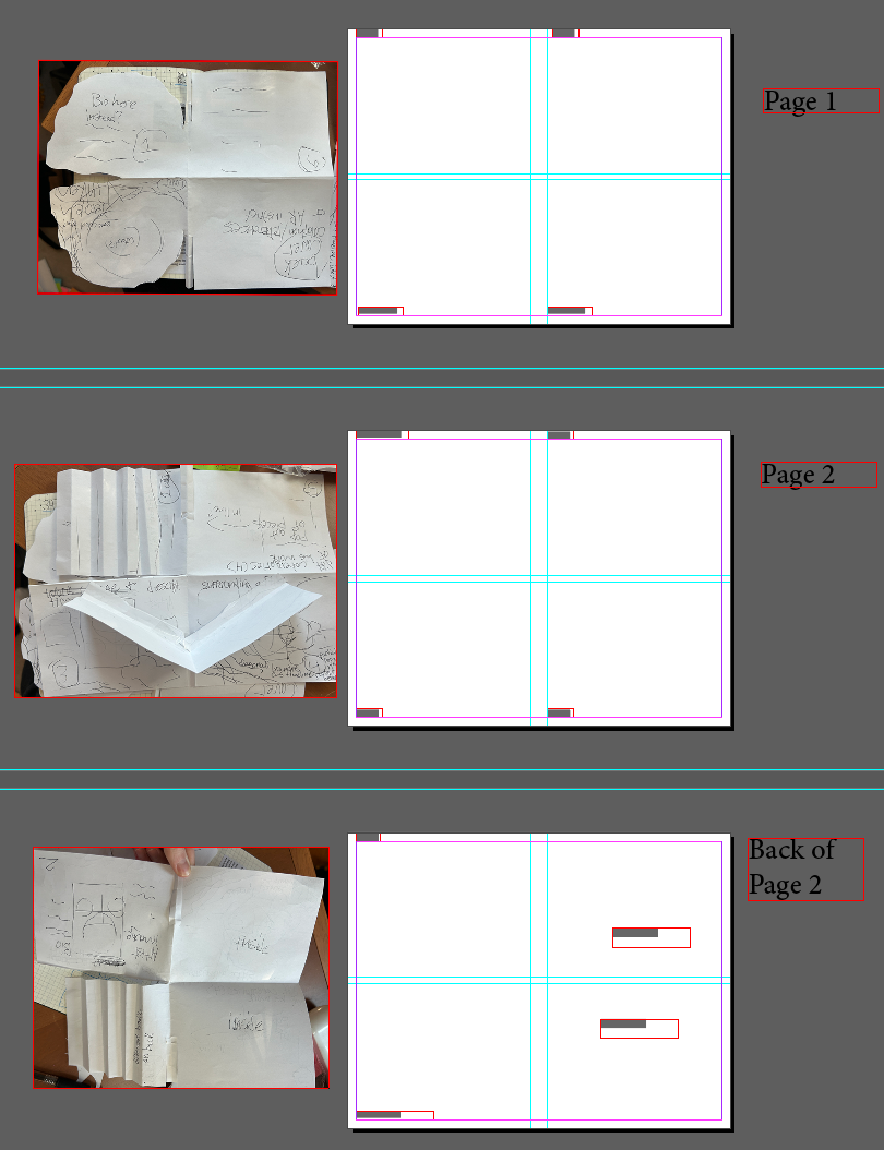
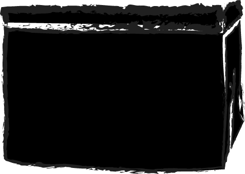
My start was pretty slow at the beginning. It felt as if I was completely drained of ideas, especially for a medium that I work with extremely rarely. I had a few basic sketches at first, but still no design by the time our first general critique came around. I don't remember much from how crowded and busy my brain was, but I definitely remember the panic. Thankfully one day, it suddenly clicked. I was mostly struggling with how to fold the book in a way that was creative and interesting. By experimenting with dummy drafts, solving the problem physically seemingly made the wires in my brain connect. I would try a method, and if it didn't work, would toss it to the side and grab another paper without a second thought. Eventually, I got to a binding that uses slot cutting lines on the spine. It isn't anything crazy, but the folio holds without tape. I was really excited about that.
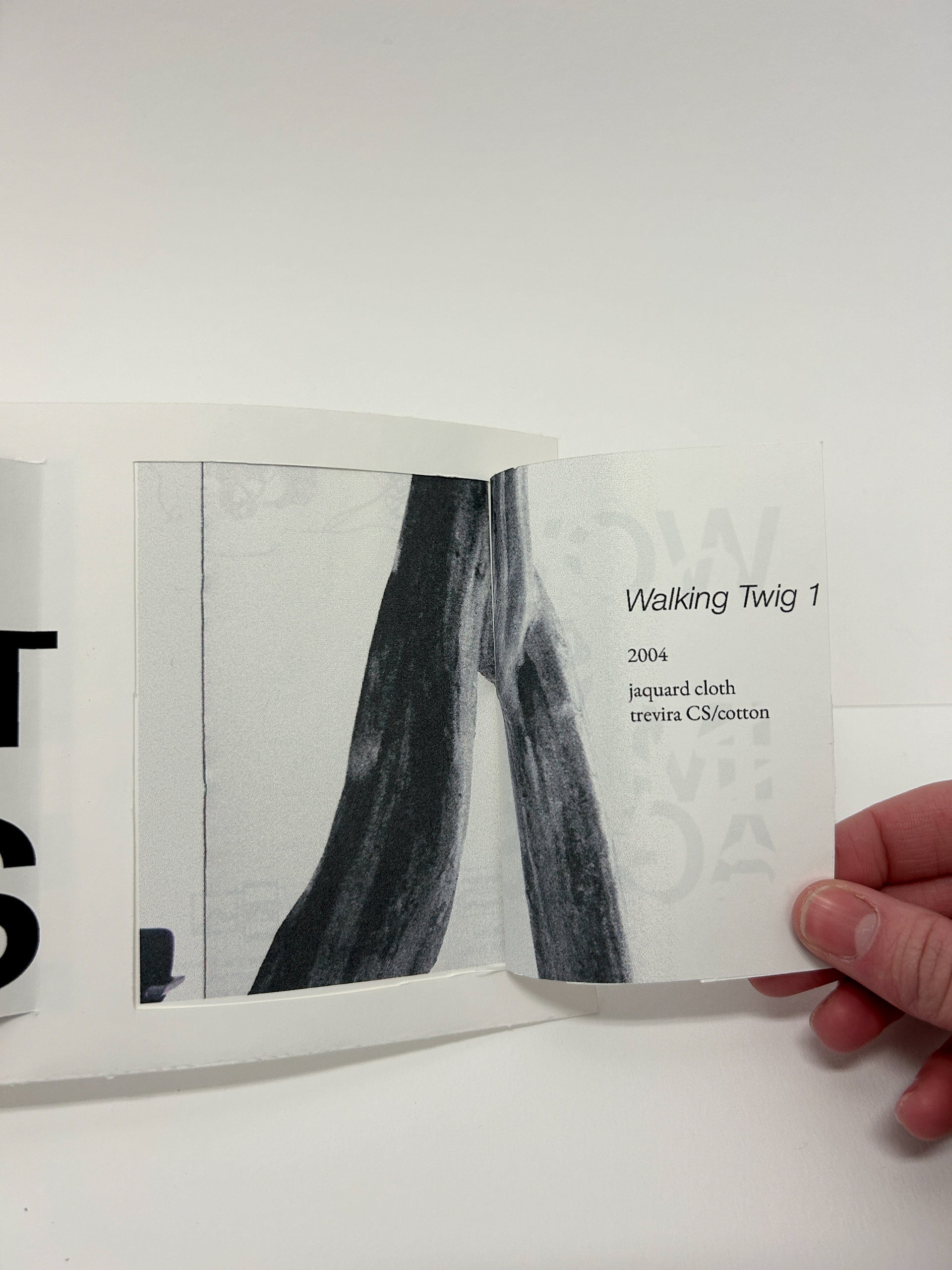
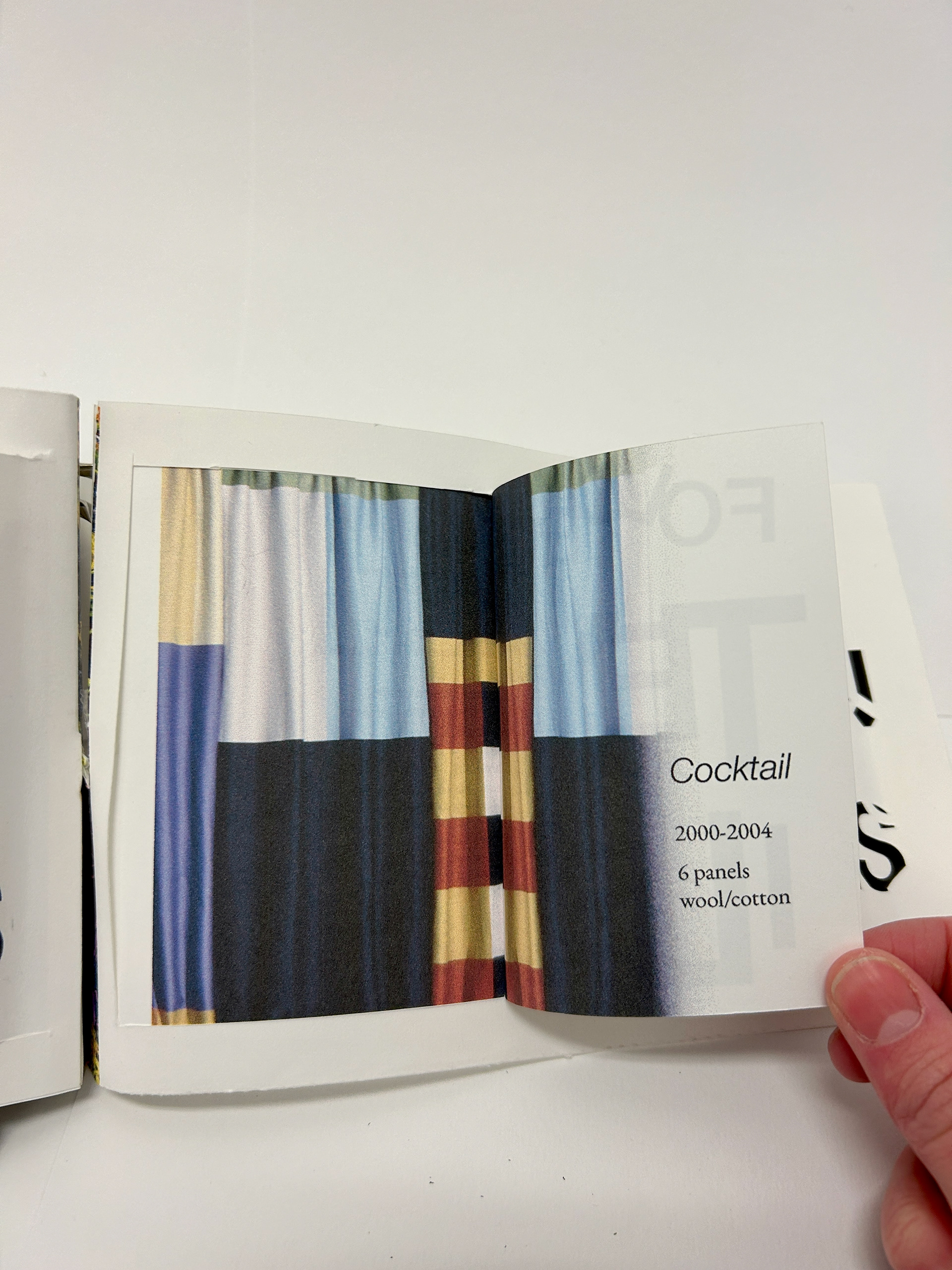
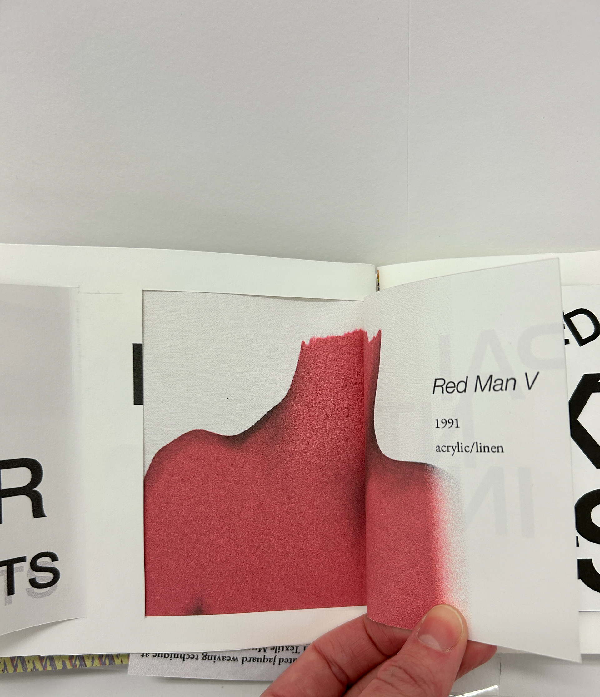
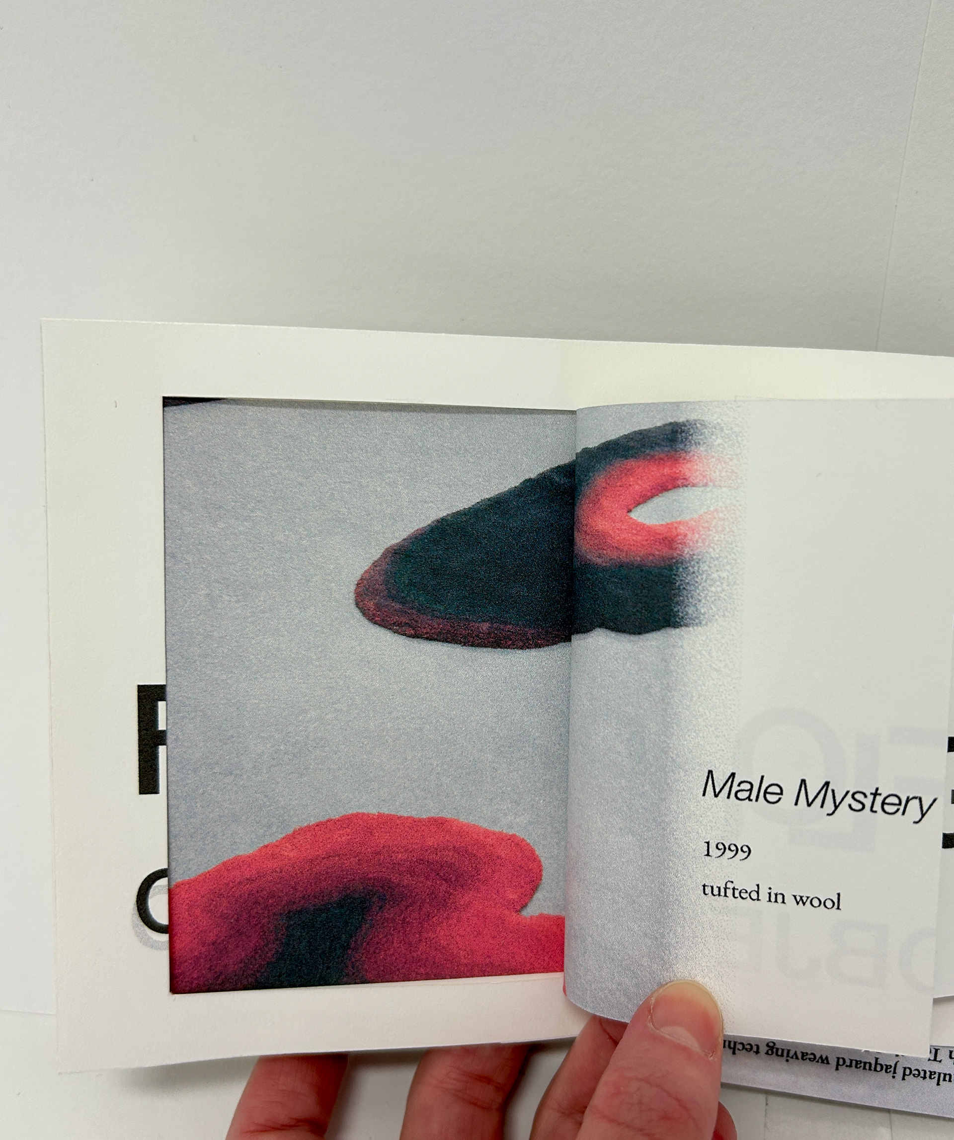
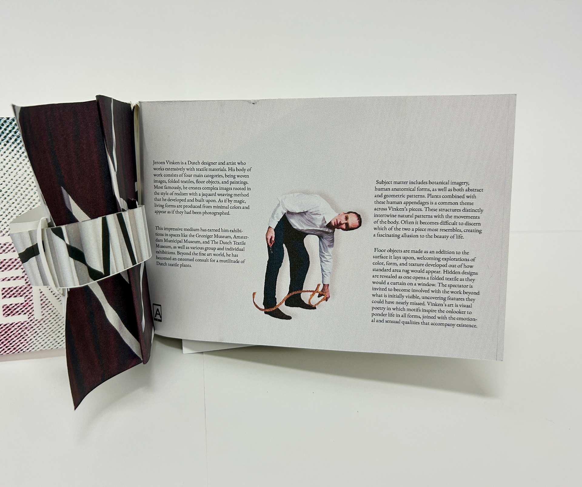
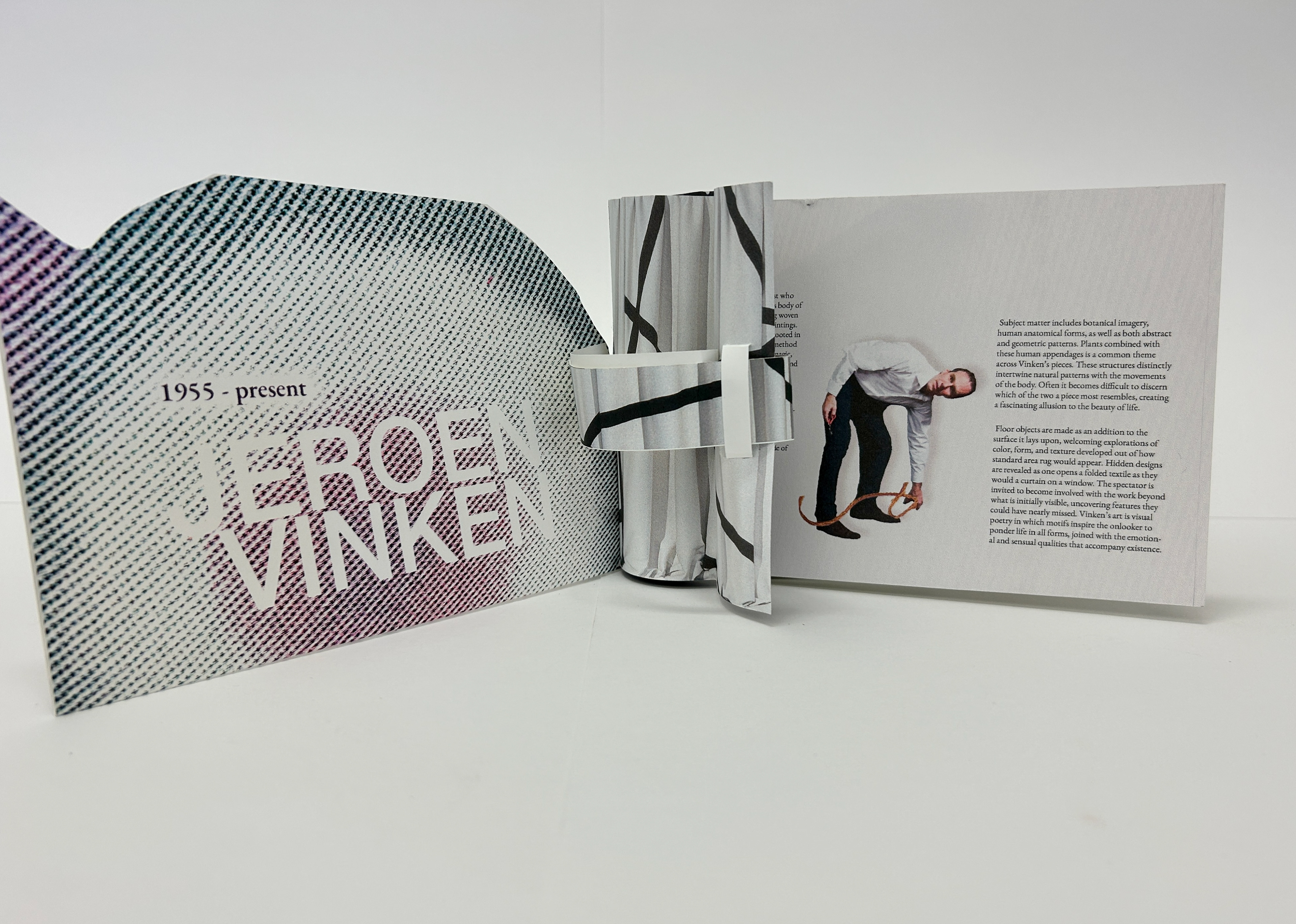
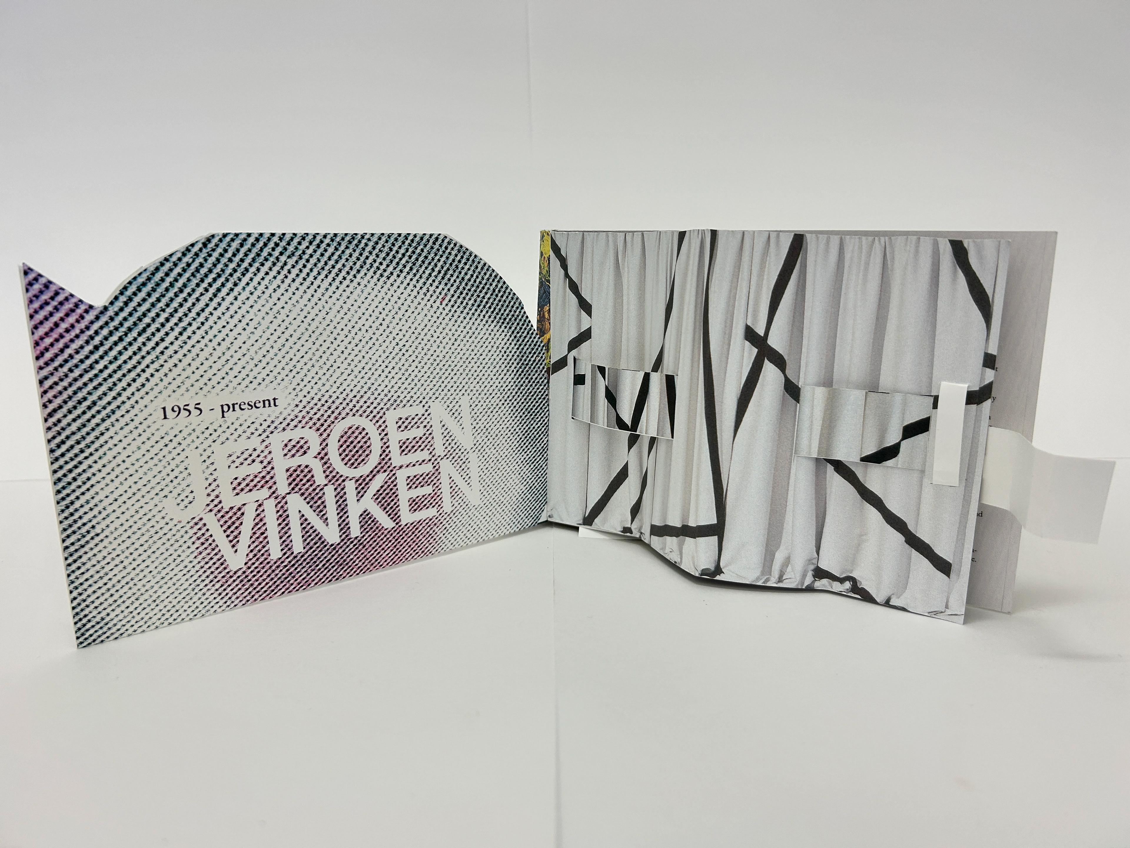
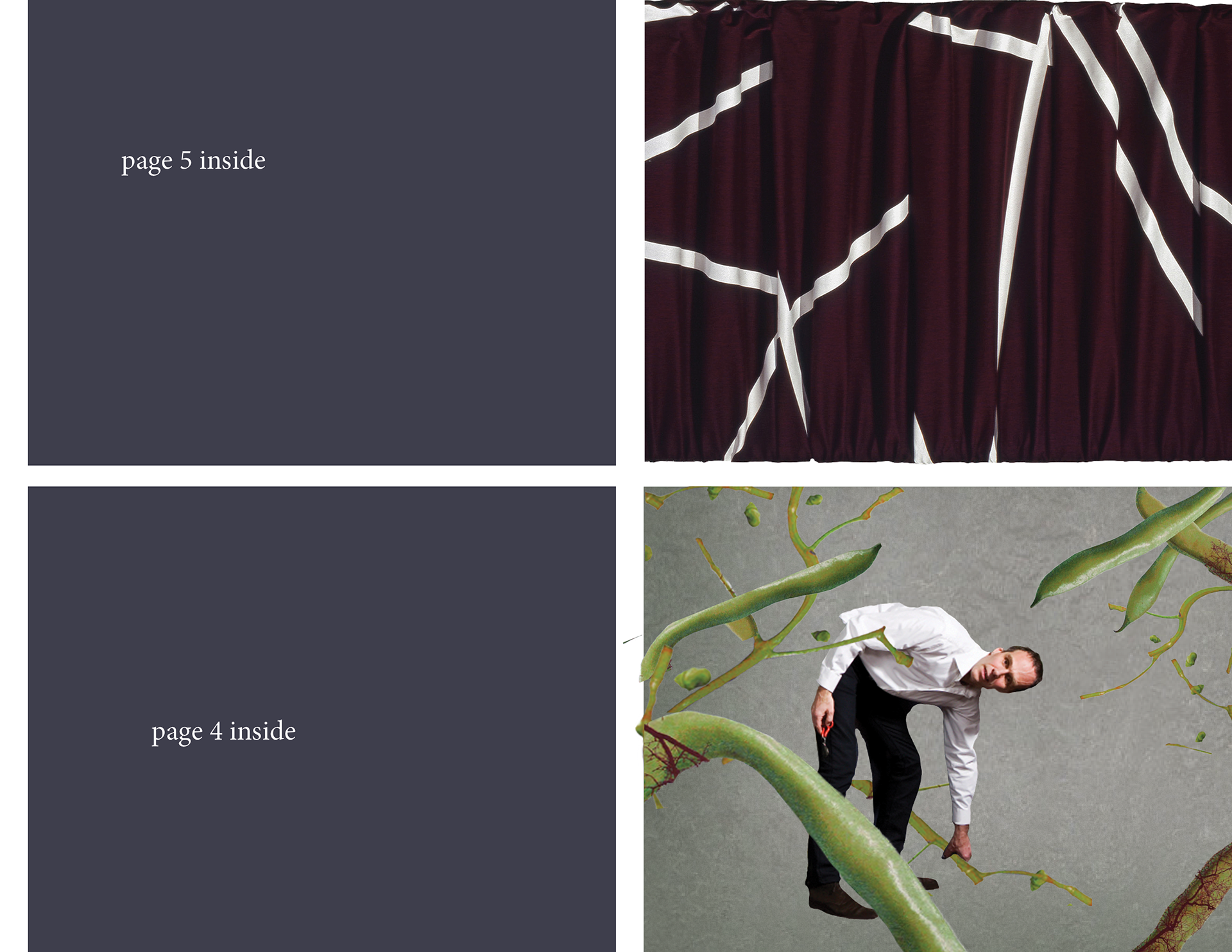
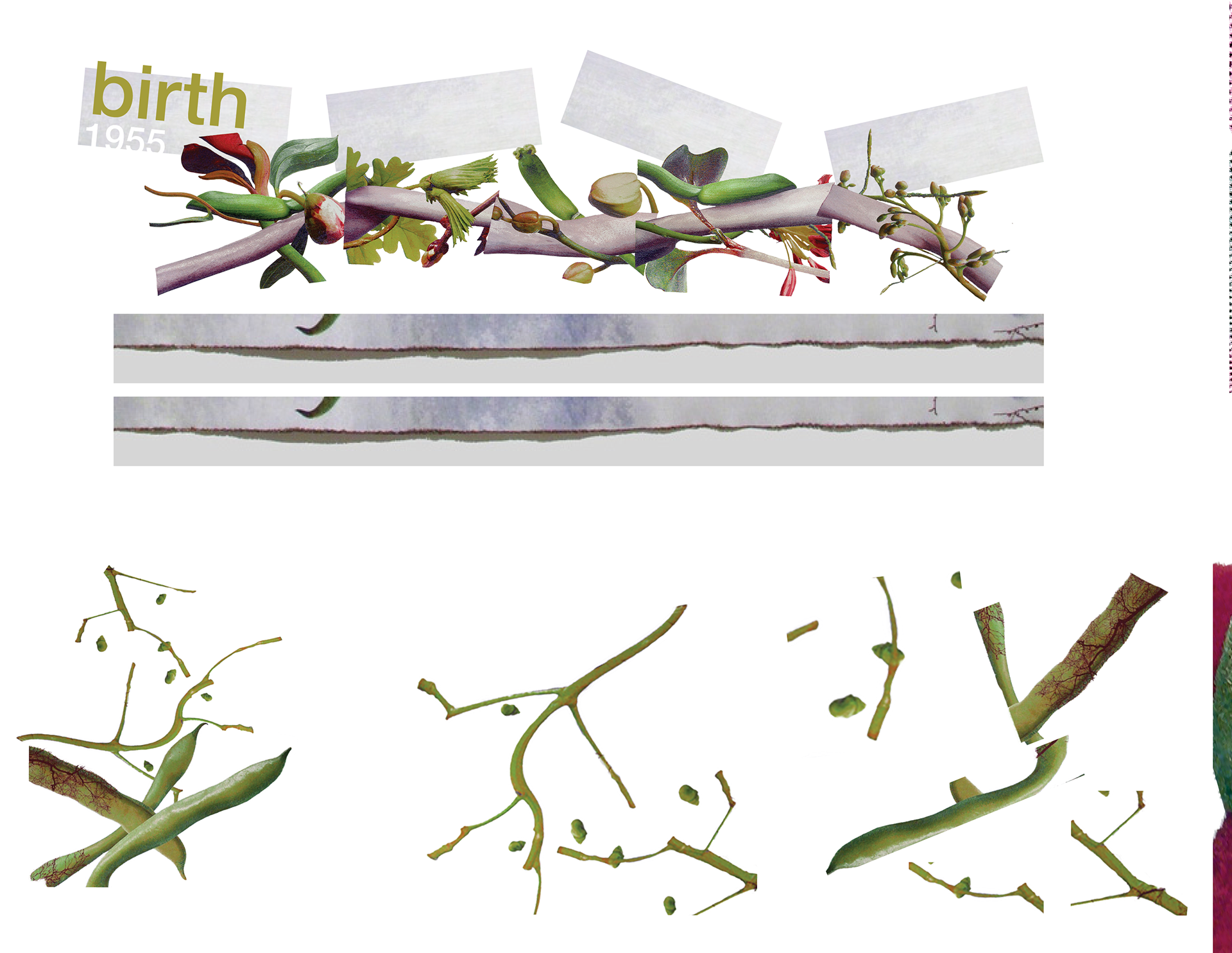
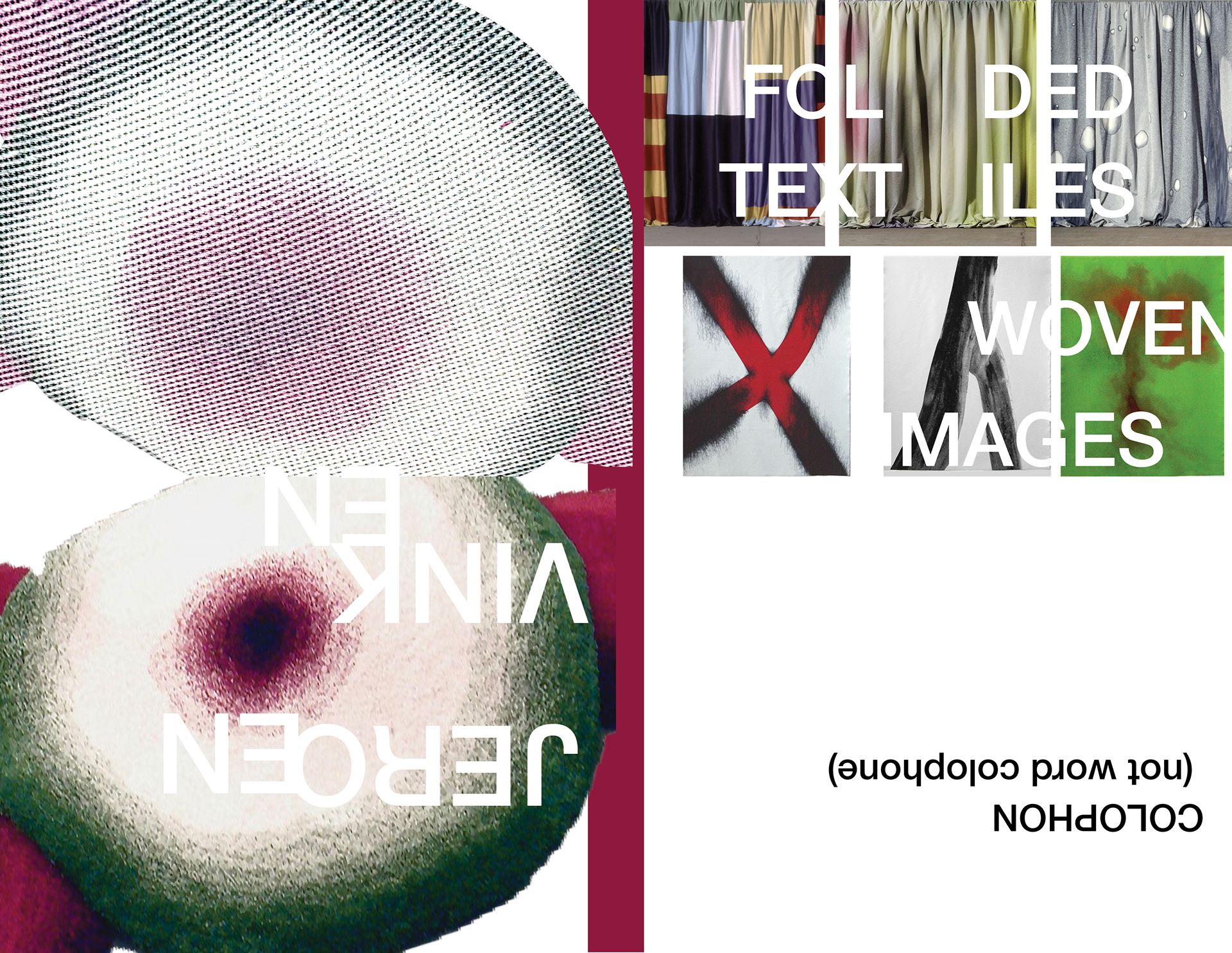
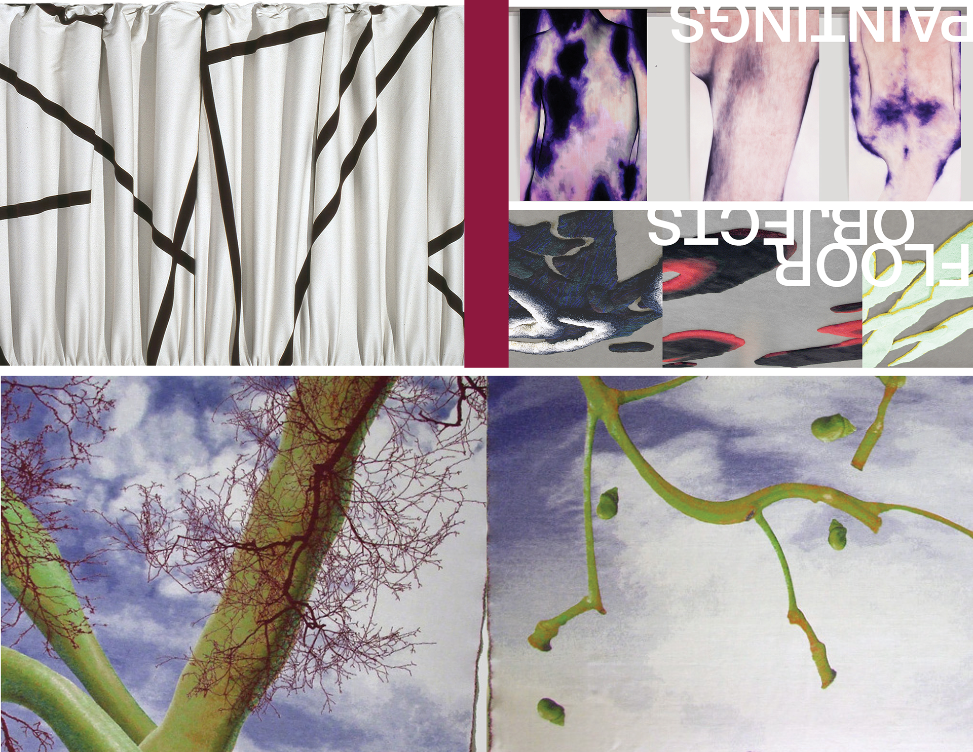
Subject matter wasn't too difficult after a lot of brainstorming and website exploration. I was especially enamored with Jeroen Vinken's floor objects that resemble decorative area rugs. My favorite one definitely needed to be the cover. Adding a carpet backing texture on the first page was a way I intended to help the reader guess what the object could be before reading further. Since the original image was so low resolution, though, I eventually decided I needed to make edits that masked this without throwing out the recognition of the design. The solution eventually arrived with a repeated type pattern style I've been using lately. With a lot of experimenting of photoshop, the final type combined with the image was really a successful accident. I duplicated the type layer and the residual mask had a fascinating. broken effect, which I felt was perfect for my vision.
Engineering and assembling was a whole other mountain to climb. It was almost entirely time and measurement for me. Translating document measurements of die cuts and folds to the physical paper fried my brain for a while before I got it right. Nothing in the world beats putting the final piece together and having everything line up. Audible cheers were absolutely present. One thing I forgot though, likely due to how rarely I had printed before this semester, is to not print it the night before. I fought with settings and correct paper feeding for print on the back for more hours than I should have, combined with careful assembly, earned me two 4am bedtimes. I basically need "Don't print the night before" tattooed on my arm. While frustrating and panic inducing, at least I 'm reminded to double however long I think it'll take to get a project finished. My revised draft went a lot smoother the second night, thankfully, so revision and careful craftsmanship took the majority of my time. I'm so much happier with how the second run turned out. It feels cleaner and marginally more successful.
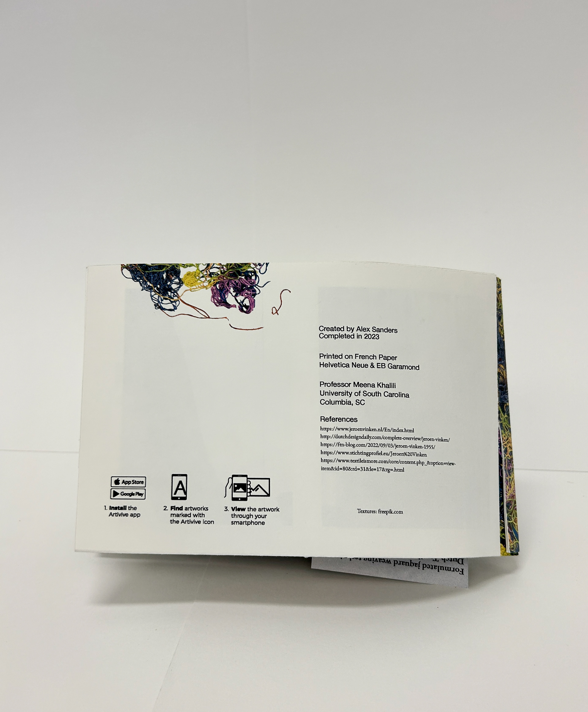
You'd think the augmented reality element would be the most painful part. To my shock, it was the easiest component to do. I spent more time on making the video than I did getting the AR to work. Seeing how simple it was really makes me want to incorporate it again, as it's such a surprising and fun extra layer to add into a work. I'm still thrilled it works even when printed.
My brain may feel a little more overheated after finishing this project, but I had so much fun making it regardless. Something about holding the folio post-assembly makes me feel as if my work is more real. This is what I believe all graphic design programs should be. I love working with the different mediums, and even if I'm not a fan of one, I still hold great appreciation for what a project teaches me. I'm walking away from this last design-intensive project knowing I really learned something, which is my favorite feeling to have when designing.


Amber Kleitz Cox Talk 11/15/2023
Our artist talk session yesterday left me with a lot of inspiration and hope for my future. Even with only a handful of years working post-grad, I feel she already has a lot of valuable experience to learn from. Hearing the different ways you can work as a designer was like having a weight lifted. Statistically speaking, I have a lot of options to choose from. Even if my first one isn't the job of my dreams, I feel better about just finding somewhere to work post-grad. Amber's walkthrough of finding employment was so helpful too. Though I've had several part-time jobs in the past, I haven't been sure how different the process may be. Working with an agency that contracts you to different companies sounds like the most reliable option to me. It appears to take away a lot of the stress associated with job hunting, which is a benefit I welcome fully. Above all, Amber is visibly so passionate about the work she does. I find it incredibly admirable and inspiring. The second that talk was over, I rushed home to keep working and designing. This wasn't out of panic, but excitement. I'm glad I've reached a point where I'm usually excited to do design homework. It's often my favorite part of the day. Whatever I end up working on, in my internship and career, I hope I can experience that same feeling of enjoyment day to day.
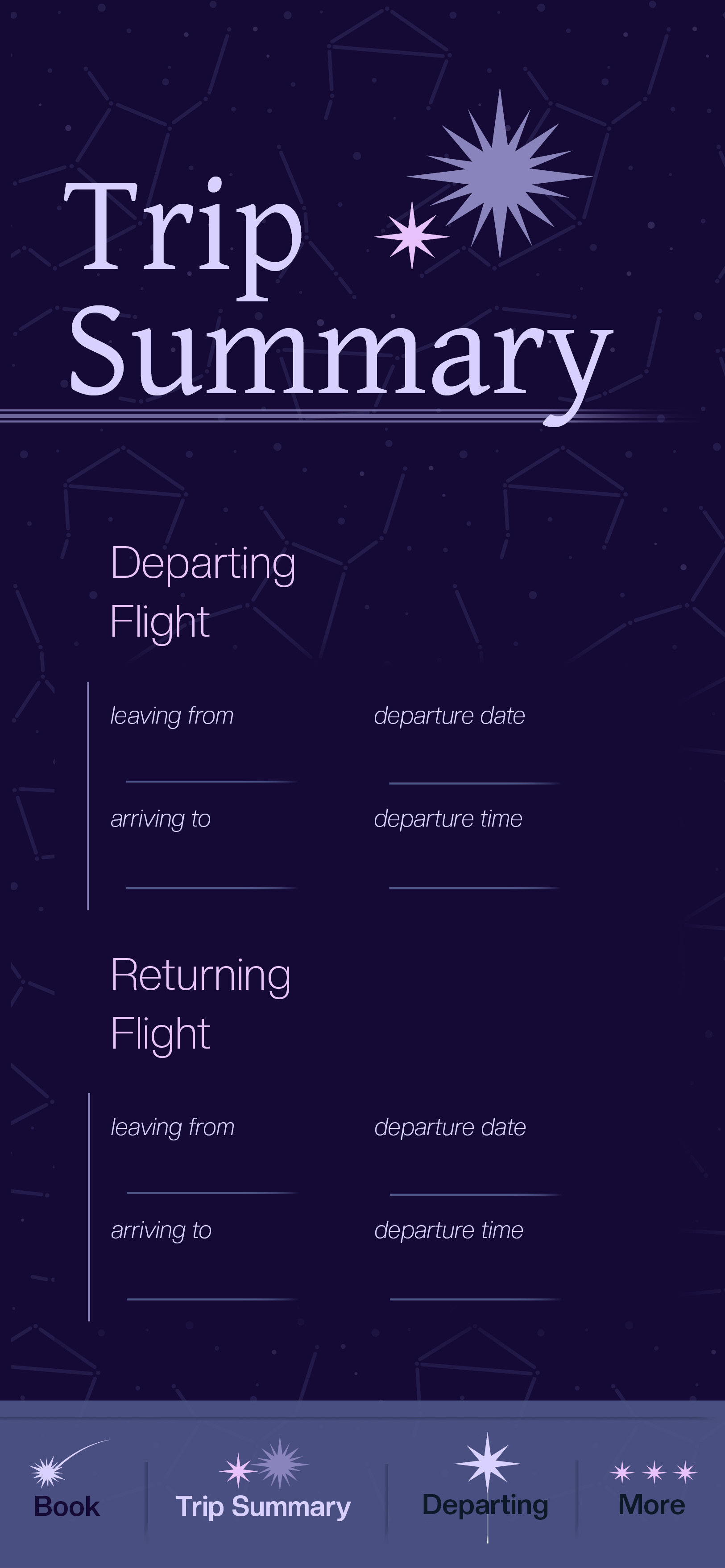
My folio project work from the week:
11/03/2023
As project three concluded, I've been left thinking about the sheer amount of time I sunk into it. Needless to say, I probably spent a bit too much time tweaking small details. By probably, I mean definitely.
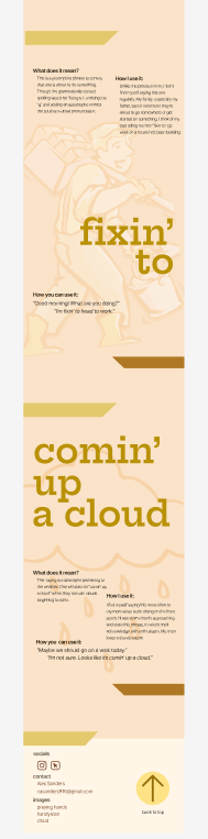
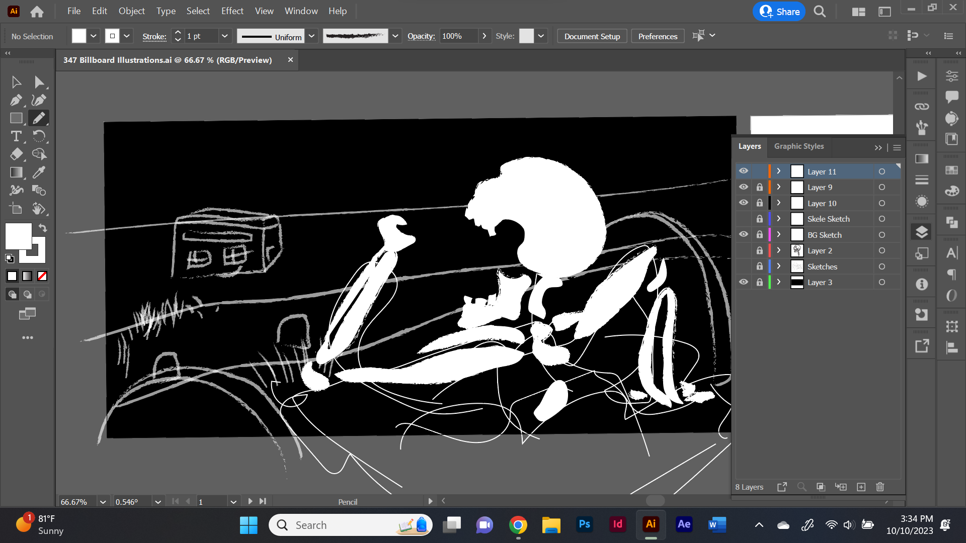
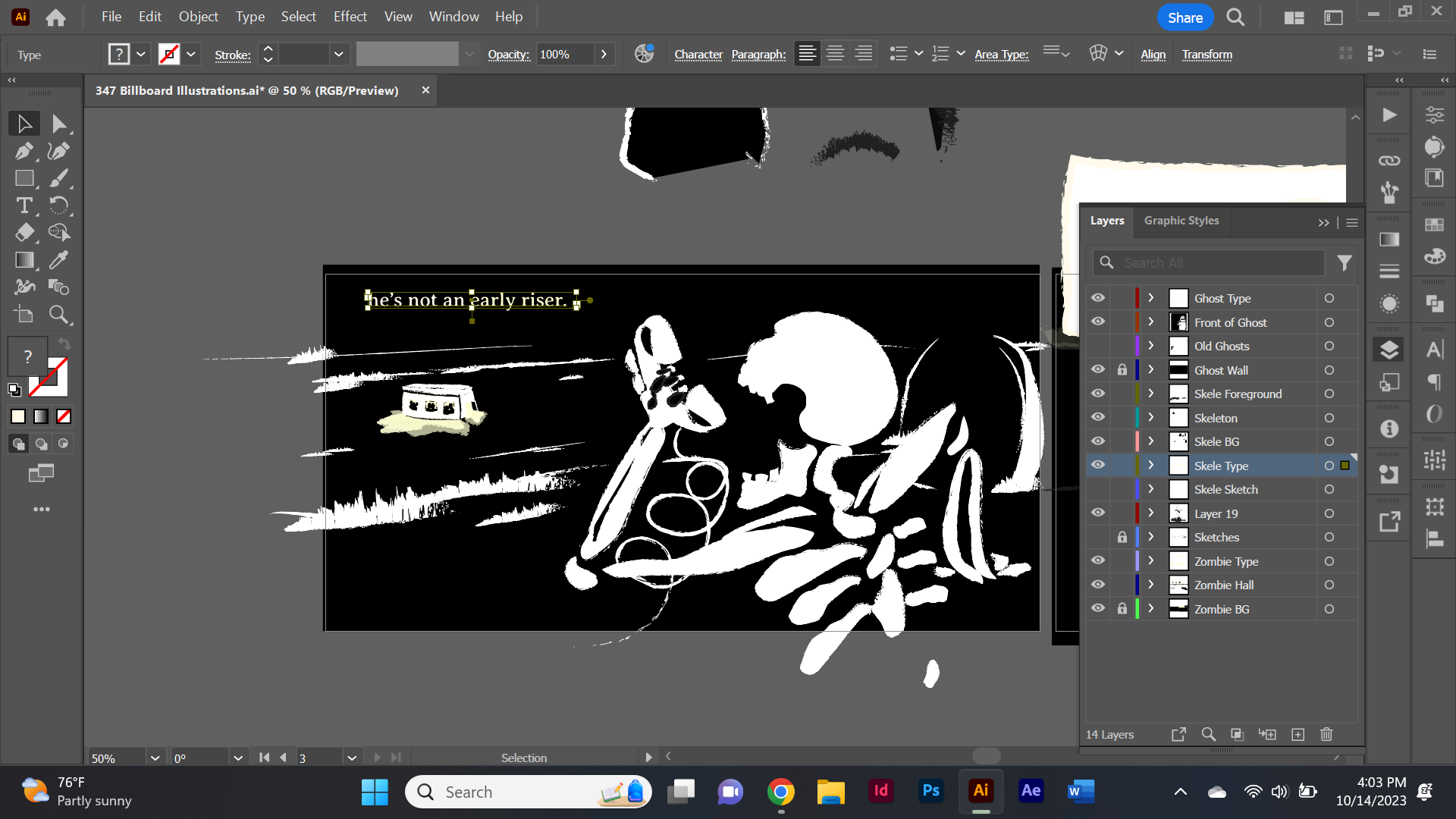
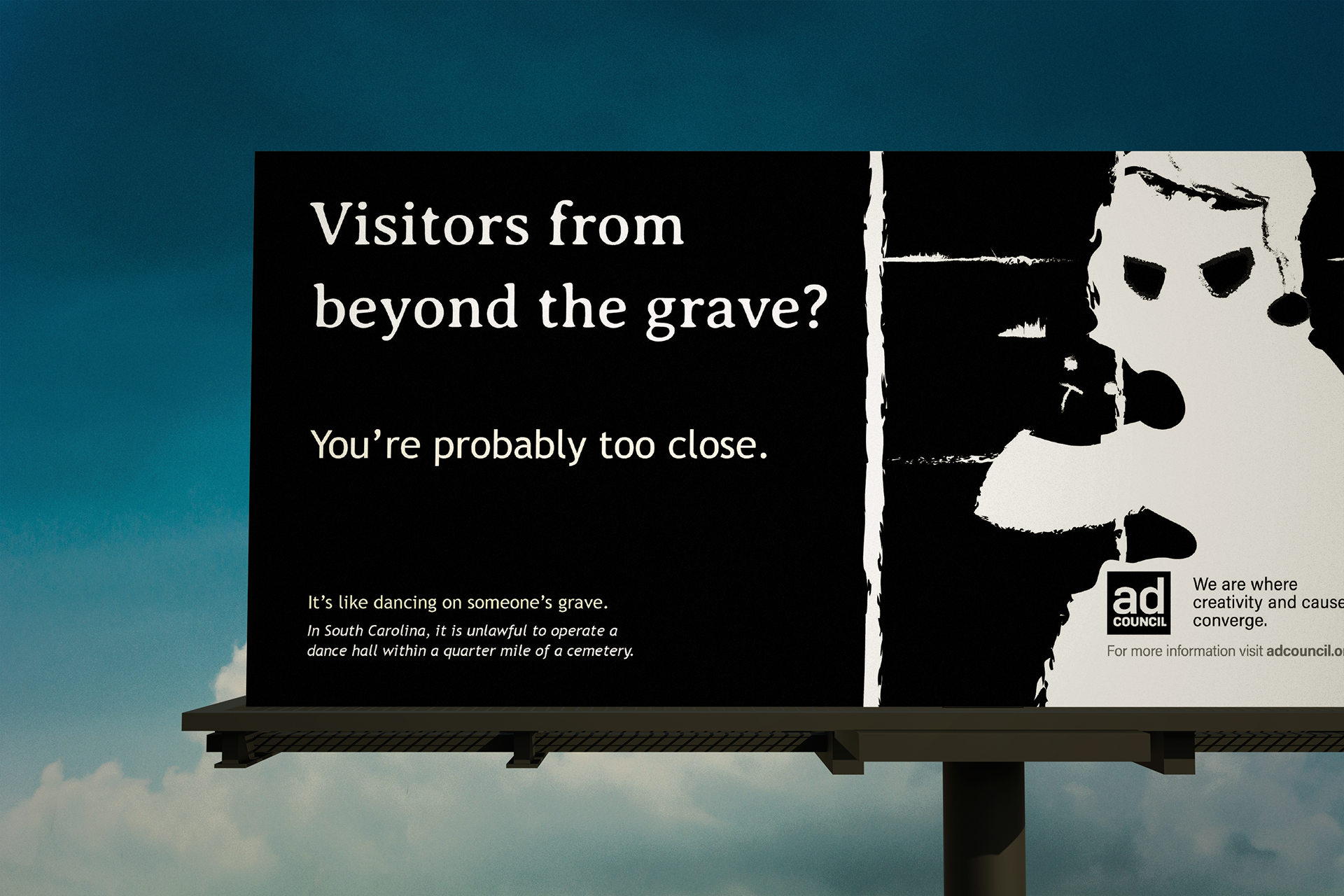
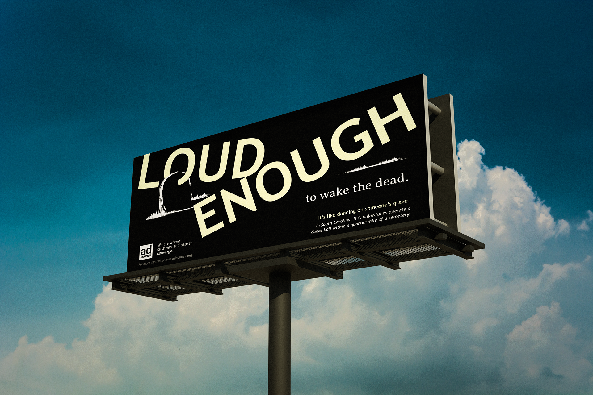
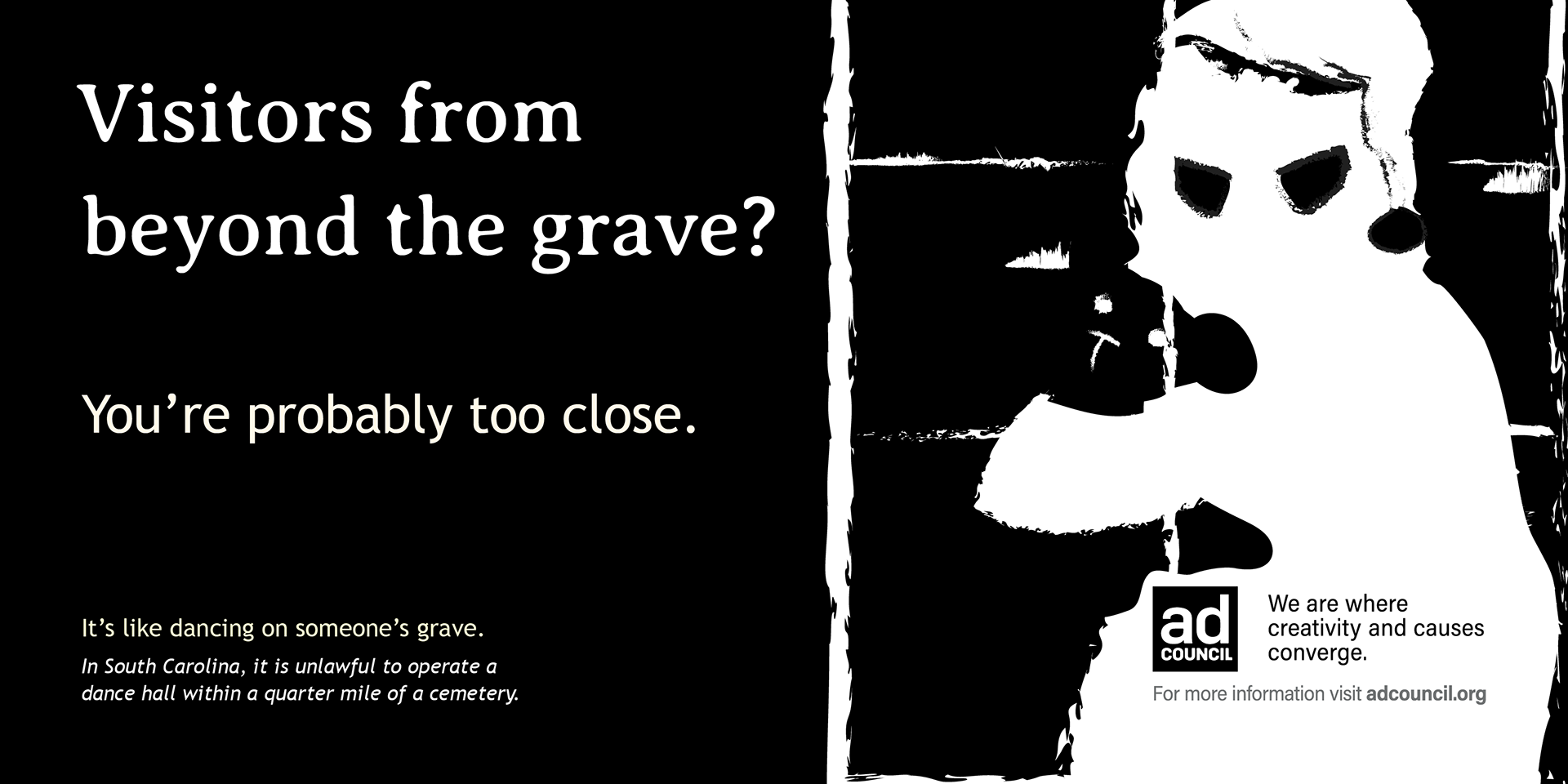
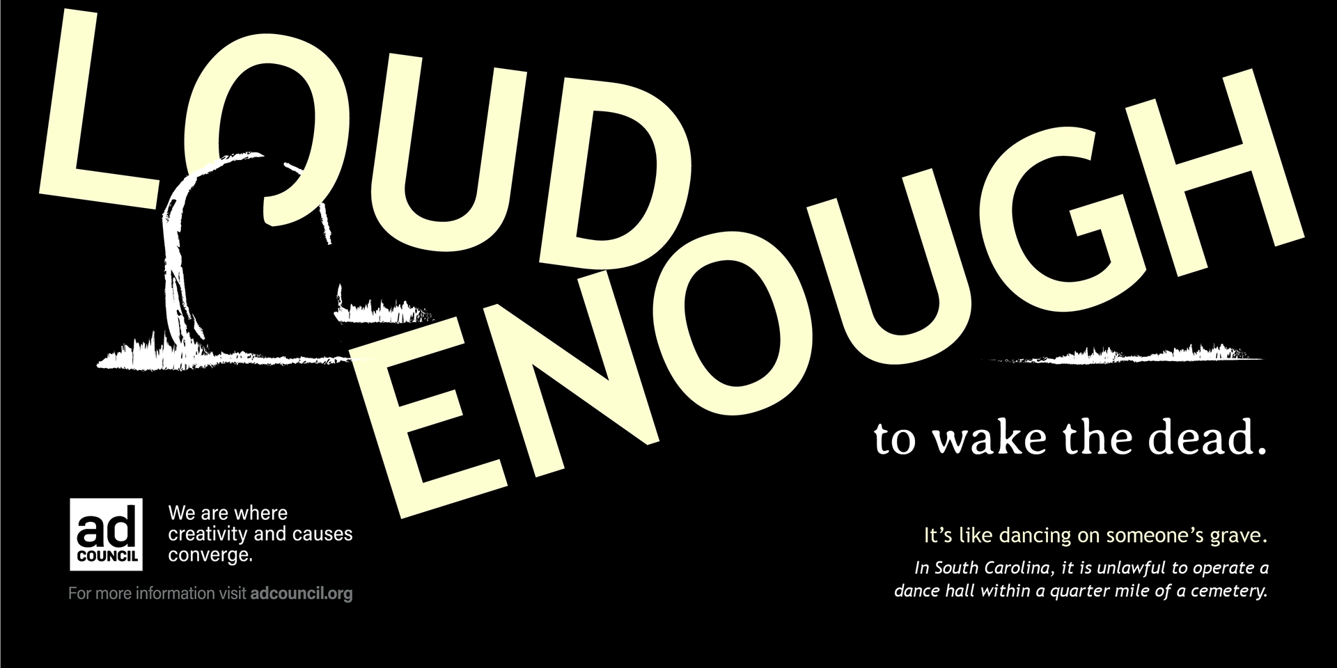
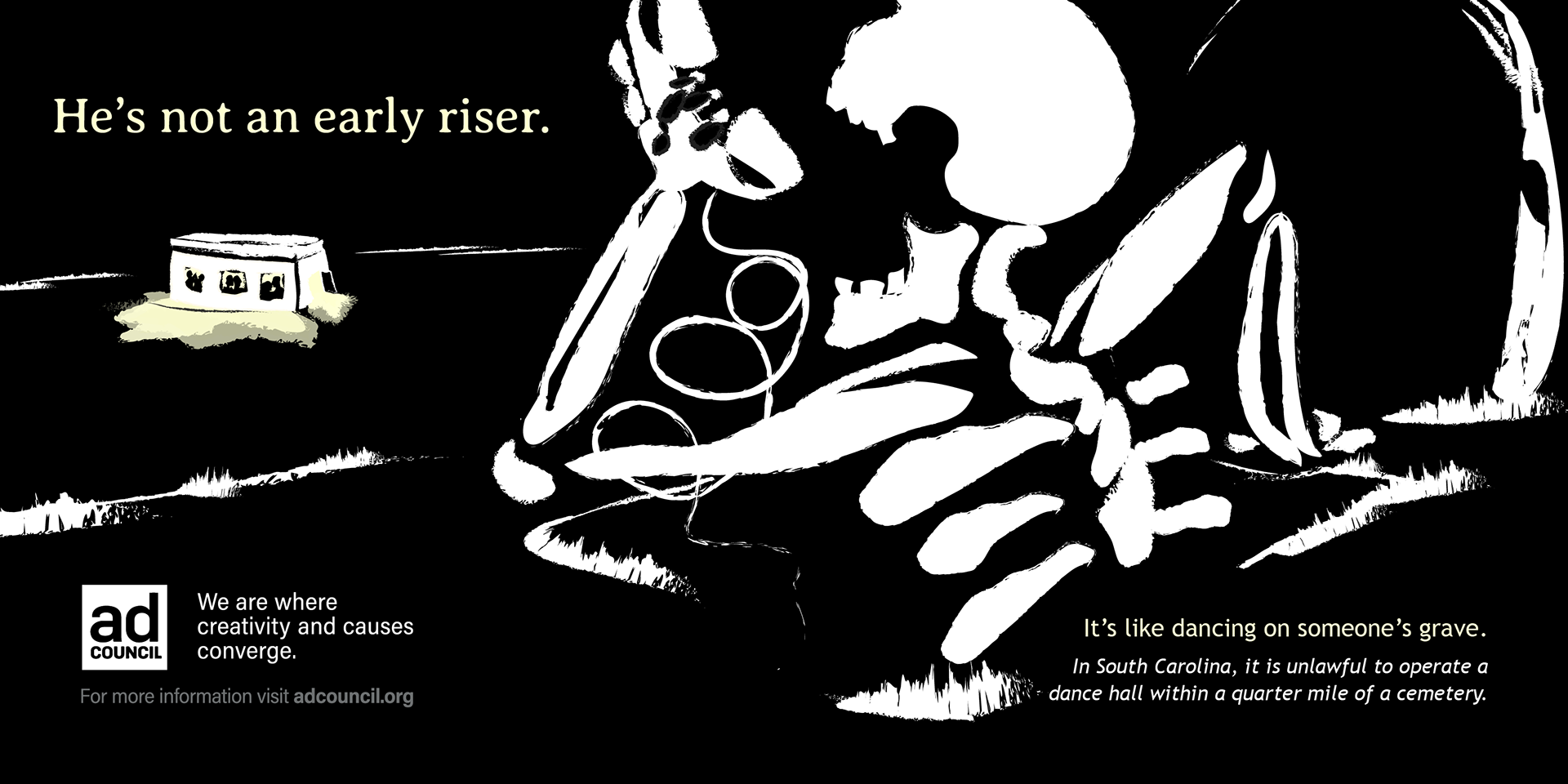
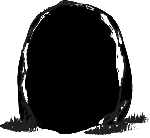
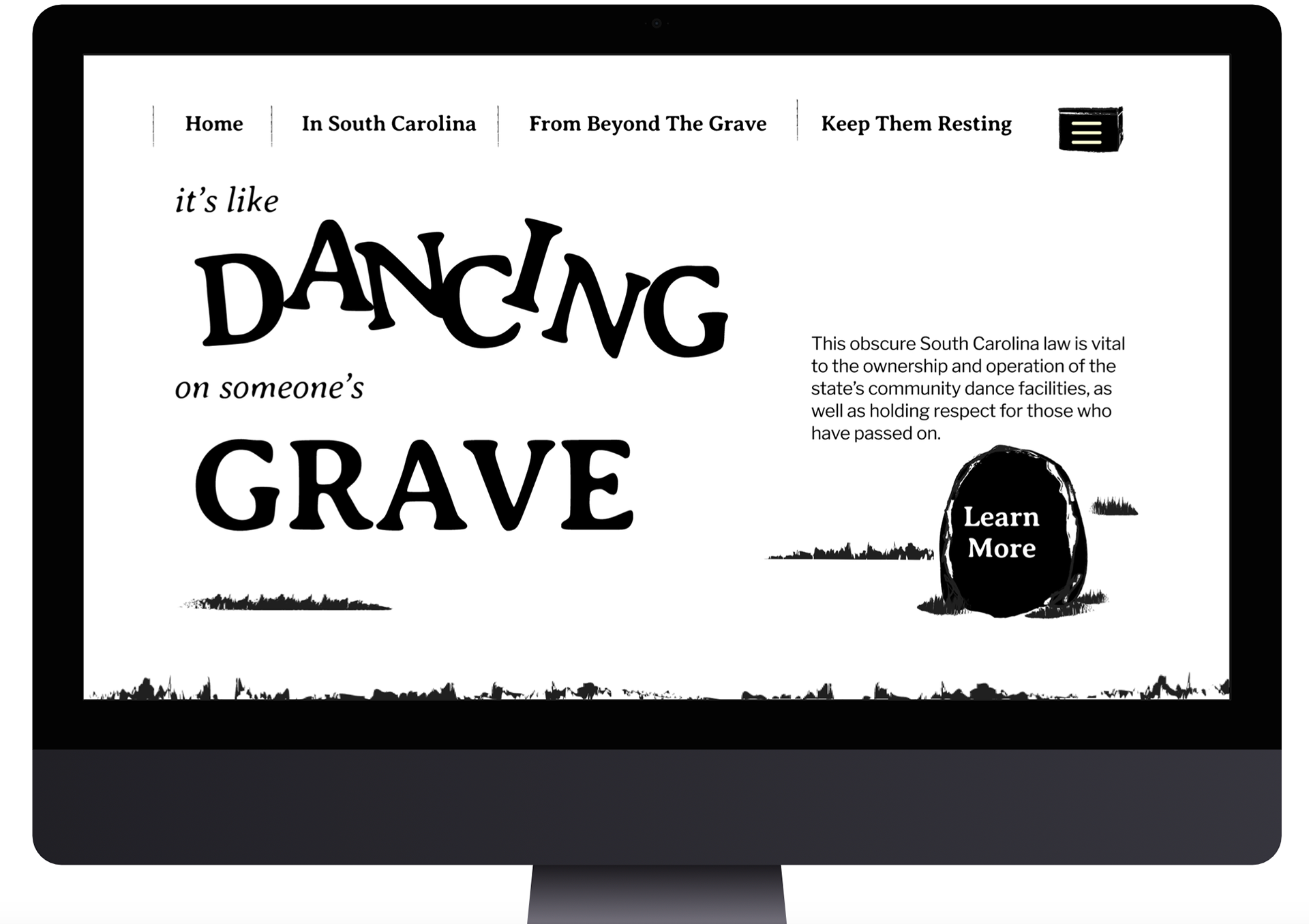
The first time I read the law I selected, I had an immediate concept visible in my head. The concept of not having a dance hall within a quarter mile of a cemetery seemed as if it was in place because it was disrespectful to those buried there. In any cemetery, it's usually intended to be a peaceful, quiet place of mourning. This topic is a pretty depressing one to think about, but I wanted to put a comedic spin on it in order to make it a memorable ad campaign. Long story short, the skeleton calling in a noise complaint on a rotary phone was too good to not use.
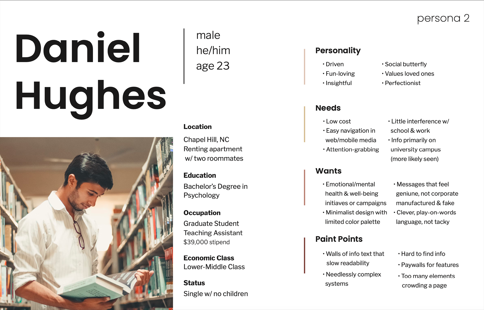
So I made a moodboard of printmaking styles and selected an archetype. The Advocate seemed to be a good fit since the campaigns purpose was to gently get people to respect the dead. Personas were next, something I didn't complete in the last project, and I spent a ton of time on them. I thought so much about what elements would be relevant, I got kind of lost in what I was writing. In the end I made two individuals, while probably a bit too fleshed out.
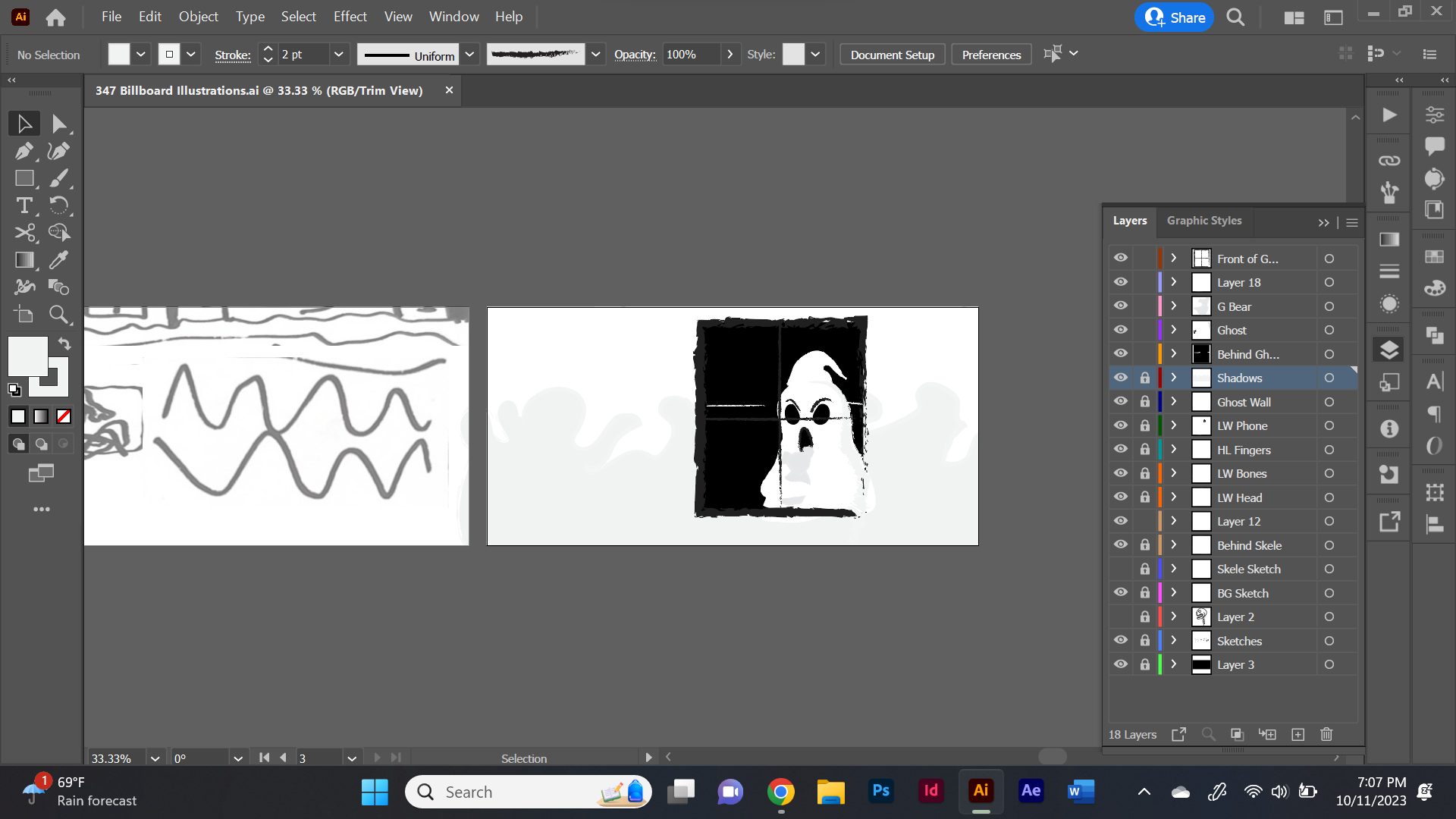
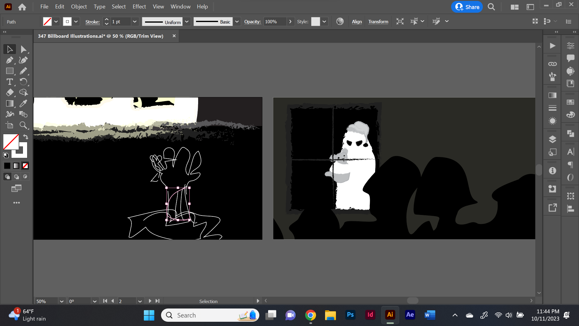
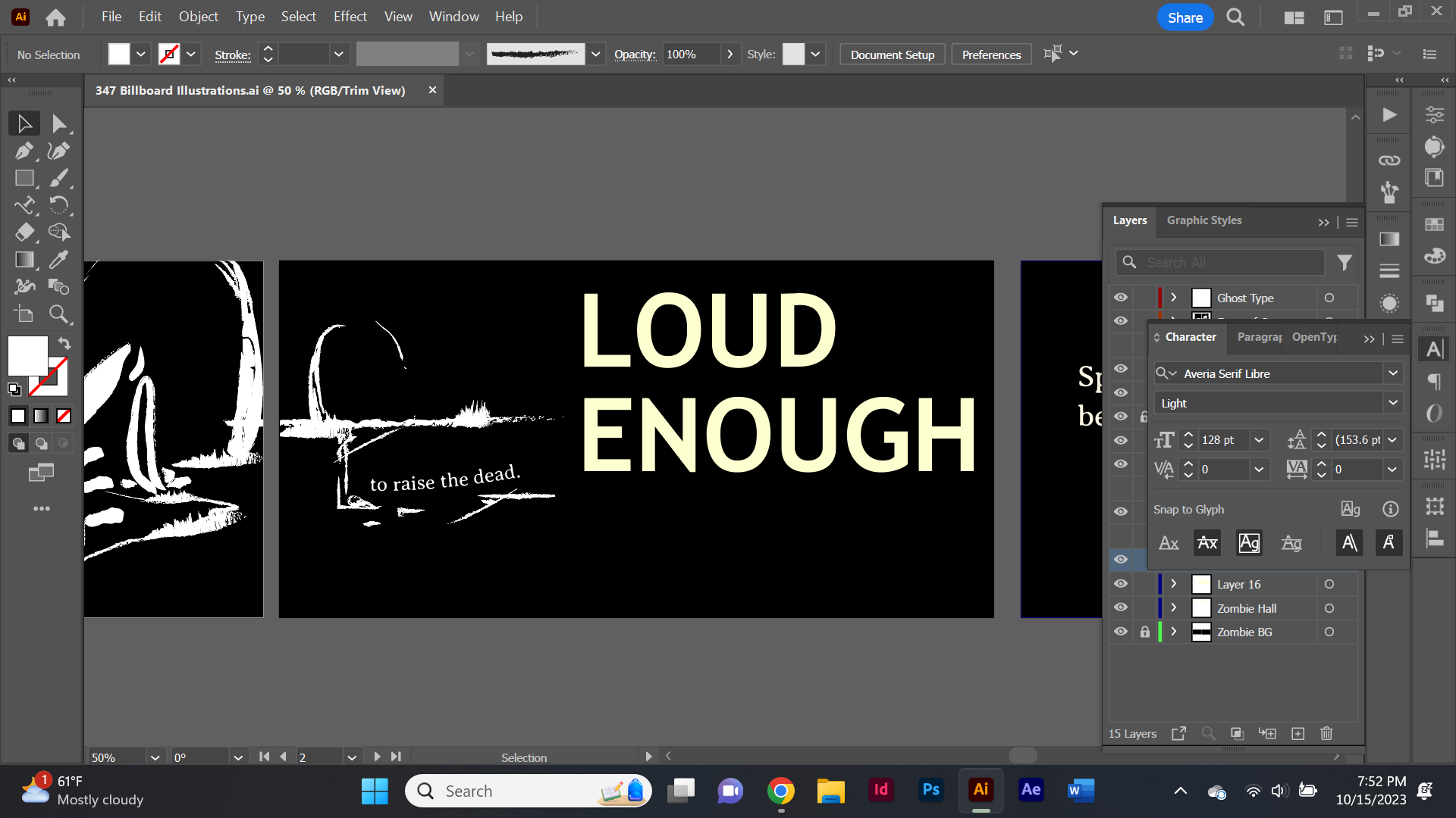
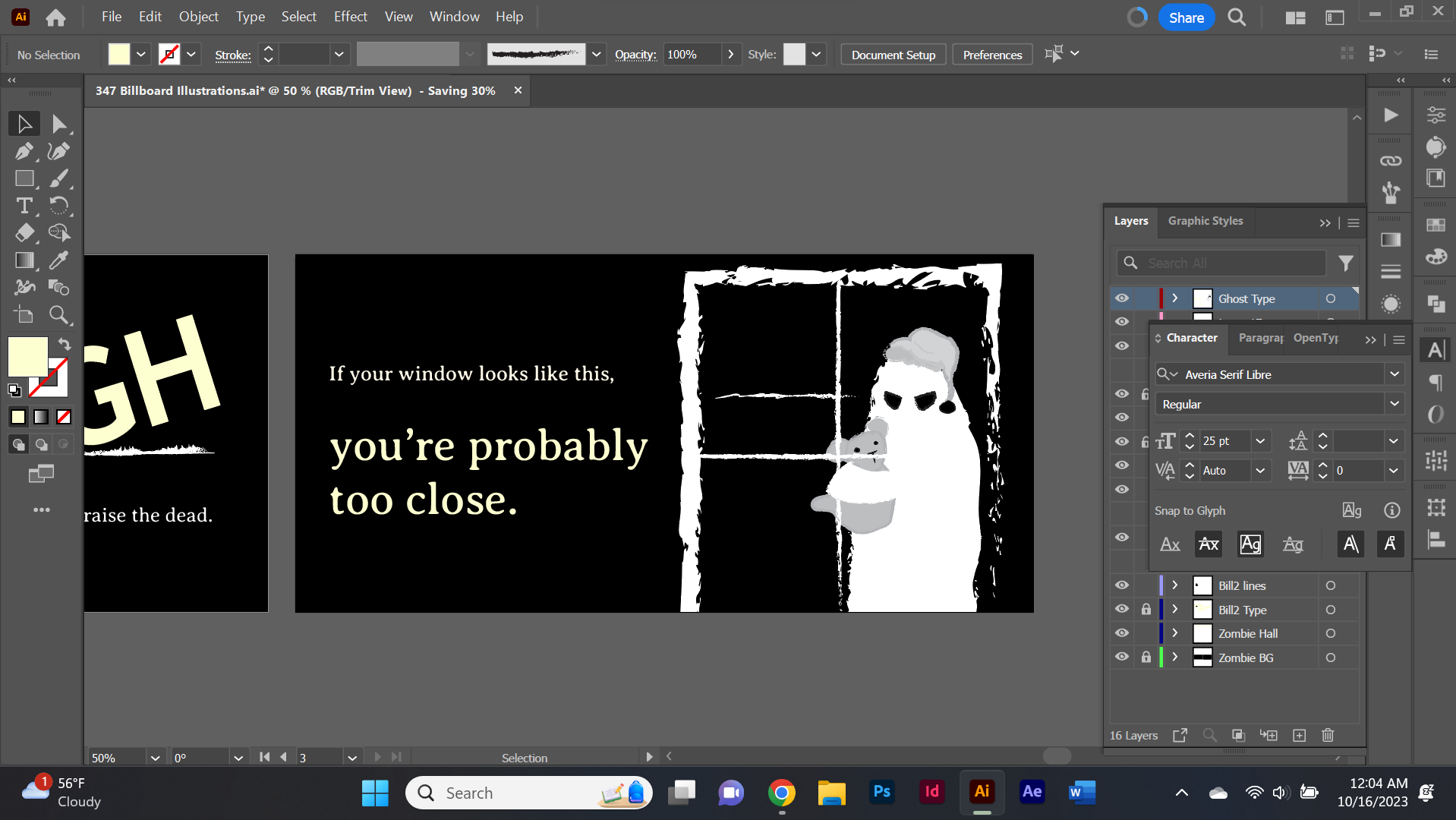
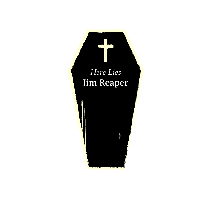
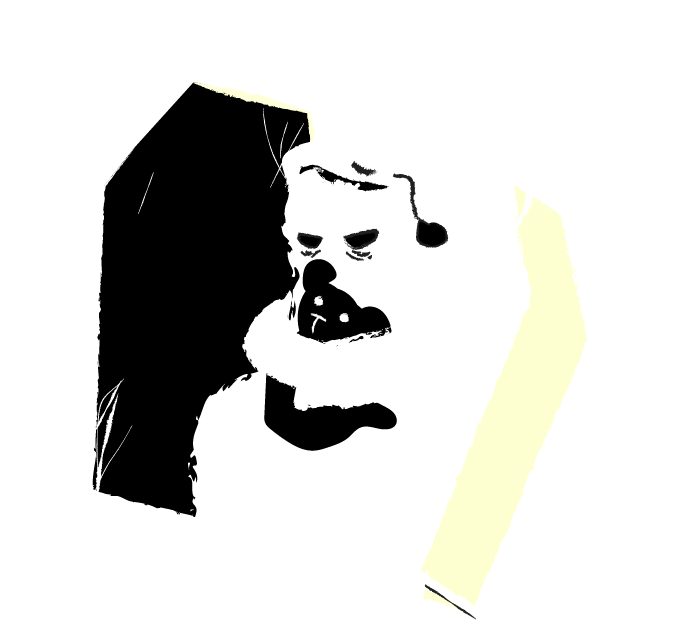
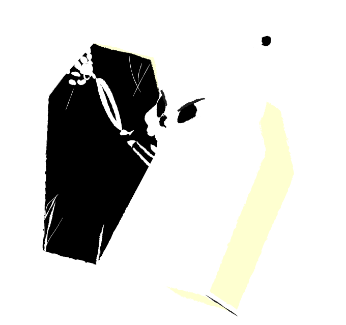
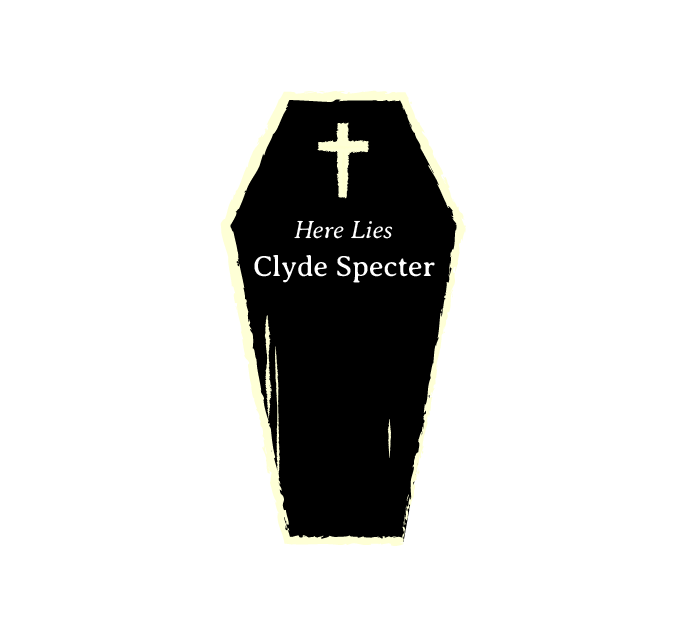
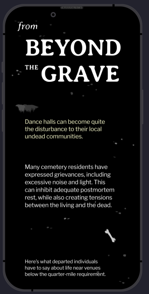
While I had the skeleton as a character, I still had two other billboards to make. Other undead characters I thought of using in the trilogy were ghosts, vampires, and zombies. Somewhere along the way, I thought of a sleepy ghost, adorned with a nightcap and ghost teddy bear, peering through the window of the dance hall. Including this guy added a charm and almost sympathetic feeling that I felt could benefit my work. As I'm sure you can tell by the current website background, I've had a ghost and skeleton duo appear in my work for a long time. It would be a cool callback to my older doodles. Though I kept the ghost, the zombie illustration I tried out didn't stick. That hand I made from the two-color palette was ugly. I would not want that shown on a highway billboard. As I suddenly remembered I needed a type dominant board, I opted for type sinking below a headstone and grave, as if the text was the noise permeating the dirt. I'm exploring a lot with type-heavy designs this semester, so this served as a good practice in making the text an illustrative element.
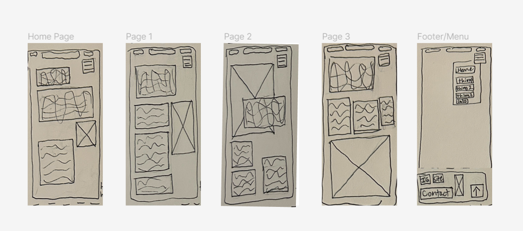
Now the final beast, web screens. They still freak me out a bit.
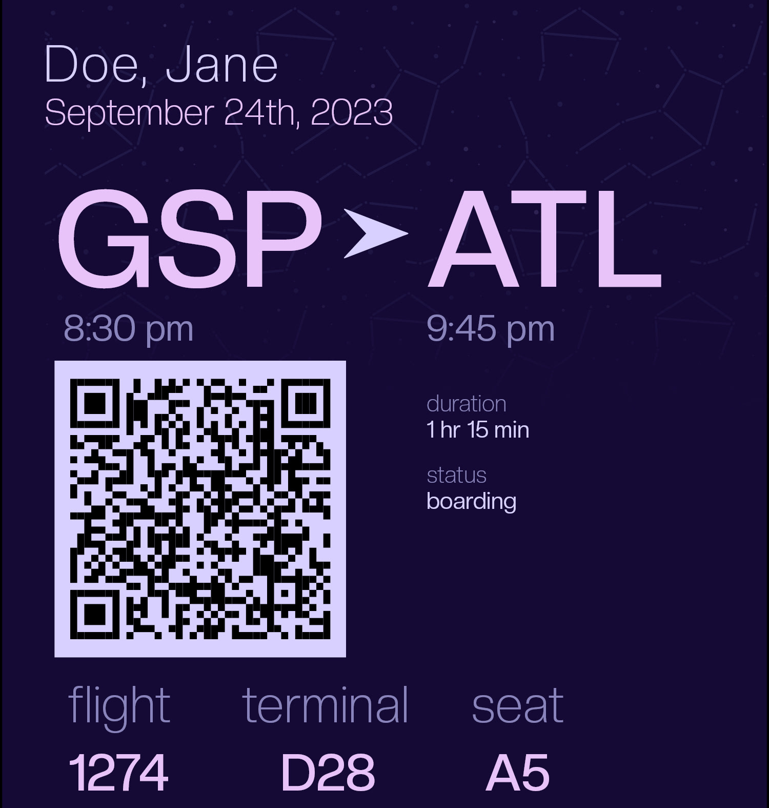
I slowly threw different elements into the mobile frame only at first. I let whatever came to mind sit, then made adjustments with fresh eyes later. Having the user scrolling underground was a key immersive feature I wanted to have in there, thus doing so by clicking the headstone to navigate down from the home screen. Not having boring type was a goal I held going into it. With a mobile screen, this can be difficult due to width and height limits. However, and I'm very proud of this one, I remembered I could stack the type together in the headings. I fit the headings together like a puzzle until the emphasis appeared on the right words. The other element I loved was having the ghost and skeleton (Clyde and Jim) appear in an overlay to speak their experiences. The open and closed coffin illustrations are very successful in my eyes. My only regret is not completely finishing everything I wanted to between designing for mobile and translating the same design to desktop. I feel that I really ran out of time at the end (due to my prolonged fixation on perfecting the work early on). I'd love to spend some time making the prototypes function properly and adding in anything else I forgot.
What I'm dealing with now is how my time should be managed going forward. I don't want to work in 8 hour straight sessions again if I don't have to, especially when I've ultimately not completed much by the end. It's like I'm completely absorbed in what I'm doing, making every single line look cohesive, then suddenly the deadline is the next morning and it's 1AM. My brain desperately needs sleep. I want to work with different methods instead of my instinctive ones, as those are clearly not efficient for my day-to-day life. My goal is to make my work output proportional to the time and energy I have at my disposal. Especially with how limited both are some days.
That's part of the process though, and I'm always looking for alternatives that my brain can really grasp.


10/06/2023
Project 2 served as a reminder for how rigorous graphic design work can be. Getting this work to the deadline was like running a marathon.
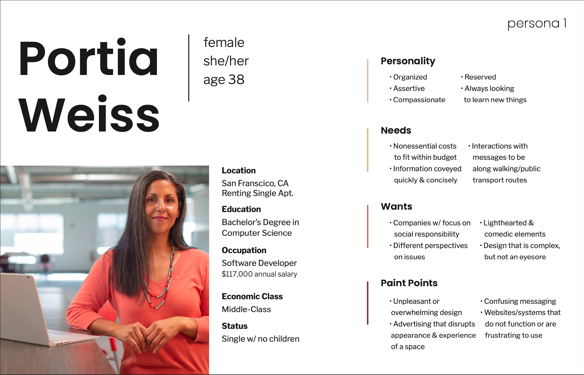
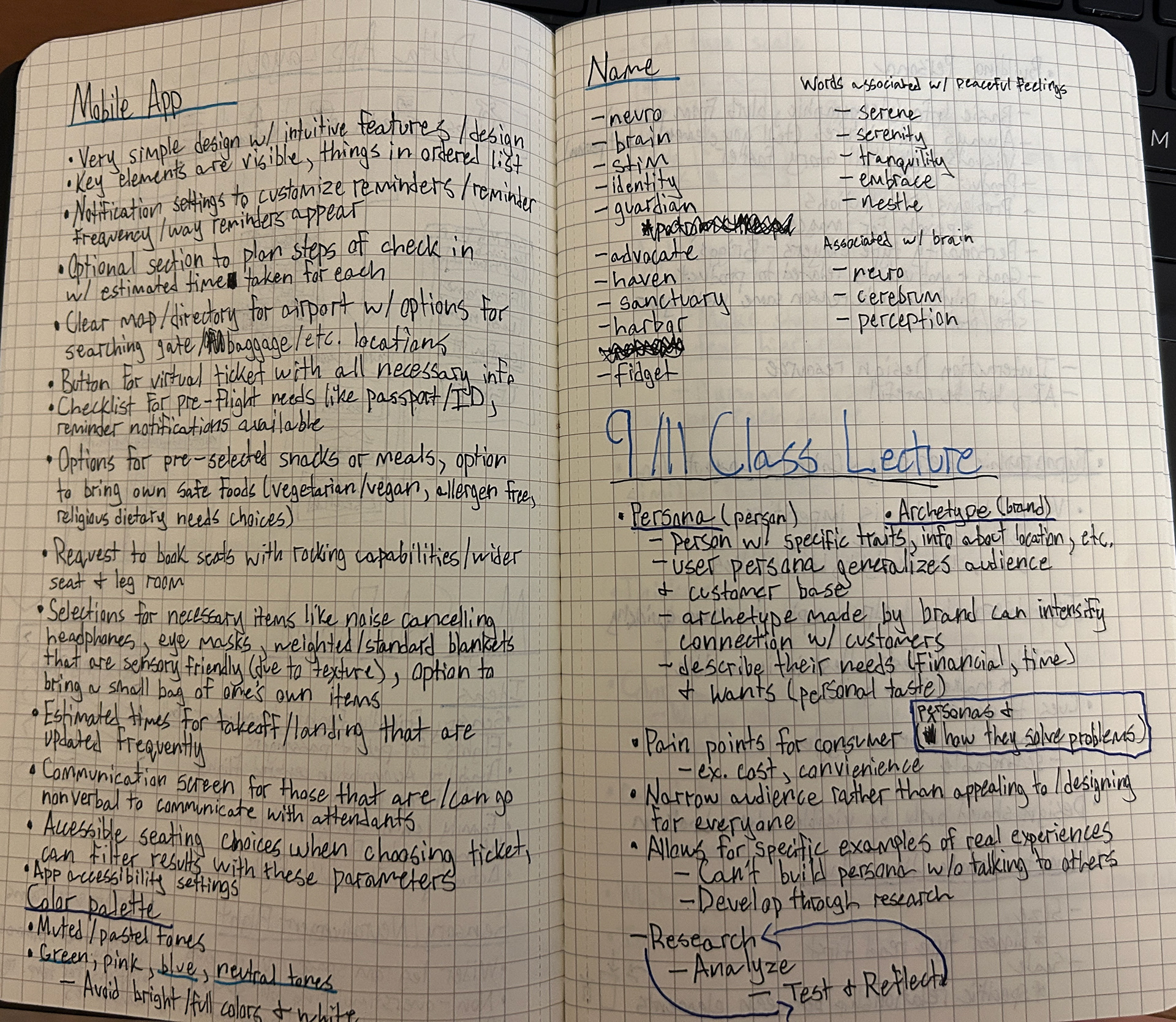
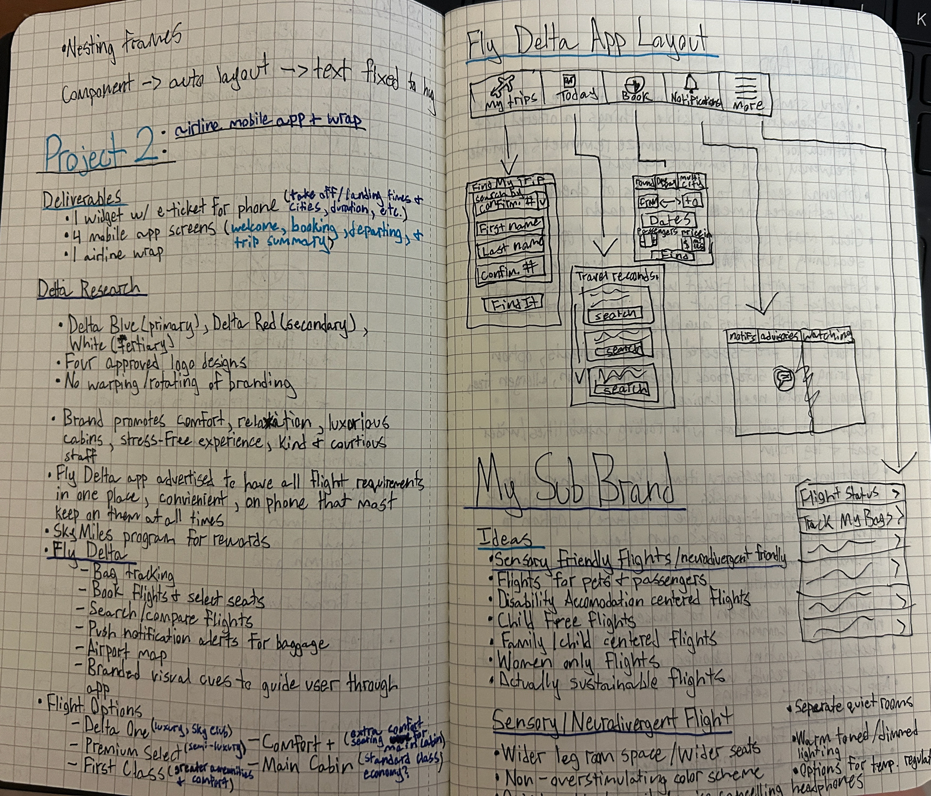
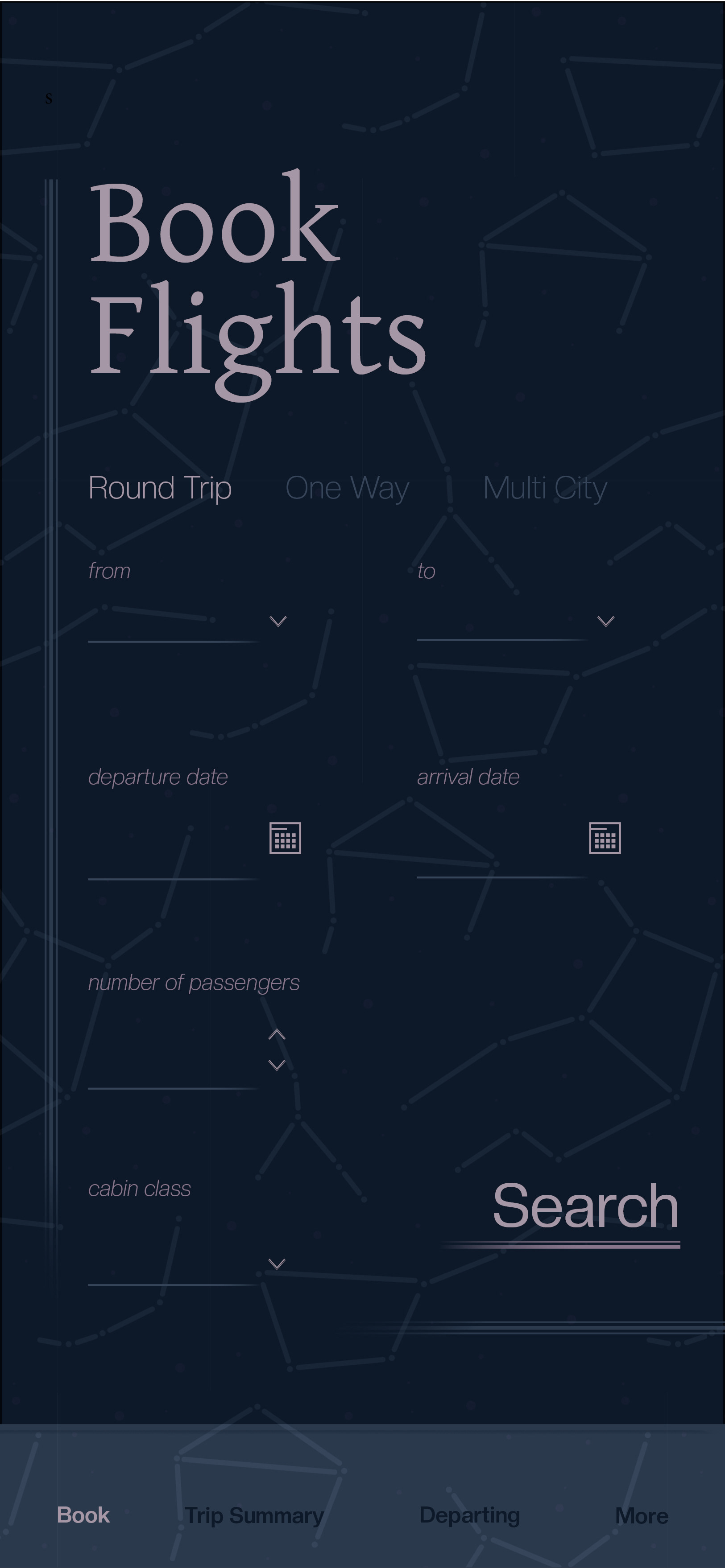
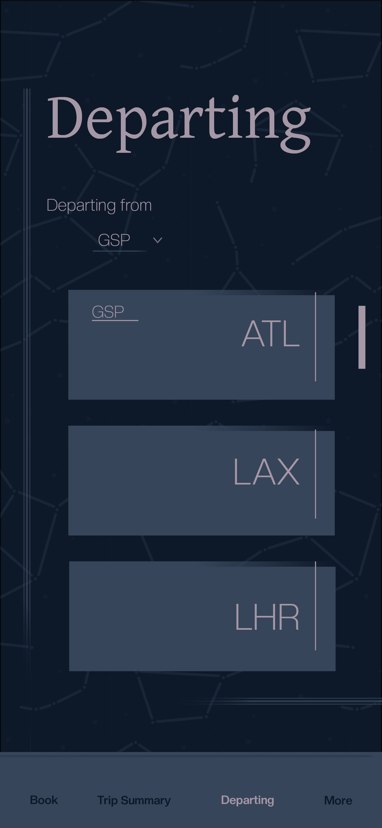
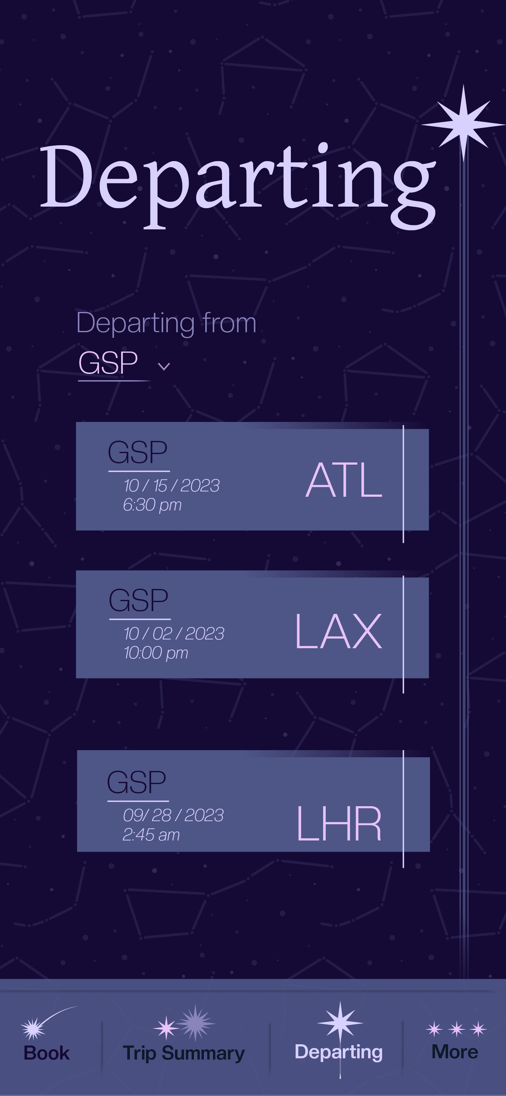
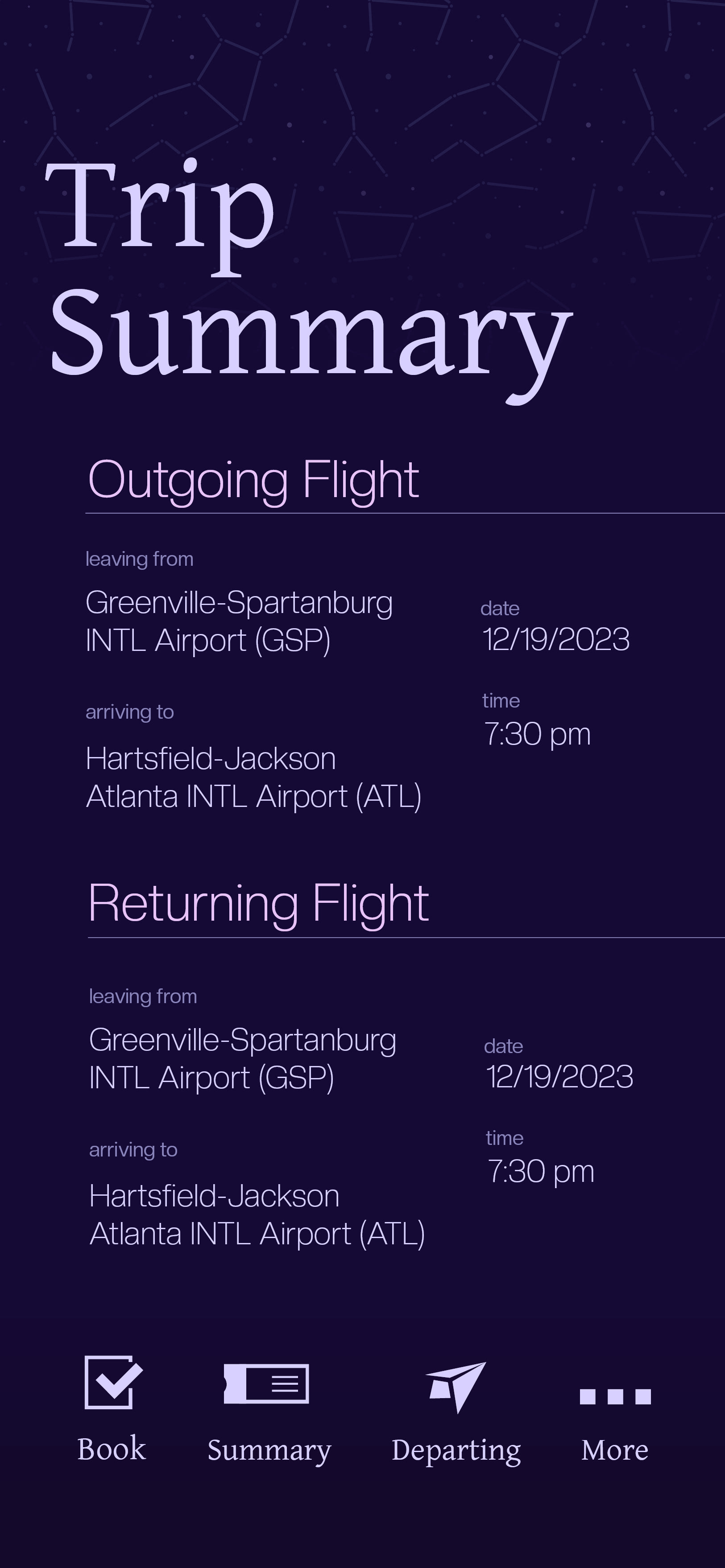
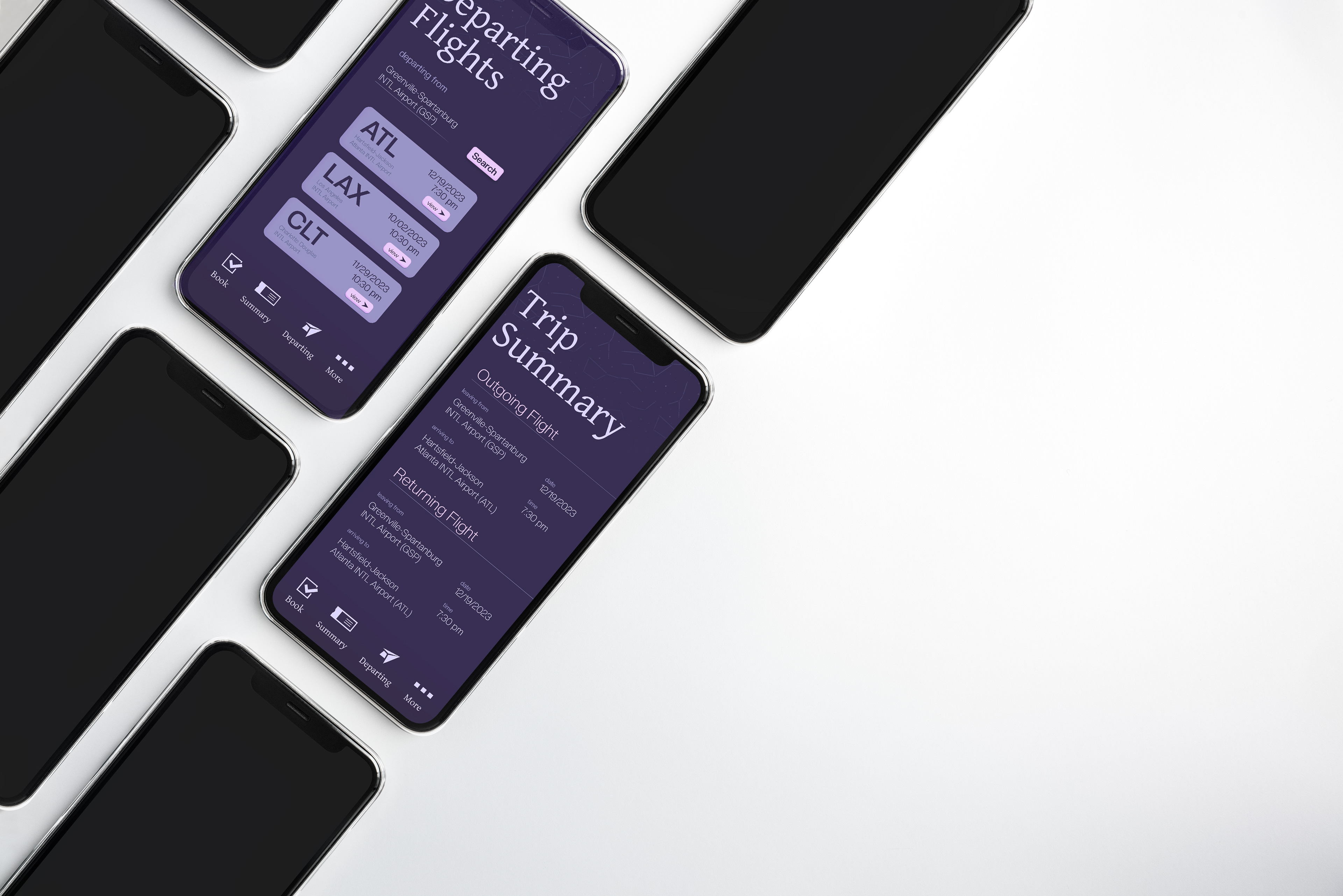
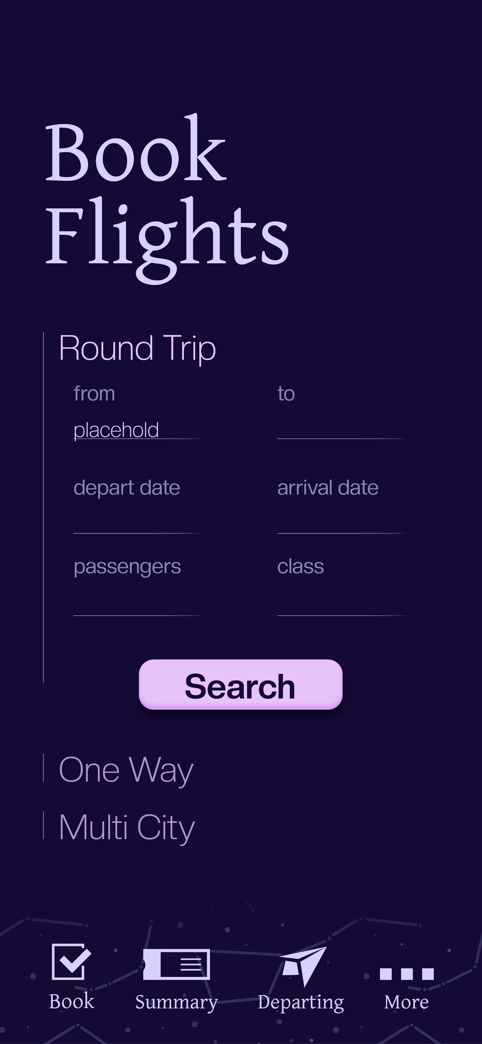
I started fleshing ideas out in a notebook when the project was first assigned. Through a long list, I narrowed down my favorite concept for a luxury airline sub-brand. The topic of neurodivergence has been on my mind a ton lately as I get to know the workings of my own brain, so in turn, I constantly notice systems around me that are frustrating to navigate. This gave me an idea to cater an airline for neurodivergent individuals with sensory sensitivities. Since I get bored writing words of my ideas, I kept the information a bit more short form while testing how drawing a concept works for me. Wouldn't you know it, I learn and retain information when I sketch out grid structures or app layouts. This research was more extensive than I typically do. I actively reminded myself to dig for information and it helped my design elements become more structured. Sometimes tedious, but very necessary.
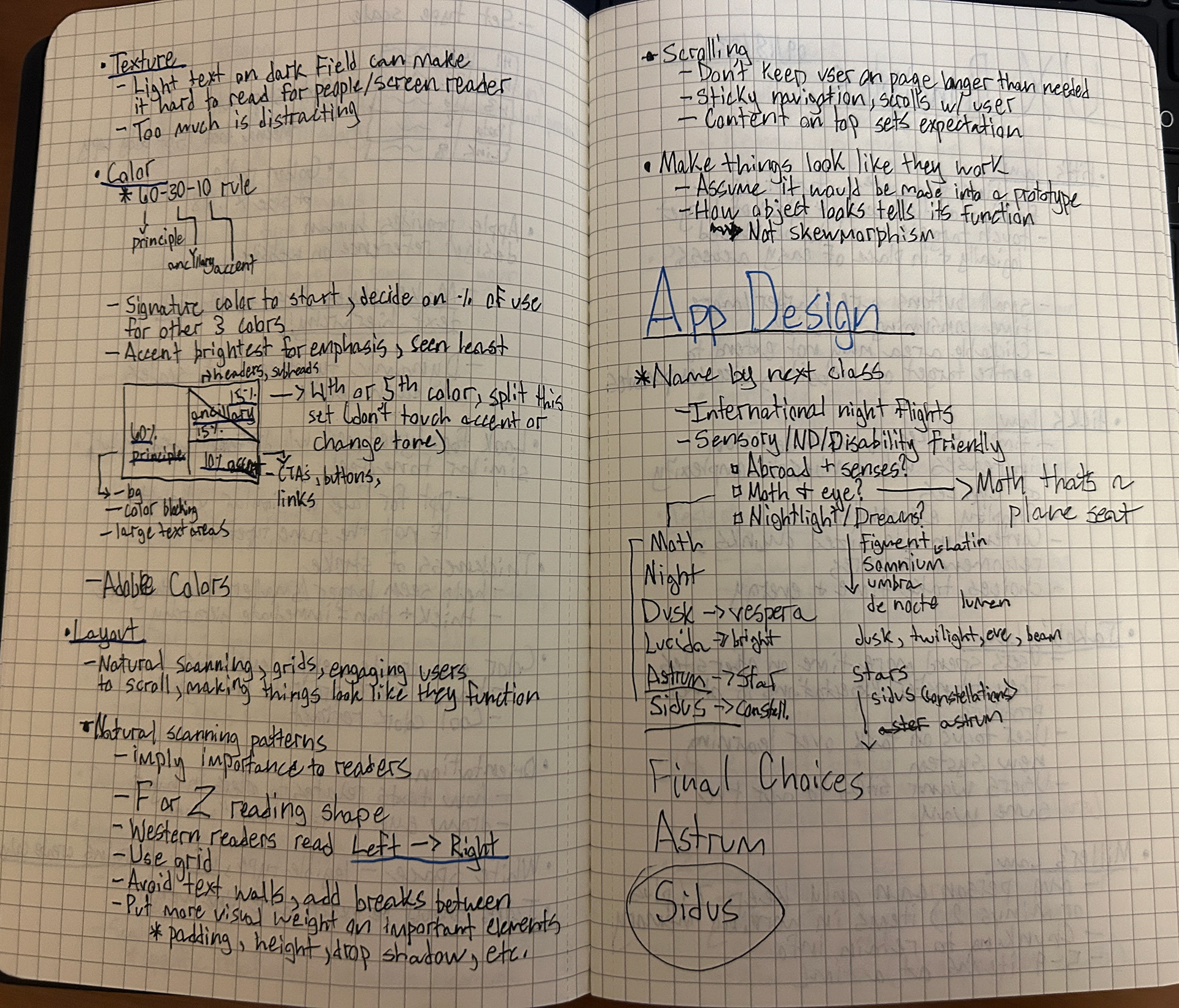
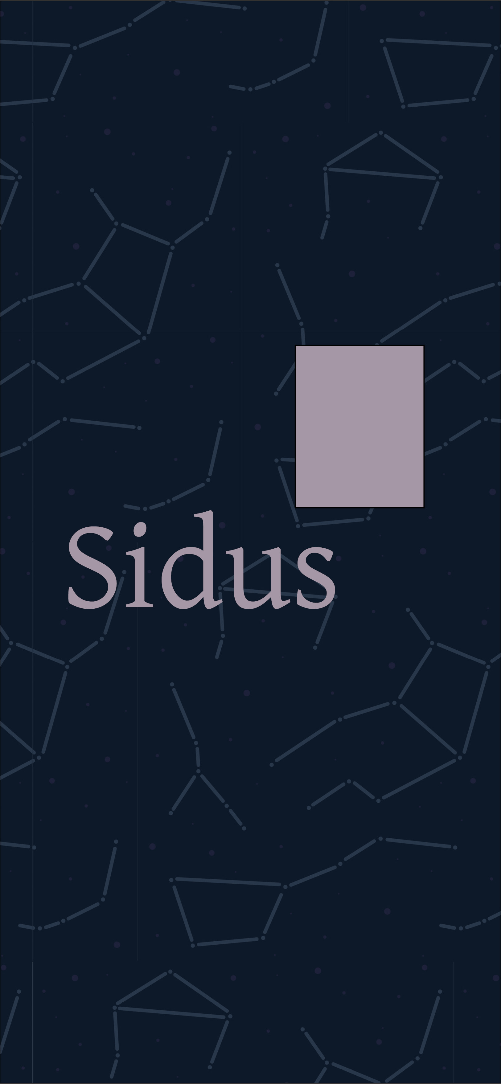
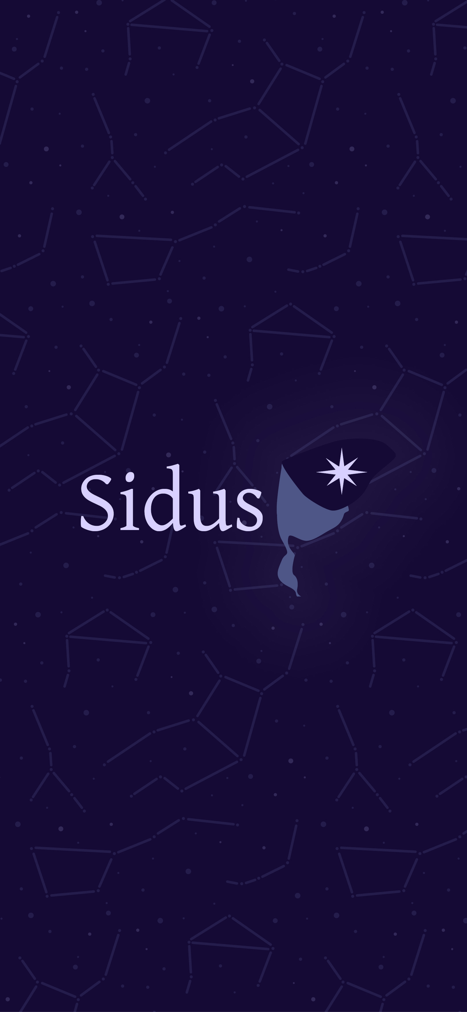
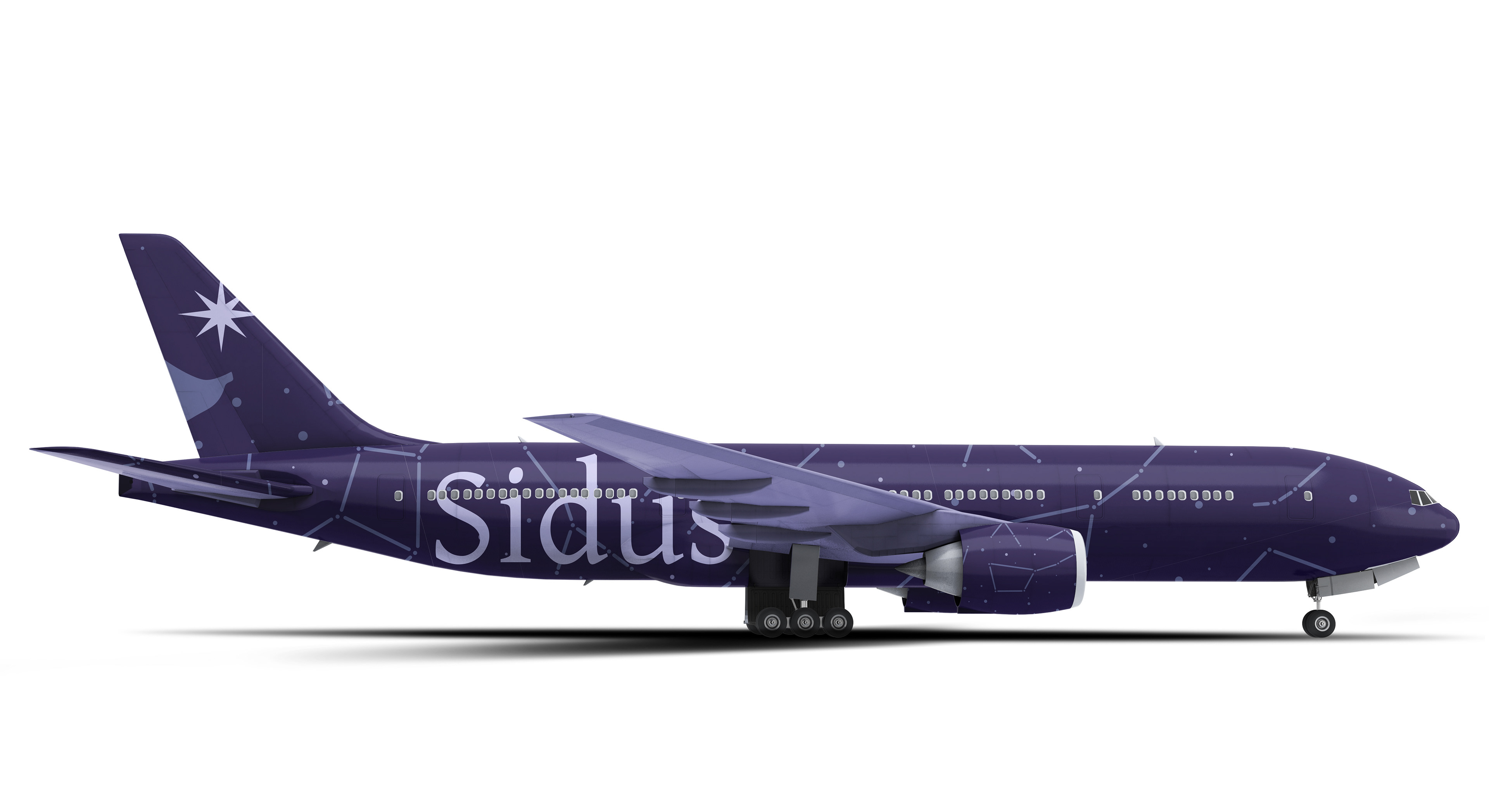
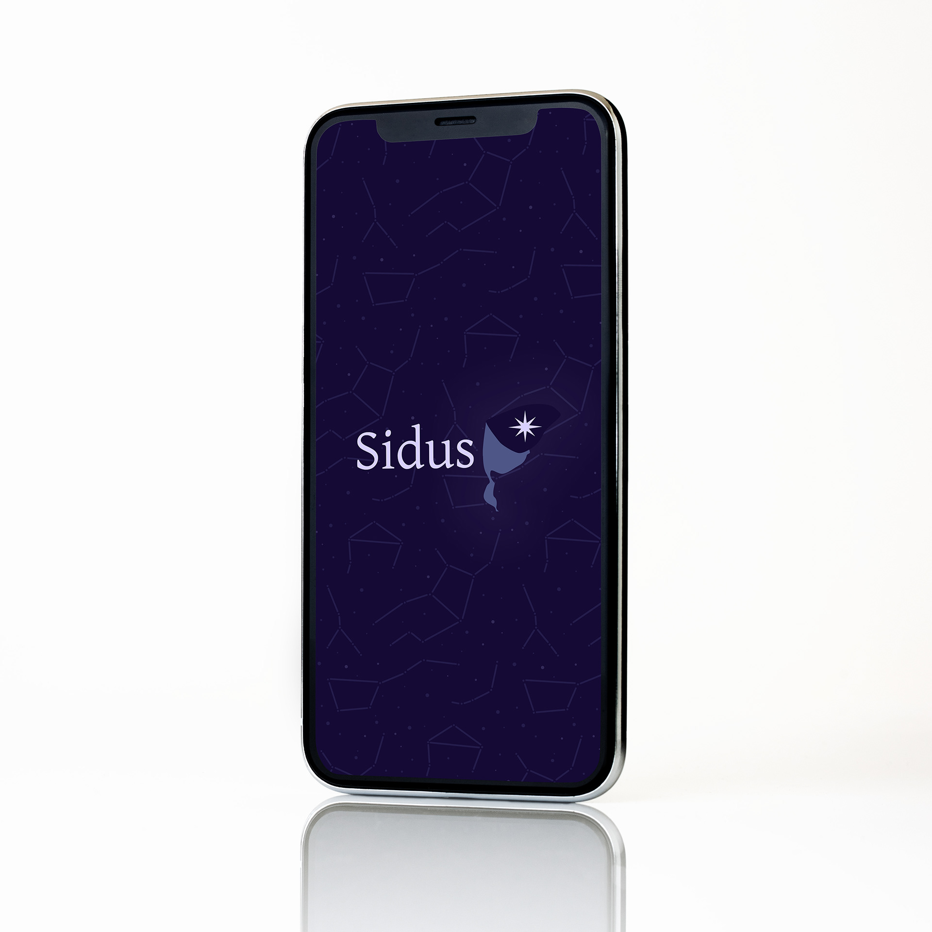
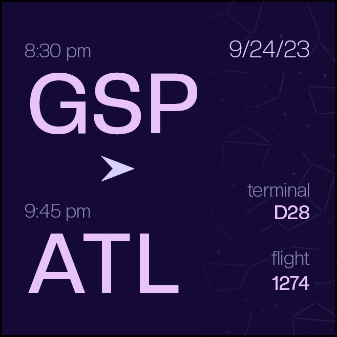
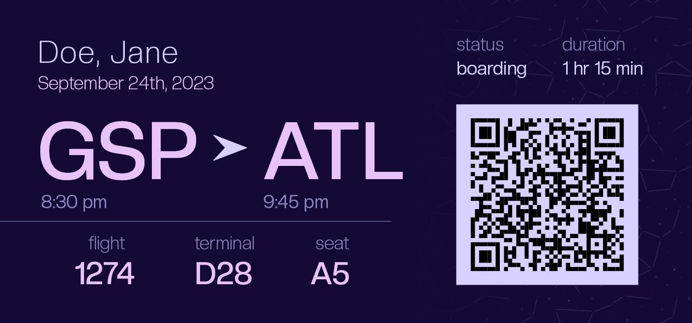
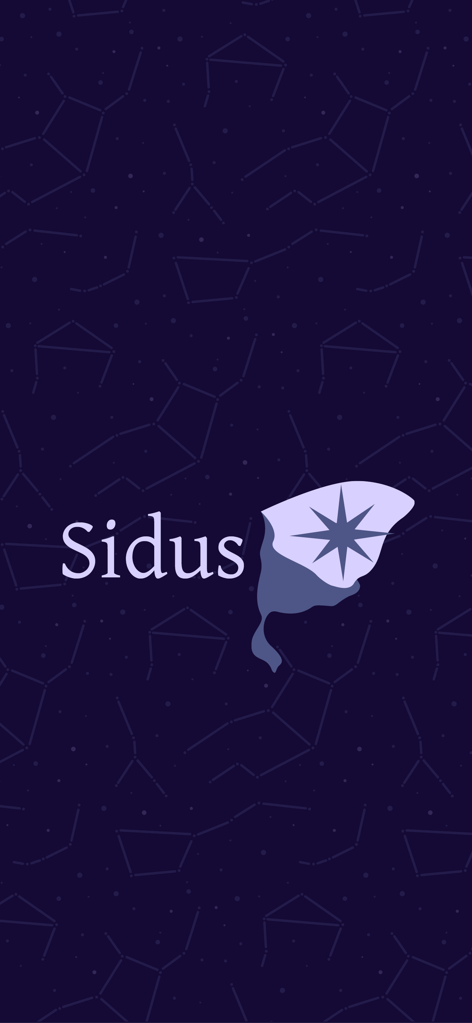
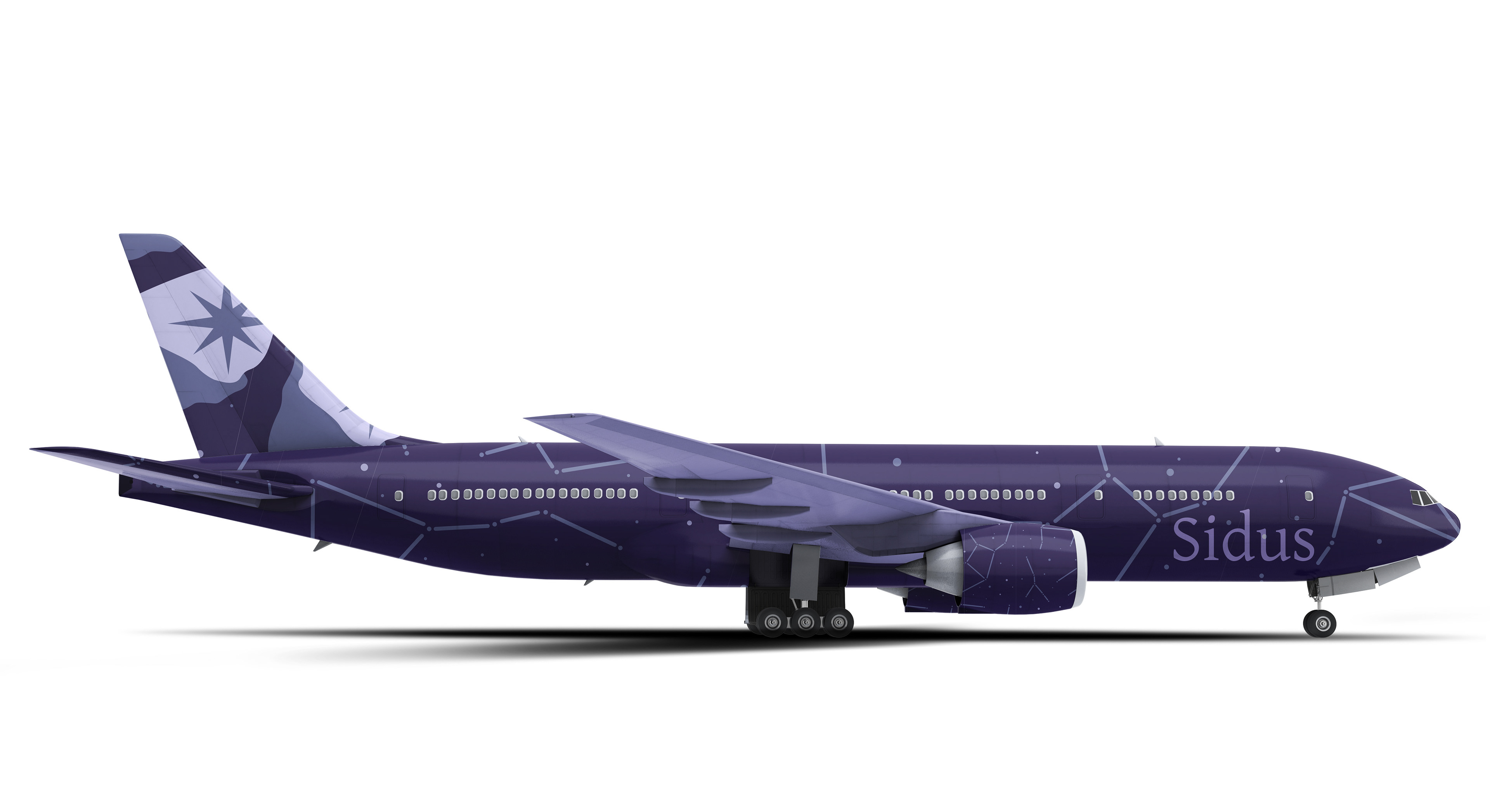
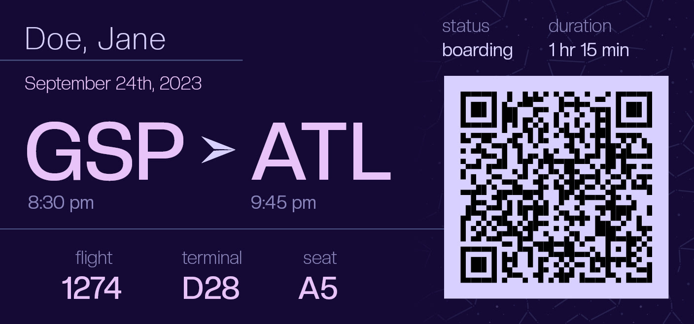
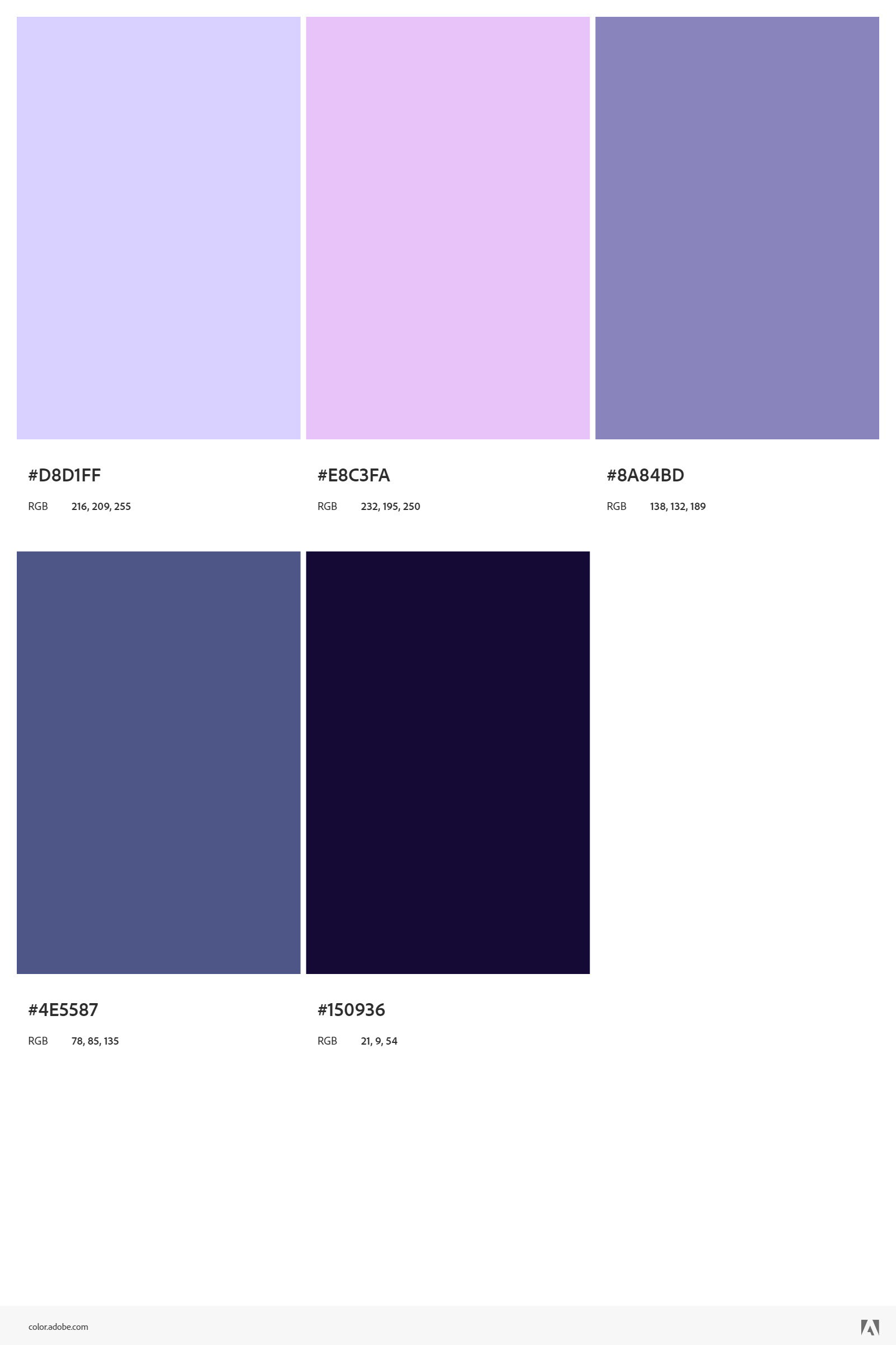
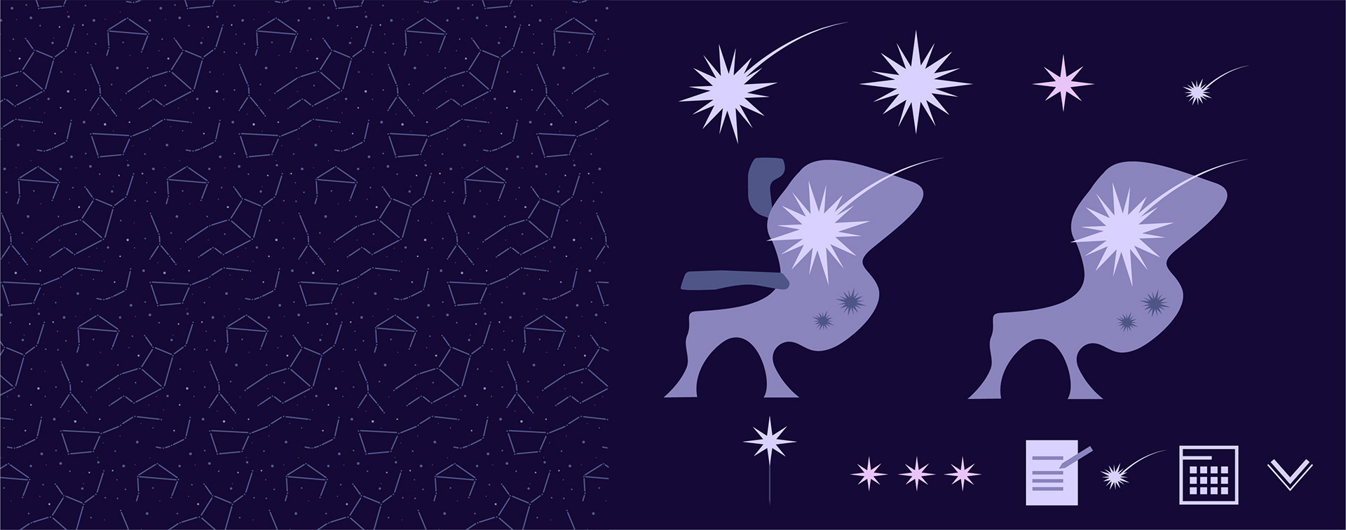
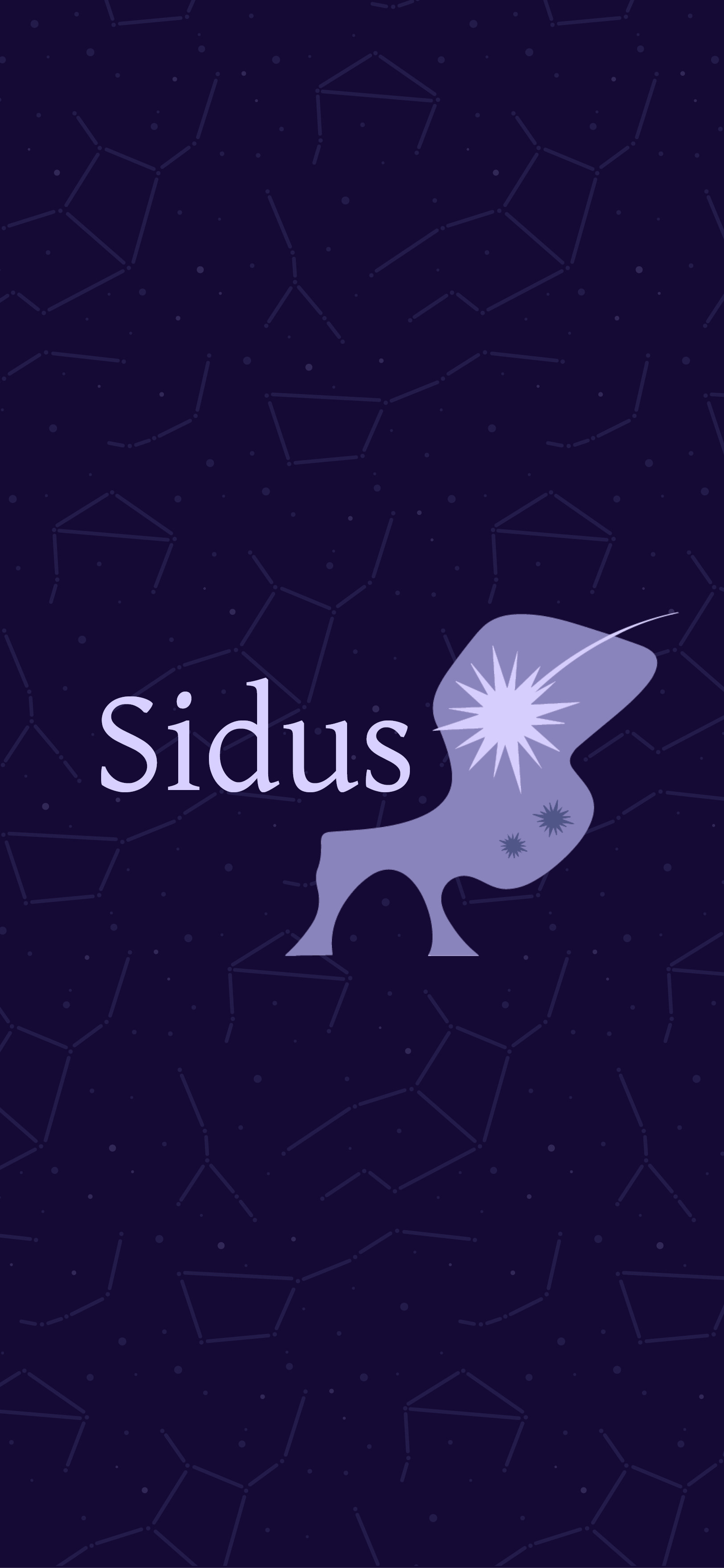
Next was my favorite part of planning a project- making a moodboard. My first idea was to create a deep blue, purple, and muted pink toned color palette. Researching a bit revealed that sensory-friendly color schemes are typically these, since they provide the least stimulation. Such dark colors resemble the night sky, so I know they would incorporate well into a celestial theme. My first rendition was extremely washed out. The more I looked at it, the more I hated it. Playing around in Adobe Color gave me a breakthrough, where the colors are still dark but tastefully vibrant. I love the second draft p From here, I generated thematic elements like constellations, as seen in the mobile app background, stars, and the luna moth. A moth logo shaped like a plane seat seemed like such a clever way to merge nighttime and air travel, thus the logo was born. Giving my brand a name took a ton of brainpower. I always want to do something clever, and clever requires Googling a lot of space terms. After a while, I stumbled upon Latin words for different objects in the night sky. "Sidus" immediately jumped out at me, translating to constellations in English. Considering my constellation pattern, it was too perfect. Images from the internet helped me get an instant visual for ideas and emulate the feelings I aim to invoke when someone uses the app. The board was an important a creative tool that helped me get my thoughts in one place, and served as a reference for components like page layouts.
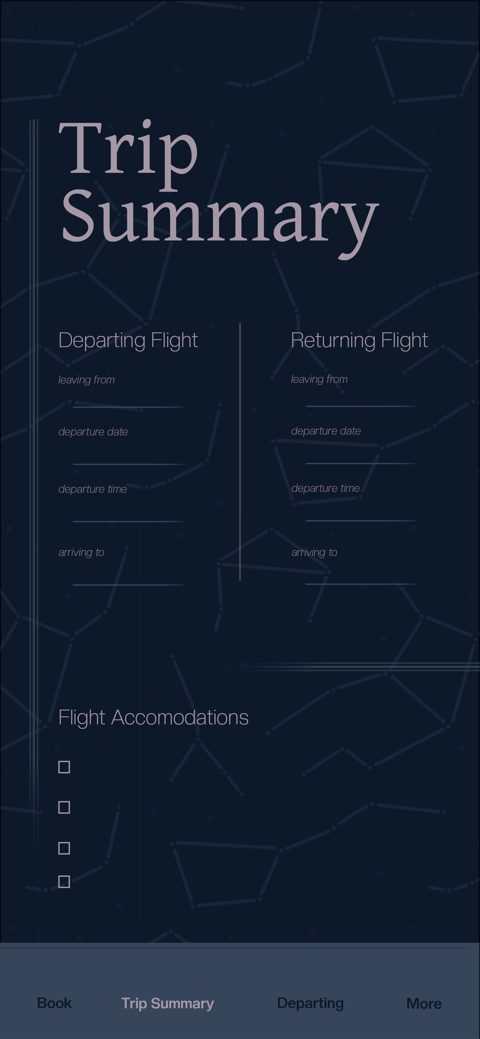
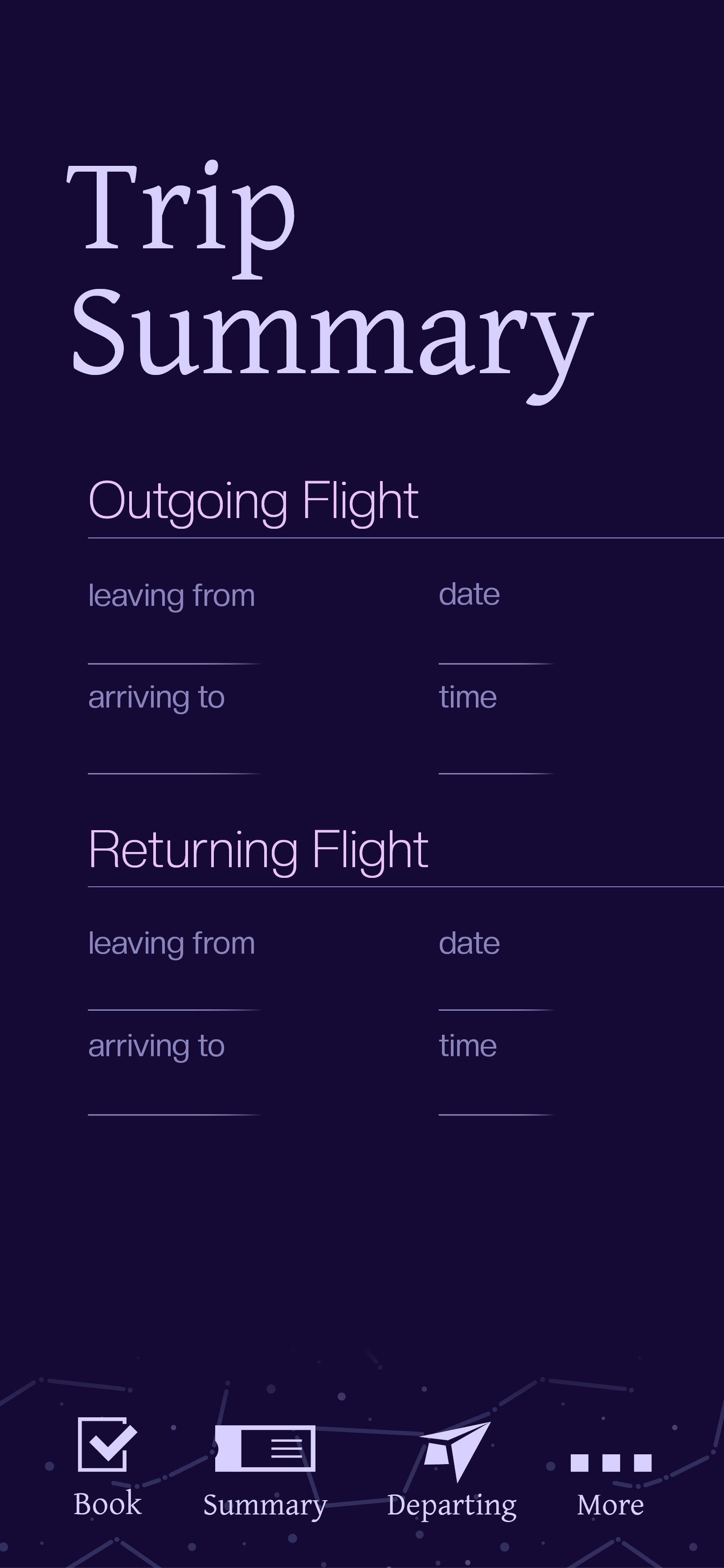
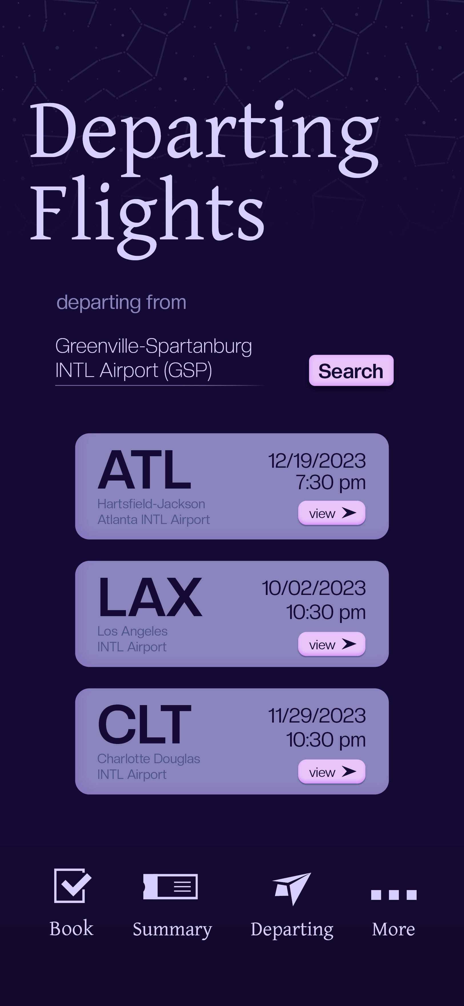
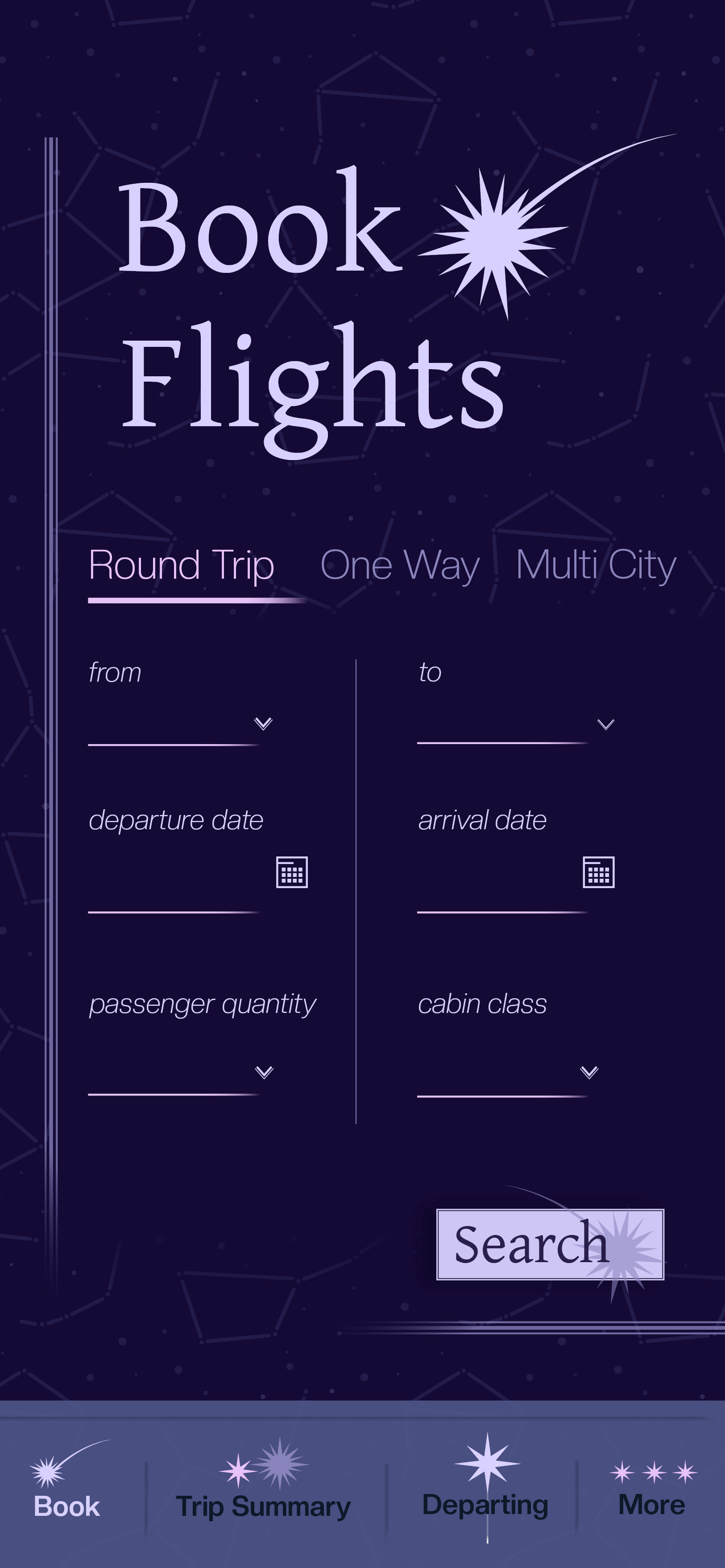
I fought a lot with designing a layout for the mobile screens. Definitely way more than I should have. I remember our first class critique of them, I was told my current draft was actually doing a bit of the opposite when it came to being simple and straightforward. This is where I chose to gut as much as possible. Anything extra like dividing lines between sections had to go. I'm especially grateful for this insight. My work tends to get crowded quickly when trying to fit in all of my ideas. I learned that space in your designs should do the work for you. I let the type in the mobile screens and widgets guide the viewing eye with different hierarchical structures, and it felt successful to me. Less is more is my new mantra from this point forward.
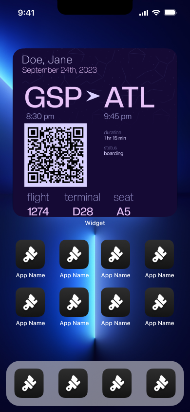
The widgets were a little bit easier once I tackled the mobile screens beast. My only issue was, again, trying to fit too much on such small spaces. Thankfully, I learned early that not every single bit of information had to go on every widget. Leaving the most important text for the smaller widgets fixed them almost immediately. The Figma mockup, however, was the challenge here. I'm new to this program so placing widget files in an iPhone mockup was a bit painful. I didn't have decorative apps in the mockup, which I'm still annoyed by, purely for lacking the time to work out how to do it. I want to make immersive phone displays next time for certain. The stock image apps are ugly.
The plane wrap was a little weird to design. I really just threw around my branding elements until something stuck. I love the pattern I made on this plane, though. Scaling it up really helped the elements pop. Eventually, I just went for it with the brand name and logo images and made them reasonably large on the wrap. This is another skill I find satisfying to practice. Once you throw exact placements to the wind, your design often gets better.
Overall, I'm pretty satisfied with the result of my first time designing a mobile app. I didn't think it'd be able to get it right, but I definitely proved myself wrong. I'm looking forward to taking critique to future assignments and incorporating the lessons I learned by doing.
I'm also looking forward to some decent sleep. Banning 2AM minor detail work sessions from this point forward.


Final Deliverables Start Here! ->


09/29/23
Dean's talk with us at truematter this week was, to my knowledge, the first time I've been to a graphic design related studio. A career in this field has always been a sort of distant image in my head. I also haven't really had any point of reference for how these offices function prior to Monday morning. It felt kind of surreal. A glimpse of the future reality I'll hopefully be living in a year from now felt like it was appearing in front of me. Hearing Dean explain the timeline of how he got to where he is now was extremely fascinating. I don't really know how the industry-entrance process goes either, so this was a really important experience to hear even if it was thirty years ago. Also, I loved the part where he talked about looking at some of the first websites when they were released. Historical events in society & culture are something I could never get bored of. I can't fathom building a personal computer now, but especially not with no one having done it before. AND building the first forms of the internet? No. Thinking about that too hard freaks me out.
You probably guessed this, but all that career related talk definitely sent me into a small panic. I will admit any day of the week that I am scared to death of what comes next semester. I'm about to take all these big steps in my life when most days I find myself running from responsibility to responsibility like a headless chicken. My brain is at full capacity so often, I really don't know how to start effectively planning post-grad life. If it's one thing I know, though, I like to wait for the "perfect time" where all my ducks are in a row to start a task. But in reality, not all of them are in a row simultaneously and there will not be a "perfect time" to do this. I just have to start and most importantly, ask for help from educators and advisors (which seems like the most uncomfortable part).
I remember one point in the talk hearing Dean talk about how much he had to work at first. Pulling all-nighters, staying late at the office- stuff like that. I also heard him describe what gets you paid. Big scary subjects for me. College feels like getting almost getting hit by a car while crossing the street then actually getting hit when you think you're good- over and over for four years. I've been burnt out more times than I can list and don't remember the last time I woke up feeling well rested. Basically, hearing Dean say that made my stomach sink a little. My sleep deprived and drained state definitely enhanced these doomsday feeling, but it still feels a little defeating now. The possibility not getting a break from struggling is scary, especially when cost of living gets involved. I want a job I like that can support me & my cat and a healthy work-life balance, whatever that looks like realistically. I'm intending to get there, no matter how many more sinking feelings come with it.
Overall, I got some good information, the task to reach out about internships, and a little necessary existential panic. Is it dramatic? Maybe. But it's really and truly my thoughts around the near future. I know it'll only get better as I search for advice in people that have done it. So to the top of the to-do list it goes.
(Also, I made a lot of changes to my airline mobile app. You should look at those over on the right.)


09/22/2023
I will admit, I'm writing this extremely last minute. I'm noticing a frustrating pattern this semester of thinking I've finished my to-do list, but then seeing an assignment that slipped through the cracks right before its due. Thus, panic ensues. I'm working on it though. The tangled wires for brains I have connect eventually, and usually (thank god) before 11:59pm.
Disclaimer aside, I've been extremely hard at work the past two weeks. My spare seconds are often spent with an Adobe program open. The airline app project has mostly held the top priority title especially. I've found myself extremely invested, sometimes to a fault though. I have become a bit too focused on minor details here. My mindset has been, "You're graduating and hopefully starting your career in less than a year. Your work has to look professional with minimal mistakes right now or you won't be successful ever". Obviously, black and white thinking at its finest. I'm gradually learning that is not realistic whatsoever. Correct me if I'm wrong, but you keep learning these things after graduation. I will fully admit I don't really know how many rows or columns I need for a project's grid. Golden ratio? Will have to Google what that is for a while. I'm wrestling with my brain's opposition to just store this information, but that's something I've worked around forever. With working on projects, I've become so concerned with if the math is right that I forget the actual design. With that as well, I develop so many ideas that I usually overcomplicate what should be a simple project. I get so into it that, realistically, it isn't possible to do everything I want before the deadline. I HATE turning in work that I'm not satisfied with or don't like, but I'll probably need to if I don't want to sacrifice another class for it.
These traits have been glaringly present with my airline mobile screens. My idea is to create an app for a sensory friendly, minimal stress airline that is as easy as possible for people like me to use. I learned in critique this week that I may have accidentally strayed the other way. The design I formulated just has too many factors. It comes from a passion of wanting to make things easier, plain and simple. Too many things in my adult life feel needlessly complicated or are structured in a way that I and many other struggle with. Though I'm learning to do tasks in a way that works for me, I find myself wishing I could fix the problems in the system entirely. This isn't an app for a real company I'm designing, but I can appreciate myself for having such a strong desire to make things work better.
Long story short, I'm conducting a purge of elements from this project (and probably others as well). If making the app design feels overwhelming from all the different components, that's saying something. I'm going to focus on the absolute basic necessities that go into booking and getting on a flight. I can make it aesthetically pleasing without going too hard (aka the concept of minimalism). My typefaces, color palette, and pattern can stay. My icons/logo need simplification and any extra decoration can go. This really makes me feel relieved. Going forward, I plan to make a list of what is absolutely necessary in a project along with what is just extra, choosing only a few elements from the extra pile. A lot of these courses are turning out to be more focused on a functioning creative process than I even thought about. It's so vital to figure out though. If you're drowning in work at all times, it's probably time to make adjustments.
I'm making it a goal to make my schedule and project organization very Type A, but in a streamlined way. If I have to schedule a full night of sleep (I do), then in the planner it goes. I'll start with the widgets due on Monday. Since their whole point is to fit all the core information on an inch or two of home screen, this is a perfect first trial.
(Soon to be gutted designs are to your right)

9/8/2023
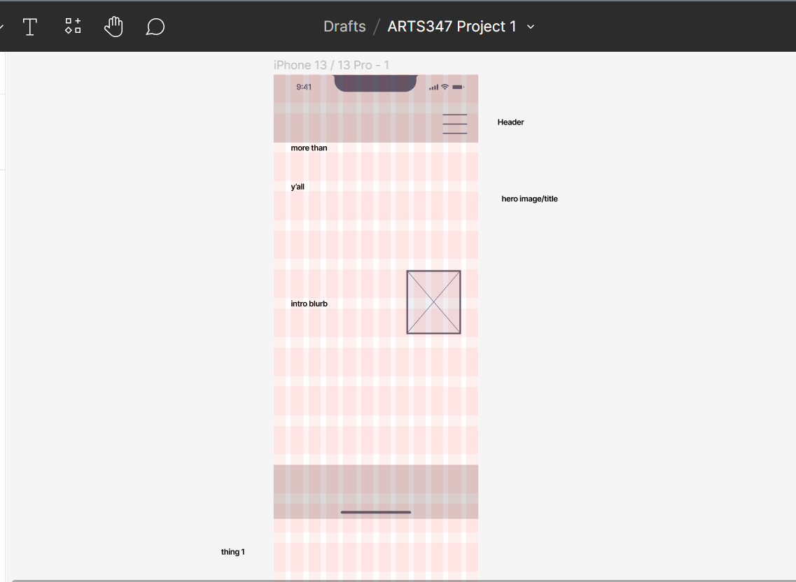
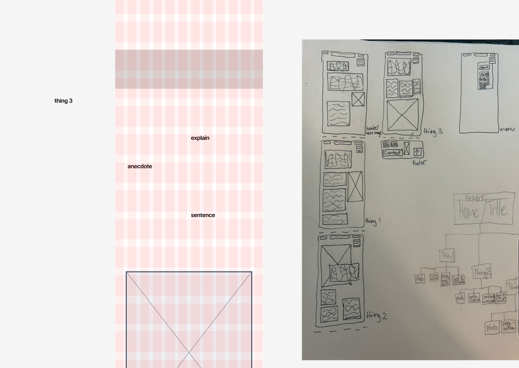
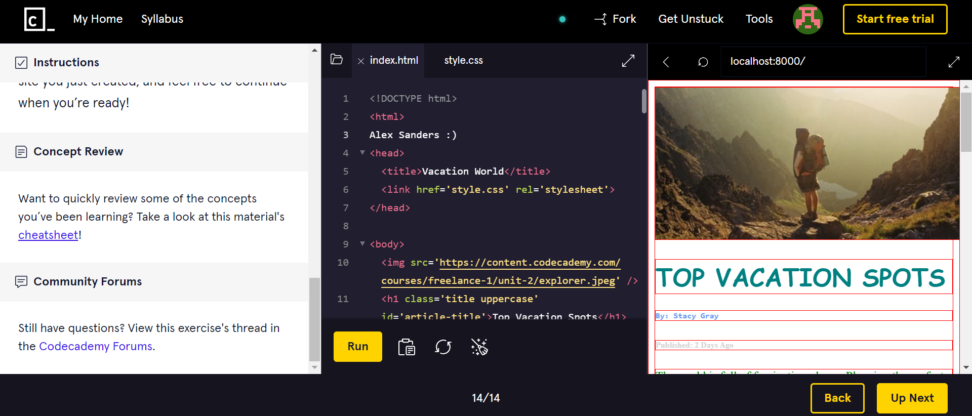
With the end of this week, the final deliverables were due for our first project. My progress on this assignment in the beginning was slow going. Figma was extremely intimidating for me and I was struggling to navigate creating a prototype with it. I took to lots of tutorial videos online that helped me build some momentum and I eventually pieced different aspects together. From my experience, I found the resource not very intuitive. This may be a necessary consequence for being able to build a web prototype though, and I do my best to acknowledge that. Such a steep learning curve was a challenge, but eventually different functions clicked.
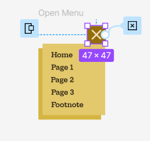
My greatest successes were the addition of website buttons that actually perform their function, such as the opening hamburger menu in the top right corner of the prototype. This element specifically gave me some of the most trouble, but also the greatest payoff. I do wish I was able to make the navigation buttons for each section functional. I believe this fault was attributed to making the site a single page. My impression was that in order to be single-scrolling, it had to be one long page. Through my research, I figured out that pairing components like the navigation buttons required individual pages to connect them to. I'll definitely be incorporating this learning experience in any other prototypes I create.
Overall, I feel that my execution of the prompt was pretty successful for a first product in the software. I noticed throughout that I paid close attention to how my elements connected to one another. This is residual skill from my previous graphic design courses that now, to my excitement, feels like second nature. The color palette, type, and imagery feels relatively balanced to one another aside from a few errors. Slowly but surely, wins like these are building my confidence as a designer. Our next project involves similar UI & UX design, and while I'm nervous, I hope to continue proving my capabilities in this field to myself.
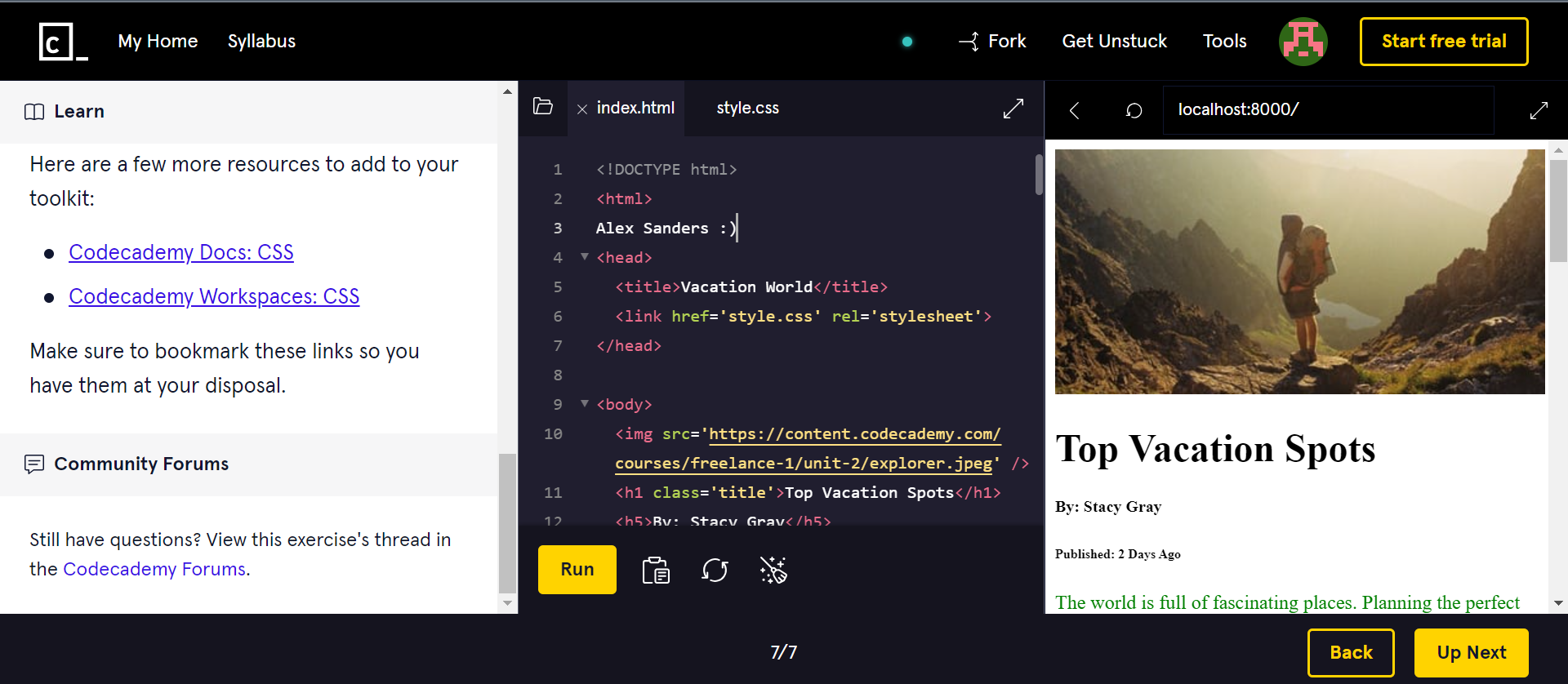
With the coding assignments, I've gained a lot of knowledge thus far surrounding how complicated coding a website is. I will admit, I barely understand a lot of concepts and coding languages are overwhelming to me. So many elements are fragile and depend on one another. I already greatly appreciate the work computer science professionals do. I definitely chose the right major.